≡ Menu

I realize that it sorta reminds one of a tongue teaser, but take it from me it isn’t.

For those that might be new to my blog, I have been putting out a post every five or six days since 2011. I teach an online class with the BPSOP, and I conduct personal workshops all over this perfectly round planet.

As most of you know, I prefer the challenge of getting it right in the camera with little or no Photoshop/Lightroom help. However, if there’s nothing I can do before clicking the shutter, a.k.a., moving forward, backwards, raising the camera up a little, or down to eliminate or adding an object, then as part of my thought process, and before I click the shutter I will realize what I have to do in post, and I have no qualms about doing it.

Having said that. I want to make sure that what I do, doesn’t look like I did it. So many of my students or even when they’re not, tend to over process their photos to the point of looking like some kind of cartoon. The real problem I face is that when they tell me how much someone loves their image, it’s hard to discourage them from stopping.

The general public basically has no taste and has no idea when something looks garish. It’s a dilemma that I constantly face when working with fellow photographers.

All I can do is to point something out and then rely on their photographic integrity and resolve to rise about any one sided compliments that are coming from family, friends, fellow photo club members and even to go as far as any service animals…”Oh the Horror”!!

All I can say, with years of experience, is that if it ain’t broke, don’t try to fix it. It will take firmness of purpose, and if I’m there to help you down the road of righteousness leading to a better world, you can count on me  to supply the backbone you’ll need for those first few steps to photo glory.

WOW, now there’s a mouthful of utter BS!!!!

:-)))))))))))))))))))))))))))))))))))

Bottom line is to take a look at what you’ve done and ask yourself…Do I believe it?

In the above photo, do you believe it?


{ 0 comments }

A Question About Color.

askjoebbonnieLamprey

Bonnie, an online student, sent me this photo with a question. As I always do, I put the message from the photographer so everyone can read it. This way, those that have similar issues or questions can benefit. Here’s what she said:

“Joe, my question on this photo is mainly about the color.  The boat in the foreground was in shade and the one in the background was in the sun.  I like the composition (mostly), but the differences in color (hue?) between the foreground and background is extreme.  I exposed for the boat in the background, so it would be seen.  Would you brighten up the boat in the foreground?  Would you have metered from a different spot?

I did do some post-processing – increased the contrast a bit and cropped off a bit on the right (there was too much space behind the background boat).  Also, the wire lines from the foreground boat cut across the front of the background boat – I’d like some space between the two.  I’ll go back to this spot again (undoubtedly a lot more times!), so I can keep my former mistakes in mind J .

Thanks!

Hi Bonnie,

Ok, first let’s address the question mark (?) you had next to the word “Hue”. The word Hue is basically the characteristics of a color. For example one might say,” Doctor, his face had a yellowish green hue (or color) to it”.

The photo of the boats is not just about color, its mostly about exposure. Let me explain:

This is really all about Dynamic Range. The light reflecting off the boat in the background was too far from the boat in the shade. I don’t know what you use to take readings, but I’m guessing you let your camera make the exposure recommendations, and like a good photographer you believe it. Depending on what you had your meter set on, it probably was picking up too much of the boat in shadow. For me, I never let the camera tell me what I should do, which is why I use a hand held Minolta One Degree Spot Meter. If I were to take a reflected reading of each boat separately, I would know that there’s way too much difference to get a proper exposure on each one. So, what to do?

I either change my composition so everything will read the same, or I stick with what I have. If I like what I have, I’m going after the boat in the sunlight, then underexpose it a stop. That’s where I want the colors to have depth and be saturated. What will happen is that the boat in the shade will be a lot darker, so you have to decide if that’s ok. Personally, I think it would still look good. In any event, you can always open the shadow in post.

Btw, If I had been standing next to you, I would have asked you why you didn’t want the boat in the background to be sharp?????? I think it would have looked soooooooo much better. Remember when you have that much distance between the foreground and background, you should always check your DOF to make sure you’re getting what you want.

One last note: If you ever want to become a really good photographer, I strongly suggest you do your cropping in the camera. If you use the computer to do your cropping, you’ll never know where the edges and corners of your frame are. Use the edges of your frame as a compositional tool.

Since I know you took my online class with the BPSOP, and as I tell the students in my “Stretching Your Frame of Mind” workshops, you probably forget to use your “Fifteen Point Protection Plan“. Otherwise you would have left some space between the cables on the boat in the foreground and the bow of the boat in the background; making it a “quicker read” and not so confusing.

Oh yes I forget to mention that I really like your composition!!!

Visit my website at: www.joebaraban.com and follow me on Instagram: www.instagram.com/barabanjoe. Be sure to check out my workshop schedule at the top of this Blog. Come shoot with me sometime.

JoeB

{ 0 comments }

Working on the silhouette.

I’ve been teaching an online class with the BPSOP for just about three years, and I’m always amazed and impressed with the level of work that’s generated over the course of the four weeks. I had started out with just one class, and like my “Stretching Your Frame of Mind” workshops I conduct around the planet, we work on incorporating the basic elements of visual design and composition to make  fellow photographer’s images stronger.

Several years ago I began teaching a part II class that extended these elements to include shadows, silhouettes, some interesting assignments, and some of the principles of Gestalt. When you put all these elements and concepts together the results are memorable photos that the viewer will mentally enjoy long after he’s stopped looking.

Here’s some examples of how these elements that they’ve  learn over the month made their photos look as good as I believe they do. These are amateur photographers with all different skill levels since everyone can benefit from my classes no matter where they are in the scheme of things…photographically that is!!!

The following slideshow is from both my Part I and Part II…enjoy and see if you can pick out the different elements and concepts.

Visit my website at: www.joebaraban.com and follow me on Instagram: www.instagram.com/barabanjoe. Check out my workshop schedule at the top of this blog. Come shoot the elements with me sometime.

JoeB

{ 4 comments }

Lumix DMC-LX7

First of all, I still have a spot open for my next trip to Cuba. This time we’re going to Santiago and Baracoa, the end of January and it’s a small group of seven. With these trips you don’t have to be a photographer, you can just come for the historical and cultural aspect. We always have a Cuban Historian with us and you can just use your iPhone if you want. Click on workshops at the top of this blog for the complete description.

If you’re interested and have questions, you can email me at: joe@joebaraban.com.

Ok, back to business! For those new to my blog, I have been writing these posts since 2011; one coming out every six days…that’s lot of posts. I teach an online class with the BPSOP, and I conduct workshops all over this completely round planet.

Photography is not about the camera. A camera didn’t make a great picture any more than a typewriter wrote a great novel. What’s important is the ten inches behind the camera that really counts.

Take a moment and think about all the famous photographs that were shot by: Alfred Steiglitz, Margaret Bourke-White, Henri Cartier-Bresson, Ansel Adams, Dorothea Lange, Edward Weston, just to name a few that immediately comes to mind.

These photographers and their photographers have stood the test of time and their cameras were antiquated and archaic compared to the sleek new mirrorless cameras we use today that can do everything except snap the shutter…and they can ever do that for you!!!

So, my fellow photographers, don’t worry about the camera you use, although at the very least I would recommend a full frame camera so what you saw looking through the viewfinder, you got.  Concentrate on your composition and incorporating the basic elements of design. Shoot on manual, get rid of those insidious blinking lights. Also, you don’t need a Histogram. Learn the light all by yourself. I’ve been shooting for fifty-three years and I’ve never even thought about it…and my pictures have come out pretty good.

FYI, the above photo was shot with my little Lumix DMC-LX7. If you look at the photos on my website, you would be surprised how many were shot with this camera.

I would also highly consider taking my classes!!

Visit my website at www.joebaraban.com and follow me on Instagram www.instagram.com/barabanjoe. Check out my workshops at the top of this blog and come shoot with me sometime. How about coming to Chicago with me September 4th to the 11th for a great workshop in a great city.

JoeB

{ 0 comments }

I was invited to bring my workshop to the Julia Dean Photo Workshops in Hollywood, California. It was my second time, and it’s always a special treat to teach there because after all it is LA, and the weather can’t be beat for shooting pictures; not to mention the great staff at the workshop who are very professional and accommodating to me and the students.

I teach an online class with the BPSOP, and I also conduct my workshops all over the world. I took one of my workshops to the Getty Center to photograph the wonderful architecture, and once we were there they spread out looking for the ‘elements’ of visual design found on their new ‘Artist Palette‘ (they began working on it the first day of the workshop), as well as ways to incorporate the Theory of Gestalt into their photos.

The Getty Center

While working with Rina, one of my students, this is one of the shots she took. Not only is it about Line, Texture, Pattern, Negative Space and Perspective (all of these found on her ‘Artist Palette’), but it’s also a great example of one of the concepts of Gestalt I also teach called “The Law of Common Fate”. I’ll be sharing this concept with you in a coming post, so stay tuned.

Visit my website at: www.joebaraban.com, and follow me on Instagram: www.instagram.com/barabanjoe. Check out my new workshop schedule at the top of this blog. Come shoot me sometime.

A really good photo Rina!!!

JoeB

{ 0 comments }

Linda sent me her photo to talk about. here’s what she had to say, as I like to share each photographer’s feelings and situation. I’ve found that many of you out there are in similar situations:

Hi,

I am retired now and am an amateur photographer, always appreciative of positive criticism.  I have a Canon Rebel xs and usually use Zoom browser for any post production,  I do not have photoshop/lightroom.

I was out with the local photo club, Kamloops, BC, Canada at the universities horticultural area and came across this beautiful setting, my first thought was the array of vibrant greens with the water fountain in front and wanted to create a window looking into this scene.  Although pleased with the colors, I still see blur……even with a tripod.

Linda, first let’s address the issue you have with “blur”. What you have here isn’t an issue with blur, it’s an issue with your aperture settings. If you look at the area that’s in the foreground from the fountain to the camera, it’s all in focus. From the fountain to the implied horizon it’s not as sharp…not blurry, but just not in focus which is a big difference. Your aperture was not closed down enough to get everything in focus. Being on a tripod won’t matter if you don’t have enough depth of field.

If you want everything to be sharp from the foreground to the background, you have to make sure your aperture is stopped down to it’s smallest setting on your lens. If you’re shooting with a wide angle lens, you don’t have to stop down as much as you would with a longer lens. For example, with a lens that has a focal length of 28mm down to let’s say 16mm, F/5.6 will

The next time you’re in a situation like this and you’re on a tripod (which you should be to have complete control), shoot the same picture but with different aperture settings and compare them to each other. You’ll be able to see the difference and make future decisions based on you’re findings.

I would highly recommend setting your focus to manual and then focus about a third of the way in at F/22. That way you have control instead of your camera’s auto-focus function that would focus on the fountain.

Ok, let’s talk about the photo itself:

The first thing I want you to notice is that I straightened your horizon. The strong line above the fountain was going downhill. Line is probably the most important element of visual design, and it’s part of what I teach in my online class with the BPSOP, and in my “Stretching Your Frame of Mind” workshops I conduct around the planet. Without Line, none of the other elements would exist as they all require Lines. You and I wouldn’t exist as we both have an implied outLINE.

Having said that, the most important Line is the horizon line and when I see a photo that has a horizon line that’s not straight, it’s a sign that a novice took it. I can tell by your photo that you haven’t been a novice for a long time…why do I say this? Because you instinctively framed the background with the two posts with the plants growing on them. In my classes we talk a lot about the ways to create Visual Tension, and one of the ways is to frame a subject within a frame. Combining opposites also creates Visual Tension. The hardness of the concrete and the softness of the green area are the contrasting elements.

Color is another element of visual design, and you’ve used color here to communicate an idea….namely the plant life found in this botanical garden. Texture is yet another element found on my “Artist Palette”, and you have lots of it working for you here.

Linda, it’s a much stronger image than you probably thought!!! Thanks for sharing it.

Visit my website at: www.joebaraban and follow me on Instagram: www.instagram.com/barabanjoe. Be sure to check out my workshop schedule at the top of this blog. I still have a spot ope on my next trip to Cuba, see above.

Come shoot with me sometime.

JoeB


{ 0 comments }

Life Before Photoshop: VW Campaign

One exposure on one piece of film.

One exposure on one piece of film.

In the film days, the days when the word Adobe meant a type of house in the southwest, we had to create all our images in the camera. One piece of celluloid, one exposure was all we had to work with.

I would say that the hardest subject matter to shoot during those times were automobiles, and actually anything that had wheels and moved was difficult. These were big budget shoots, and if you didn’t nail it, you didn’t work on that account any longer; you didn’t work at all with that agency. You were “persona non grata”, which basically meant that you would be through getting work from them. Worse, if that art director you just made to look bad wound up at another agency (and they moved around all the time), you were done there as well.

Scary times? you bet!!!

I loved car shoots because the day rates were the largest and you always stayed at the best hotels, flew first class, and ate at the best restaurants. Believe me when I say it was great times, but hardly worth whatever consequences there were if you screwed it up.

I was shooting a big campaign for Volkswagen, and one of the ads was going to have a local buy…as they referred to advertisements running in just one or two cities. The budget couldn’t support a camera car so when this occasionally came up, we would rent a Lincoln Town car because they had the smoothest ride. As in the photo above, we would get in the trunk and shoot car-to-car from there.

After determining the Sun’s position using my Sunpath readings and my Morin2000 hand bearing compass, we decided on this urban street in LA. My assistant and I were in the trunk of the Town Car, and another station wagon with a large piece of foam-board taped to the rear door to bounce light back into the grill, was right next to me.

We hired two cops to block the street and a water truck to give the road a wet-down…so the reflection would add to the visual interest. Although the car looks like it’s speeding down the road, in actuality we were only traveling ten to fifteen to twenty miles maximum per hour. As long as both cars were moving at the identical speed, I could shoot at 1/4th of a second) to create the illusion of speed while keeping the car sharp..

As I tell my online students with the BPSOP, and the ones that take my “Stretching Your Frame of Mind” workshops I conduct around the planet, in the digital age, the age of CGI, most car photography is now done in the studio, often times the landscape is bought separately, and the illusion of speed and the blending of the car in the landscape is handled with Photoshop….so sad, so very sad!!!

🙁

Visit my website at: www.joebaraban.com, and follow me on Instagram: www.instagram.com/baraban/joe. Be sure to check out  my workshop schedule at the top of this post. Come shoot with me sometime.

JoeB

{ 0 comments }

Student work: Does it Make A Statement?

One of my students sent me this photo and as always I like to copy exactly what each photographer had to say. I’ve found that there’s a lot of folks out there that have had similar experiences at one time or another.

Here’s what was said:

“I wanted to ask you if you thing that the attached picture makes a statement on its own, without any explanation required. It is called “Whatever the Dusk or the Dawn ” because I entered it in a Can Geo photo contest called “Whatever the Weather”.

I took it because I liked the colors and the multiple layers in the sky. I did not want to include the sun or other silhouettes in the frame, because I liked the simplicity of the colors alone.
I find that people don’t have the reaction I expected towards this photo. I believe that they take it as another pretty picture of a sunset that everybody can point and shoot.

This is one of those that does not scream the center of interest at you, but definitely has the visual interest through colors. When I look at it I see an abstract painting on canvas and all kind of other things, but as you say I am not there to tell my story.

Any critique will be appreciated.

Thank you very much.

I immediately wanted to send you a link to an article I read some time ago and have repeatedly show to my BPSOP and in my “Stretching Your Frame of Workshop” I conduct around the planet. It’s called “Giving meaning to photographs”. I think you’ll find it the answer to all your questions.

Remember that you’re not always going to be around to share your thought process or emotions at the time you created your image; it has to stand on its own merit. The feeling you had and the thoughts running through your mind were important to you. Unless the viewer was standing next to you, he can’t sense the same ethereal qualities just by looking at a pretty sky that he might have seen before.

So many times I’ve been driving down the road or walking on the beach and had the pleasure of witnessing a beautiful sunrise or sunset. The first thing I do is to look for anything else I can put in the photo to add what I refer to as a “layer of interest’. If I don’t see something I may shoot anyway just because I’m a photographer and like to take pictures of pretty things. There’s just as much chance as me not shooting it and just standing there smiling while I enjoy the forever fleeting moment.

Reason being that I’ve personally shot a million pretty skies and my files are crowded with them!

Here’s a post written my a very famous photographer who once said, “If you don’t have anything to say, your pictures aren’t going to say much. http://joebaraban.com/blog/my-favorite-quotes-gordon-parks/

Having said all this, it is a pretty sky with great colors…but just another pretty sky.

I hope this has helped.

Visit my website at: www.joebaraban.com, and follow me on Instagram: www.instagram.com/barabanjoe. Check out my workshop schedule at the top of this blog. Come shoot with me.

JoeB

{ 0 comments }

Student Work: Medusa Hair

Sue sent me this photo to talk about and as usual I like to copy exactly what fellow photographers had to say. It is often the case where others have experienced the same situation or might have a similar question about one of their photos. Here’s what sue had to say:

Medusa?

“Hi, I was thinking this has to be the best head of Medusa Hair in a long time. I wanted to get close and see what it would look like””.

Sue

Ok Sue, first of all I agree with you that it has been a long time since Medusa was around in Greek mythology.

Getting what I refer to as “up close and personal” was a good way to bring out the differences between the green and white “Lines”. I say lines because when you “see past your first impression”, that’s what they are.  In my online class with the BPSOP, and in my “Stretching Your Frame of Mind” workshops I conduct around the planet, I talk about Line. It’s the most important of all the elements of visual design, for without Line, none of the other elements would exist. As a matter of fact, nothing in this world would exist…you and I, planes, trains, automobiles, etc. all have an outLine.

Having said that, this is a study of green and white lines and so if I had been standing there I would have suggested to things to you: The first would have been to take out the dead (brown) blades of the green lines. They really aren’t adding anything and to me they take away from the pretty green ones.

So many of my students just don’t think about things like that. The main reason is because they’re out “taking pictures” instead of “making pictures”. It’s ok to change the way things look in your frame, if it will help it look better. Taking out the dead blades of the green grass is what I mean by “making pictures”.

The second thing I would have mentioned to you is that the bottom half of your photo looks more interesting than the top half. The top half is not as clean, graphic, and is somewhat distracting. Look at how simple the relationship between the white and green Lines and how much better the viewer’s eye can flow.

BTW, I would have suggested that you not show the area in the top right or left corners as they take away from the center of interest. Either “use it or lose it”. Next time, be sure to check the four corners to see things like that and be able to decide what to do in your next adjustments.

Thanks for the submission Sue and did you know that Medusa was beheaded? I’ll bet that left a mark!!!

Visit my website at: www.joebaraban.com and follow me on Instagram: www.instagram.com/barabanjoe. BE SURE TO CHECK OUT my NEW workshop schedule at the top of this blog. Come shoot with me sometime.

JoeB

{ 0 comments }
Look ma, no Photoshop.

Look ma, no Photoshop.


Every time I write one of these posts it takes me way, way back to the days when Adobe was the name of a style of house in the Southwest part of the US.

The good old days when you had to do everything in the camera, and as a result got the occasional ulcer for doing it. Yes, those do-da days where it took just one screw-up and you became persona non grata at not just the agency you were shooting for, but if that Art Director that picked you went to another agency, and they often did, your name went with them. That’s just the chance you took because the money was so good. In those days car shooters (the good ones) were getting $5000.00 per shot (plus all expenses) and up, and that day sometimes meant one shot at sunrise and one at sunset.

In my online classes with the BPSOP, and in my “Stretching Your Frame of Mind” workshops I conduct around the planet, we work on incorporating the Elements of Visual Design into their photography. We also work on getting as much in the camera before the shutter is clicked so that my fellow photographers can become better photographers, not better computer artists.

That’s not to say that I don’t use Photoshop because I do with just about every photo; not to do anything except minor tweaking. For me, getting it in the camera is a great challenge, and as a result I fell good that I’m a good shooter that relies on my eye and imagination, not Histograms, blinking lights, and that insidious bane of existence that’s called…HDR!!!.

In the above photo, the Art director and I choose The Bonneville Salt Flats for the location because of the simplicity, the great light, and all that wonderful texture.

It may look like a simple set-up but I can tell you that it was anything but simple. The car company that brought the new-never been seen before Alpha Romeo got their huge van and trailer stuck and after hours of trying and a twenty foot hole, we were able to rent a back hoe to get the tractor out that got stuck trying to get the trailer out in the first place…what a mess!!! This took a day. Then, we had to fill in this giant crater so it looked like it never happened…another day of expenses.

Simple set-up????????

Simple set-up????????

The placement of the car was extremely important since as a prototype it came without a motor and had to be manually placed (by hands) to get the right angle of the light. When seconds counted, there wasn’t enough time to move it again (and keep those tire tracks out of the shot. To do this I determined the degrees of both sunset and sunrise then I used my Morin 2000 hand bearing compass to decide on which one to shoot and to get it at the exact angle to eliminate unwanted hotspots and glare, and the shadow that was important as well. I knew that the shot had to be taken right before the full sun was visible on the horizon. After that the car was subject to those elements that couldn’t be taken out since any thought of post-processing was years away.

Visit my website at: www.joebaraban.com, and follow me on Instagram: www.instagram.com/barabanjoe. Check out my workshop schedule at the top of this blog. come shoot with me sometime.

JoeB

{ 0 comments }

Student work: What Do You Think?

What do you think?

Daniel sent this photo to me and asked what I thought about it.

Ok, first of all, let’s address the color to B/W conversion. B/W photography and I go back a very long way. In 1971, I  started my career shooting for UPI then AP, and virtually everything I shot was in B/W. I love the medium, and in the digital era I know when it’s a good fit and I can usually tell when the decision to convert a photo was done after the fact in front of a computer.

This may or not be the case in this example, but it sure feels like it was not thought of right before the shutter was clicked. I may be way off base here, but it just doesn’t feel like it should be a B/W photo. It doesn’t feel like that was the idea when the composition was formulating in Daniel’s mind…why do I say that?

Because of the location and the light. To me, B/W photography is all about subject matter. Daniel’s photo is closer to “street shooting” than any other genre. With the possible exception of landscapes B/W photography street photos should be made with a recipe in mind. When I think of B/W, I think of subject matter that has at least some of these ingredients: Tough, Tenacity, resolve, true-to-life ideas, gutsy, story telling, and above all, it has to have soul.

The direction of the light is coming from 9 O’clock and is side lighting the person. With this kind of light, I would have thought that it would have looked good in color, since side light is one of my favorite ways to like a subject, and we work on lighting in my classes.

Having said all this, to me a strong B/W photo is thought out in advance, with the clear intention of going out and shooting B/W for the sake and love of B/W. As I said, Daniel may well have shot this with the intention of it being a B/W image. It just doesn’t feel like it to me.

Ok, let’s talk about the photo itself. Let’s talk about how many of elements of visual design and composition are present in Daniel’s photo. In my online class with the BPSOP, and in my “Stretching Your Frame of Mind” workshop I conduct around the planet, I show fellow photographers how to incorporate the basic elements of visual design and composition into their photography. At the end of my class and workshop, my students walk away with what I call an Artist Palette. instead of pigment, this Palette now has: Line, Shape, Form, Negative Space, Vanishing Point, Perspective, Balance, Tension, Color, and Light.  

Daniel’s photo has a lot going for it!!! It has a strong directional Line that leads the viewer from the bottom left (the natural way we perceive) to an “implied” Vanishing Point through the person to the horizon. He has divided the un-inspiring sky into two Shapes which really helps the composition. Look at all the Negative Space that defines the Positive Space. What I’m talking about is the areas of sky that borders the lampposts. The area between the lamppost and the building on the left, the area (Negative Space) that defines the lamppost in the middle of the frame, and the area around the person that defines him, and the area on the far right that defines each lamppost.

One of the most important elements on the  is Visual Tension. There are several ways to achieve  this type of Tension, and one of the ways is to minimize the Negative Space that borders the Positive Space. If you notice the area between the person and the lampposts, this Negative Space has been minimized, which generates Tension. The Tension I’m talking about is not the Tension that comes from mental or emotional strain. It’s the Visual Tension that comes when forces (the Positive Space or in other words the person) act against one another. What that means is that the anticipation of the person and the lampposts touching one another.

I assure you that these shapes were no accident. Daniel saw these shapes and used them to his advantage. He used his “fifteen Point Protection Plan” he received while taking my online class to create this pleasing composition. So, why convert it to B/W?

I have no idea. I’m afraid you’ll just have to ask him!!!

Thanks for the submission Daniel.

Visit my website at: www.joebaraban.com and follow me on Instagram: www.instagram.com/barabanjoe. Watch for my new workshop schedule you’ll find at the top of the blog. Come shoot with me sometime.

JoeB

{ 0 comments }

Photography Workshop Overview

Several elements from my ‘Artist Palette’.

“STRETCHING YOUR FRAME OF MIND”

When you sign up for my online class with the BPSOP, or consider taking my “Stretching Your Frame of Mind” digital photography workshop I teach around the globe, this is the first part of what you’ll read in my workshop overview:

THE ARTIST’S PALETTE:

Imagine yourself standing at some location with an artist’s palette in your hand. A recently stretched canvas is waiting on an easel, and a jar full of cleaned brushes sits on a small table next to you. Cobalt and Ultramarine Blue, Raw Sienna and Burnt Umber are positioned side by side while Chromium Oxide Green, Cadmium Red and Yellow lie together opposite them; Mars Black and Titanium White sit in the middle. They all have been squeezed from tubes and anxious to be mixed together.

Now, imagine that instead of all those wonderful pigments on your palette, there are the elements of visual design and composition.  Terms like: Vanishing Point, Negative Space, Perspective, Tension, Color, Light, Texture, Pattern, and Line, have been etched into the aged wood.

Everyone knows what happens when you mix red and blue, right? You get purple. How about when you mix blue and yellow together? Green, right again. But, what happens when you add Tension, a few Patterns, and Perspective together while taking your daughter’s portrait during an outdoor birthday party? Or Negative Space, some Texture, and a Vanishing Point when you’re composing a street scene in a small Tuscan village? Or a small fishing town, like the one shown below that I shot while with my class at the Maine Media Workshop.

What happens? Well you’ll get the picture.

Check out my website at www.joebaraban.com and follow me on Instagram: www.instagram.com/barabanjoe. Check out my workshop description at the top of this blog. Come shoot with me sometime!!!

JoeB

{ 0 comments }

Student work: Street Market In London


As I normally do, I like to give the readers of my blog the actual request from the photographers. So many times what they are asking is the same kinds of questions a lot of you would be asking. Here’s what Joyce had to say:

“Hi Joe

I was reading your blog post so thought I’d send this photo I took today at a street market in the East End of London…at first I saw the street art on the wall but then from the corner of my eye I noticed the African guy in the corner so managed to quickly incorporate him into the scene before he walked across the street.
Are you doing any more photo trips this year?

Cheers,

Joyce”

To me, it was a great idea to incorporate the man into your photo. By doing so you’ve put an entirely different spin on it. Now, instead of the  being taken in the East End of London, it could have been shot somewhere in Africa. I’m not going for any kind of profiling here, but because of the image on the building, and the black man ” Up close and Personal”, it sends a message that can be construed as some kind of rally in one of the countries in Africa. The white guys in the background comes across as journalists; especially since you read everyday about all the problems so many countries are having now.

Here’s what I like about things being “Up Close And Personal”. By putting him in the foreground, you’ve created Perspective (depth). Now, you have what I call “Layers of Interest”.

If this is something you didn’t want to happen, then you have to step back and look at this photo before submitting it anywhere.

Ok, now let’s talk about “In a perfect world, what if”. This is a phrase I’m constantly talking to my online class with the BPSOP, and in my “Stretching Your Frame of Mind” workshops I conduct around the planet. When critiquing one of my students photos that was submitted for a particular assignment, I ask  them if they could go back and change or do anything they wanted, what would they do differently.

If I had been standing next to Joyce when she was shooting this photo, I would have had her tell the black man to glance directly into the lens…why you ask?

Line is the most important of all the elements of visual design found on the student’s ‘Artist Palette’ I give them at the beginning of the classes. Without Line, none of the other elements would exist. In fact, there wouldn’t be planes, trains, and automobiles. People wouldn’t even exist because we all have an outLINE. Now, a very powerful Line would be the implied Line between the black man’s eyes and the lens. There would be Visual Tension, and perhaps even a “shock value”, especially if he wasn’t smiling. It would also match the direction of the person’s image on the wall.

I would also have you turn him around and face out of the frame. This not only implies content outside the frame, but it also gives “visual direction” to the overall look. This falls into one of the six principles of Gestalt I often refer to with my students. Be sure to read the article I wrote for Adorama on these principles. and check out the one called The Law of common Fate.

The last thing I would have done is to move him so that the pole wasn’t growing out of his head. This is also one of the principles I talk about called Proximity.

Thanks for the submission Joyce.

Check out my website at: joebaraban.com and follow me on Instagram www.instagram.com/barabanjoe.  Be sure to watch for my upcoming 2024 workshop schedule. Come shoot with me sometime.

JoeB

{ 0 comments }

AskJoeB: Confucius Says

Confucius says.

Check out my new workshop on the six concepts in the Psychology of Gestalt: Gestalt Workshop link

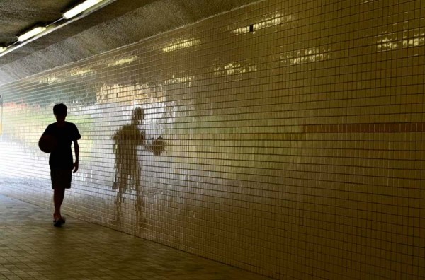
Here’s another photo that was submitted to me from a photographer that took my online class with the BPSOP. As is usually the case, I like to show everyone exactly what the sender had to say. I’ve found that by sharing it, a lot of people might identify with it or just want to know the background, if any. Here’s what Charlie had to say:

Hi Joe,

I recently participated in a calendar-shoot project where we were assigned a quote and tasked with taking/submitting a photo that we felt was representative. My quote was “It does not matter how slowly you go, as long as you do not stop” – Confucius

I was out-and-about with my camera, with “seeing beyond first impressions” foremost in my thoughts, and I came across this gentleman who struck me as someone who was keen on making time for going slowly, something I think we should never stop doing, which may or may not be a spin on where Confucius was coming from.

Anyway, I thought about several things we learned in your Stretching Your Frame of Mind classes:

  • creating illusion of depth using wide angle lens
  • anchoring subject in the foreground
  • creating layers of interest
  • maintaining sharpness from foreground through background

I saw this man flying his kite as an opportunity to apply these ideas. I asked his permission to photograph him, which he kindly provided, then I got down on my belly and crawled in close, my lens was inches from his shoulder. In retrospect, I think I could have made the image stronger if I had followed your rule “get in so close that it hurts, then get in closer”, in this case, I got in close enough to hurt from bouncing into the kite flyer’s personal space, I should have then gone in even closer.

This photo is pretty much straight from the camera, notice how I remembered to keep the horizon level 😉 , I did a little cosmetic cleanup with Photoshop to remove a palm tree whose top was just “touching” the heel of his tennis shoe, and to remove some extraneous kite “hardware” that was making contact with the left and right edges of the frame.

As always, thank you for your review/critique and for increasing my awareness and understanding of ways to stretch one’s frame of mind – something that has stuck with me and which I use every time I’m evaluating scenes for photo possibilities or looking through my viewfinder.

Charlie Jones

San Diego


Charlie,

It’s always good to hear from my students, and to see what they’re doing. I remember your images as I always remember the ones that were consistently “up a notch”!!!

Ok, the first thing I notice is that your photo is closer to being a square format than a 2X3 ration. If you remember me saying that we don’t perceive in a square, we perceive in a rectangle. It’s extremely difficult to create Visual Tension in a square. There’s only a few that can do it; Diane Arbus comes to mind.

If this has been cropped, then it’s not “straight out of the camera”. What do you have your aspect ratio set on? Is it set on 3:2 or maybe 4:3? In my opinion it should always be set on 2X3 since that’s how we perceive.

Your image feels closed in and almost claustrophobic. You have a location that needs to be seen. Flying a kite is generally done in a large area, but you’ve made it look just the opposite.

One last note on cropping: If you crop, you’ll never know where the edges and corners of your frame are. You’ll only know when you’re sitting in front of your computer, and by then it’s too late. If photographers want to be better shooters, then I suggest they use the edges of their frame as a compositional tool. If the composition wasn’t strong enough right before you clicked the shutter, then why click the shutter?

One last note…I once read that when you crop, it’s a sign of sloppy technique and a lack of discipline.  Food for thought.

Now that I got that out of the way, let’s talk about your photo:

I love your point of view! It’s what my online class and workshop is all about, and you were definitely “Stretching Your Frame of Mind” when you were composing. You were right in getting “up close and personal” as it not only creates Perspective (depth) by creating “layers of interest”, but it feels as though the viewer is also flying the kite. You also suggest a lazy blue day, a day when you have absolutely nothing better to do than “go fly a kite”.

Btw, as you probably remember, I virtually always shoot early and late and rarely shoot in the middle of the day, but this photo needs to say “a lazy blue day”.

A good interpretation of what Confucius had to say…nice job!!!

Thanks for the submission and I hope to hear from you again.

Visit my website at: www.joebaraban.com and follow me on Instagram: www.instagram.com/barabanjoe. Be sure to watch for my new workshop schedule. Come shoot with me sometime.

JoeB

{ 0 comments }