Did he do too much?
Tom submitted this photo with a question. I always like to share what people say to me, in their own words. Since so many of my fellow photographers will occasionally find themselves in the same situation, it’s good to know that they’re not alone. Here’s what Tom had to say:
“Joe,
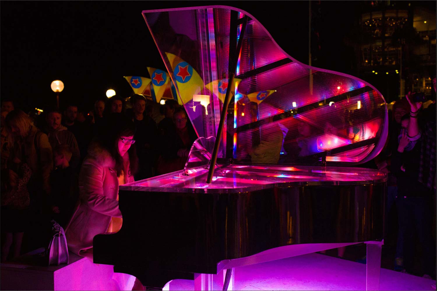
I took this at the Vivid Sydney festival. This piano lit up in different colors when different keys were played. Most of the people who played on it were seriously good, including this lady. I wanted to capture her poise and confidence, the purples and blues she was producing with her music, and the vividly lit sails of the Opera House in the background. Am I trying to do too much here? What do you think?”
Tom,
Given the circumstances, I think you did as good a job as possible to get your message across to the viewer. That’s a tough situation to be in since you have virtually no control and have to “go with the flow”. I don’t think you did too much. It’s a pretty straight forward photo that shows the environment (as best as you could given the exposure parameters), and the energy created by the light and colors.
If I had been there with you, I would have suggested that you wait (with your finger close to the shutter release) for her to express herself with more body language; perhaps some kind of gesture. I want to hear the music through her body language and even facial expression. It seems like she’s stopped or waiting for something. Maybe she leaned and looked to her left. Something other than the appearance of her holding still.
In my online class with the BPSOP, and in my “Stretching Your Frame of Mind” workshops I conduct around the planet, I often refer to my expression “In a perfect world what if”?
What I mean is that if you could go back and do anything you wanted, what would you do? In this case, I’d like to be able to move around her. One shot I would definitely take is from the end of the piano looking straight at her. I would be using the top of the piano to frame her with color, and use the piano strings (wire) to lead the viewer to her face. What else would you like to do?
It’s a good photo Tom, and thanks for sharing it.
Visit my website at: www.joebaraban.com, and follow me on Instagram: www.instagram.com/barabanjoe. Be sure to check out my workshop schedule at the top of this blog. Come shoot with me sometime.
JoeB