The “Springtime in Sicily” Workshop.

Photograph by Nick DePasquale

A location that had always been on my bucket list to conduct a workshop was held in Sicily. We based out of Palermo for three days, then Catania for another three days.

While shooting in Palermo, we took early morning and afternoon trips to Trapani, and Cefalu’. After a leisurely private motor coach ride to Catania, we spend the day relaxing and shooting around the city center. We also spent time shooting in Ortygia and Taormina.

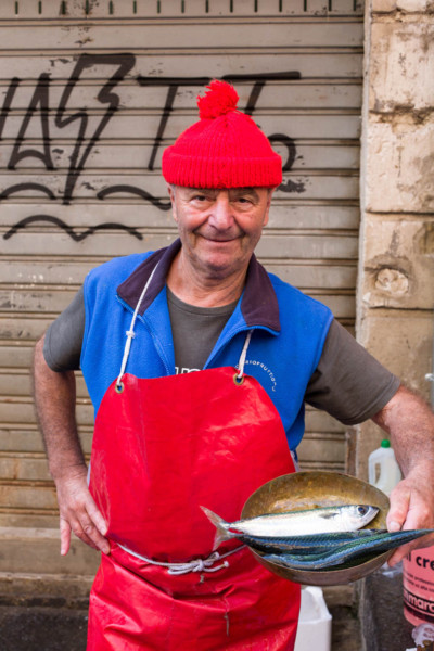
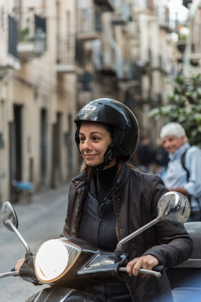
The workshop was once again full, many who have taken my online courses, and I can speak for everyone when I say that Sicily was everything we all expected. The food was always an interesting dining experience, the people were warm, friendly, and didn’t mind their picture being taken; right out of central casting. The villages we shot in were all by the sea, and as picturesque as one would imagine; just like the postcards.

As usual, I select hotels that are centrally located with photo opportunities virtually right outside the door. Many were no more than a twenty minute walk. The group always traveled to the other locations by a private bus, comfort being one of my main concerns.

Each day during the critiques, I was always looking forward to seeing how people were seeing things so differently when given the same subject matter. So many of the photographers have taken one to seven other workshops with me and as a result I love observing how their eye and their ability to see rather than look at things has improved so much. The group

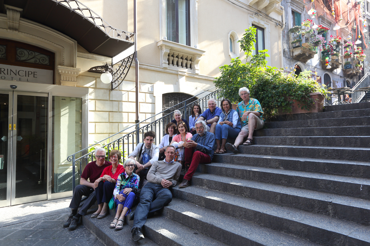
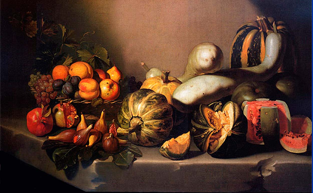
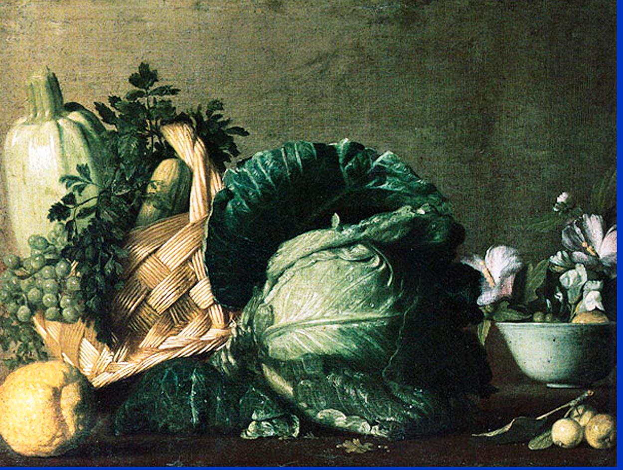
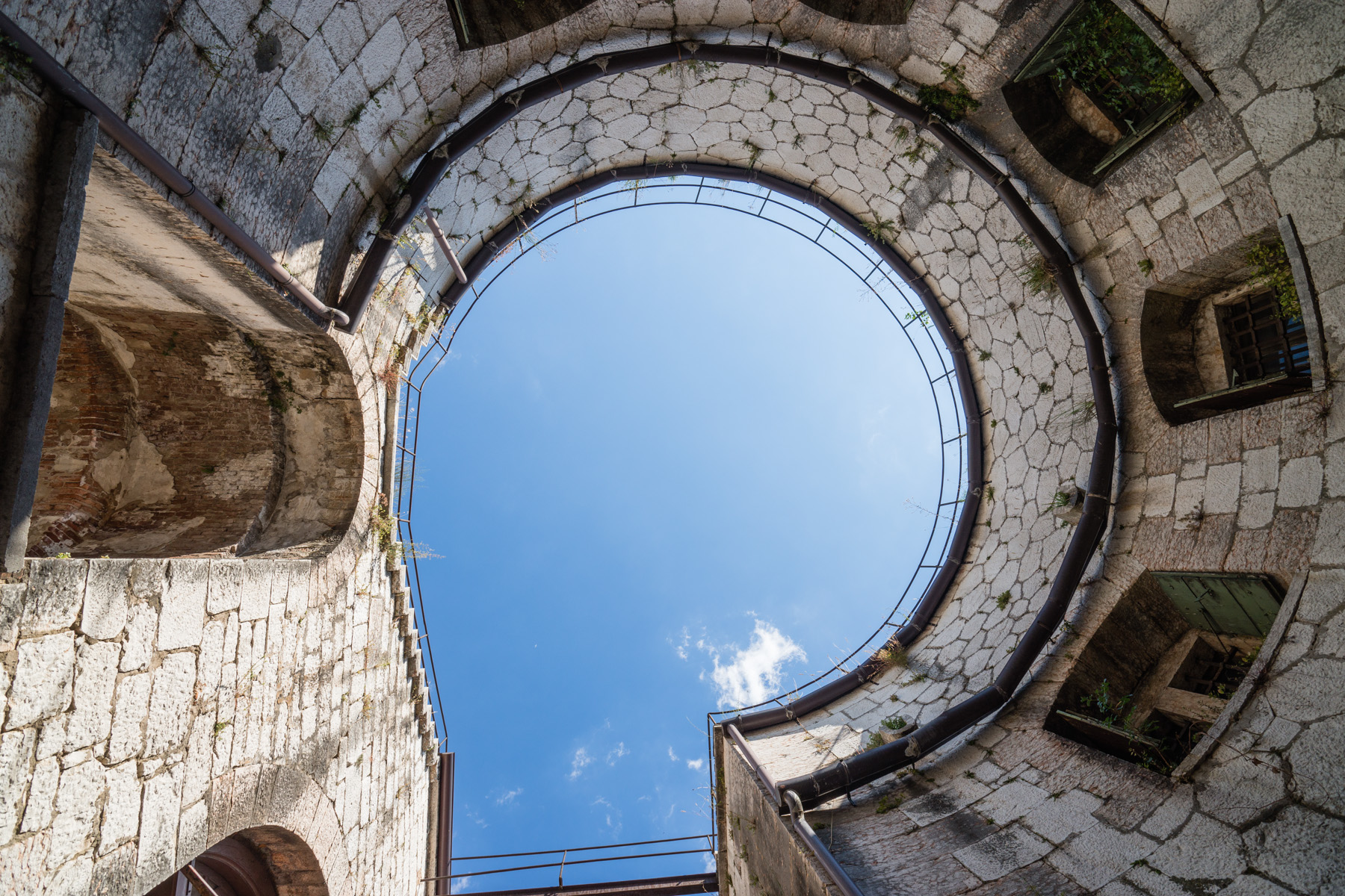
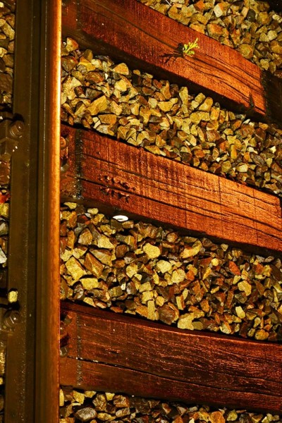
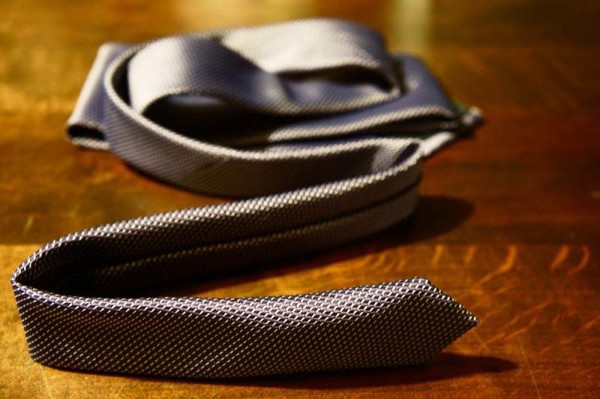
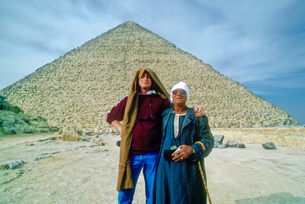
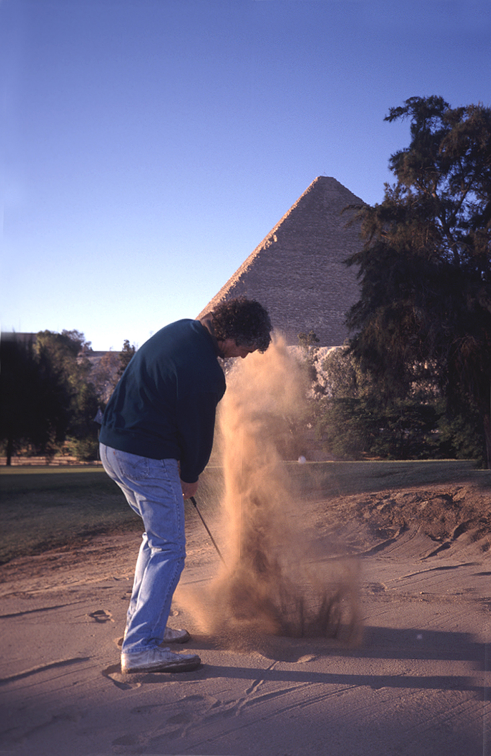
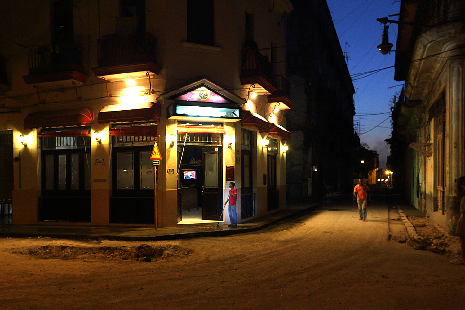
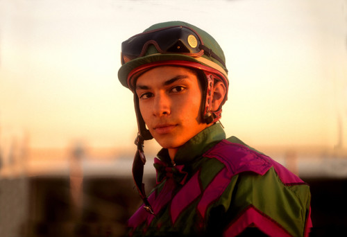
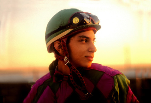
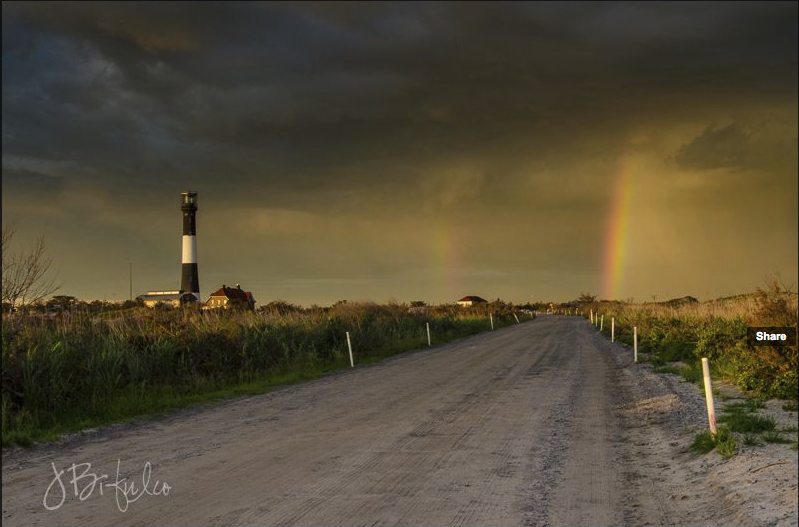
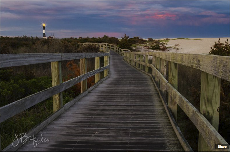
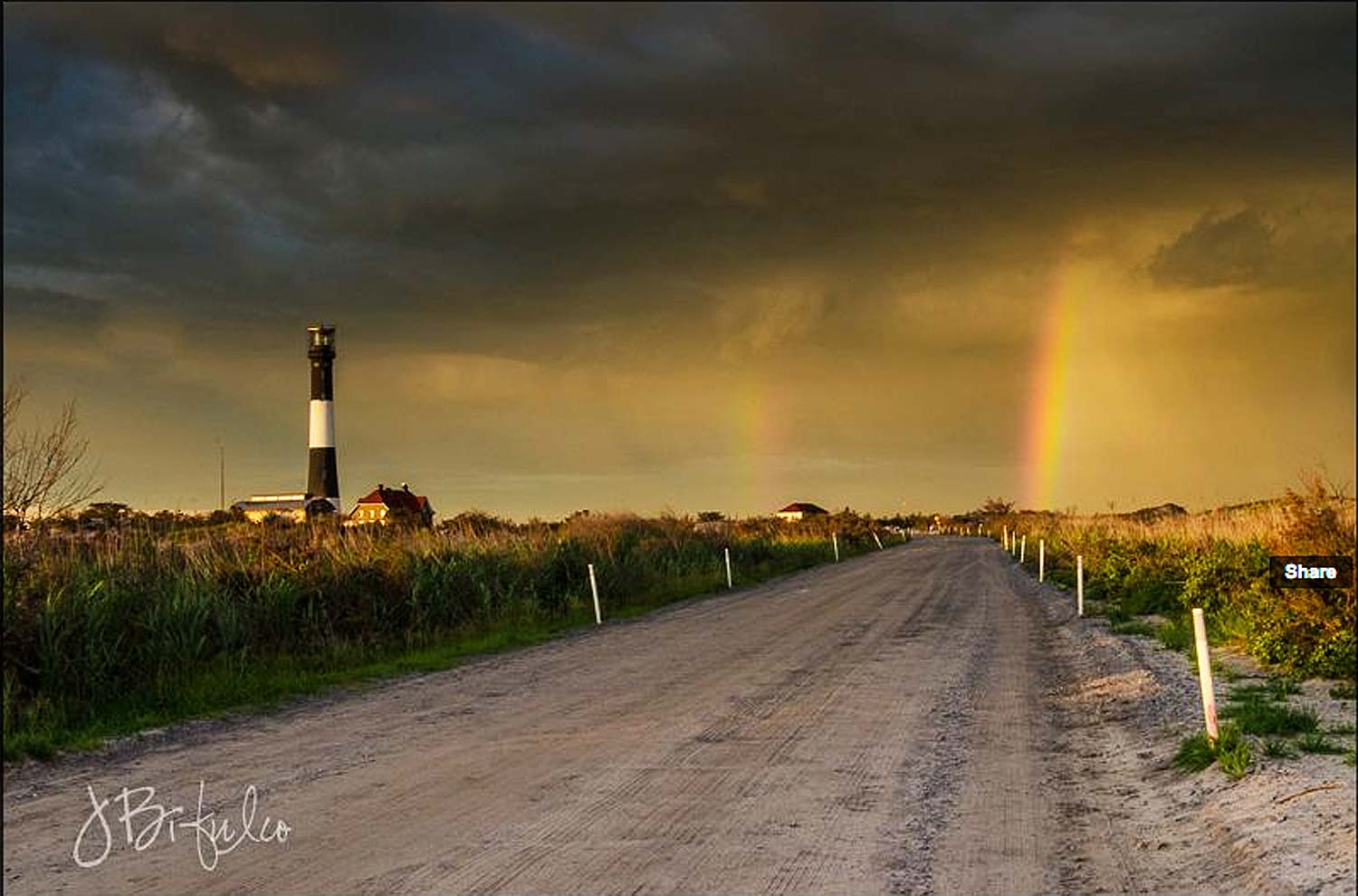
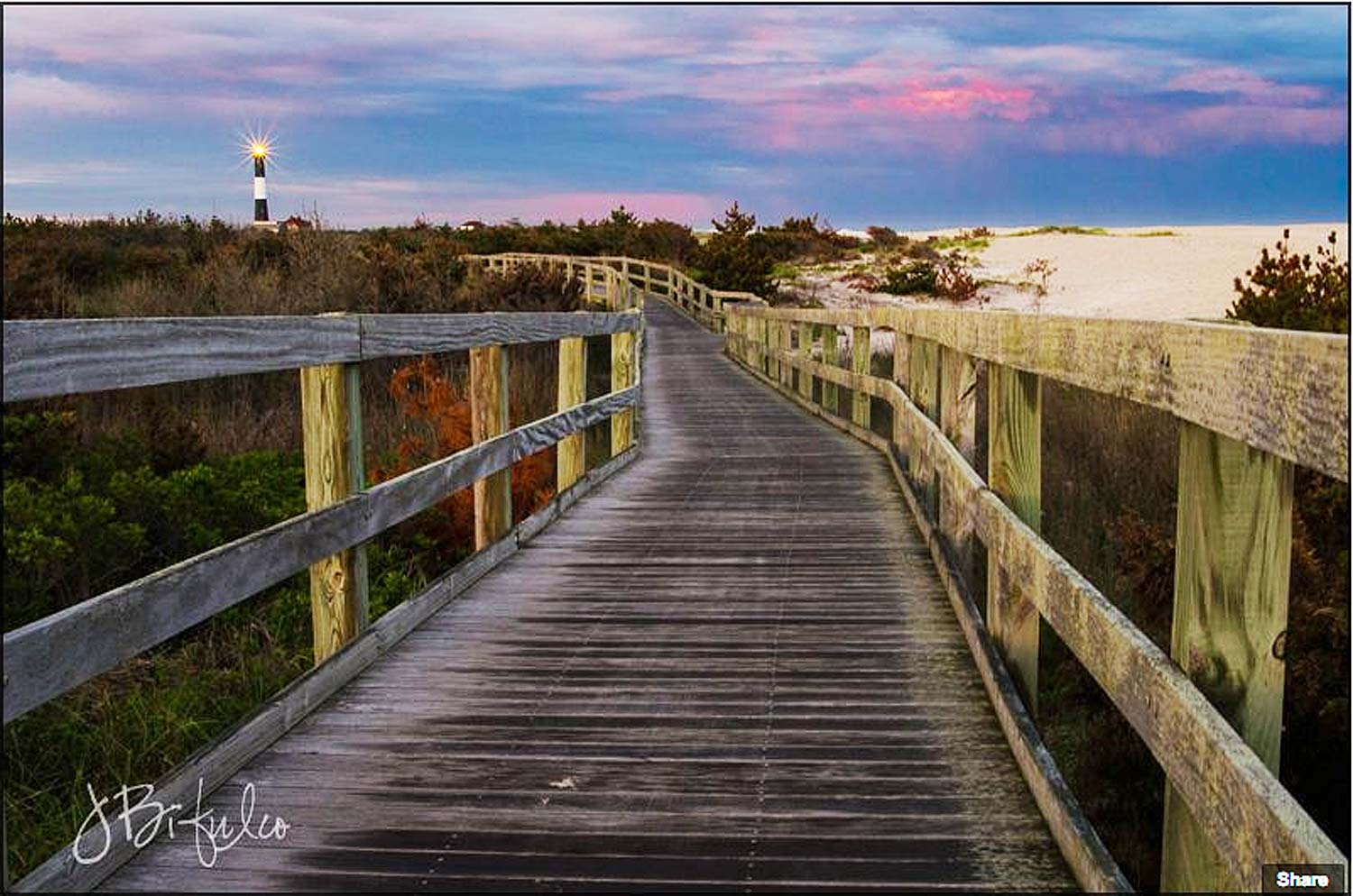
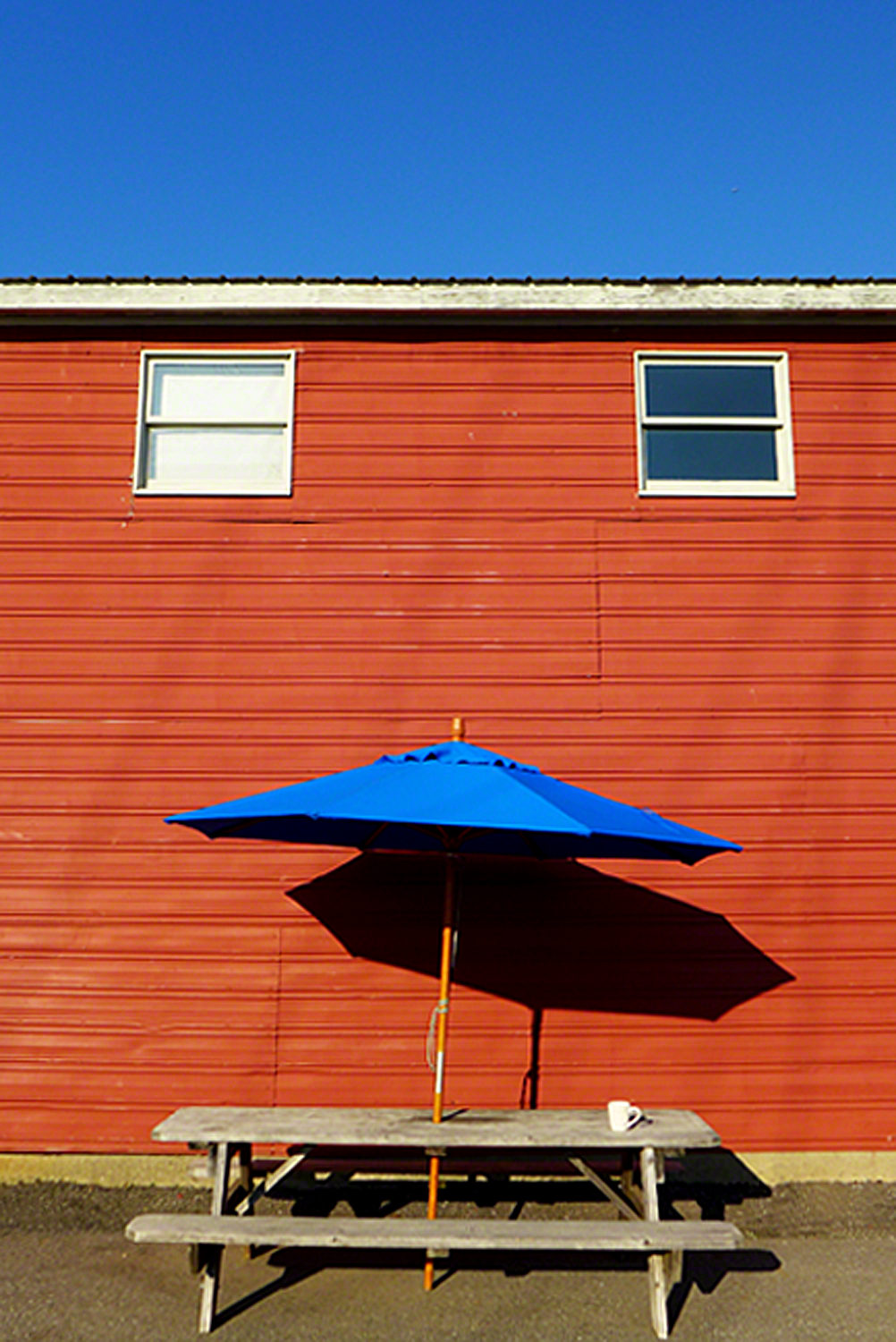
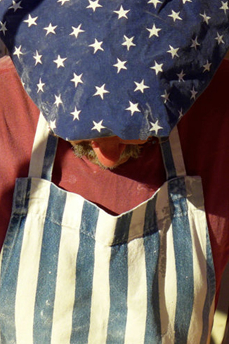
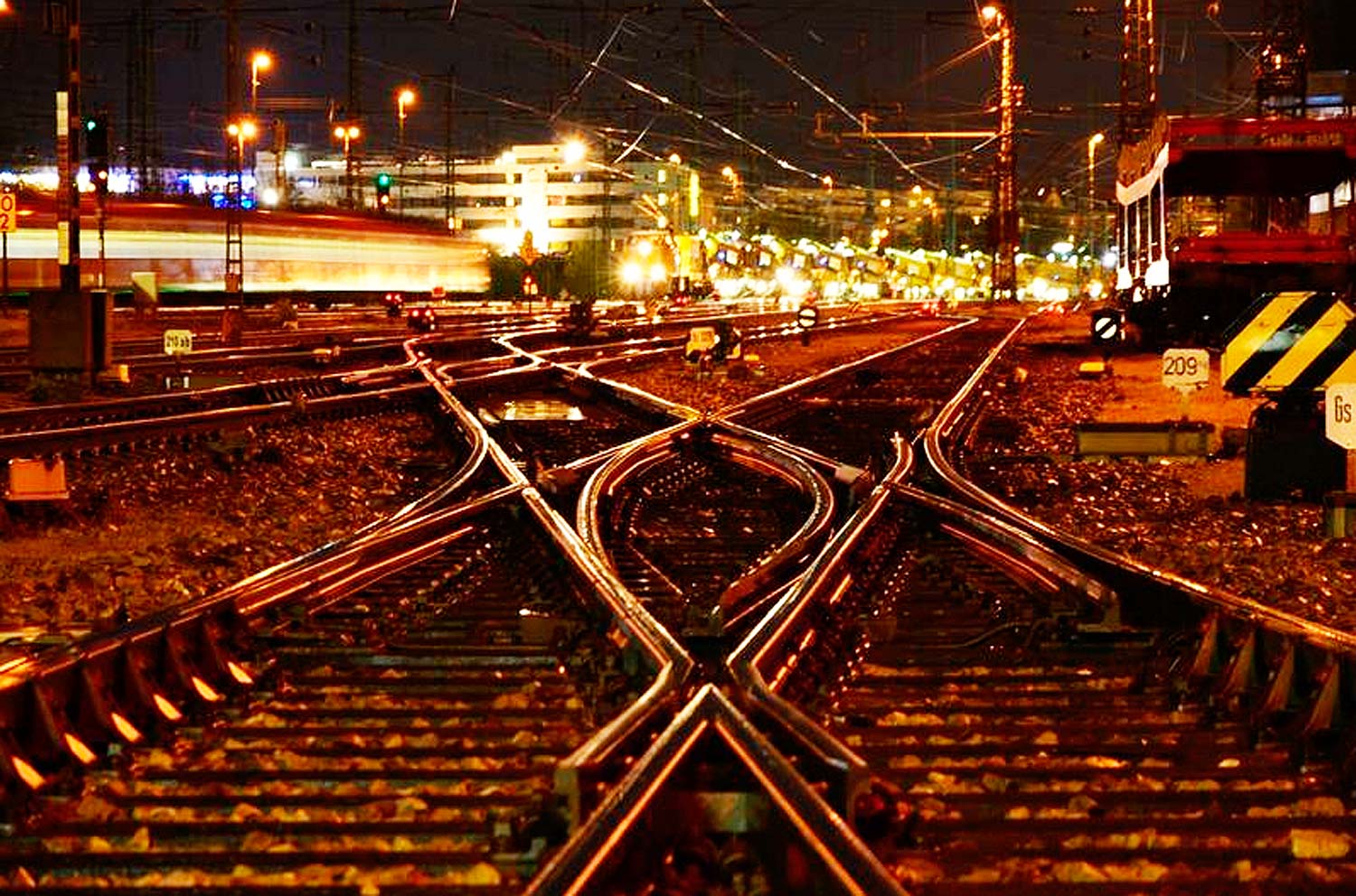
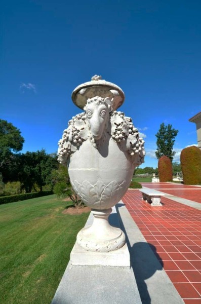
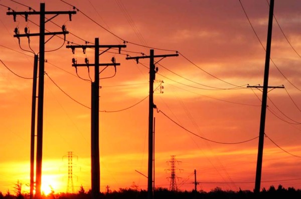
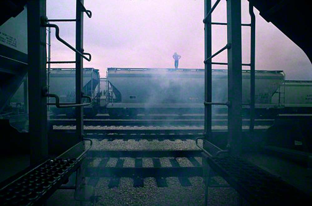
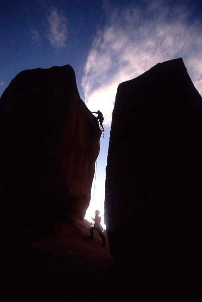
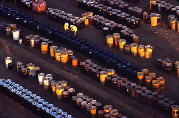
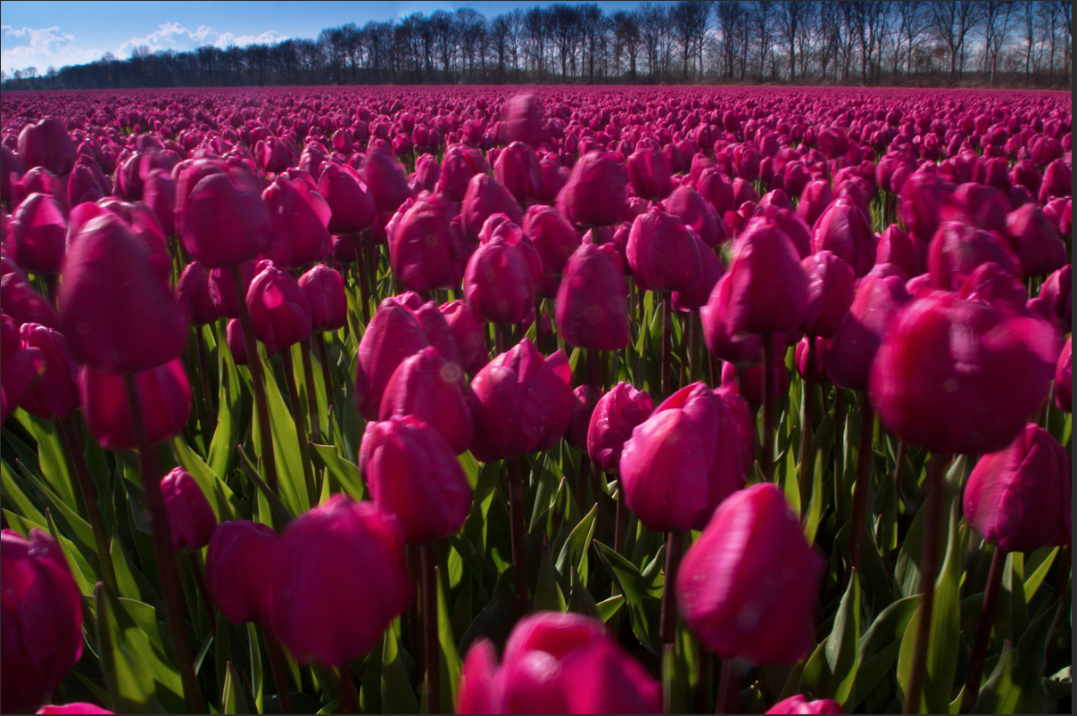
I have written several posts about my workshops, and I always like to show some of the images my fellow photographers were shooting. I realize that there are a lot of photos to look, but I’ve actually narrowed down the amount by half!!

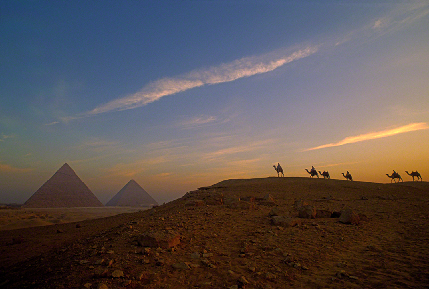
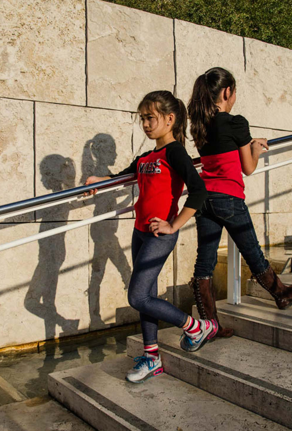
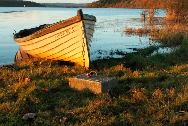
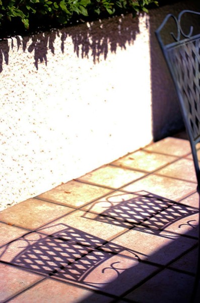
I wanted to give you a visual feeling for the country as well as showing you some of the remarkable images taken by my class.

I hope you’re as impressed as I am.

Enjoy the show.

Visit my website at www.joebaraban.com, and follow me on Instagram: www.instagram.com/barabanjoe. Be sure to watch for my upcoming workshop schedule at the top of this blog.

JoeB

Food For Digital Thought: The How and the Why

Explaining the How and the why.

Several of my students that take my  “Stretching Your Frame of Mind” workshops I conduct around our planet say to me that what they like most about my classes is not only do I show people how to make stronger photos, but why they are.

The how comes from teaching people how to incorporate the elements of visual design into their imagery: Line, Pattern, Form, Texture, Balance, Color, Light, and Shape are the elements that my students will eventually wind up putting on their new Artist Palette. With this palette (that also has shadows, silhouettes, and vanishing points on it) they can start using the right side of their brain (the creative side) instead of the left side (the analytical side).

For example, a photographer looking at a tree with the left side sees only a tree. That same photographer looking at the same tree with the right side sees patterns made by the bark, the texture of the bark, negative space separating and defining the leaves and branches, the lines that make up the trunk and branches, the way the light falls on the tree (side, back, or front lighting), and the color of the leaves.

The why is all about perception. The goal is to present your photo in such a way as to take control of how the viewer perceives and processes the information we lay out to him in the form of a photograph. If that same tree is presented in such a way as to keep the viewer around longer by looking at the warm late afternoon side light emphasizing the patterns and texture of the bark, then you’ve done your job.

If that same light is coming from behind the tree, it passes through the negative space that was created to define the leaves. It will turn the tree into a two-dimensional silhouette but because of those green, yellow, red, and orange leaves being translucent, they will glow; and don’t forget about that wonderful shadow (your best friend) that lies on the ground stretching out to the camera…again you’ve done your job, and a job well done.

In the photo above taken at LaDefense in Paris, with the left side of my brain I saw a man sitting on the steps. With the right side I saw Line, Pattern, Texture, Shape, and Figure-Ground…a dark subject against a lighter background.

The people that look at your images created by the right side of your brain will undoubtedly find more visual interest than those created with the left side…they just won’t necessarily know why…it will be our little secret!

🙂

Visit my website at: www.joebaraban.com, and follow me on Instagram: www.instagram.com/barabanjoe. Check out my workshop schedule at the top of this blog. Come shoot with me sometime.

JoeB

Student Work

Does this look like a pro's work?
Does this look like a pro’s work?

Stephen sent me this still life for a critique. As usual, I like to submit the actual question so that those that have similar questions, or are trying to accomplish similar ideas can read what he had to say:

“Hi Joe….I took this shot in my kitchen using daylight from my back door glass to illuminate the subject, and my idea was to make an image like pro shots I’d seen in books or magazines. The only manipulation with PS CS2 was maybe 10% contrast adjustment and some sharpening. My question to you is “do you think I achieved my goal of making a professional looking ( quality in tone and light) still life ?”

Thank you,
Stephen

Stephen, First of all, by definition, a professional is someone that gets paid for a service..that’s all it means!!!! Being a professional does not guarantee you professional work. I assure you that there are photographers out there that call themselves a pro and whose work occasionally appears in magazines, that you don’t want to be anything like.

Ok, let’s talk about your photo:

The first thing is the exposure. It’s so underexposed you’ve lost where half the fruit ends. That might be what you were after, but to me, I’d like to see a little separation from the onions in the back and right side to the background. You’ve lost the bowl the fruit is in as well, and the bowl is too important to not be able to see. You’ve also lost the fabric that the bowl is sitting on and I think it would add quite a bit to the overall feel.

Ok, how about the depth of field? Did you really want just the onions and garlic in the front to be sharp? If I were taking a photo of a bowl of fruit, I would want the viewer to enjoy the texture of each of the elements. I think it would be important here for it to be sharp from front to back.

I like my still life’s to have an environment, not a black background. I wrote a post called “The whole enchilada”. In it I talk about not just concentrating on the main center of interest or subject, but the background, the foreground, or either side, or anything that helps make the photo stronger.

In my “Stretching Your Frame of Mind” workshop I always tell my fellow photographers to study art, and light…Renaissance Lighting would be a great start.

 If you want your still life to look like still life’s of fruit painted in the Renaissance, then I suggest you study those painters and not look at photos in a magazine. You’ll  get a lot more from them, and at the same time develop your own style.

Take a look at what I mean in these two still life’s painted by a Renaissance painter named Caravaggio. When you’re still life photos look closer to these, you won’t ever have to worry whether your work looks like a pro.

Thanks for the submission Stephen.

Visit my website at: www.joebaraban.com and follow me on Instagram: www.instagram.com/barabanjoe. Check out my  workshop schedule at the top of this blog. Come shoot with me sometime.

JoeB

Anecdotes: Seton Hospital

Hello to all new to my blog. My name for those that don’t know it is Joe Baraban, and I shot advertising, corporate, and editorial photography for forty-eight years. I know teach my “Stretching Your Frame of Mind” workshops all over our planet, and I also taught online with the BPSOP. Sadly, the founder Bryan Peterson passes away not too long ago and the school closed.

Over these past fifty-three years there’s been funny incidents that have happened along the way, and I find myself reminiscing when it comes to some of these stories. Some were funny then and still funny and some were amusing at best but now seem funny…due mostly to time and my age!

I was shooting a brochure for Seton Hospital in Austin, Texas and on the shot list was their emergency room facilities; which they were both proud of and well known for.

My idea was to create something that was common among emergency rooms and make it look as though it was happening in real time. I also wanted some action to make it even more believable. Easier said than done as I would soon find out. You have to remember that there was no Photoshop to help me back then!!!

The answer came to me as I was standing in the hallway next to the emergency room doors to the outside. An ambulance pulled up to deliver a patient that wasn’t really sick. She had just been transferred from one hospital to Seton. Still, it gave me the idea that wound up working out pretty good.

In the above photo, I was on a gurney next to the one you see, and moving down the corridor at the same rate of speed. I used a sync delay that fired the strobe right before the shutter closed instead of the strobe going off right after the shutter opened. This is what gives it that blurred but sharp look. To re-create a real situation, I had some of the hospital staff playing the role of the actual emergency team.

The woman laying on the gurney and in obvious distress was a volunteer, and the only one around that was available. We did several rehearsals, and each time the woman started laughing. For some reason she thought it was the funniest thing she has ever taken part in, and couldn’t stop. Had there been anyone else around I would have replaced her because she thought it was a lot funnier than I did!!

So one of the male ambulance drivers pulled me over to the side and made a suggestion….a really good one. The portable oxygen mask was brought out and placed over her face to hide her laughter. It worked like a charm. Sometimes you gotta do what you gotta do, and the show must go on.

Visit my website at: www.joebaraban.com and follow me on Instagram: www.instagram.com/barabanjoe. Watch for my workshop schedule at the top of this blog. Come shoot with me sometime.

JoeB

Student Work: Colors and Letters

A blue 'P'.
A blue ‘P’.

Until the passing of the founder ?Bryan Peterson, I taught a four week online course with the BPSOP, and I also conduct my “Stretching Your Frame of Mind” workshops around the planet. I teach people how to incorporate the elements of Visual Design into their imagery.

I will often my fellow photographers an assignments to work on for a number of reasons. One of the areas we cover is to “see past first impressions”. To see more than meets their eye, and to focus their attention on finding certain elements that are readily available and all around them. This exercise will help them down the road to either see things occurring naturally in nature, or to use their imagination in creating photos that  represent ideas.

What I assign to each of my students is a color and letter to either find or to create. The color and letter should be one in the same, and should be what I always refer to as “A quick read”. In other words, they won’t be around to explain what their color and letter were so the viewer needs to pick up on it right away. They could either find it happening in nature, or create it using their imagination to “Stretch Your Frame of Mind”.

I want my students to realize that there’s two ways to look at everything. The left brain sees things as they are. A tree is just a tree, a bridge is just a bridge. In the above photo, the photographer’s left brain ( the analytical side) saw it as an opening to the sky in the middle of an old building in Europe. She was able to click off the left side and click on the right side of her brain…the creative side. Then, she was able to see her color and letter…a blue ‘P’.

Pretty impressive!!!

Here’s some of the ones that made it to my “Hall of Fame”.

Enjoy the show:

Visit my website at: www.joebaraban.com and follow me on Instagram: www.instagram.com/barabanjoe. Check out my workshop schedule at the top of this blog. Don’t forget to send me a photo and question to: AskJoeB@gmail.com for a video critique.

JoeB

Anecdotes: My New Best Friend

My new best friend.
My new best friend.

I was shooting the Annual Report for Apache Oil and Gas. They were about to start drilling in Egypt so they sent me there to basically shoot what ever I wanted that would capture the flavor of the country.

I was more than a little surprised when I found out that the hotel I was staying in was right across the road from the famous Pyramids of Giza. Not only did my room look out to the pyramids, but there was a casino in the hotel.

The biggest sand trap I had ever seen.

For some reason most people think more on the romantic side about the pyramids, and a lot of that is owed to Cecil B DeMille for his portrayal in his iconic movies. In actuality, the pyramids are not even outside of Cairo and besides the hotel, there’s a shopping center where tourists can buy everything imaginable that has to do with the pyramids or the Sphinx. Oh, did I forget to mention the eighteen hole golf course next to them????

Upon arriving at the pyramids, you’re swarmed/accosted  by guides that promise you secret ways to enter the pyramids, and know one else knows these passages. One such man would not leave us alone, and kept showing us all his badges he had concealed under his coat. He said that he had all the necessary permits to allow us to take photographs, and was not to be denied…I liked him right away!

As it turned out several more of these guides kept bothering us about our cameras, but Mohammad was always right there to protect and defend.

One of the photos I took at the pyramids.


Check out my website at: www.joebaraban.com, and my “Stretching Your Frame of Mind” workshops I conduct around our planet. Follow me on Instagram: www.instagram.com/barabanjoe. Come shoot with me sometime. I will occasionally put up and coming workshops at the top of this blog, so look out for them. They fill rather quick and then I take them off.


JoeB


Workshop Stuff:

In my “Stretching Your Frame of Mind” workshops I conduct around the planet, I teach fellow photographers how to incorporate the elements of Visual Design and composition into their imagery. Negative Space, Vanishing Point, Perspective, Tension, form, Shape, Pattern, Texture, Light, and Color are all permanently affixed to their new ‘Artist Palette’ I use to teach in my online classes. Unfortunately, the founder passe away and the school closed.

The color red, the word "indifference, and the use of shadows.
The color red, the word “indifference, and the use of shadows.

I spend extra time on LINE, since it’s the most important of all the basic elements of Visual Design. You see, nothing would exist without Line, planes, trains, automobiles and even people all have an “outLine”.

In my workshops. we also spend time on Silhouettes, and Shadows (Shadows are your best friend). In the photo of the two young girls, Stephanie was given the color red and the word “indifference” to use in a single photo. It’s a wonderful example of what the title is all about.  Not only does this photo contain several elements from her ‘Artist Palette’, it’s also a perfect example of how shadows can make a huge difference in our photography. it’s certainly a benchmark for workshops to come!!!

The following is a slideshow from one of my workshops. A first class collection of Lines, Silhouettes, Shadows, and all the elements tof visual Design they all brought with them.

Enjoy!!!

Visit my workshop at: www.joebaraban.com and follow me on Instagram: www.instagram.com/barabanjoe. Check out any up and coming workshops. Come shoot with me sometime.

JoeB

Quick Photo Tip: Don’t Underexpose to be Moody

pearl of wisdom

I have found that in my past online classes and also in my “Stretching Your Frame of Mind” workshops I conduct around our planet, so many people think that to create a mood, especially one that pulls at the proverbial “heart strings”, while drawing out an emotional response, you have to underexpose your photos. I mean underexpose to the extent that the viewer has no idea what he’s looking at. My fellow photographers also will try to underexpose a scene that was taken at a time of day where there is no possibility of created the kind of mood they want…as in high noon!!!!!

My answer is always the same, and fairly simple. If you’re trying to take a picture and your message to the viewer is dark and moody, then start out with something that’s already dark and moody and occurring naturally in nature. Or, at least a good start and adding ancillary lighting to finish the job.

OK, you can’t expect to find this happening outdoors naturally if you go out after breakfast…say mid-morning. You also can’t expect to see this if you go out after an afternoon nap and before dinner. If those are the only times you can shoot, for one reason or another, then go indoors where it will be easier to create a mood. This is also a good idea if it’s overcast outdoors…I don’t mean stormy, stormy is good. I mean a midday gray overcast sky.

If you can go out early or late, then it’s going to be a lot easier to pull on those heartstrings and create a photo that’s moody. Look for areas in shadow with little or no ambient light coming in. Or better yet, look for those dark areas that has a little natural light coming in from somewhere out of the frame and hitting your subject.

If you expose for the brightest part of the composition, as in the light falling on your subject, then everything else will be darker and the mood will be forthcoming.

Having said this, if you want a piece of advice don’t rely on the meter in your camera to help; because it won’t. Shoot on manual because the meter doesn’t know that you’re going for a mood. It will read the area in shadow and try to give you some detail in said shadows. If and when that happens, you can kiss the mood goodbye.

Shoot on manual (which is what I’m always preaching to the choir), take control and put your camera on spot metering, and expose for just the highlights. Do that, and you’ll achieve the mood you were after.

Visit my website at: www.joebaraban.com and follow me on Instagram: www.instagram.com/barabanjoe. Watch for my workshop schedule at the top of this blog. Come shoot with me sometime, and we’ll be moody together.

JoeB

Personal Pearls of Wisdom: But wait there’s more, it’s a two-fer

With hover (just move the mouse)
The left-hand jockey
The right-hand jockey

In sales jargon we’re use to hearing, the expression two-fer means “an item or offer that comprises two items but is sold for the price of one.” So what in the world does that mean to photography and to all my fellow photographers that love to make photos as I have which is closing in on fifty years.

It means (to the photographers that have heard me talking about it in my  “Stretching Your Frame of Mind” workshops) don’t just settle for one variation of a final composition when you can easily walk away with a two-fer and not spend that much more time doing it.

When I’m out shooting, and when I’m composing, I’m already thinking about the second variation, and a lot of the time the third. In doing that, it gives me a much better chance to come home with a Keeper. It might be something as simple as shooting both horizontally and vertically. I will often change my POV from eye level to climbing up on a ladder to look down on the subject. I can tell you one thing I always do and that is to change the direction of the light. I’ll move around or have the subject move around so they are both side and back lit.

I’ll usually go out with just one or two lens that will cover anything I want from 17 to 70mm. I don’t mean just standing there and zooming in and out. I mean having the ability in shooting with a wide angle lens, a fairly normal focal length, and a medium telephoto.

Light is so fleeting that I seldom have time to try different filtration such as a ND or a polarizing filter, but if the timing is right they can offer me other different looks. The Polarizing filter can get rid of unwanted reflections (although I love reflections since they can add visual interest and tension). It can also darken the sky and make clouds stand out.

You have to remember that this will only work if the sun is at  ninety degrees to where your lens is pointing to. You’ll also have problems trying to use a wide angle lens with it. A Neutral Density filter, especially one that’s at least two stops can make running water look smooth and also make the clouds appear to be moving.

In the above portrait, having the jockey looking into the lens gives off a completely different feeling as when he’s looking out of the frame. It took several seconds and a slight shift of my POV since the horse was moving around to leave with two versions of an environmental portrait. Of course shooting at sunrise didn’t hurt as far as the quality of the light is concerned.

So there’s many ways to make your image look different and it can be done in less than a minute; as long as you’re thinking about it in the first place. Next time you go out think about that two-fer…two keepers for the price of one!!

Visit my website at: www.joebaraban.com, and follow me on Instagram: www.instagram.com/barabanjoe. Check out my workshop schedule at the top of this blog. Come shoot with me sometime.FYI, my workshops fill in a few days, and when they do I take it off.

JoeB

Student work: What Do You Think?


Underexposed?
Underexposed?
Underexposed?
Underexposed?

Jean was one of my students that had taken my online class with the BPSOP before it shut own due to the passing of the founder Bryan Peterson.

She sent me this photo to talk about. As usual, i like to copy what every photographer had to say since so many have experienced the same situation or problem at one time or another. Here’s what Jean had to say:

Hi Joe!

I don’t think I will ever take a serious image again without hearing your words in my head about vanishing points, line, color, tension, etc.

I took a ride out to Robert Moses Park and Lighthouse in between rainstorms and had the good fortune to be there as a vivid rainbow appeared as the sun was beginning to set.  I am pretty happy with these two photos, but I really want to know what YOU think.

Thanks, Joe!”

Sincerely,

Jeanne

Hello Jeanne, ok, let’s talk about them:

First let’s talk about exposure and how important it is to bracket. In my “Stretching Your Frame of Mind” workshop I conduct around the planet, I’m always talking about how important it is to bracket, and bracket manually; in the camera…Why is it important when you can lighten or darken things later in front of a computer?

Because it will make you a more rounded and stronger photographer, not a better computer artist. By bracketing yourself, you’ll gain knowledge in shutter speed/aperture relationships and learn to see, sense, and feel the light around you…especially when it changes. One day you’ll be able to stand there and know by instinct what exposure is going to be the best, whether it be under or over exposing what the camera has told you what was the on reading. To me, being in control and doing things myself is a lot more gratifying than having some software do it for me.

I say all this because both of your photos are underexposed and to me hides how well done they are.

Take a look at them now:

Better exposure?
Better exposure?
Better to see the Vanishing Point?

The photo with the rainbow is one of those times that doesn’t come very often, so when it does, be ready to act fast. As Eddie Adams said, “When you get lucky, be ready”.

It’s a great photo, but to me there is too much road and not enough of that tension filled wonderful ominous sky. The road is just a road, with little redeeming qualities about it except of course the obvious one…it creates a Vanishing Point that leads the viewer to the point on the horizon and the remarkable payoff.

Having said that, you would still have the Vanishing Point if you raised your camera up to get more sky and less of the road.

In the second photo, you have also created a Vanishing Point that takes the viewer on a ride to the horizon and lighthouse. As you remember in my classes, the more ways we can lead the viewer around our frame the better. By doing this we make him an active participant and make him work a little…exactly what we want him to do.

You have also designed the composition as to include a couple more elements from your ‘Artist Palette’: The use of Negative space to define the railing and all the rectangular shapes created when the Negative Space defines the different parts.

Nice photos Jean and thanks for sharing them.

Visit my website at: www.JoeBaraban.com and follow me on Instagram: www.instagram.com/barabanjoe. Check out my workshop schedule at the top of this blog. Come shoot with me sometime

JoeB

My Favorite Quotes: The Temptations

It was a smiley face winking at me.

I usually read or hear something first that get my attention and gives me some of my ideas, then I apply it to conversations I have with my  fellow photographers that sign up for my “Stretching Your Frame of Mind” workshops I conduct around the planet. In this case I had the idea/feeling before hearing or reading it somewhere, and followed it up by searching the web to see if others experienced similar ideas or feelings.

The feeling I had was when I remembered my mother always telling me that I had a huge imagination and it was always running away with me.

im·ag·i·na·tion

iˌmajəˈnāSH(ə)n/
noun
noun: imagination; plural noun: imaginations

“The faculty or action of forming new ideas, or images or concepts of external objects not present to the senses. The ability of the mind to be creative or resourceful”.

Here’s what made me remember that:

I was in Rockport, Maine conducting a workshop and while shooting down the road in Camden, I saw a table with an umbrella and a coffee cup against a wall. I moved the table over to the right to avoid a broken window to keep it clean and to have balance and negative space surrounding  and defining it.

When I stepped back to take the photo, I didn’t see what I thought I was going to see, instead I saw a smiley face winking at me!!

The next day I took my class to the Lobster Festival down the road in Rockland (which is the reason I have picked this same week to teach there for thirty-six years) and while walking around I stopped suddenly to take a photo of a man putting batter on fish. All of a sudden I was no longer looking at a man, but instead a living American flag…Old Glory. It was my imagination running away with me once again.

So my fellow photographers, the next time you go out shooting open up your mind and let it wander around. Give it a try, follow it because it just might lead you to a place you’ve never been before.

Use that imagination of yours and you’ll see that it’s a very powerful tool.

Henry David Thoreau once said, “It’s not what you look at, it’s what you see”.

Btw, one of the first things that popped up while searching the web (and what this post is named after and for) was this song, and one of my favorites by the Temptations…how serendipitous was that????????????

Just my imagination running away with me

Visit my website at: www.joebaraban.com, and follow me on Instagram: www.instagram.com/barabanjoe. Check out my workshop schedule at the top of this blog.

JoeB

Student Work: April PPSOP Class.

Peter shot this all in the camera on a rainy night.

I’m especially proud and impressed by the number of really good photos from this class. It was a great four weeks, and every day I saw in all my fellow photographer’s work how much their thought process, their approach to “making not taking pictures”, and how their eye was progressing.

Before Byron Peterson, the founder of the school…the BPSOP passed away this last year and still in my  “Stretching Your Frame of Mind” workshops I conduct around the planet, I taught and still teach people how to incorporate the Elements of Visual Design into their photography. I also show them how to use other important elements such as the silhouette and shadows as two examples. Each week I give out a lesson with two of the elements as their assignment, and I give out a video critique for each one photo submitted to me.

I call it my Artist Palette, and after the end of both my part I and part II, their Artist Palette is filled with: Line, Texture, Pattern, Form, Shape, Negative Space, Perspective, Visual Tension, the silhouette, and  your best friend the shadow.

When you look at the April slideshow, keep in mind that my class is not allowed to use any post processing during the four weeks, so what you see is straight out of the camera.

Impressed? I am!!!

Visit my website at: www.joebaraban.com, and follow me on Instagram: www.instagram.com/barabanjoe. Watch for my workshop schedule at the top of this blog. Come shoot with me. I

JoeB

Food For Digital Thought: Showing Scale Part II

man-on-the-train-car-in-the-fog_DM

This is a continuation of a previous post when I talked about showing scale in a landscape photograph. Since I’m not a Purist when it comes to taking landscape photos, I like to give the viewer a sense of how vast an area is when I look through the viewfinder. For me, it puts things into perspective. It also gives the viewer a chance to discover new elements in my images. For example, a person or object somewhere in the frame that’s not immediately seen. Since I’m a follower of the psychology of Gestalt, I want the viewer to become an active participant in my thought process, and by having him discover new things when looking at my work, he’ll do just that.

There is another way that I like to show scale in my photos, and that is to show a person or object in relation to something much larger and man made. There’s a dichotomy created when I put a person in opposition to something that’s larger and/or more powerful. Animate verses inanimate. One of the ways to create Visual Tension is to have opposites sharing the same composition, thus competing with one another. The contrast creates energy, and the formula I’ve always given both in my online classes and in the “Stretching Your Frame of Mind” workshop I conduct around the planet is: Tension=Energy.

Besides the visual tension that’s created, the photo takes on an editorial feel by communicating some sort of story. Why is that person doing whatever it is that he’s doing. Why are they there? Where is he exactly, etc.

Here are a few examples of showing scale in a non-landscape environment.

Visit my website at: www.joebaraban.com, and follow me on Instagram: www.instagram.com/barabanjoe. Check out my workshop schedule at the top of this blog. Although I put them up, they fill rather quickly and then I take them down.Come shoot with me sometime.

JoeB

AskJoeB: What’s My Take On These Tulips?

Elements at work here from his Artist Palette

A fellow photographer and student sent this photo of a field of Tulips for discussion. Here’s what he had to say:

“Joe, here is a photo I’ve taken recently. My question to you is simple: How do you “read” it? (On purpose, I am not saying anything by words; I’d like to let the photo speak to you…)

Ok, let’s talk about your tulip photo. You asked how your picture of these tulips spoke to me, and how I read it.

First of all, it probably speaks to me differently than anyone else you might ask for the simple reason that I love tulips. I plant them every year, and when I buy cut flowers, which I usually do, I’ll buy tulips and when I can, I’ll buy French Tulips. So, you already have a score of ten. Now, lets see if you can keep it!!!

As you’ll notice, I lightened it a couple of stops so it’s a lot brighter, and now the color isn’t quite so heavy…which by the way is not the same as if it were over saturated. The main reason why the tulips appear dark and the sky looks ok, is that if you were to take a reflected reading just of the sky and then the tulips, you would find a big difference in the exposure. You wouldn’t be able to get both the flowers and the sky exposed properly without the help of post processing. It’s all about Dynamic Range, and if you click on this link, I can go into more detail.

Not that it’s a bad idea, but I like creating my pictures in the camera first without any help. I’ll resort to any post work when I absolutely have to. For me, I like creating my images before I click the shutter simply for the challenge…plus it has made me a better shooter in the process.

But I digress!

Ok, lets talk about how you used the elements of visual design you learned from taking my online classes and that you have on your Artist Palette.  These are shown in bold:

First of all, I like the contrast between the Texture of the trees in the background and the tulips. As you know, contrast is one of the ways to create visual tension. The tension that occurs when forces as in the trees and the tulips act in opposition to one another. Very different from the Tension that comes with emotional or mental strain.

I like the blue triangle you created in the top left corner. Since Shape is an element of visual design, I’m always looking to include one of the four basic shapes,  that being a square, circle, rectangle or a triangle.

As I’ve said a million times, Light is everything. Wherever I am , the first thing I do, before I raise the viewfinder to my eye is to determine the direction of the light. I’m always looking to back or sidelight anything that’s translucent,  like the stems and leaves in your photo. I love the way they glow!

I might have come around more to the right to get the tulips more backlit so they would glow as well. Right now, the shadows on the tulips take up most of the surface area…that’s not necessarily bad, as I like to side light as well.

The last thing I want to mention is to always be sure what’s going to be in focus, from the front to the back. In my opinion, the tulips in the foreground are large and out of focus which is somewhat distracting.

I’m going to assume that you were hand holding your camera so you might not have been able to stop all the way down without adjusting your ISO; in which case you weren’t in control…that’s why I use a tripod.

By the way, since Color is a great communicator of ideas, the field of red makes up a Pattern ( another element of visual design) that tells the viewer that the bulbs you buy here will all be the same color…red. Pattern is a good thing to include in our imagery, and breaking the rhythm of patterns is even better.

Overall, I would say that it’s a good shot, nicely composed and lit…but then I love tulips!!!

Thanks again for your submission.

Visit my website at: www.joebaraban.com, and follow me on Instagram: www.instagram.com/barabanjoe. Check out my workshop schedule at the top of this page. They don’t stay up very long. so you have to catch them at the right time. Come shoot with me sometime.

JoeB