Quick Photo Tip: Using People to Show Scale
Besides the fact that people like to see people in photos, I like to have people in my shots to bring a sense of scale to them; not all the time, just some of the time.
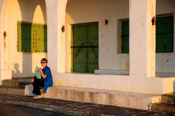
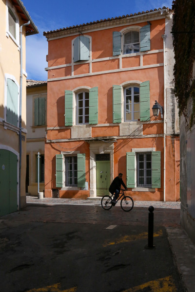
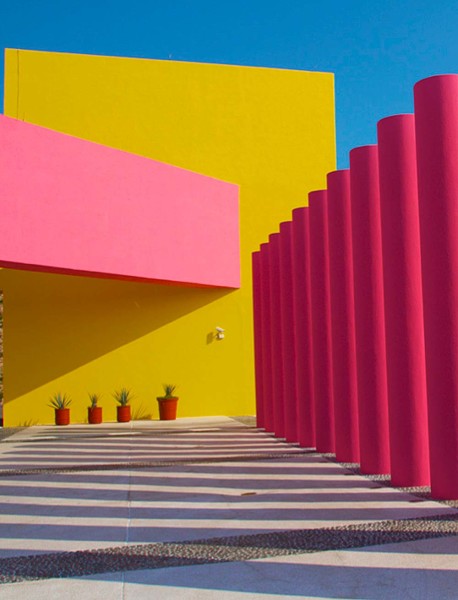
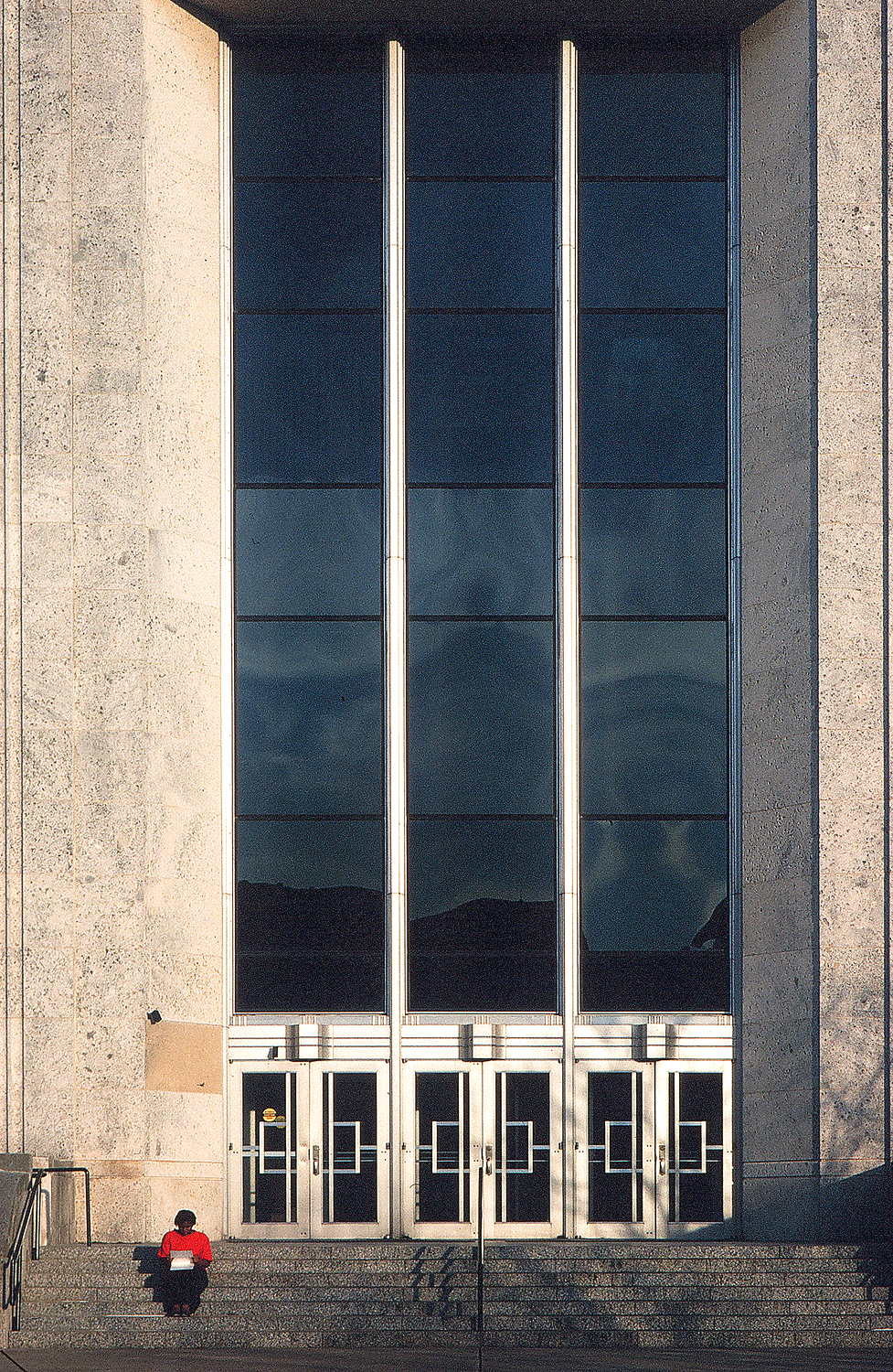
Not only will adding a person show scale, but it will also change the genre of the photograph. In other words, adding people will editorialize the original idea. for example, taking a picture of a building with no people in it makes it lean towards the architectural side of photography. 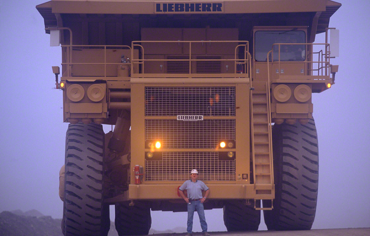
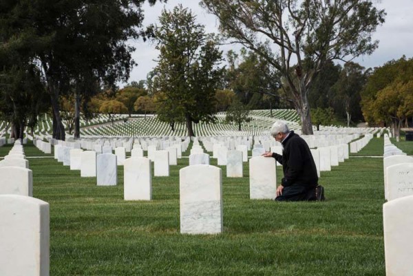
When you add a person, not only will it reveal the actual size of the building, but it will ask the viewer why the person is there. When you do that it you’re creating a story for the viewer to read visually; it asks the viewer to express an opinion making it editorial instead of architectural.
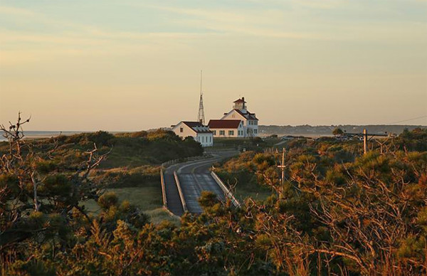
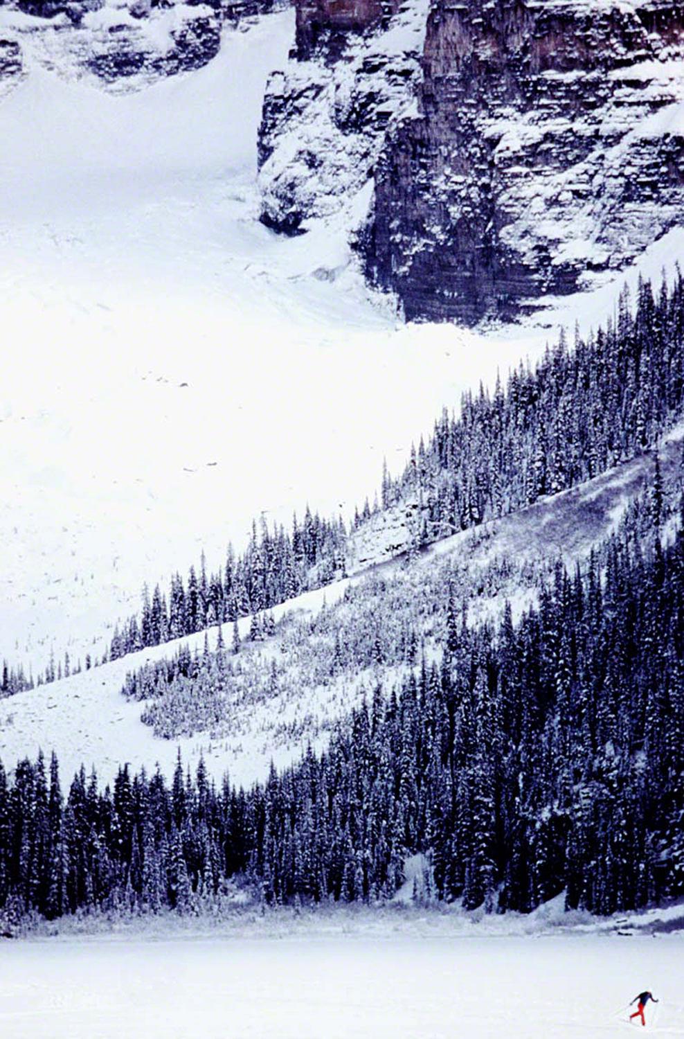 The same thing happens with a landscape. Simply stated, a landscape represents all the visible features of a countryside that the viewer can see all at one time from a single viewpoint.
Before the passing of the school’s founder Bryan Peterson, I’ve had ‘landscape photographers’ take my online class with the BPSOP and I’ve also had them sign up for my “Stretching Your Frame of Mind” workshops I conduct around our planet, and I can tell you that they can be a stubborn lot; not all of them but a lot. What I’m getting at is that they can be adamant that a landscape cannot be a landscape if there buildings in the composition, and certainly not a person. 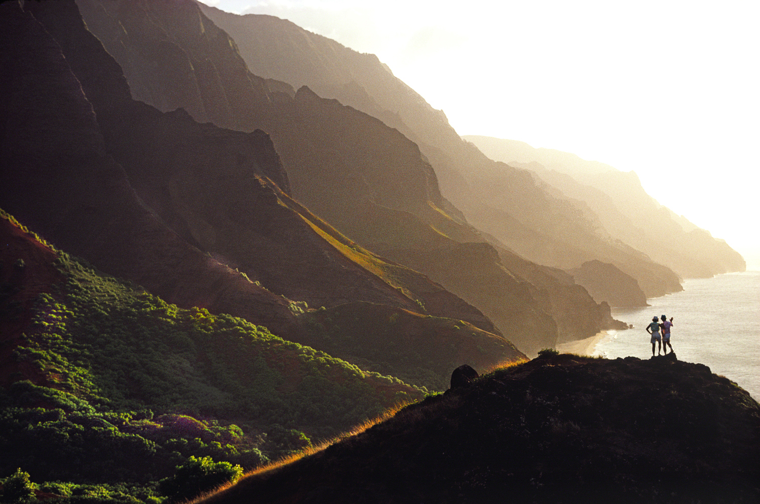
These people call themselves purists, but they have no compunction to do a little work on them in Lightroom or Photoshop; it makes me wonder just when you can begin or stop being a purist?????
I digress again.
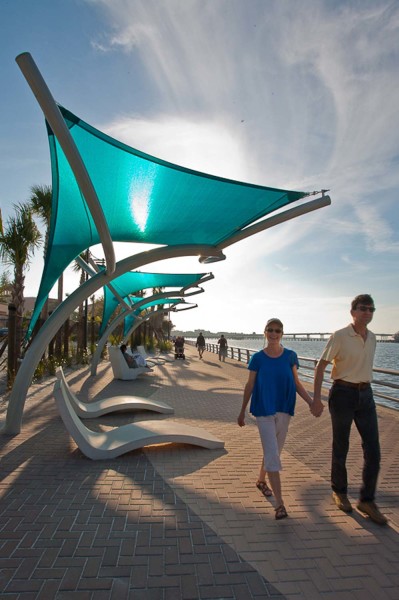
I’m not going to get into that, but I will say that when you add a person it gives scale to the image. The viewer doesn’t know the actual size of a building nor does he have any idea of the vastness of the landscape he’s looking at. What he does know is the average size of a person, and that will help him identify the size of a building or the scope of a landscape.
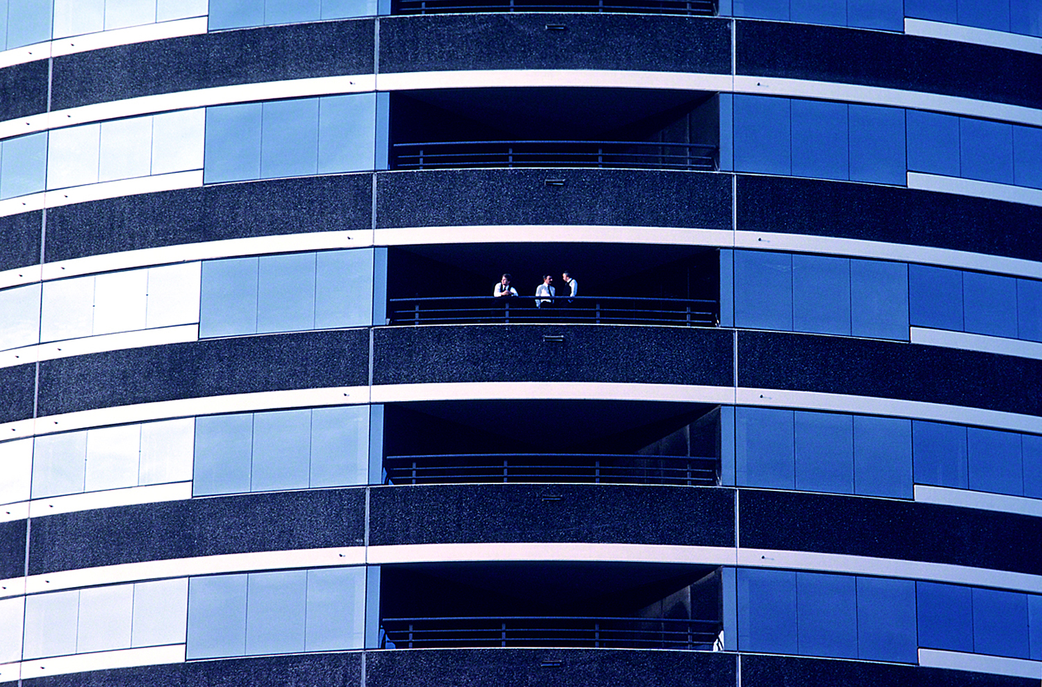 BTW it also, like an architectural photo, makes the viewer wonder who that person is, where did he come from, and why is he there. These are questions that will keep the viewer around, and unless you’re shooting photos strictly for yourself and if you’re at all like me, you like people to look at your pictures.
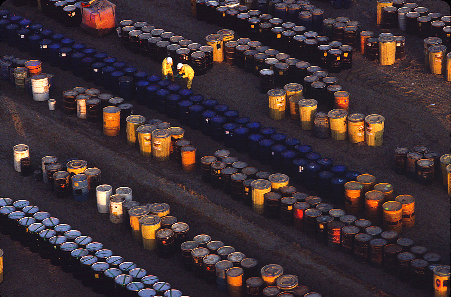
Visit my website at: www.joebaraban.com, and follow me on Instagram: www.instagram.com/barabanjoe. Check out my workshop schedule at the top of this blog. Come shoot with me some time.
JoeB