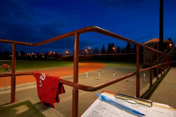
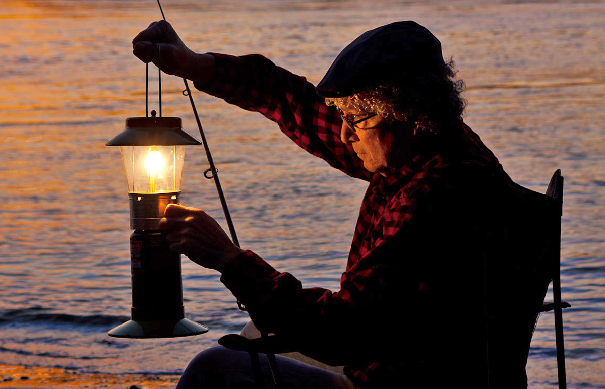
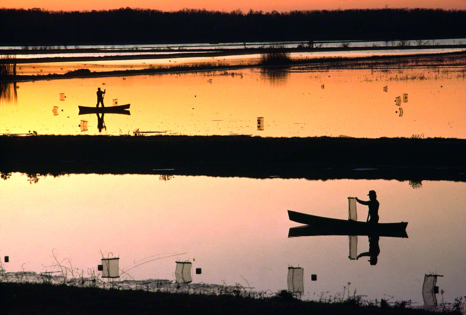
Food for Digital Thought: Color or B/W

When I first starting my career, right at the beginning of recorded history, I knew nothing about color photography. I had studied painting and design my entire life and almost always worked in color.
However, at the time when I was shooting with my first real camera, a Pentax Spotmatic with a 50mm lens, I was shooting in B/W. The reason being that I was also learning all about photography and how to process my film to eventually make my own prints. Color wasn’t an option even if I did know or think about it…which I didn’t.
In 1971, when I started shooting for UPI, AP, and was a Black Star photographer we shot primarily in B/W, so that’s the way I saw things. Besides at that time I was looking for the moment, that moment that assured me that my photo would be bought ( for ten dollars apiece) and transmitted. Color never entered my mind.
To me, that was the best way to shoot B/W…with B/W film. Now, As I tell people in my online classes with the BPSOP, and in my “Stretching Your Frame of Mind” workshops I conduct around the planet, if you’re going out with the intention of shooting B/W, then either look for the action and capturing it or look for the ten different tones that’s between white and black.
As I’ve told my fellow photographers, my background is in painting, drawing, and design. One of the exercises I remember is completing the grayscale with white and black tempera paint. I had to start out with a block of white and by adding a little black at a time get to black in ten steps. We referred it to: 10% of black, 20%, 30%, 40%, 50%, etc. until we got to 100%…pure black right out of the bottle. You might try it sometime. It will help you better understand how we perceive our environment around us without any color.
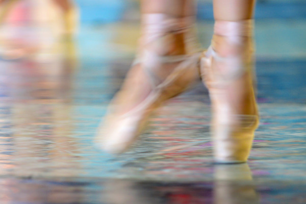
Contrast will be so important when composing, and you’ll want to have areas of pure white and areas of pure black..as well as the complete tonal range. It takes some getting use to if you’ve never thought that way, but in the long run, I think your images will turn out much stronger than just sit in front of the computer and deciding to convert a color image.
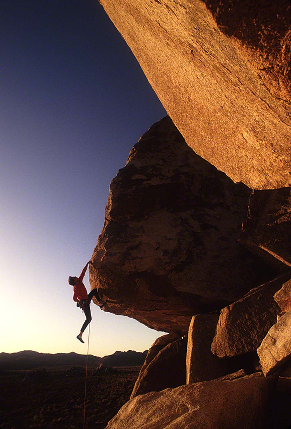
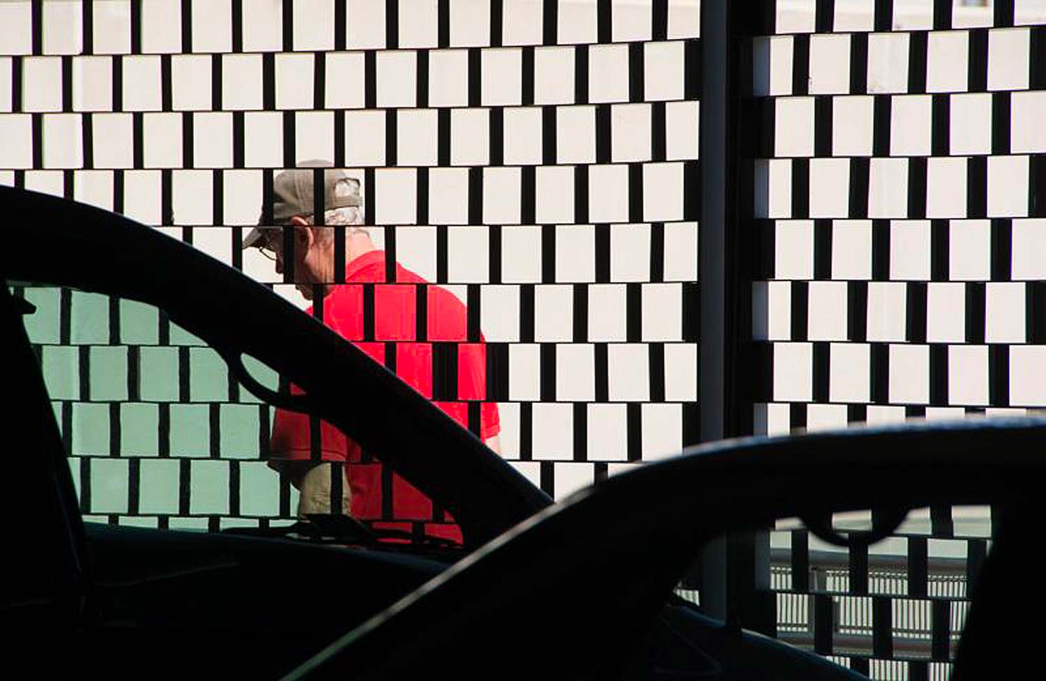
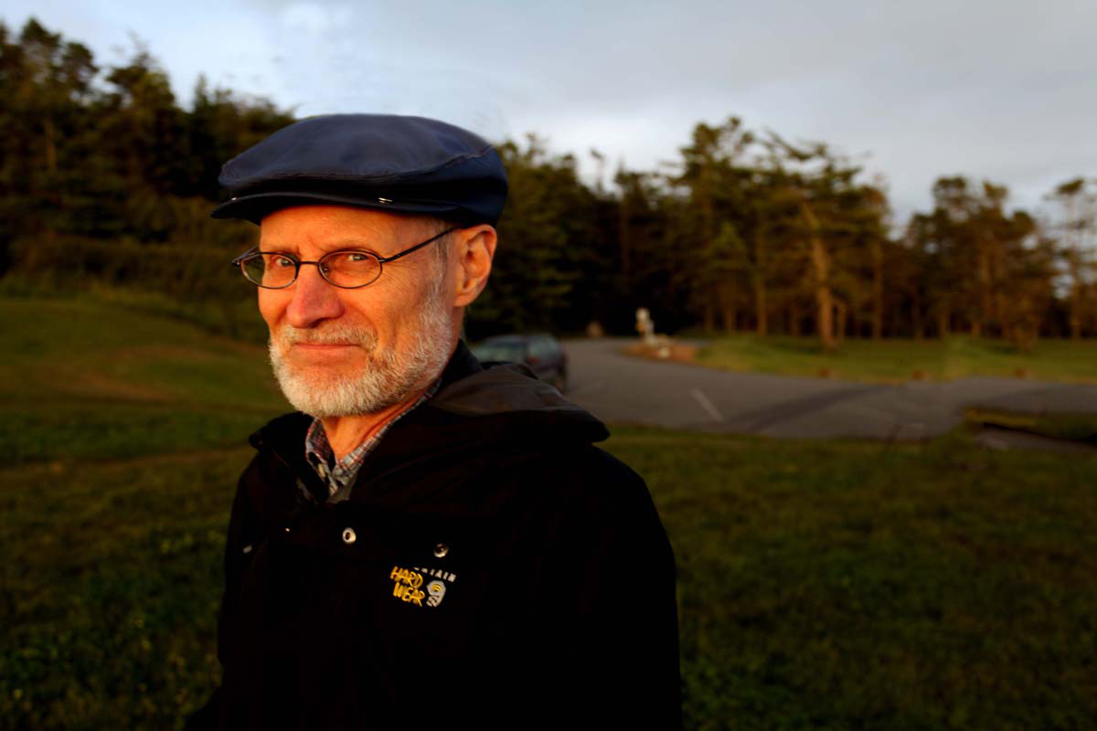
My B/W image is from those early days when I only thought in B/W. Unfortunately it’s a digital files so it’s lost a lot of the real beauty it had when it was a print.
Btw, Ted Grant, a Canadian photojournalist once said, “When you’re thinking and shooting in color you’re photographing their clothing, and when you’re shooting in B/W, you’re taking pictures of their soul”.
Visit my website at: www.joebaraban.com, and follow me on Instagram: www.joebarabam.com/barabanjoe. Check out my upcoming workshop description at the top of this blog. Come shoot with me sometime.
JoeB