AskJoeB: The Little White Chapel
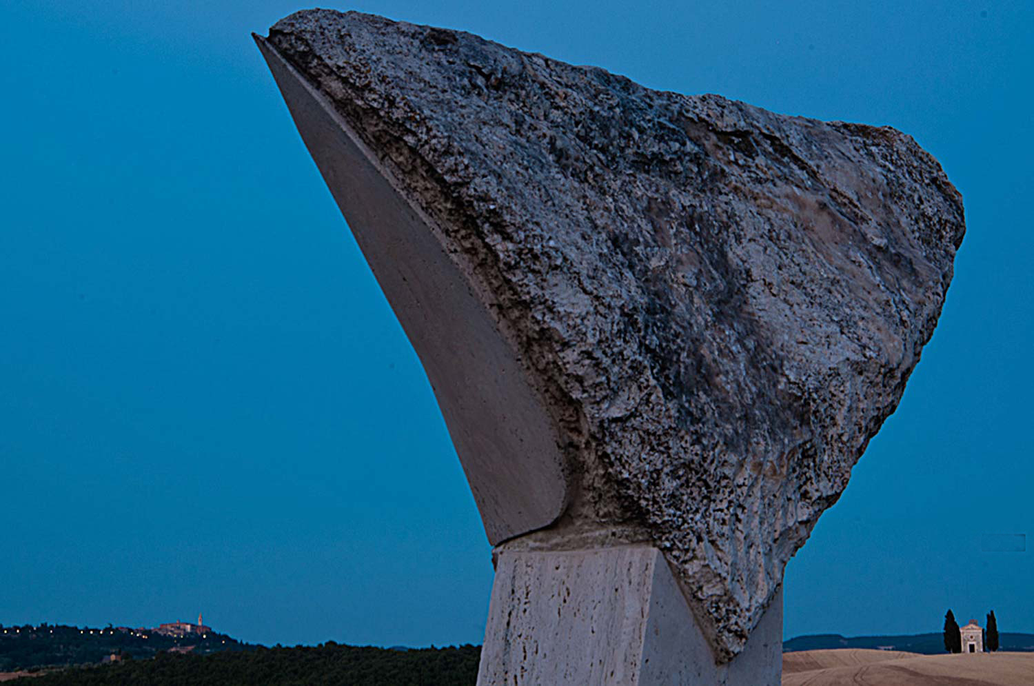
Valeriano sent me this photo to talk about. As usual I like to have people read what was said to me when the image was submitted. I find that a lot of photographers share the same problems, or the same stories, or the same ideas so it’s nice to know that you’re not alone. Here’s what he had to say:
“Hi Joe,
I’d really like your critique about this photograph and mainly about my composition.
The little white chapel (with the cypress trees “guarding” it) is an iconic landmark in this Tuscan area named Val d’Orcia (a UNESCO world heritage site). I’ve shot it in many different ways and in many light situations and seasonal situations, as well as with different weather conditions.
Thus this time I went there again, I really wanted to find a different point of view for this subject. The sculpture in the immediate foreground is something that I thought could work to define a frame within a frame composition. I’ve got the idea cause I was together with another photographer at the place I usually go, and he “hates” these sculptures that the landlord allowed to be put on its property by an artist. I always wondered if there was some interesting way to shot ’em, I probably have found one.
Unfortunately this idea came up to me at very last moment I was in my stay at this place. Moreover I was in a very bad creative vision moment for my photography, which, as usual, will start to improve as I’m at the end of a time slice exclusively dedicated to photography.
I didn’t shot it with the right light conditions I would had rather have: at sunset with a nice side light which would had let the texture of the sculpture pop up. Therefore I shot it at twilight.On the left side, in the background, there is also the profile of the little town Pienza, another well known place of this area.
Please let me know your thoughts about it and if there is anything I can improve with this composition.
Thanks a lot,
Valeriano.
Valeriano,
The first thing I felt I needed to do was to turn your photo upside down. For those of you out there that don’t know why I do this, it’s to show how well a composition is balanced. I’m talking about the balance between the Negative Space and the Positive space. In Valeriano’s photo, the Positive Space is the sculpture in the foreground, the small chapel, and the land mass and town in the left background. The Negative Space is the blue sky.
When you look at this photo right side up, the way you meant it to be, you’re looking at it with the right side of your brain; the creative side. You see a sculpture, a chapel, and a small town, and blue sky. When you look at this photo upside down, you’re looking at it with the left side of your brain; the analytical side. The sculpture, the chapel, the town, and the sky don’t exist anymore. Now, all you see are shapes and how they relate to one another. Now it’s easy to see how well the balance between the Negative and Positive Space actually is.
Is this photo balanced? To me, it’s very heavy on the right side of an imaginary line drawn down the middle. Don’t get me wrong, I’m the first one that would disrupt the way a viewer perceives then processes one of my photos, but when you have an object this large anchored in the foreground, it’s too much.
Since Valeriano wanted to show both the chapel and the town, I would have moved a few steps to the right so as to balance the sky on both sides of the sculpture.
Ok, Valeriano mentioned “framing within a frame”. Since he took my online class with the PPSOP, he learned several ways to create Visual Tension. I also teach this in my “Stretching Your Frame of Mind” workshops I conduct around the planet. One of the ways is to frame a subject, or an object or a scene within a frame. By cleverly using the sculpture and the right edge to frame the chapel, he succeeded. I also show my students how to use perspective to create the feeling of depth. By ‘anchoring’ the sculpture in the foreground he created “layers of interest” which in turn created the feeling of not only depth, but distance and scale as well.
The last thing I want to mention is that people that follow my blog and my work know that I’m very big on light, since light is everything!!! However, in this photo I like the absence of directional light here. There’s something magical about this photo and waiting for the twilight color to take effect. The psychological effect color has on our psyche can’t be dismissed as it has been proven to have certain powers.
A very cool photo!!!!! You were definitely “Stretching your Frame of mind”.
By the way, did you know that there was a time when the color blue was believed to soothe illness and treat pain; ancient cultures practiced Chromotherapy or the use of color to heal.
Thanks for the submission.
Visit my website at: www.joebaraban.com and watch for my 2013 workshop schedule. Come shoot with me sometime.
Keep those questions and photos coming in at: AskJoeB@gmail.com
JoeB