One of the terms that’s used in the film industry and you’ll see on movie scripts is the initials ECU, and it stands for extreme close-up. When I was a director-cameraman I would often put at least one close-up of a person on film just in case the powers that be would use it…they never did.
The reason is not because it didn’t look good, there just wasn’t a lot of places for one…unless you were shooting a toothpaste commercial. That doesn’t hold water anymore when I’m shooting stills, because to me it’s a great way to really get up close and personal to their personality.
I’m not talking about filling the frame with someone’s face. I’m talking about using a wide angle lens (17-40mm) putting the subject in the center, and including a lot of the environment around them or the background behind them.
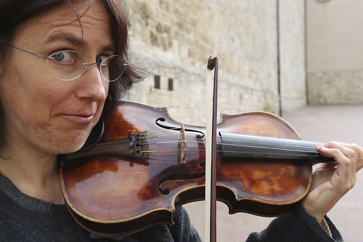
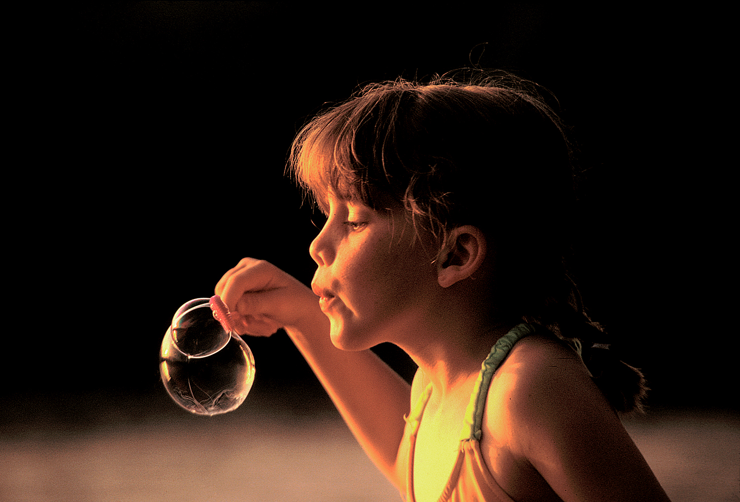
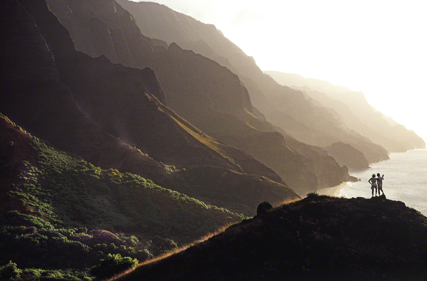
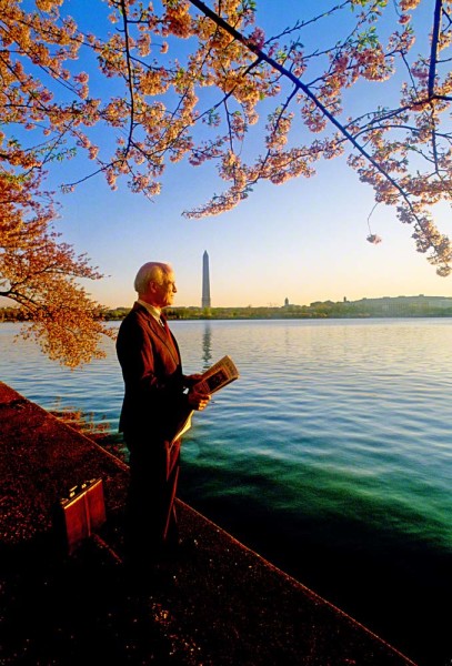
In my online classes with the BPSOP I use to show students examples and encourage people to give it a shot. When I’m conducting one of my “Stretching Your Frame of Mind” workshops I’ll create a scenario with someone local, ask one of my students to take his or her portrait, then I’ll show what a ECU looks like to them…as in the photo above taken in my Springtime in Tuscany Workshop.
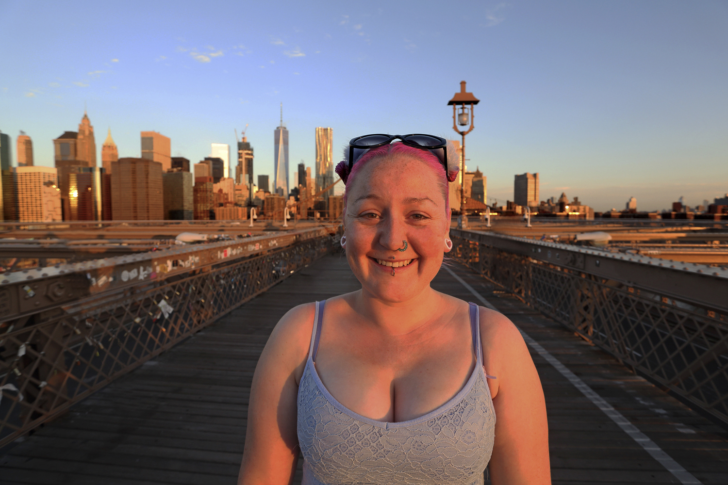
Her ECU was on the Brooklyn.
BTW, when you put someone in the center and keep your camera level, you’ll avoid any weird distortion; otherwise, well you know what that looks like and it’s the primary reason my fellow photographers don’t like to do it. Again you have to keep the camera level and the subject right in the center or very close to it.
I don’t advise you making that you’re first variation as it will probably freak out the person..which is sometimes a good idea to record their reaction. I would ease your way into it after a certain amount of rapport and then maybe the last shot is one you take..after switching lens and moving n for the ECU.
Over the past five years, I found that in both my online classes with the BPSOP, and in my “Stretching Your Frame of Mind” workshops I conduct, people that are just now starting to understand the “why and the how” of photography are not quite confident in what they put or don’t put into a photograph.
As the level of my fellow photographers images goes up to what I refer to as up a notch, striving for that OMG shot, that photo that can become a wall-hanger, will become more difficult; at least in their minds. You can read more about it in a post I did under the category “My favorite quotes” and was about Edgar Degas, who once said, “Painting is easy when you don’t know how, very difficult when you do”.
So, the tendency is to put more than you need to get your message across. To that I always say, “When it doubt leave it out”.
This might mean taking a little more time when composing, and there lies the rub. I’ve found that after thirty years of showing people how to create stronger images, people just are not willing to take the extra time. I can tell you from my fifty years of shooting, that’s what it will take.
Photography is the art of subtraction. When you have a blank canvas on an easel you fill it up with all different pigment until you get the desired effect; a camera on a tripod is just the opposite.
When you raise the camera up to your eye and look through the viewfinder, it’s already filled with some sort of composition based on the environment you happen to be standing it. To me that’s when the real thought process, the real photography begins.
It begins by the photographer choosing what to leave in and what to take out, and this is where it gets a little tricky! This is when you decide what you need to create that illusive keeper.
This is when, and I’ve seen it a thousand times, one will tend to put or keep in too much because of the lack of confidence; the moment when your photo is about to go up one level.
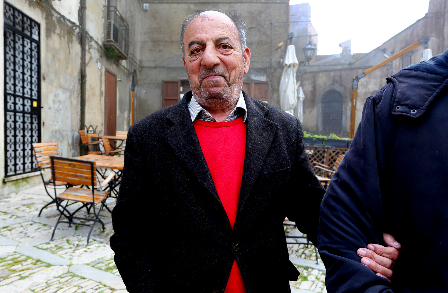
In the above image I shot on a very cold and foggy day in a small Medieval village north of Taromina, Sicily. People walking around were few and far between. I saw these two men walking down a very small cobblestone street and was immediately drawn to his red sweater; since finding color anywhere would have been a blessing.
However, I didn’t want to show very much of the sky sine it was so gloomy. I decided to come in close to the older man while still giving the viewer a clear message that he was being helped by a friend or family member. To me leaving the rest of the man out added another dimension…Closure in the Psychology of Gestalt.
If you have happened to take my online classes where I show photographers how to incorporate the elements of visual design into their photos, the job is considerably easier; because now you know what to look for.
Although I’m a firm believer in the expression, “if more’s better then too much is just right”, in this scenario more is definitely not better.
I leave you with one last thought…if you have the opportunity shoot it both ways and look at both images side by side on your monitor and them make the decision.
Visit my website at: www.joebaraban.com, and follow me on Instagram: www.joebaraban.instagram/barabanjoe. Check out my workshop schedule at the top of this blog. Come shoot with me sometime. Please be patient because when I post an upcoming workshop, it fills within a few days.
Light is one of my favorite subjects to talk about…why? Because light is everything to me, and that’s why over the past five years of writing these posts I have written several on the subject; my mantra is you find the light, you’ll find the shot.
In one of my online lessons with the BPSOP, a school that unfortunately close due to the passing of its founder Bryan Peterson. I talked about my clock, and always knowing where the sun is on it. In other words, if you look at my clock you’ll see where the camera is in relation to the subject. From there you can determine if your subject is going to be side lit, back lit, or front lit.
For example, if the source of the light is coming from behind the 8,9 or 3, or 4 then you’re subject will be side lit. If the light is coming in from the 10 or 2, I call that the “law of the light where the angle of incidence equals the angle of reflection; my favorite way to light people.
If the light is coming from behind the 11,12,or 1, then it will backlight the subject. Last, if the light is coming from behind the 5,6,or 7, then your subject will be front lit.
By the way, I avoid front light like the plague, and when I’m shooting with my fellow photographers that sign up for my “Stretching Your Frame of Mind” workshops I conduct around our planet, it’s easier to physically show them the difference between all the different ways just my merely turning the subject or have them move around the same subject.
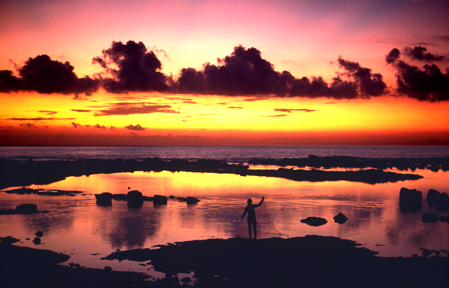
Light right on the edge at 10 o’clock
The reason I avoid front light is because you won’t be able to achieve depth, you’ll only be able to show height and width. You can show the third dimension by having the sun behind the 9 or 3…which is true sidelight.
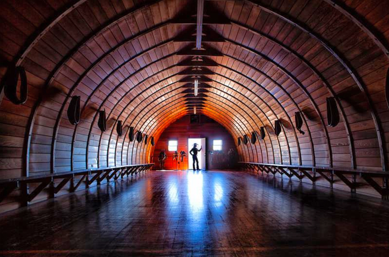
Now I’ve talked about the clock before but what I want to add to the mix is placing your subject just at the edge of darkness. what I mean is placing your subject right where the light ends and the dark background begins. I like to do this for a couple of reasons:
The first reason is that it will create visual tension. Two of the ways to create visual tension is through contrast and the use of light. The second reason I like to do this is because of the Figure-Ground concept in the psychology of Gestalt; putting a light object or subject against a dark background.
I said that I don’t like to front light, but the one exception is when I have my subject in the light but right on the edge of darkness so that I’m taking advantage of Figure-Ground; as I’ve done in the photo above.
Before Bryan Peterson, the founder of the school, a conversation that often comes up is when one of my students was taking my BPSOP class tells me that according to their Histogram, the exposure was the correct one. During one of my “Stretching Your Frame of Mind” workshops, I’ve walked up to one of my fellow photographers, when there was a few seconds of great light still left, and saw him/her standing there looking at that worthless chart on the back of their camera…the Histogram!!!
EGADS!!! YIKES!!! WHAT???
So let me get this straight. You’re telling me that you need ( or should be doing) to look at something the Digital Gods (those would be the geeks) created with the sole purpose of letting you miss what could have been the best photo you’ve ever taken? REALLY???
When I do encounter that problem during one of my workshops, I always tell people to get that off their camera…why? Because you don’t need it to create good photos. It’s going to do more harm than good, and that’s the reality of it all. The absolute last thing I want to be doing is to have a camera ( a machine) telling me if a photo is ready to be taken. I want and can decide that all by lonesome…thank you very much!
Ok, so it’s not all their fault. The majority of my students didn’t begin their passion for photography until after the advent of the digital world. They only know what they’re led to believe, and they’re led to believe that in order to take good photos you have to pay attention to Histograms, and those ridiculous blinking areas on the back of your camera telling you that you’ve clipped the highlights.
All I can say is don’t stand there and miss the shot, be a student of light and know to take matters into your own hands…How? By bracketing. By bracketing you’ll be able to get the exposure in the camera without needing to look at a Histogram. By putting your brackets next to each other on your monitor you’ll start to realize when you’ll need to underexpose more and overexpose more. Try setting your camera to bracket automatically then you can study the different exposures and have a clearer idea about shutter speed/aperture combinations.
The above photo was taken without the help of a Histogram. If I had been looking at the back of my camera waiting for it to tell me that it was ok to shoot, I would have missed the shot.
🙁
Visit my website at: www.joebaraban.com, and follow me on Instagram: www.instagram.com/barabanjoe. Check out my workshop schedule at the top of this blog. Come shoot with me sometime. BTW, the workshop doesn’t stay up long so hopefully you’ll keep looking for a spot.
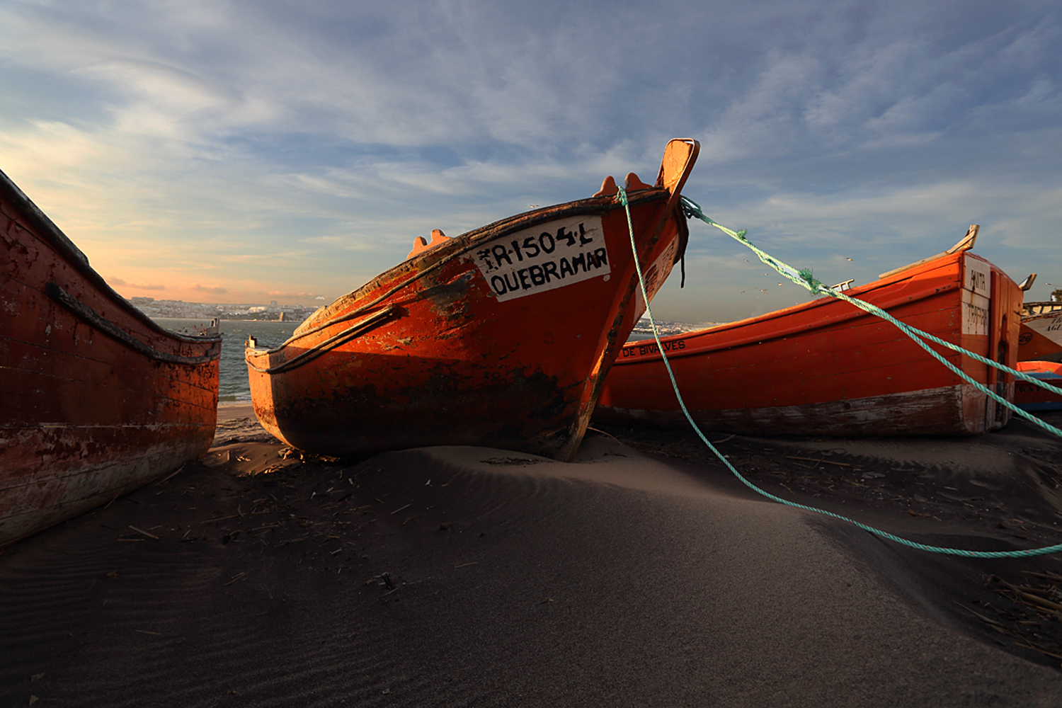
I knew the where, when, and why…in Lisbon, Portugal.
I’ve been writing down my personal pearls of wisdom for years, and over the course of these years I’ve been sharing them with my fellow photographers that sign up for my “Stretching Your Frame of Mind workshops ” I conduct around our planet. The one I want to share with you today is one of my favorites and most important…“My three W’s”
Ok, I guess you need to know just what they are, and once again it’s all about the light. People are always asking me how I can get the quality of the light and the saturation/depth in my color without a lot of post processing. First let me digress just a little.
I’m from the old school that shot Kodachrome 25 and way before the invention of the computer much less Lightroom and Photoshop. We did everything in the camera, and the finished photo was on one piece of 35mm film…one exposure! Nowadays, I love the challenge of getting as much in the camera as I can, with a minimum amount of time spend in front of the computer. To me it’s more important to be a good photographer than a good computer artist.
Don’t get me wrong, I do a little on every photo, but not much more that what I did to a print in the darkroom.
So, the three W’s: Know WHERE to stand, WHEN to stand there, and WHY you have to be quick when you’re standing there.
WHERE: Before I raise my camera up to my eye, I determine where the source of the light is coming from. I’ve watched so many photographers walk up to their subject and just start shooting, paying absolutely no attention to the light. I can tell you that light is everything, except perhaps when you’re street shooting; although good directional light can enhance any situation and generate visual interest and tension.
I want to create the third dimension in Form ( a basic element of visual design), by adding Depth. This can only be done when you side light your subject. Otherwise you’re left with only height and width. I also like to back light my subject (especially when it’s translucent) which gives it a glow around its outline.
WHEN: Knowing that (for me) the best times to shoot is during the Golden Hour, when the sun is low on the horizon; generally ten to fifteen degrees above the horizon either at sunrise or sunset…depending on the time of year and if you’re North or South of the equator. I also like to be at a location before the sun comes up and after it goes down.
This is the time for Blue Hour when the sun is at a significant distance to the horizon, and it comes before dawn (another great time to shoot) when the blue turns into reds, yellows, pinks, purples, and oranges…and dusk when the reds, yellows, oranges, and purples, turn blue before turning into black.
WHY: After chasing the light for nearly fifty years, I can tell you that it’s so fleeting you can miss a great photo by seconds. Part of what has helped me through a half of a century of taking pictures (saying it that way sure does make me feel really old) is knowing where the sun, to the degree, is going to rise and set at any location in the world…on any day of the week. I know how long I’ll have before the sun gets up to high and becomes hot and harsh.
I’ll know if there’s a building, structure, hill, or mountain that will cut my time short either by clearing the obstacle in the morning, or losing it behind an obstacle at sunset. Part of my process for determining how much time I have is by an incredible app I have on my iPhone. It’s called “My Radar”, and it shows, in real time with a GPS, where any rain is by showing the actual storm as it moves from one direction to another.. I know this doesn’t sound like it’s a big deal, but I know if I’m about to get bad weather and when it will pass over…sometimes leaving a rainbow behind.
Even knowing the where, when, and why doesn’t guarantee you that you’re going to come home every time with that illusive “OMG” photo, but it certainly doesn’t hurt. As Eddie Adams once said, “When you get lucky, be ready”.
I just love working on this category, and when I hear, see, or read something that directly relates to information I’ve been sharing with my fellow photographers that had taken my online class with the BPSOP and still come on my “Stretching Your Frame of Mind” workshops I conduct around our planet, it really makes me smile!!
One of my all time favorite singers is Dr. John, a Rock and Roll Hall of Fame legend from New Orleans. One of my all time favorite songs he wrote is “Right Place Wrong Time”, and of all the quotes I’ve been sharing with all of you this one probably means the most to me.
It hits home because of the one and only time (a million years ago) I showed up at a location at sunrise all ready to shoot, only to discover that the location only received light at sunset. It wouldn’t have been quite so bad had I shown up alone with my assistants but noooooooooooo…the Art Director, agency account executive, and last but certainly nor least was the client!!!!
We were at the right place at the wrong time!!! What did I do you ask? With my tail between my legs we all got back in our cars went back to the hotel and waited until sunset. It was a bummer extraordinaire.
🙁
From that moment on I made a promise to myself that it would never happen to me again, and to this day ( a million years later) it hasn’t.
Right place, right time
There’s two different way I approach photography: The first is if I’m just walking around a city in the US or some village in Europe or Asia either by myself or with a group from one of my workshops. If I was able to scout the locations ahead of time to see when it received the best light for the longest time all the better; if not I just showed up and just made do with the light we had.
A lot of the time we were there mid morning to mid afternoon when the sun was at it’s zenith, and for the most part it was fine as most of these old medieval towns or Asian villages had narrow streets with tall buildings surrounding them. The best advice I had at that point was to look for areas in shadow and use the contrast between light and dark to their advantage.
The second approach is the more serious approach and that is to scout all my locations ahead of time to determine exactly where the sun will come up and go down to the degree; as well as knowing where it will be all day.
For as long as I can remember I used a program to determine where the sun came up and went down and along with a hand bearing compass called a Morin2000, I knew exactly to the one degree where the sun was all day. It was a far better combination that one of those apps you put on your phone…far more accurate and it’s great when shooting indoors with window light.
I don’t want to be at a location at sunrise when I should have been there at sunset. Depending on the subject matter, the idea, and the location, I might want to backlight, but on the other hand side light might be the best way to achieve what I want. If I’m really lucky, I might be able to do both.
Scouting ahead of time will also enable me to develop a shot list. Let’s say for example I’m at a large marina that’s nestled into the side of a small group of hills. My first shots would be as close to those hills as possible, then as the sun began to drop behind those same hills I would want to get as far away from the hills as I could which would by me some more time before losing the light altogether.
Always at the right place ,at the right time.
Let’s also say that the mega-yacht I’m suppose to shoot is moored close to the end of the marina and even closer to the hills. If the sun is coming up right behind the hills, early morning light won’t be hitting the vessel until mid morning. I don’t want to be there at sunrise, I need to be there at sunset so that late afternoon light (golden hour) will be hitting the yacht.
So, my fellow photographers the best advice I could give you is to make sure you don’t show up all excited and ready to shoot great photos only to discover that your morning has been a waste of time…be prepared!
Dawn sent me another photo to comment on. As usual, I like to include the actual question since so many out there may have experienced a similar situation or have thought about similar question. Here’s what Dawn had to say:
“Hi Joe,
This question has to do with composition. I took the attached pic on a visit to Cascais, Portugal 2 weeks ago. It wasn’t a photo workshop or tour but I wanted pics to show what Cascais was like, and the people. In this shot, I wanted to maintain the negative space between the two groups of people, the ladies and the 3 policemen in the background. I included the policemen in the shot for depth and to draw the viewer into the photo. Overall, I thought it captures the sunny relaxed feel of the town. Thank you for your comments, if you have time to make some.
Regards,
Dawn”
Dawn, I’ve begun to answer questions and talk about photos with a video critique. It’s the way I taught in my online class with the BPSOP and also in the occasional question I’m asked from recent photographers that have taken my “Stretching Your Frame of mind” workshop somewhere around the planet.
Until Bryan Peterson’s passing, each month I taught a class with the BPSOP. It was an online four week class, and each month I usually get twenty to twenty five participants; and they’re more than likely just like you. That is, they’re amateur photographers passionate about photography, and want to take their images up to the next level but just don’t know how to go about it.
Now that the school is permanently closed, I still teach a six-month Mentoring private class, and my “Stretching your Frame of Mind” workshops I conduct around the planet, I teach students how to incorporate the Elements of Visual Design and Composition into their image making. Negative Space, Vanishing Point, Perspective, Line, Texture, Pattern, Form, Shape, Light and Color are the elements that we work together on. Each week the class is given a different lesson to work on, while taking what they’ve learned in the prior lesson with them to the next week’s assignment. At the end of the four weeks, they walk away with an ‘Artist Palette’ with all these elements on it.
As the month progresses, the level of work changes with each day. Once each student embraces a particular element they can integrate in into their thought process and “make a picture” using it.
I want to share some of their wonderful pictures with you they had taken over the course of the four weeks, so you can see how their new Palette has helped take their imagery what I refer to in class as, “Up a notch”. What you see is a small representation of the work that was created. The level of work is incredible and unfortunately there were just too many to show all of them, so I tried to represent all the elements that they learned how to use. Can you see them?
Visit my website at: www.joebaraban.com and follow me on Instagram: www.instagram.com/barabanajoe. I’m working on my 2027 workshop schedule, so stay tuned. Come shoot all the elements with me sometime.
I suppose I see as many or probably more baby photos as the next guy…why you might be asking? Because I have four kids and two grandkids, and my wife has two kids and five grandchildren which would seem to qualify me as a semi-expert on baby photos.
That’s not counting the times when someone shows me their kids on their phones…ad nauseam!!
If you’re at all interested in showing off your kids/grandkids and not having the person you’re showing them to break out in hives, then here’s a great tip for you and it relates to one of the six concepts of Gestalt I teach online both in my six-month private Zoom program and in my “Stretching Your frame of Mind” workshops I conduct around our planet…the concept is called Closure.
So, the next time you’re in a position to photograph one of your kids or grandkids, think about this concept and allow the viewer the chance to fill in the rest of the image…as in the parent. I’ll bet you a dollar to a doughnut that they will think it’s a really good photo and will even think you’re a creative photographer…besides being relieved from seeing just one more baby photo.
Visit my website at: www.joebaraban.com, and follow me on Instagram: www.instagram.com/barabanjoe. Check out my workshop schedule at the top of this blog. Come shoot with me sometime. I have added a new workshop to my 2027 schedule. in Puglia, Italy. Come shoot with me.
How many times growing up did a parent, usually your mother, tell you to stop playing with your food? How many times have you been guilty of saying those same indelible words to one or more of your children?
I don’t know about you, but I lost count way back when. As an adult I also admit to saying those words or something like them to each of my four kids…and grand kids. By the way, if you were lucky as I was, you wanted your mom to say it more than your dad, if you know what I mean.
Well, my fellow photographers in both my private six-month mentoring Zoom program and in my “Stretching Your Frame of Mind” workshops I conduct around our planet, I’m here to tell you to start playing with your food again; only this time with your camera.
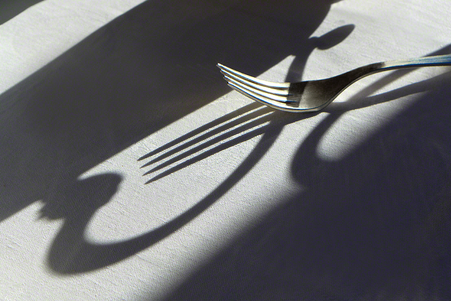
Since I’m always carrying my little Lumix DMC-LX7 in my pocket, I’m always at the ready when that illusive photo epiphany suddenly reveals itself to my imagination. It can be just about anywhere, including a bathroom. I see it a lot at restaurants, dinner tables (mine or friends), or anywhere where food and/or utensils are served and used.
This epiphany or sudden revelation usually occurs when some form of light comes into play, and as you know by now…light rules the photo world. You find the light and you’ll find the shot.
The above photo was taken during the beginning of breakfast on the terrace at the Royal Hotel in San Remo, Italy. While waiting to be served, I noticed the early morning light casting a shadow on our two-top. I began moving around the fork and silver tea service until I had the composition I wanted. By the way, all this was happening while Mikki was patiently watching…waiting until I was through “playing around” so she could pour herself a cup of coffee.
Visit my website at: www.joebaraban.com, and follow me on Instagram: www.instagram.com/barabanjoe. Come shoot with me sometime in 2027 in Puglia, Italy.
I first talked about this shoot in a previous post that was called “Life Before Photoshop” where I said that the behind the scenes story would come out at a later date.
I love all the categories I write for my blog, but the one that brings back the funniest memories and moments is the category I call Anecdotes. These are stories that actually happened over the course of my forty-eight years as an advertising, corporate, and editorial photographer; the names might have been changed to protect the innocent.
Looking back over the years there’s been some pretty amazing things that have happened on a shoot. Some are downright unbelievable because no one could possibly say or do some of the things they do. I’m here to tell you that at my age I’ve seen enough to boggle the minds of both young and old alike.
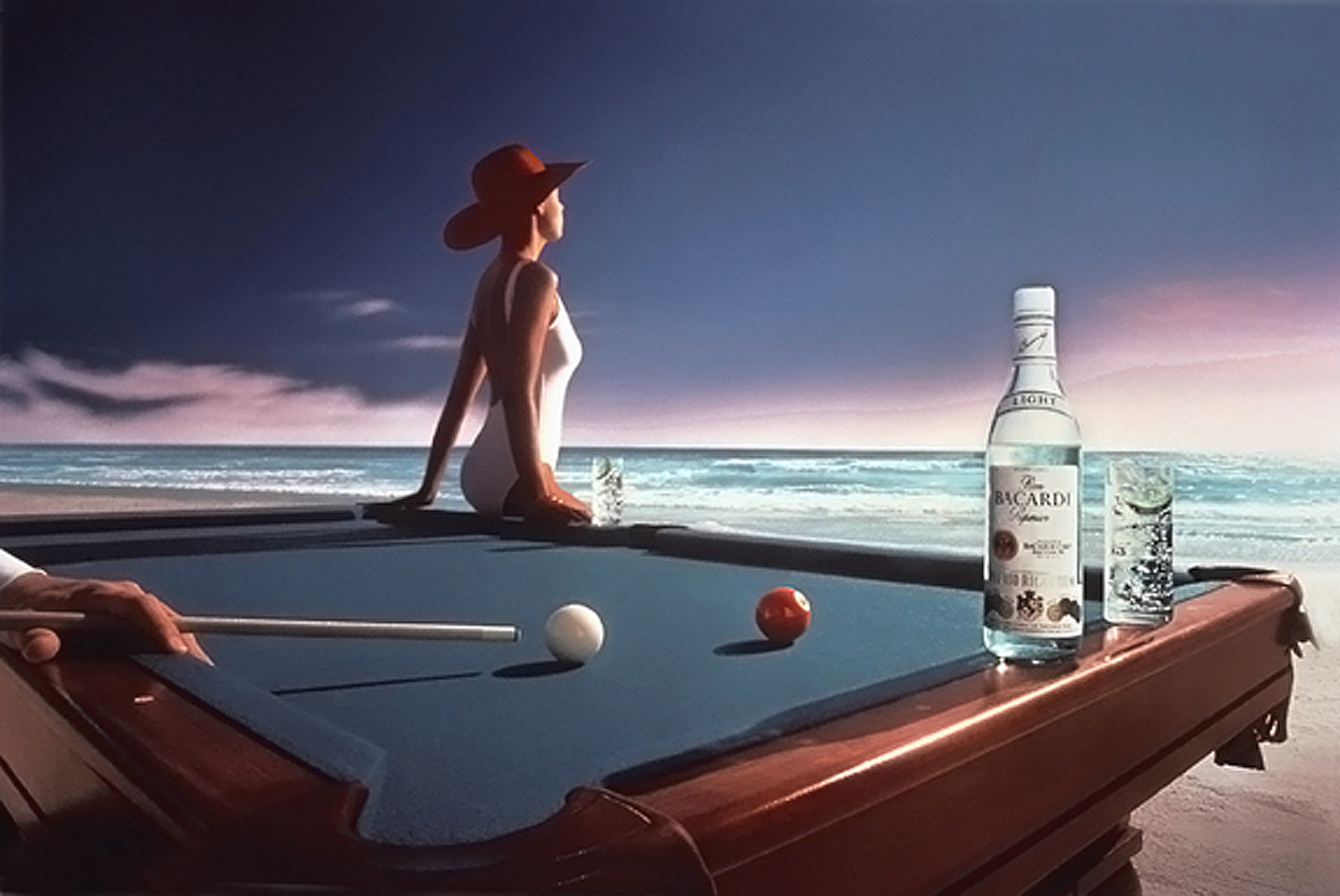
I was shooting a national advertisement for Bacardi Rum, and the Art Director wanted me to put a full size pool table on a white sand beach. From experience I knew that Sarasota, Florida had some of the best beaches in the country, and had a totally un-obstructed view to the setting sun.
As most of you know by know, Light is everything to me, and it’s what I stress both in my private mentoring six-month zoom and in my “Stretching Your Frame of Mind” workshops I conduct around our planet.
I called the producer I had worked with over the years and had her start assembling all the pieces that are always need to pull a fairly large production. From shooting the different beaches to show to the client, to renting a full size pool table and having a company deliver it, set it up, and take it away.
Then you have the usual details like hotels, car and van rentals, assistants, and anything else you can think of as far as aiding in the production. In this photo, a hand model was needed so agency photos were also sent to the client for approval.
Last but certainly not least was taking care of all the needs for Miss Bacardi, who came with her own entourage.
From the outset, I knew there was something special about Miss Bacardi but I couldn’t put my finger on it. Perhaps it was her question as to why someone would put a pool table on the beach????? Why only one instead of the several you would find in a pool hall???
There’s no denying the fact that she was beautiful and had a near perfect figure, but I could only figure that God ( in his omnipotent wisdom) forgot all about what to put on the inside of her head.
The day of the shoot happened to fall on the day of the Super Bowl, and we finished up in time to go to the bar of our hotel and watch it from the beginning.
Right before the game I went to a phone (no cell phones in those days) to place a small bet with a friend back in Houston. The game was being played on the West coast which was on Pacific time, which meant that it was starting three hours later for those on the East coast. It was being played in Houston two hours earlier than the East coast. Keep in mind that the game was actually starting at the same time from coast to coast.
When I returned and told my crew who I had called in Houston to place a bet, Miss Bacardi told me that it was a dumb idea to bet with someone that would know the final score before I did.
True story…they are all children dressed up in their parent’s cloths!!!
Visit my website at: www.joebaraban.com, and follow me on Instagram: www.instagram.com/barabanjoe. Check out my workshop schedule at the top of this blog. I will be putting one together in 2027 to Puglia. If you’re interested send me a note through my contact info on my website.vCome shoot with me sometime.
Besides my “Stretching Your Frame of Mind” workshops I conduct around our planet, I teach a four week class with the BPSOP. Actually I teach three classes: A part I, II, and a class on the six concepts in the psychology of Gestalt.
My part I and II classes are centered around the basic elements of visual design, and how to incorporate these elements into your photography: Texture, Pattern, Shape, Form, Color, Light, and the most important of all the elements…Line.
Without Line, none of the other elements would exist; in fact you and I would cease to exist since we have an outLINE. What about planes, trains, automobiles? Those as well would come to an end.
We learn all the ways to generate Visual Tension, a week on just shadows (your best friend), silhouettes, and the ability to “see past first impressions”. We work on ‘making’ not taking pictures, and basically seeing with new eyes.
The following slideshow is made up of a couple of months of my part I and II classes work. These photos were all shot by my fellow photographers, students that have begun to look at the world with the right side of their brain…the creative side.
When you’re looking at all the photos (and I know there’s a lot), you’ll be able to see just how they’ve used the elements to create strong images; they now use my “artist Palette” whenever they go out shooting. Now, they’re not just looking, but seeing.
My next class starts this Friday April 8th. Sign up for my part I, and I can guarantee you’re work will rise to a higher level in four weeks.
The July 31st. marks my twenty-eight year at the Maine Media Workshops. It’s a wonderful way to immerse yourself for a week and think about nothing but photography. It’s the same week as the Lobster Festival down the road in Rockland, and offers a completely different set of photo ops than the beautiful Maine coastline, amazing lighthouses, and quaint fishing villages. The full description is at the top of this blog.
I have added a new workshop to my 2016 schedule. On September 21st, ten photographers will get together with me at my evening “meet and greet” to begin a fantastic five-day workshop in New York, New York. Check out my description at the top of this blog. Come shoot with me.
Visit my website at: www.joebaraban.com, and check out the workshops I offer at the top of this blog. Come shoot with me sometime.
Keep those photos and questions coming to: AskJoeB@gmail.com, and I’ll create a video critique of your photo.
Ok, I know what a lot of you are probably thinking when I say the word Tension, but it’s not what you’re thinking. When you hear the word tension you more than likely associate it with mental or emotional stress since that’s the most popular definition. After all, how many commercials have you seen or heard where they talk about “the tension headache”, and that their pill works better than all the rest to get rid of it?
I’m talking about the kind of Visual Tension that’s comes as a result of forces acting against one another; which creates energy and visual interest. When Visual Tension is present, it’s the feeling that something is going to occur that will change the dynamics of the message we’re trying to get across to the viewer.
In the psychology of Gestalt, we want to make the viewer an active participant when looking at our photos, and generating visual interest is a good way to keep him around longer looking at our imagery. I don’t know about you, but that’s what I want.
In my online classes, my six month private mentoring, and in my “Stretching Your Frame of Mind” workshops I conduct around the planet, we work on several ways to create Visual Tension, and one of the ways is called, “Framing within a frame”. This happens when we place a frame of some sort around our subject or centers of interest. This can be anything, including one of the four edges that surrounds our composition. BTW, it’s one of the reasons why it’s best not to crop your photos, so you can use the edges of your frame as a compositional tool.
The frame directs the viewer’s eye to not only the subject, but the environment it sits in; giving it a frame of reference. Framing within a frame adds depth and it’s the feeling of the frame closing in that also provides tension. Also, when you put a frame around your subject or center of interest, it will lead the viewers eyes directly to it and the energy it generates to focus his/her attention takes work and work takes time, which requires energy, and energy equals tension.
Here are some examples of “framing within a frame”:
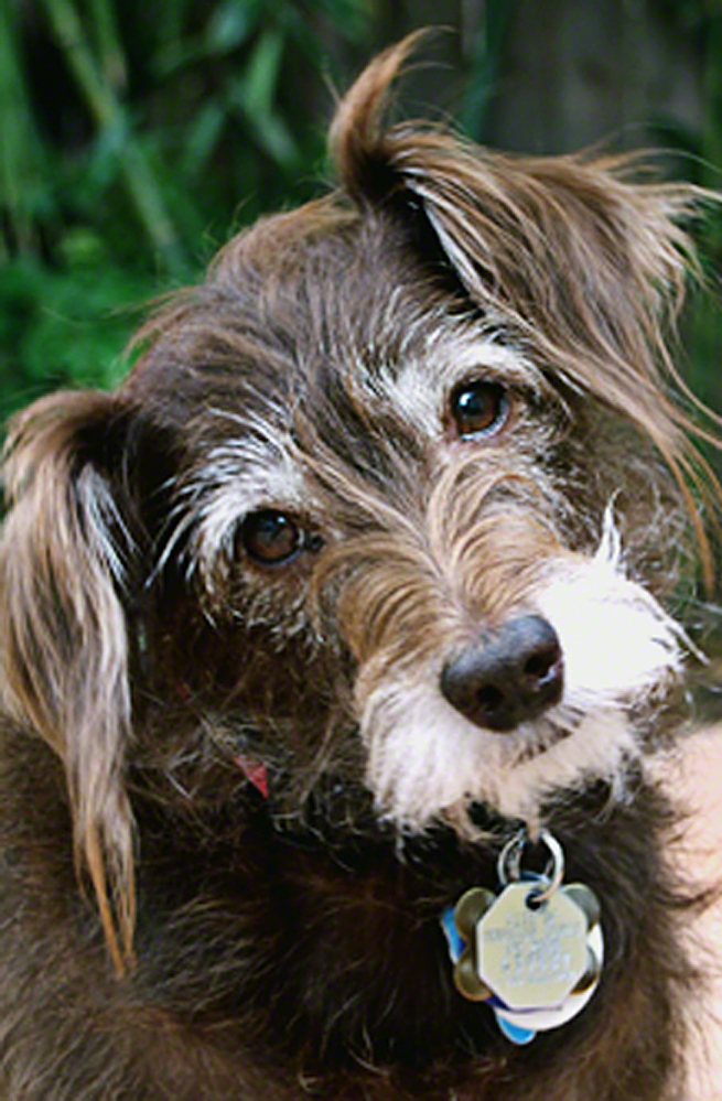
I made a weird noise to bring out Gertie’s personality.
Until the passing of Bryan Peterson, the founder of the BPSOP, I taught classes with the school. I also conduct my “Stretching Your Frame of Mind” workshops around the planet. I’ve occasionally been asked how do I photograph pets, so since there’s a million links to this genre, I’ll put my two cents in and make it brief.
I’m not a pet photographer per se, I was an advertising and corporate photographer that periodically would get a project that included shooting animals; specifically dogs…why? I’m not a cat person, I’m a dog guy so I guess it was just one of those reasons that no one ever called me to shoot cats. So what I know about shooting pets is mostly about shooting dogs.
What advice I can offer is first and foremost, get it sharp! Make sure you’re shooting at a fast enough shutter speed to freeze any action, and above all make sure you have a comfortable F/stop to get the nose to the eyes in focus. This is not a rule because there’s always going to be times when having areas out of focus is more important; getting it sharp is just generally a good overall suggestion.
Get on their level. To me it makes for a stronger connection, especially the implied line between their eyes and the lens.
Always use natural light. The obvious reason is that the light will be softer, but another reason is that electronic flash could either distract or scare them…or both.
Choose a background that’s familiar to your pet. A backyard (depending on the light) is desirable so he won’t be distracted by a new environment. If it’s a portrait I’m after, then I like to have the background out of focus. A medium telephoto shot at it’s widest aperture will usually make this happen. Just don’t put Fido in front of something or close to anything that will look like it’s growing out of his head.
If you’re dog is dark put him in front of something light. Conversely, if you’re dog is light, put him in front of something dark.
If you use a small zoom, you have the option in filling the frame with just their head to quickly pulling out to reveal some kind of out of focus environment.
Remember that you’re dealing with an animal, so patience is going to be rewarded. If you need to take a Valium beforehand…then just do it!
Feeding your pet ahead of time is always a good idea as it will keep them relaxed…especially if you didn’t take your Valium
Having someone to help you can be a Godsend. If you have a large pet, getting someone to lay down and hold their feet in position has worked for me.
If you’re after their personality and that can mean getting an inquisitive look, try making some type of weird sound. Be sure to have your finger pressed firmly on the shutter release because more than likely they won’t hold the pose for you.
If you’re taking a portrait of a family member with their pet. Get the pose you want from them then tell them to keep looking into the lens and ignore any and all commands you give to the dog. This will help tremendously since you’ll only have to concentrate on one of them.
Well that’s about all I can think of right now. I can tell you that if you follow these guidelines you’ll have an excellent chance in walking away the winner of the joint meeting or friendly confrontation!!
Visit my website at: www.joebaraban.com, and follow me on Instagram: www,instagram.com/barabanjoe. Check out my workshop schedule at the top of this blog. Come shoot with me sometime. My workshop descriptions don’t stay up more than a couple of days before they’re filled.