In the last couple of years I’ve seen a trend develop concerning my fellow photographers that take my three classes with the BPSOP, and also in my “Stretching Your Frame of Mind” workshops I conduct around the planet.
It seems that everyone wants to have a website and actually try to generate some income from it. I’m often been asked what type of photos would need to be in it in order for people to be interested in buying their services.
My first question to anyone is what do you like taking pictures of? That’s so important, because if you don’t love your subject matter, you’ll never be happy with whatever outcome befalls you. Second question would be where do you want this new generated income to be coming from. Are you looking for people to buy prints from your site, or do you want someone to hire you to shoot original photography.
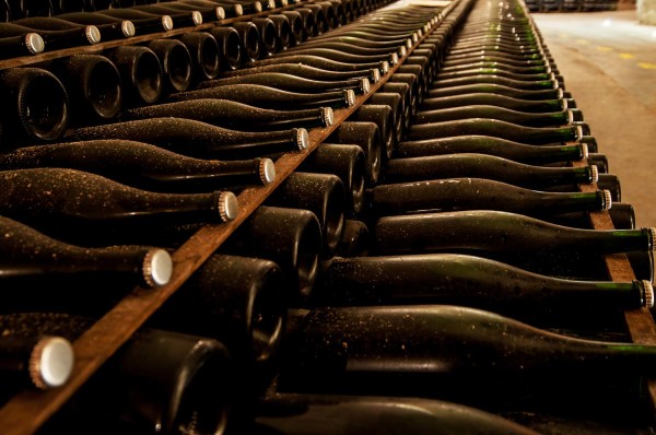
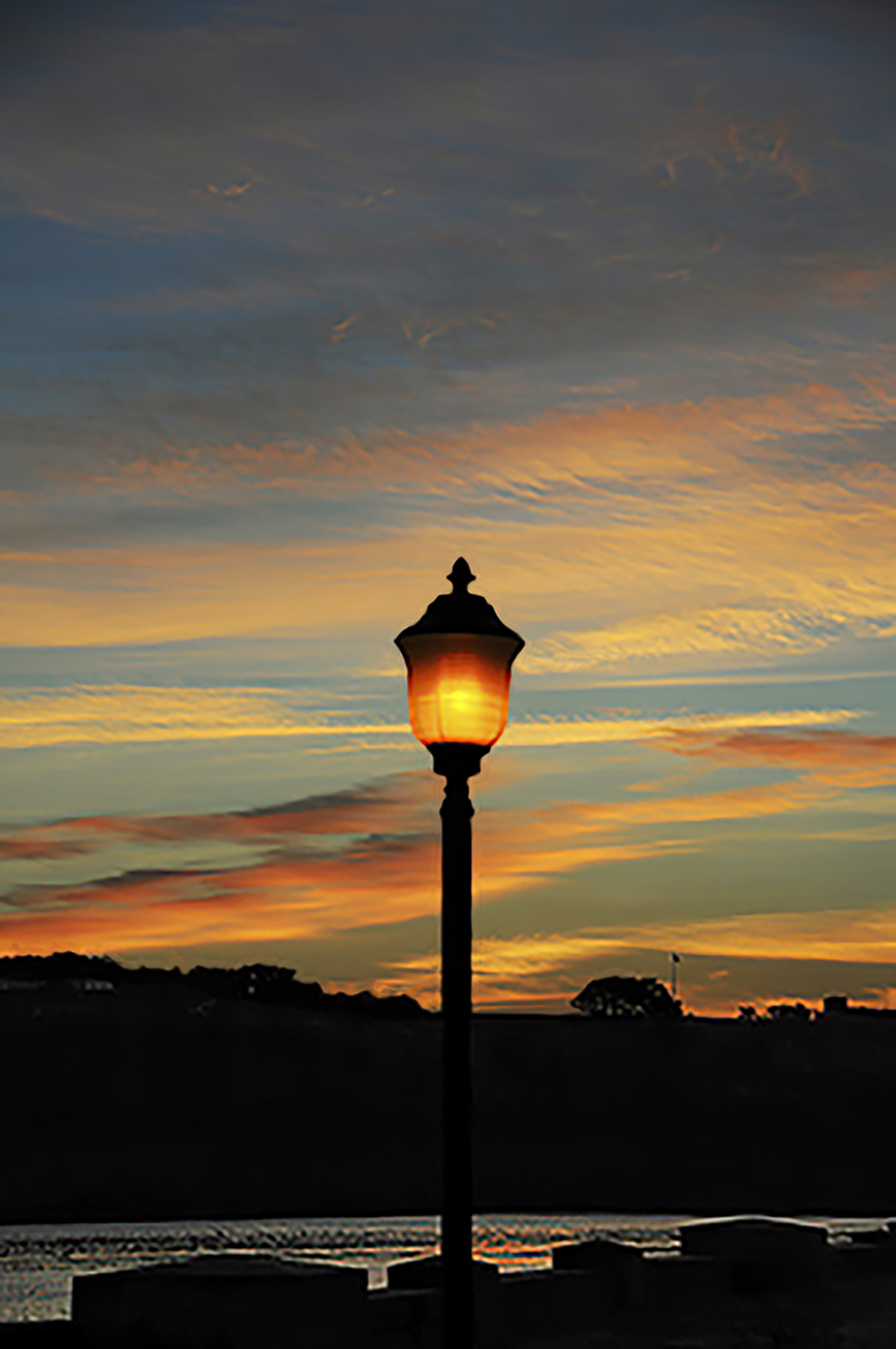
If you’re only interested in selling prints, then the subject matter should be generic in nature. In other words, color photography of land or seascapes, flowers, abstracts, or B/W editorial or photojournalism. Of course any of the areas I’ve mentioned can also be shot in B/W.
If you’re interested in being hired to shoot editorial, corporate, or advertising photography, then it’s very important to be able to shoot people. People like to see people in photos, and for an editor, art director, or graphic designer to hire you you need to be good at what’s called Lifestyle Photography.
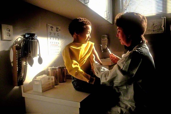
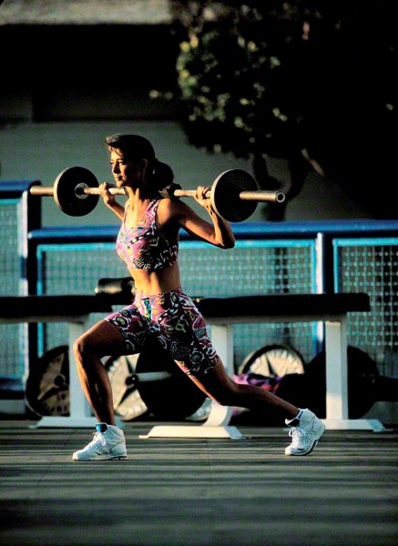
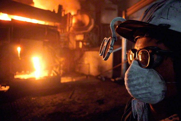
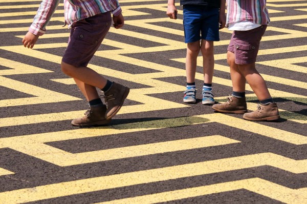
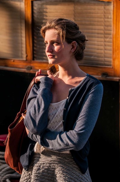
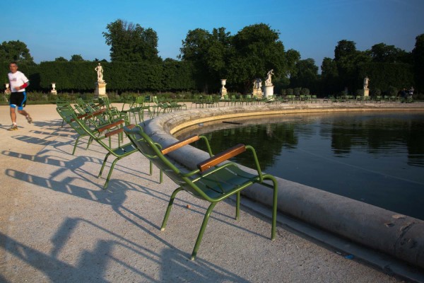
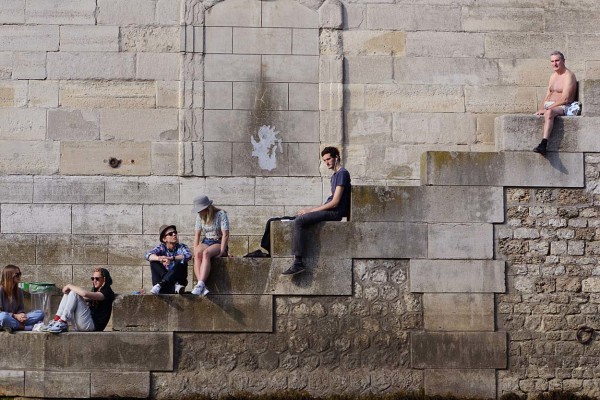
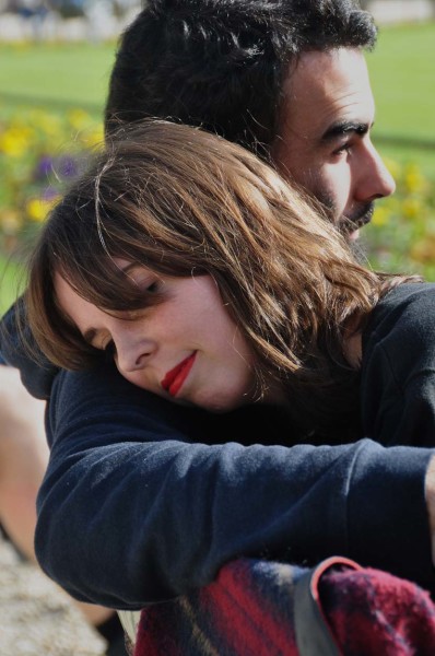
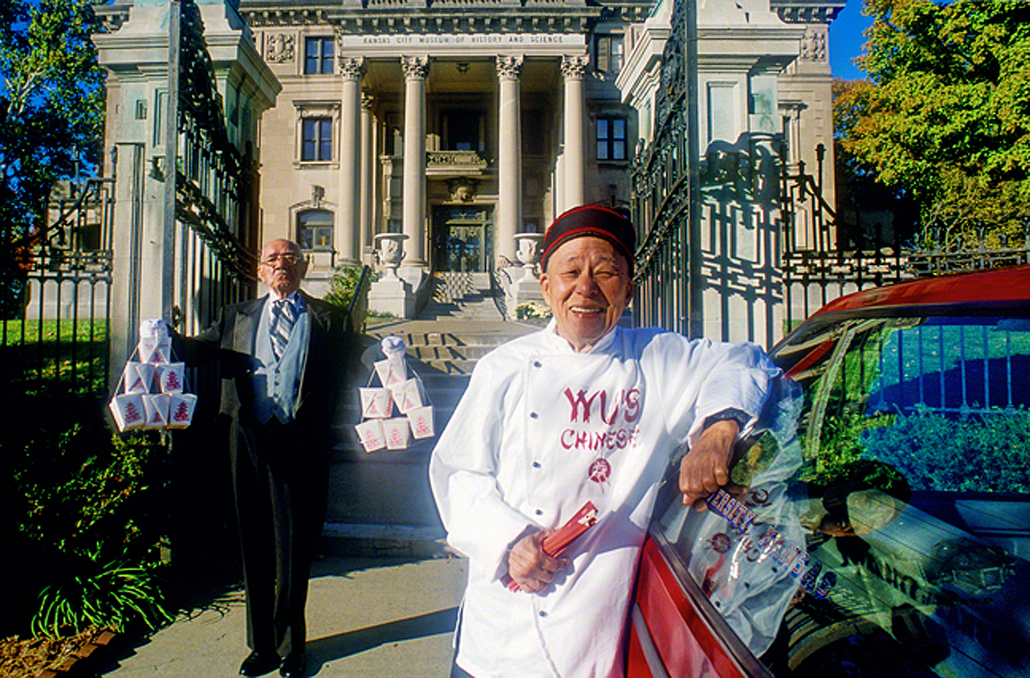
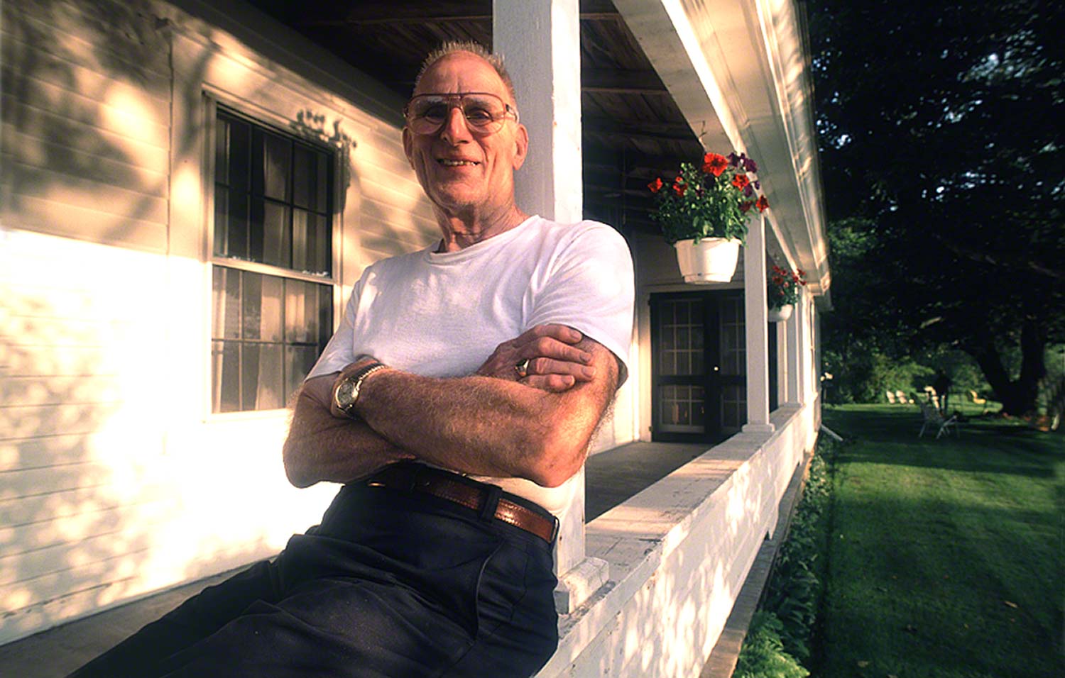
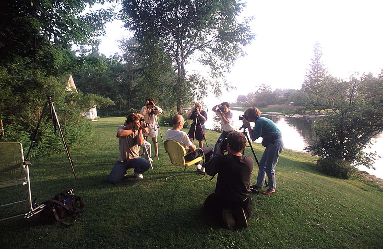
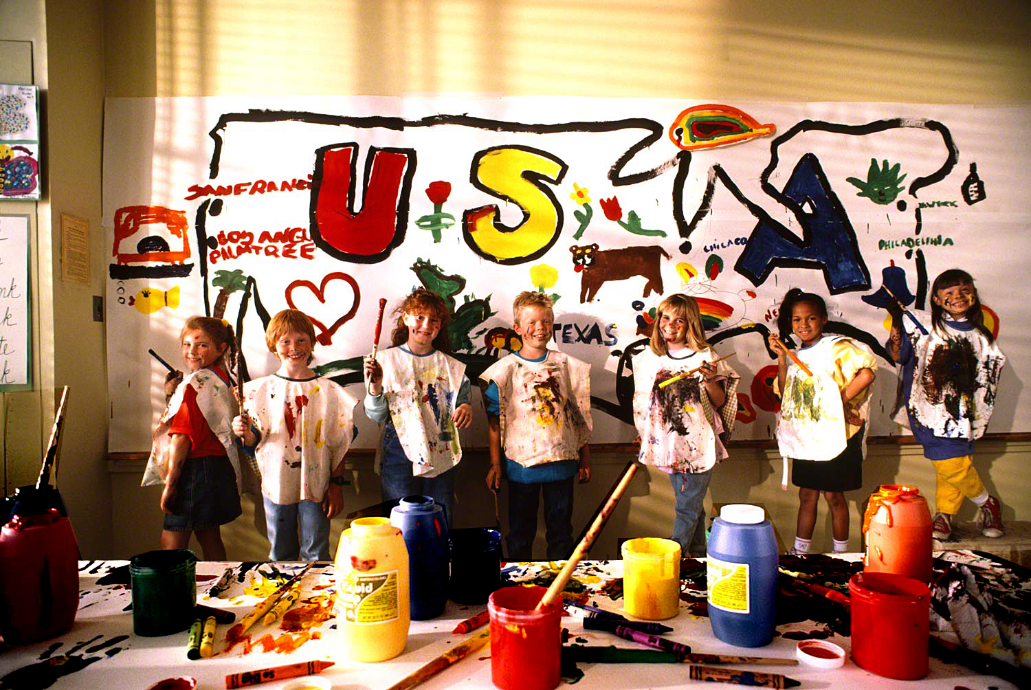
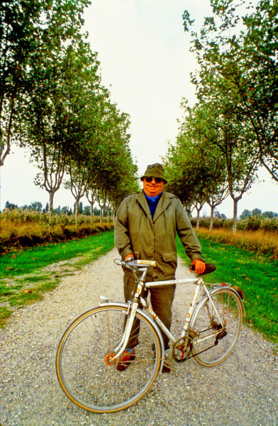
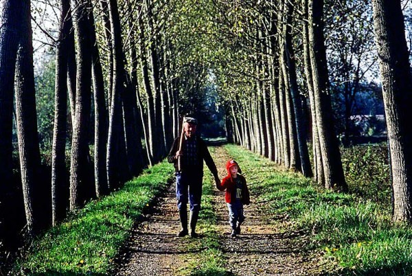
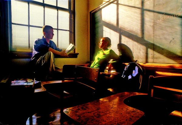
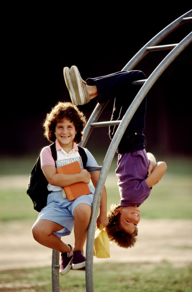
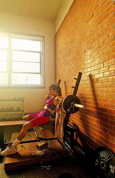
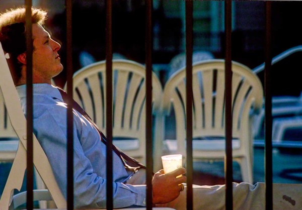
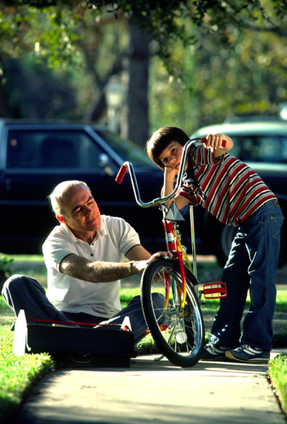
Lifestyle was one of the areas I was best known for back in the days when I was shooting for all three of these avenues. It’s about capturing people in everyday life. Situations that are common to the people that will be looking at your pictures. Situations that they are involved in every day of their lives. Needless to say these Lifestyle photos need to be shot by portrait or people photographers and handled in an artistic manner.
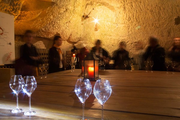
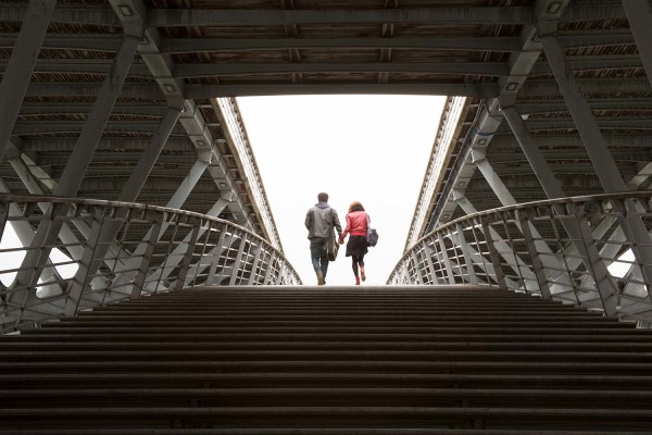
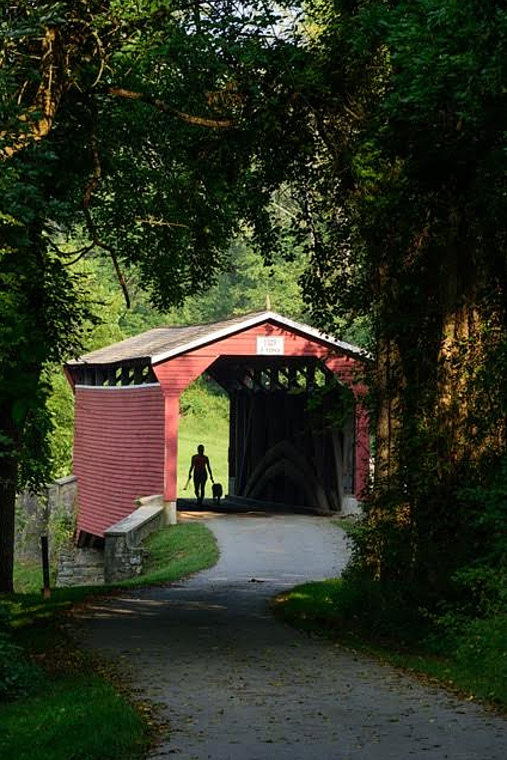
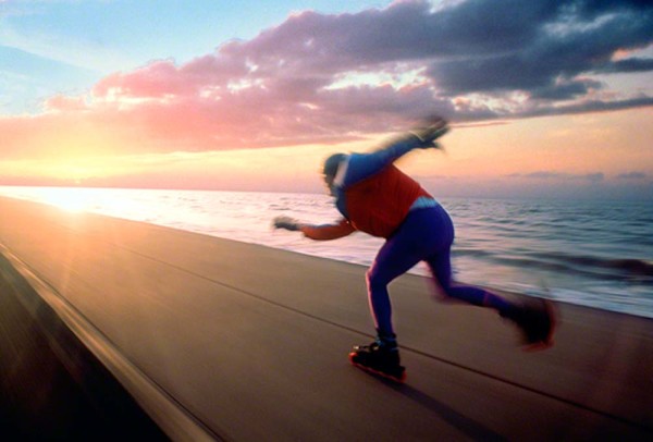
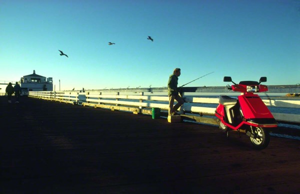
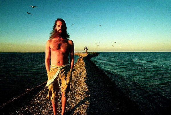
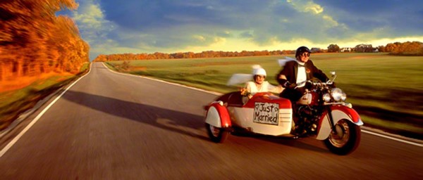
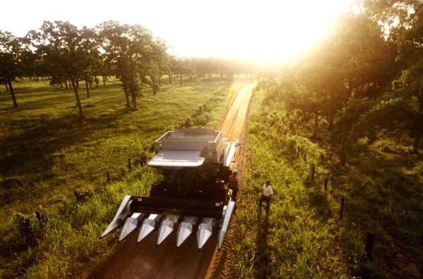
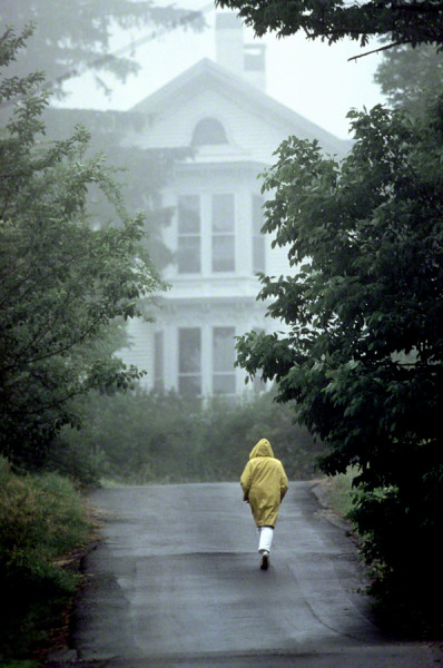
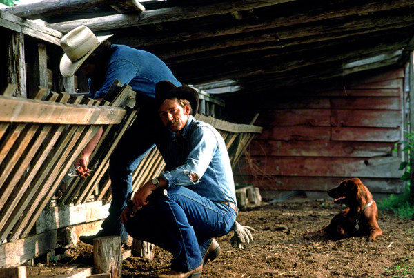
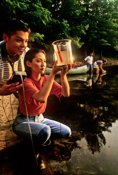
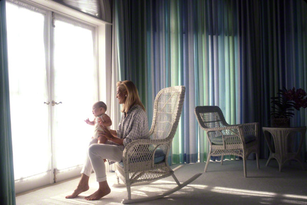
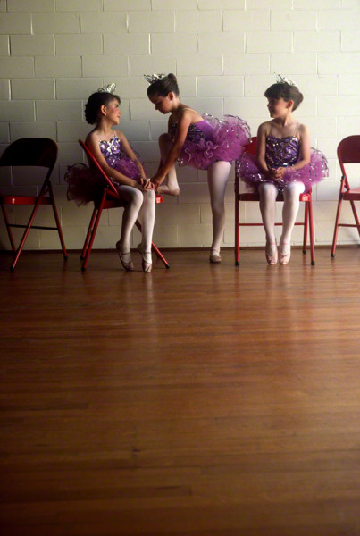
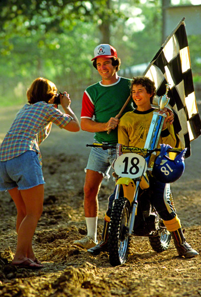
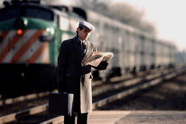
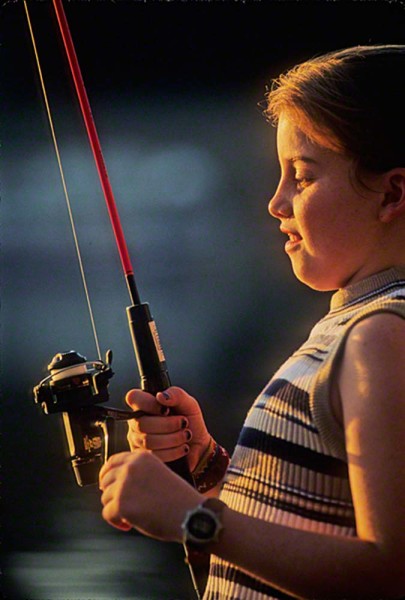
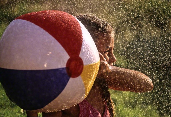
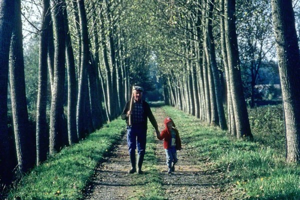
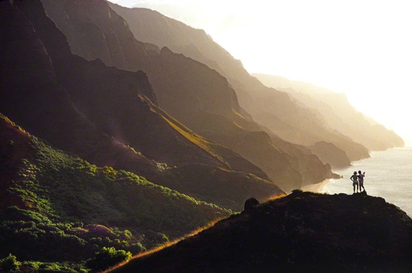
Although Lifestyle photography depicts common everyday occurrences, it would also include those moments that are not seen everyday, but still include people interacting with other people or people being alone with nature. For example a lone cross country skier alone against the elements. 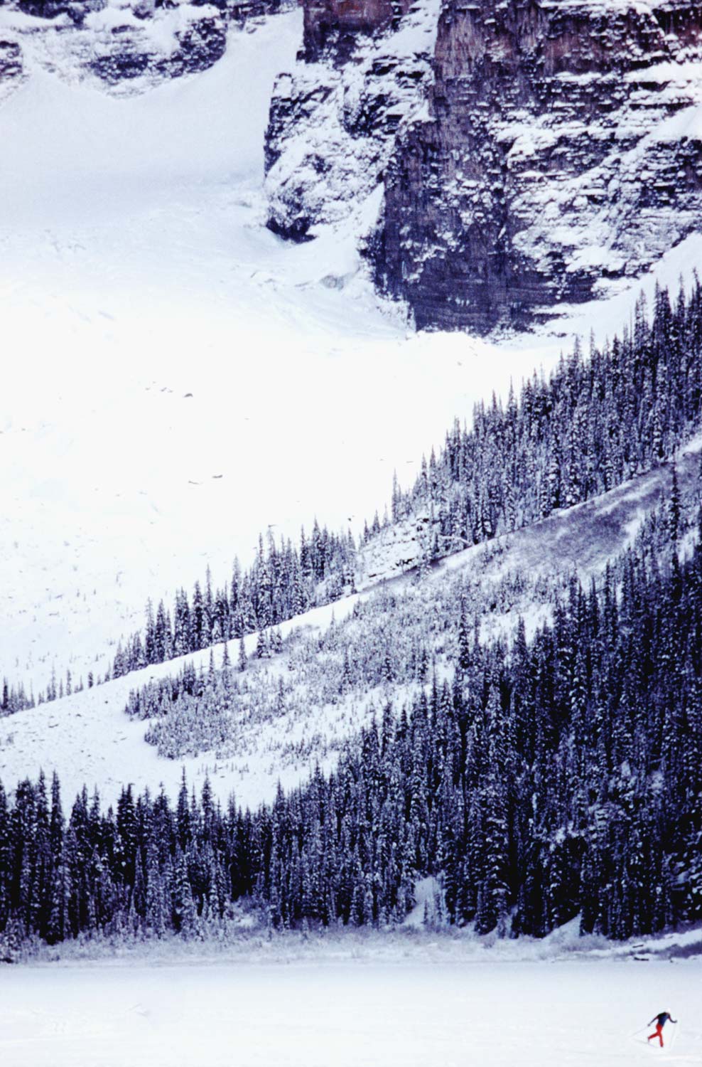
Think of situations that you’ve experienced or seen being experienced by others. Finding these happening in real time…real life may take you a long time to accumulate enough images to put on a site.
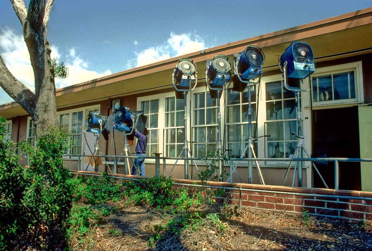
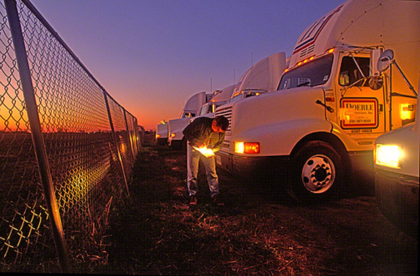
Or, try setting these scenarios up and then shooting in a reportage style. In other words, set up a situation and shoot it as if it were really happening.
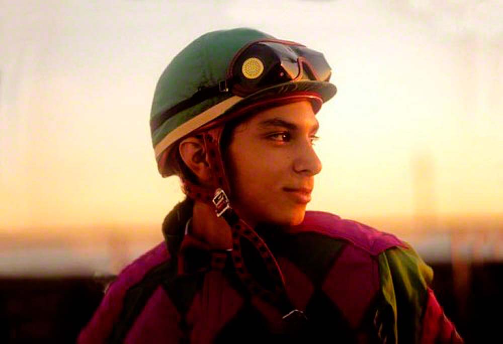
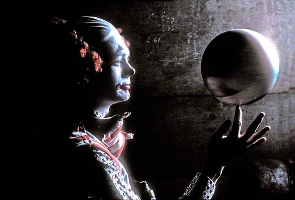
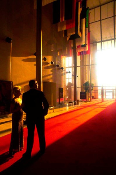
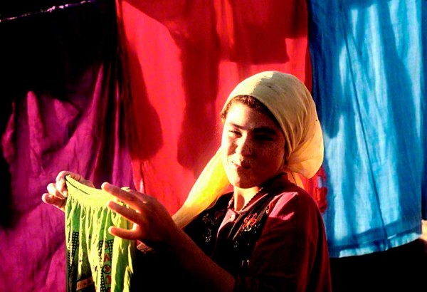
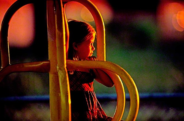
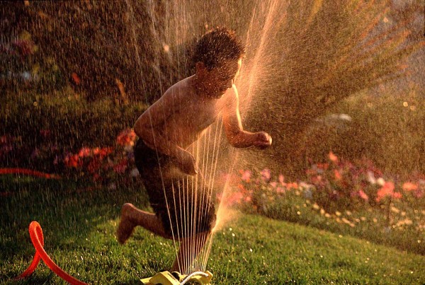
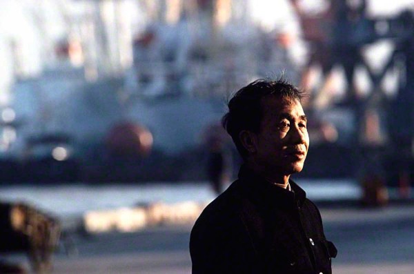
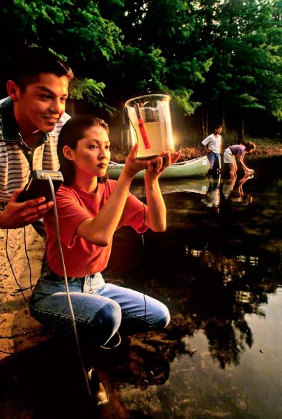
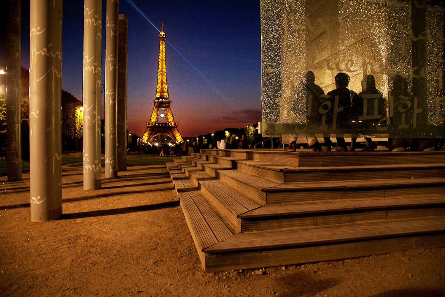
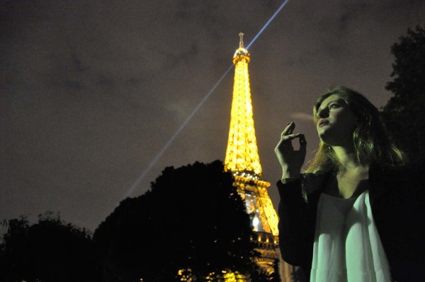
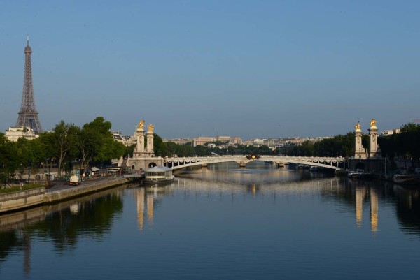
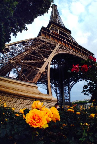
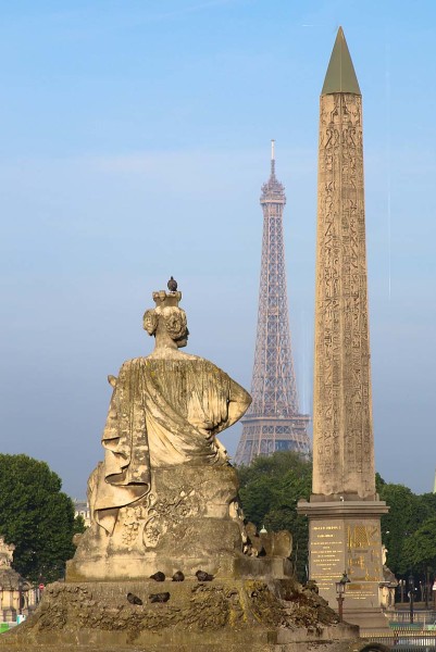
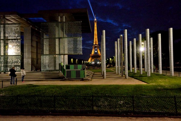
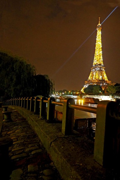
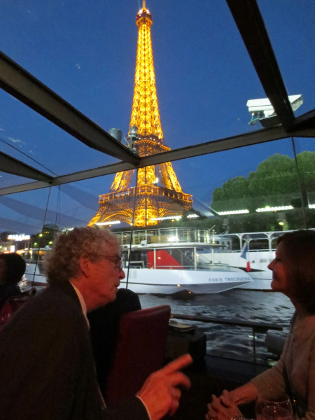
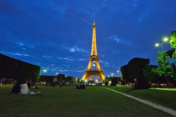
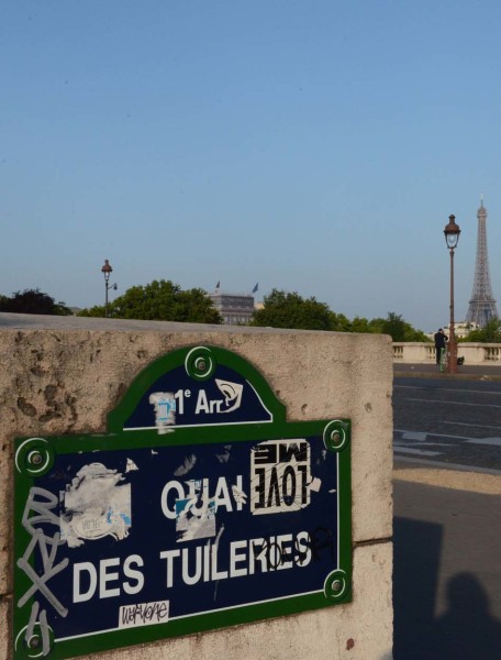
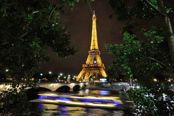
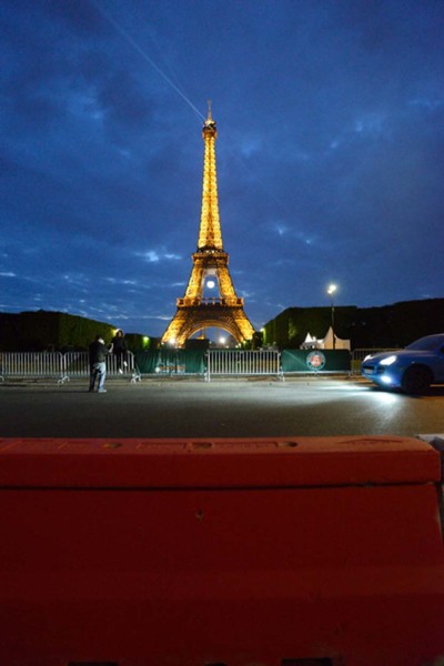
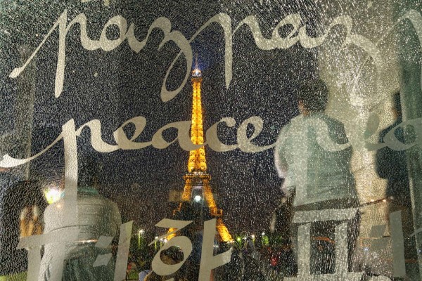
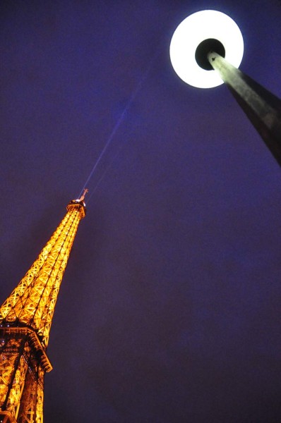
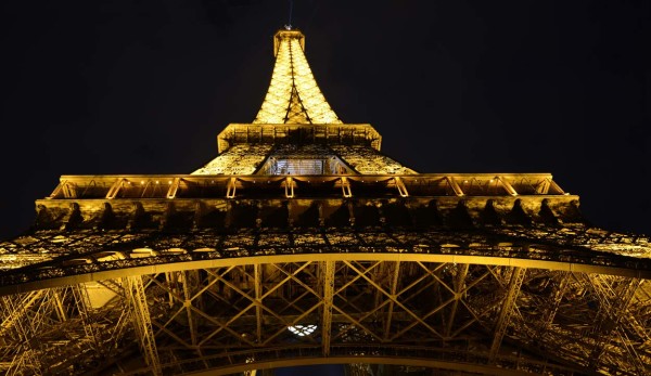
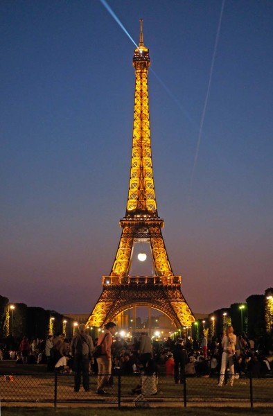
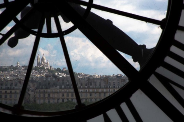
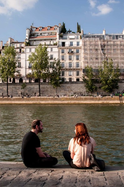
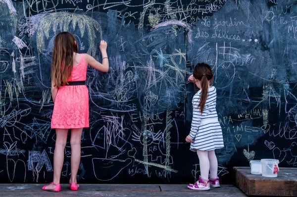
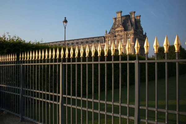
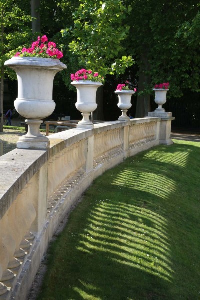
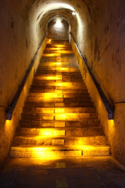
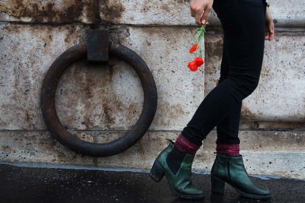
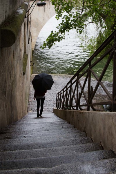
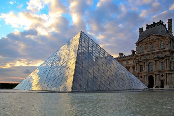
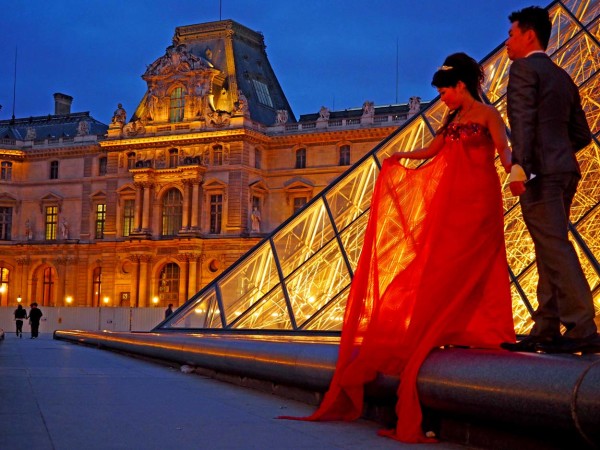
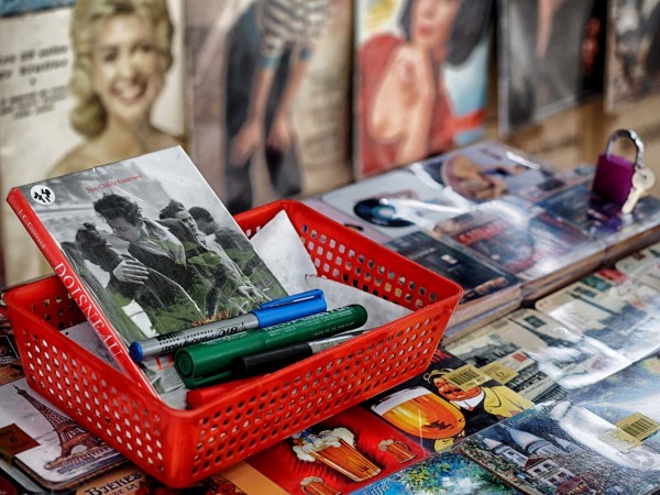
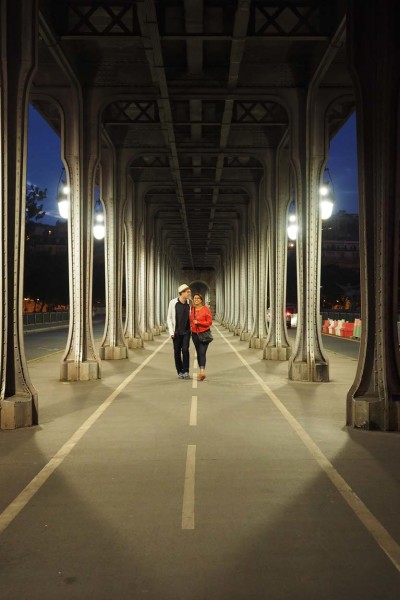
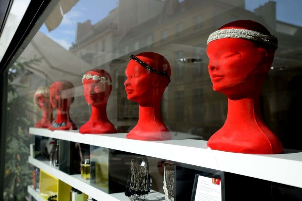
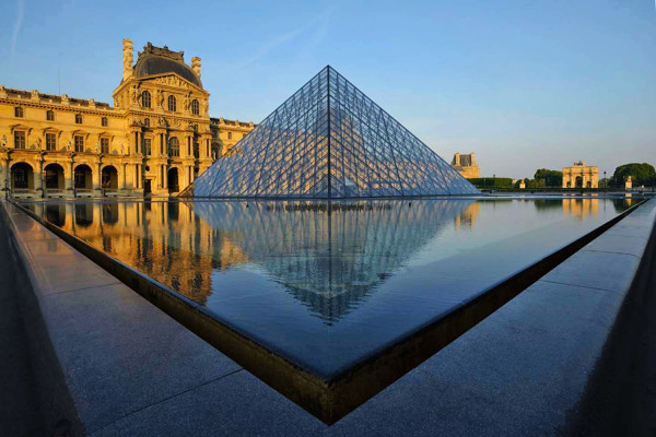
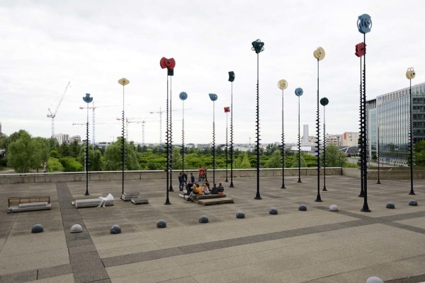
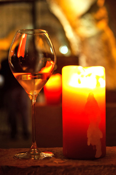
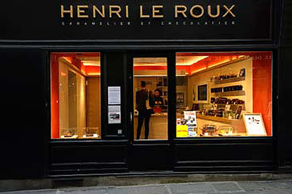
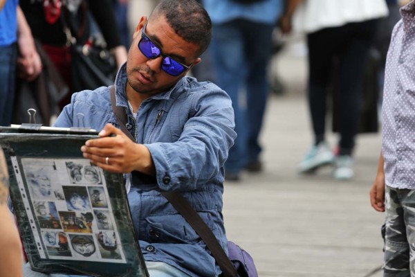
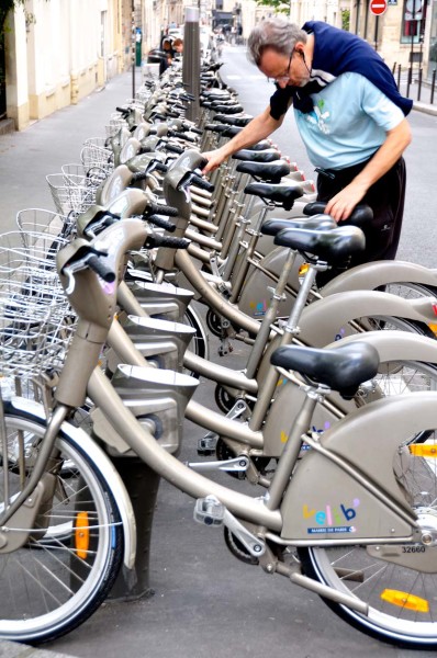
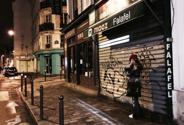
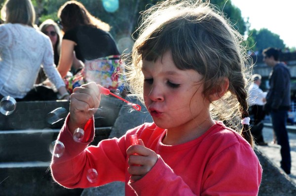
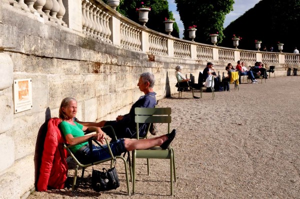
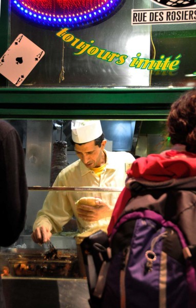
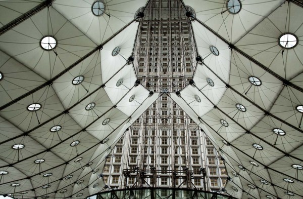
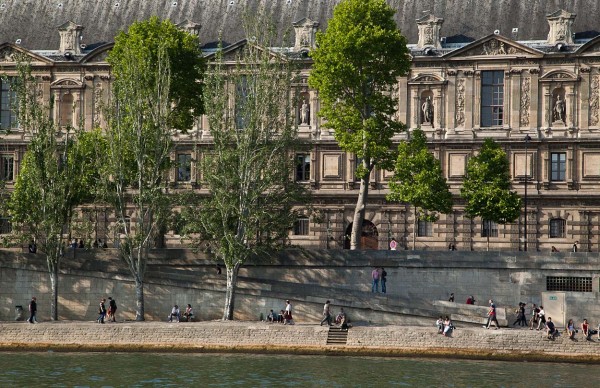
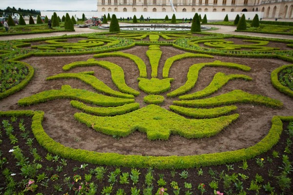
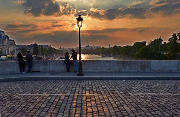
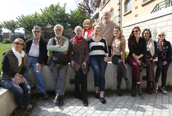
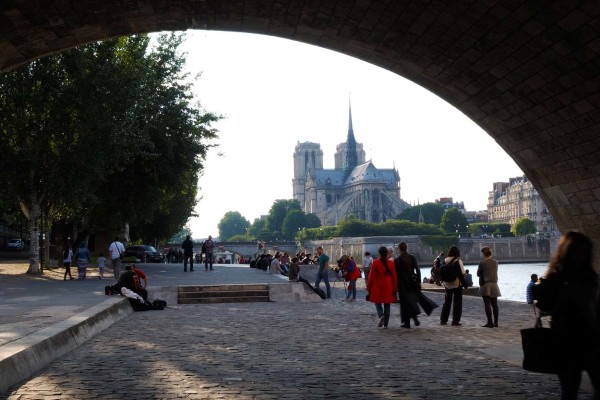
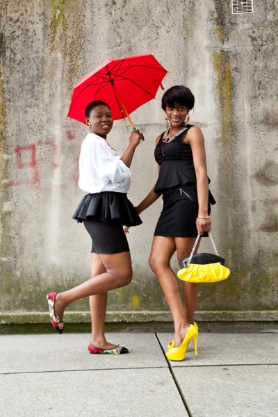
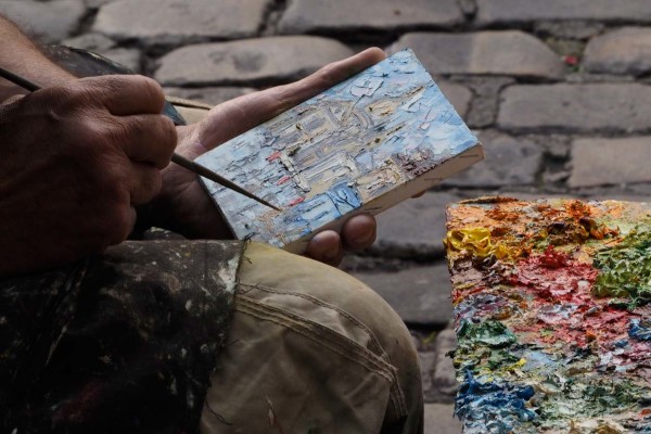
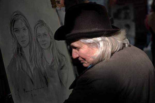
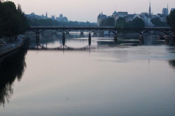
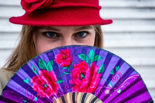
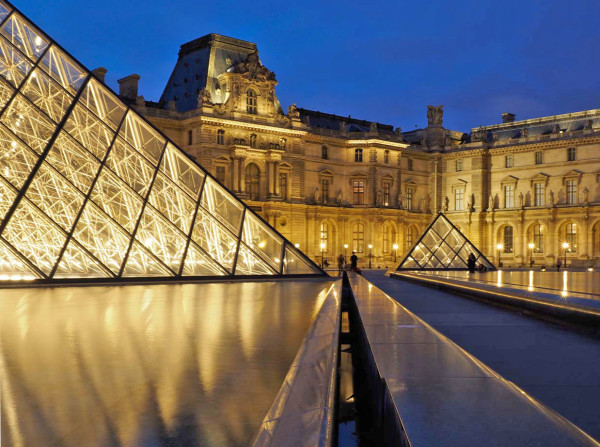
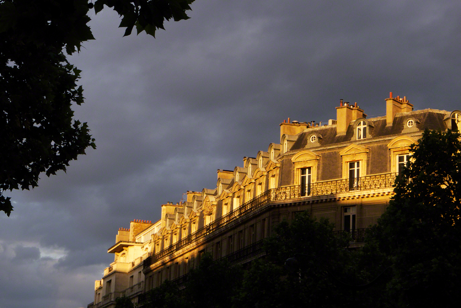
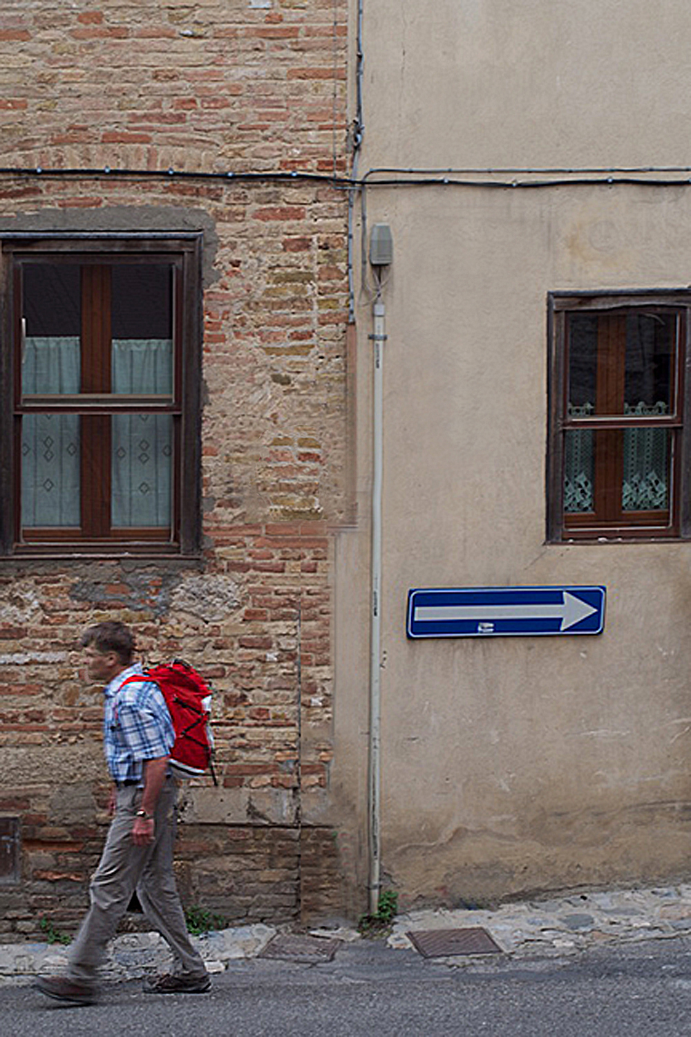
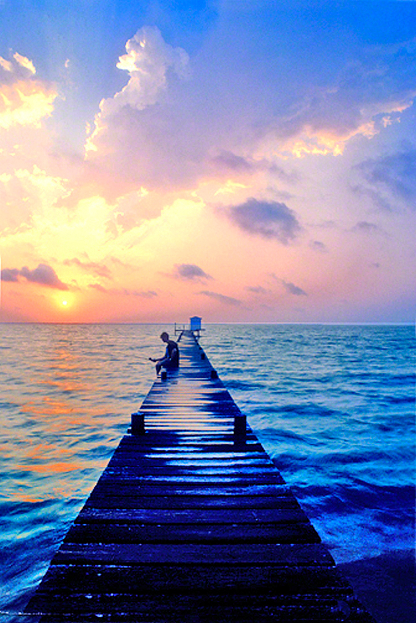
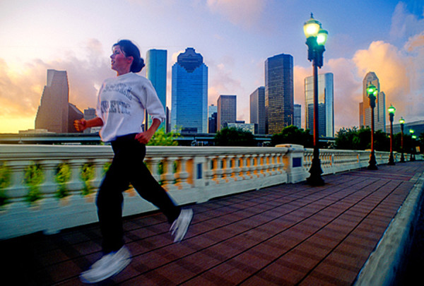
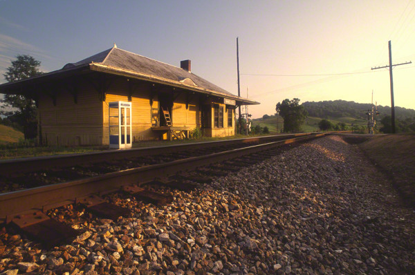
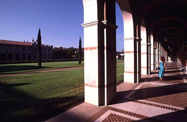
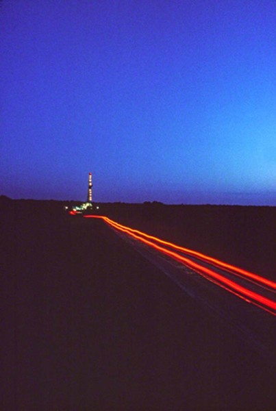
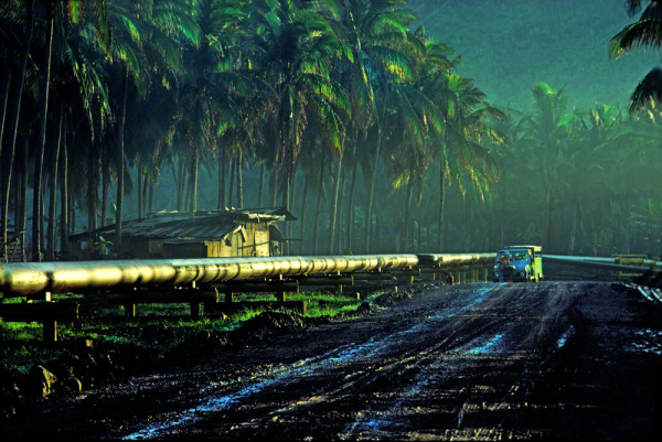
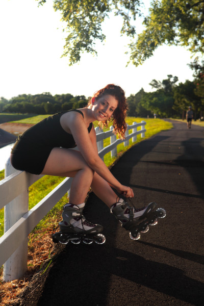
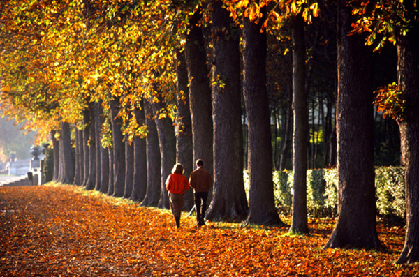
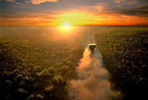
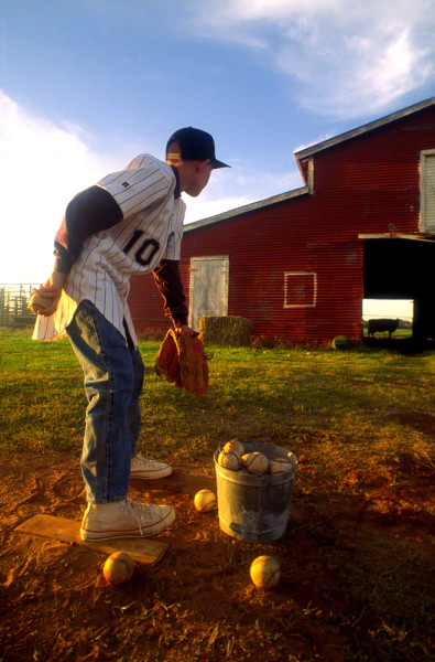
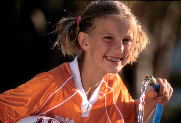
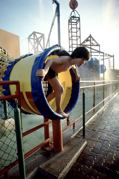
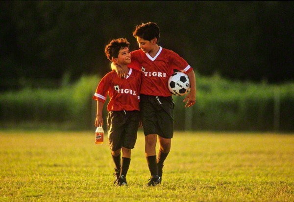
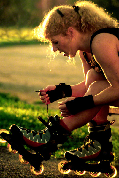
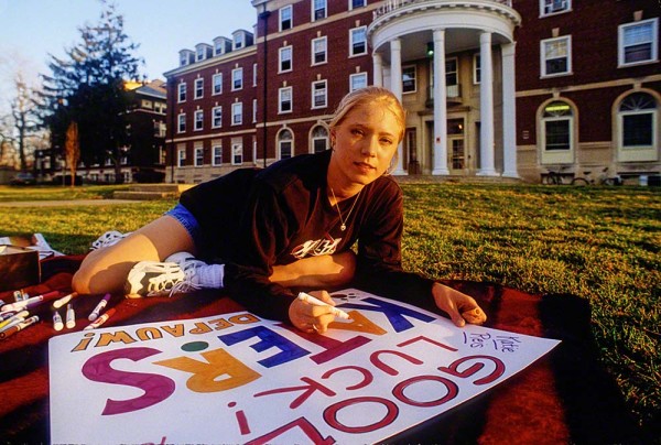
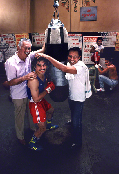
Here’s a few examples of what I mean:


Visit my website at: www.joebaraban.com, and follow me on Instagram: www.instagram.com/barabanjoe. Check out my workshop schedule at the top of this blog. come shoot with me sometime.
JoeB