Look ma, no Photoshop.
I continue my quest to bring to those of you that discovered photography in the digital era, an idea of what it was like way back when. I’m talking about a time when Adobe was a style of house found in the Southwest part of our fifty states. A time when my producer had to drive around to find a phone booth to call me, a person on our crew, a client, a location scout, etc. A time when you had to create images all by your lonesome, and “in the camera”.
Sound scary? Well it was, as I think back about it!!! However, I didn’t know any difference. It was just something you did, and everyone was on the same playing field. Yes, “those were the days my friend, oh yes those were the days.” When I teach my online class with the BPSOP, and I take my “Stretching Your Frame of mind” workshop around the planet, Photoshop is put on hold. We work on getting photos “in the camera”. I don’t mean to suggest that I never use Photoshop because I do. I just love the ‘content aware’ tool!!!
The challenge for me and one I ask of all my students is to be able to get as much as you can without the use of Photoshop. If there’s one thing I’m sure of in this “crazy mixed up world”, is that it will make you a better photographer, and that’s my goal. I’m not interested in my classes becoming better computer artists, just better shooters.
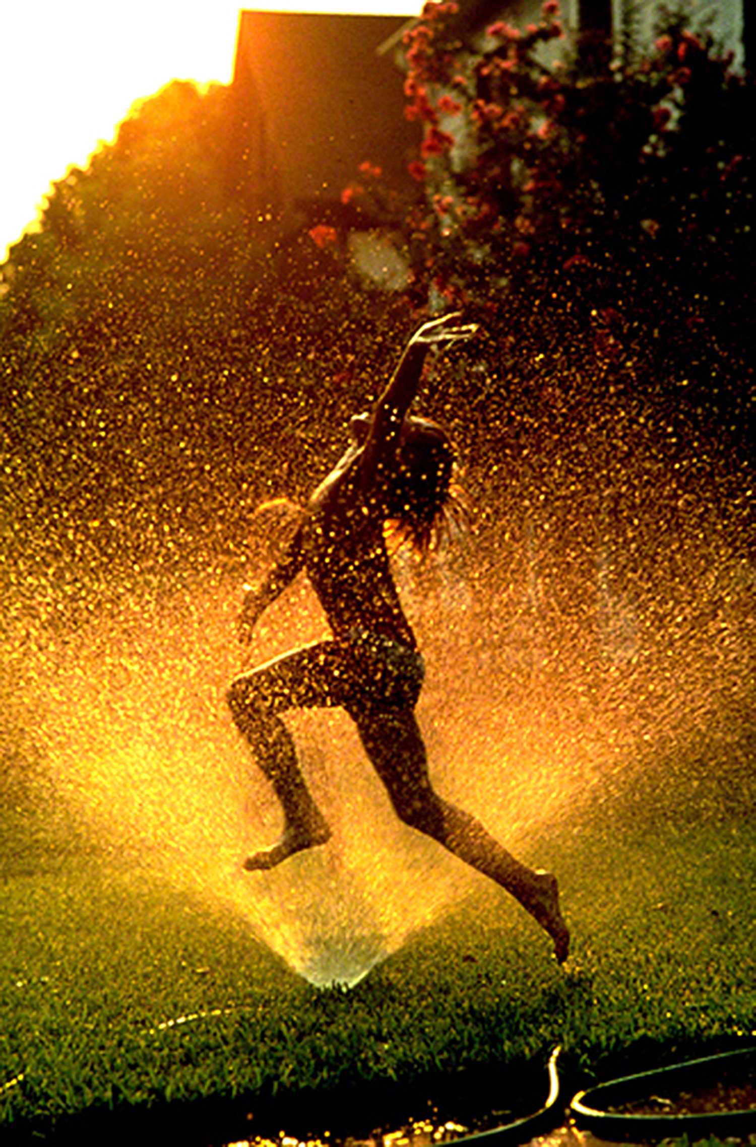
I was shooting a campaign and a series of posters for Prince, the makers of tennis equipment, and the campaign was called, “Let the games begin”. It was about what people will go through to become better players; aside from using Prince’s equipment. The photo above was taken in Santa Barbara, California, and I had scouted several locations with my Sunpath chart and my Morin 2000 hand bearing compass. I knew from those readings that the sun would hit this location at sunset. I stood where I was going to place the tennis player, took a reading with my compass, and determined that he would get perfect late light.
Since most of the work comes in the pre-production stages of a photo-shoot, I was feeling pretty good about the prospects of coming away with a “keeper”. Now, all I had to do was set up the tennis balls, put the model in the right spot, put the Prince blue bag as far away as I could, and still make the client happy, then wait for the light.
Well, here came Murphy’s Law. You know the one, that pesky law that says, “if anything can go wrong, it will. If there’s a possibility of several things going wrong, the one that will cause the most damage will be the one to go wrong.”
So, you’re asking yourself what could have gone wrong? Well imagine everything set up perfect, the late sun shining low and bright, and a Santa Anna wind coming up from nowhere and blowing every tennis ball off the court. Can you imagine? Well, I can tell you that it was just about the last thing that was on my mind, but that’s exactly what happened.
What did I do back then without the help of Photoshop? I did what I had to to make it work. I had everyone grab some Duct tape, tear off several thin strips and secure every ball to the court. So every ball you see has two pieces of very strong sticky tape under it.
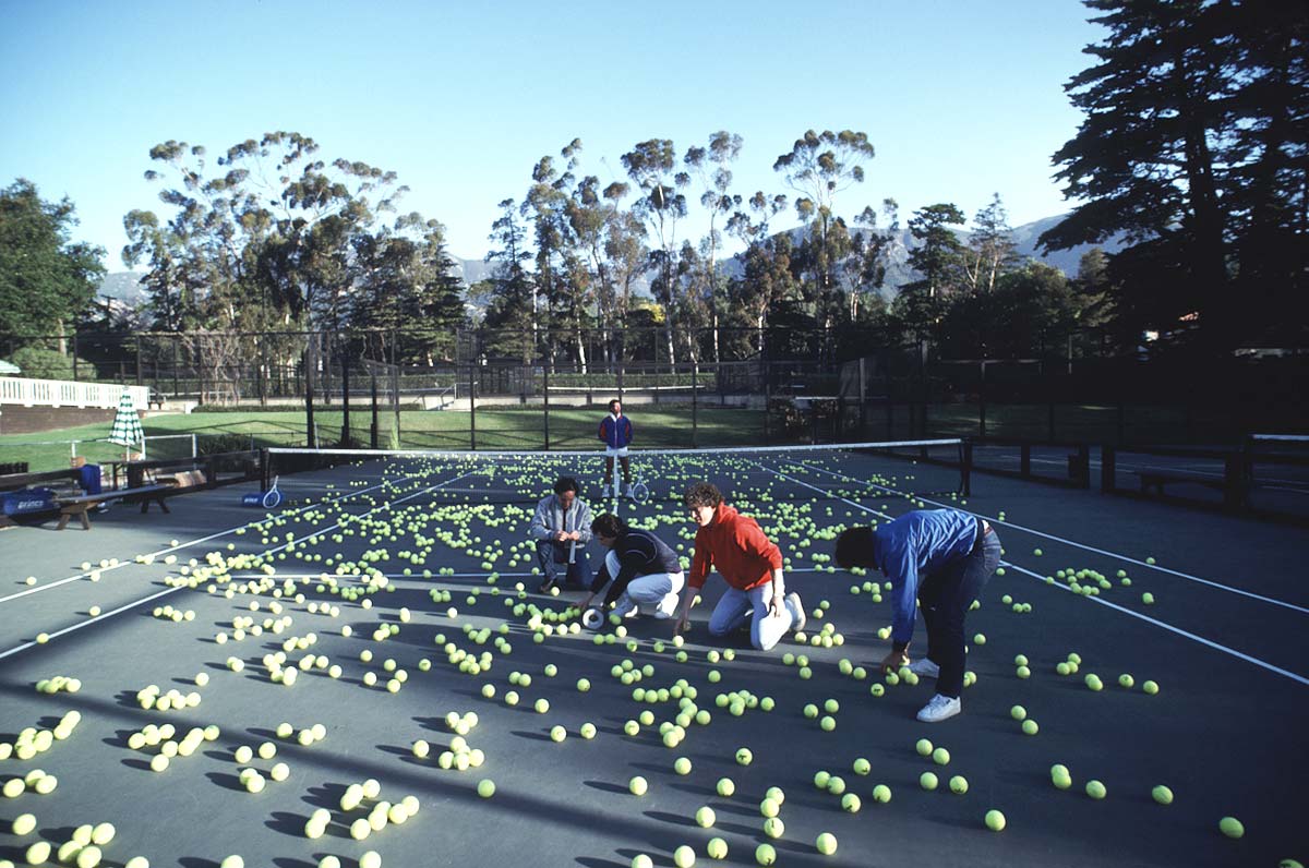
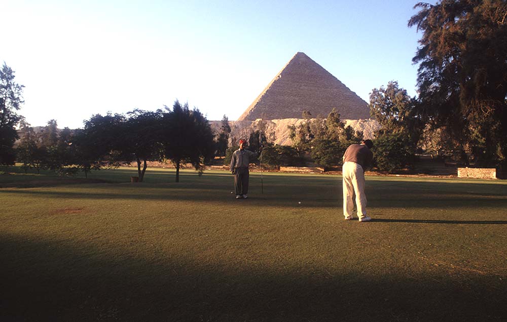
This is what people look like when they’re taping tennis balls to the court.
“Oh yes, those were the days!!!
Visit my website at: www.joebaraban.com and follow me on Instagram: www.instagram.com/barabanjoe. Watch for my workshop schedule I’ll post at the top of this blog. Come shoot with me sometime and listen to a million stories just like this one.
JoeB