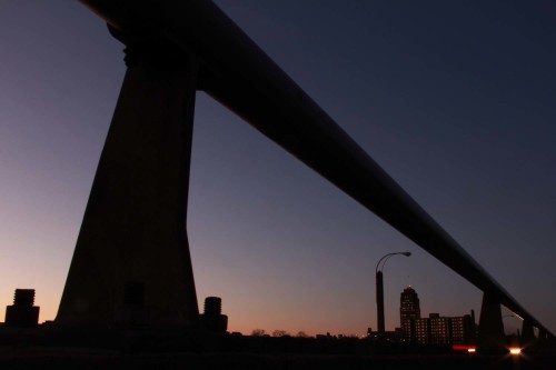
Daniel sent me this photo and asked me for “my thoughts and a critique”.
I usually get more of a description and a question associated with it, but since it’s a fairly straightforward image, I can still write a critique.
The first thing I want to discuss is one of the biggest areas of concern I have in my online class with the PPSOP, and in my “Stretching Your Frame of Mind” workshop I conduct around the planet, and that’s about exposure. For some unknown reason, my fellow photographers trusts what the camera tells them as far as what exposure to use. In my opinion, that’s one of the worst things you can do, and Daniel’s photo is a good example. It’s so underexposed, that I can’t figure out what the meter was telling him. I could be dead wrong, but if I had to guess, I would say that this was probably the only exposure taken of this composition. If you look at the top left side of the frame, the structure doesn’t really stand out against the sky until you almost get to the middle of the frame. Also, the color of the sky and horizon appear to be muddy and not a pure value of said colors.
I can’t tell you how many students of mine have no idea what shutter speeds and aperture settings are. They’ll go their entire life and never know because they let the camera do their work for them. I would not be shocked if I told one of them to put their camera on manual, and set the camera on 1/60 at F/8 and they just looked at me with question marks in their eyes…now that’s scary!!!
If you’re shooting for yourself, then it’s not going to be a problem since you were there and saw it the way it really was. If you’re shooting so other people can enjoy your work, then I suggest you learn what’s the right exposure to use for every photo you ever take. When I tell you that it will make you a stronger photographer, take it to the bank.
But I digress.
Ok, back to the photo. In my classes we spend a great deal of time working on balance and using negative space to define the positive space. In Daniel’s image if you look at the building on the left side of the structure, the negative space around it clearly defines it. If you look at the building just to the right of the same structure, a viewer won’t know where the left side ends and the object begins. It’s not a “quick read”. If you look way over to the right, the building is defined on both sides.
I like the strong diagonal line that almost cuts the frame in half. Line is the most important of all the Elements of Visual Design. Although there are many kinds of lines, the three basic ones are: Vertical, Horizontal, and Diagonal. Diagonal lines have more energy and visual tension that the other two. The reason is that it’s the anticipation of the diagonal lines falling forward that gives them the additional energy and tension.
I’m not sure what the red and white things at the bottom right corner are but I would have liked to see more of them; to add another layer of interest. The more the viewer discovers in our imagery, the longer he’ll stick around…and that’s exactly what we all want…that is if we’re shooting for other people.
Thanks for sending it to me.
Visit my website at: www.joebaraban.com, and be sure to check out my 2013 workshop schedule at the top of this blog. Come shoot with me sometime.
Don’t forget to send me a photo and question to: AskJoeB@gmail.com.
JoeB


