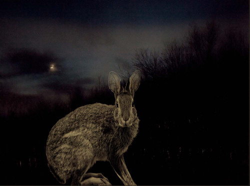
I recently had a fellow photographer submit something a little different than the usual photos I received to critique. It’s not something i will usually talk about since it’s not a pure photograph, but a montage. I found it quite interesting in the sense that being an art lover, I like looking at all kinds of different genre.
As usual, I like to show the actual question for those of you that have been in a similar situation, or have had similar questions. Here’s what Yvonne had to say:
“Dear Joe,
As a painter turned photographer, I finally needed some touch-of-the-hand. I think of the montaged part as drawing on top of a photographed image But, an unexpected weakness appeared. They look cheesy really easily.
Not all in the series are montages. I like the mixture in a single series. Many are diptychs. Yes, I’m after an emotional tone in the straight photos and I expect to add little more in the montages than a figure and an ambiguous point of view.
Well, I bow to your critical comment. This title: Your Voice is Mine, from the series Chokeberry Sugar. My question: How do *you* see the image? Thank you, Joe. It would be important to me to hear what you think of it.
Very best, Yvonne, Warwick, NY”
Yvonne,
As I said, this is not what I usually receive, and it’s not what I ever critique since I’m not a student of this particular genre. That being said, I can only comment on what I see and feel as someone that loves looking at art. However, I can comment on some of the areas that I teach in my online class with the PPSOP, and in my “Stretching Your Frame of Mind” workshops I conduct around the planet.
The first thing i want to say is why so dark? I realize that you’re trying to seduce the viewer via mystery and drama, which is a very good thing. To me, it’s important for the viewer to be able to see it so he or she can realize any kind of emotion you are obviously trying to portray. If it were me, I would have more contrast between the sky and the trees; that would add more (visual) tension…as in some of the scenes in old Beula Lagosi as a vampire and Lon Chaney as a werewolf movies.
Btw, those movies scared the daylights out of me when I was a kid.
I would have moved the rabbit over to the right, so there was black negative space defining the top of his head instead of it running into the trees in the background. I would have also shown the rabbit’s front feet instead of cutting them off. Speaking of the area on the right, you could have eliminated a lot of it by making this montage more of a vertical. You could almost divide this in half and say the same thing.
Besides that, I don’t feel like it’s cheesy, and you’re right…it can very easily. That’s probably the main reason why I usually don’t like a montage. There’s a certain degree of taste that I like about it. I love the tack sharp texture on the rabbit. Texture is one of the basic elements of visual design, and used correctly can take our art what I refer to my students as “up a notch”.
Thanks for sharing it Yvonne.
Visit my website at: www.joebaraban.com and be sure to check out my 2013 workshop schedule at the top of this blog. I’ve recently added the Julia Dean Photo Workshop, I’ll be teaching at next October so for those of you in the LA area, come shoot with me. If you click on the above ad, it will take you to my description.
Don’t forget to send me a photo and question to: AskJoeB@gmail.com.
JoeB


Hello Joe!
I would love to take your class at the Julia Dean but it is just a little too expensive for me. The rabbit photo is kind of haunting. Not sure if that was the intended effect they were going for!
Gary,
Perhaps another time. I would have liked to meet you.
JoeB