I teach three classes online with the BPSOP. My Part I and II classes deal with the elements of visual design and composition, and my third class is on the six concepts in the psychology of Gestalt. I also work on these in my “Stretching Your Frame of Mind” workshops I conduct around our planet.
One of the six concepts is called Figure-Ground, and to master it is to take your imagery what I often refer to as “up a notch”.
Figure-Ground refers to the relationship between an object and its surroundings, or background. Do you see the figure in front of you or the background? There are times when it’s easy to pick out the figure, which is the object (the positive space) from the ground, which is everything else (the negative space).
There are also times when it’s difficult to pick out the figure from the ground, so it’s important to keep a balance between the Negative and Positive space as well as making the figure a “quick read”. In other words, be sure to make a clear distinction between the figure and the (back) ground.
I typically like to have the subject (figure) stand out and be clearly defined. In these situations, I want the ground to support the figure. I can do this controlling my depth of field by using a longer lens with the widest aperture; focusing solely on the subject.
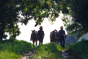
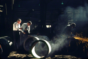
The use of contrast by either placing a dark objects against a lighter background or light objects against a darker background are two ways. I can also separate the figure from the Ground by the use of color and size.
If you’ve ever read anything about Henri Cartier-Bresson, you would know that he used Figure-Ground all the time when creating his photographs. In fact, he was a master at it.
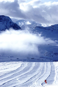
Another use of Figure-Ground is to create the feeling of the figure being small and alone. By making the ground the overwhelming part of your composition, this message will come across to the viewer.
An interesting bit of trivia is the intentional modification of the Figure-Ground that comes in the form of Camouflage. This is when we want to blend the figure and the ground together. Strange as it might sound, Grant Wood (as in the famous painting called American Gothic) helped develop the camouflage used during World War I.
JoeB


