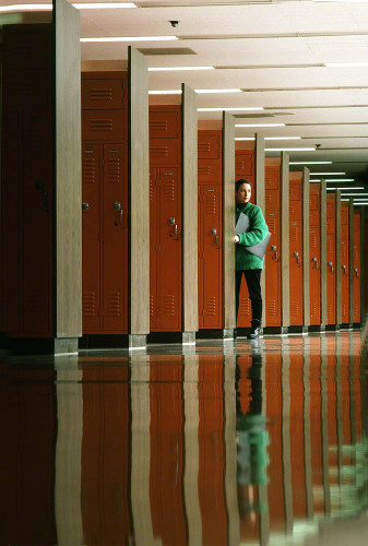
In my online class with the BPSOP, and in my “Stretching Your Frame of Mind” workshops I conduct around the planet, we work on using the Elements of Visual Design and composition to take our photos what I always refer to as “up a notch”. One of the basic elements of Visual Design is Pattern.
Patterns are repeating elements of line, shape, and color that appear in ordinary ways. The four basic shapes are triangles, squares, rectangles, and circles. When lines, shapes, and colors within a picture occur in an orderly way, they create patterns that often enhance the attractiveness of photographs. Creating your pictures around repeating elements or patterns provides picture unity and structure. Pattern repetition creates a rhythm that the eyes enjoy following.
When used as a subordinate element, they can greatly enhance your composition. They should only be used to strengthen or add to your photographs. Patterns can provide unity to your composition. They create a sense of visual rhythm that the eye can easily follow. Life is filled with patterns and once you get an eye for spotting them you’ll be amazed by what you see and you’ll wonder why you didn’t incorporate them into your photography before.
Broken patterns break the rhythm and are often more compelling than unbroken patterns. Think of a close-up of hundreds of M&M’s on a table. They are all red except for one green one. I’m always looking for patterns as well as all the elements on my Artist Palette. Whenever possible I try to find ways to break the patterns by incorporating some object or person…Why?
Because it will give the viewer one more thing to discover and think about, which will keep him/her around longer. Isn’t that just what we want?
Visit my new website at: www.joebaraban.com and check out my workshop schedule at the top of this blog. Come shoot with me sometime.
JoeB


