Student Work: Colors and Letters

A blue 'P'.
A blue ‘P’.

Until the passing of the founder ?Bryan Peterson, I taught a four week online course with the BPSOP, and I also conduct my “Stretching Your Frame of Mind” workshops around the planet. I teach people how to incorporate the elements of Visual Design into their imagery.

I will often my fellow photographers an assignments to work on for a number of reasons. One of the areas we cover is to “see past first impressions”. To see more than meets their eye, and to focus their attention on finding certain elements that are readily available and all around them. This exercise will help them down the road to either see things occurring naturally in nature, or to use their imagination in creating photos that  represent ideas.

What I assign to each of my students is a color and letter to either find or to create. The color and letter should be one in the same, and should be what I always refer to as “A quick read”. In other words, they won’t be around to explain what their color and letter were so the viewer needs to pick up on it right away. They could either find it happening in nature, or create it using their imagination to “Stretch Your Frame of Mind”.

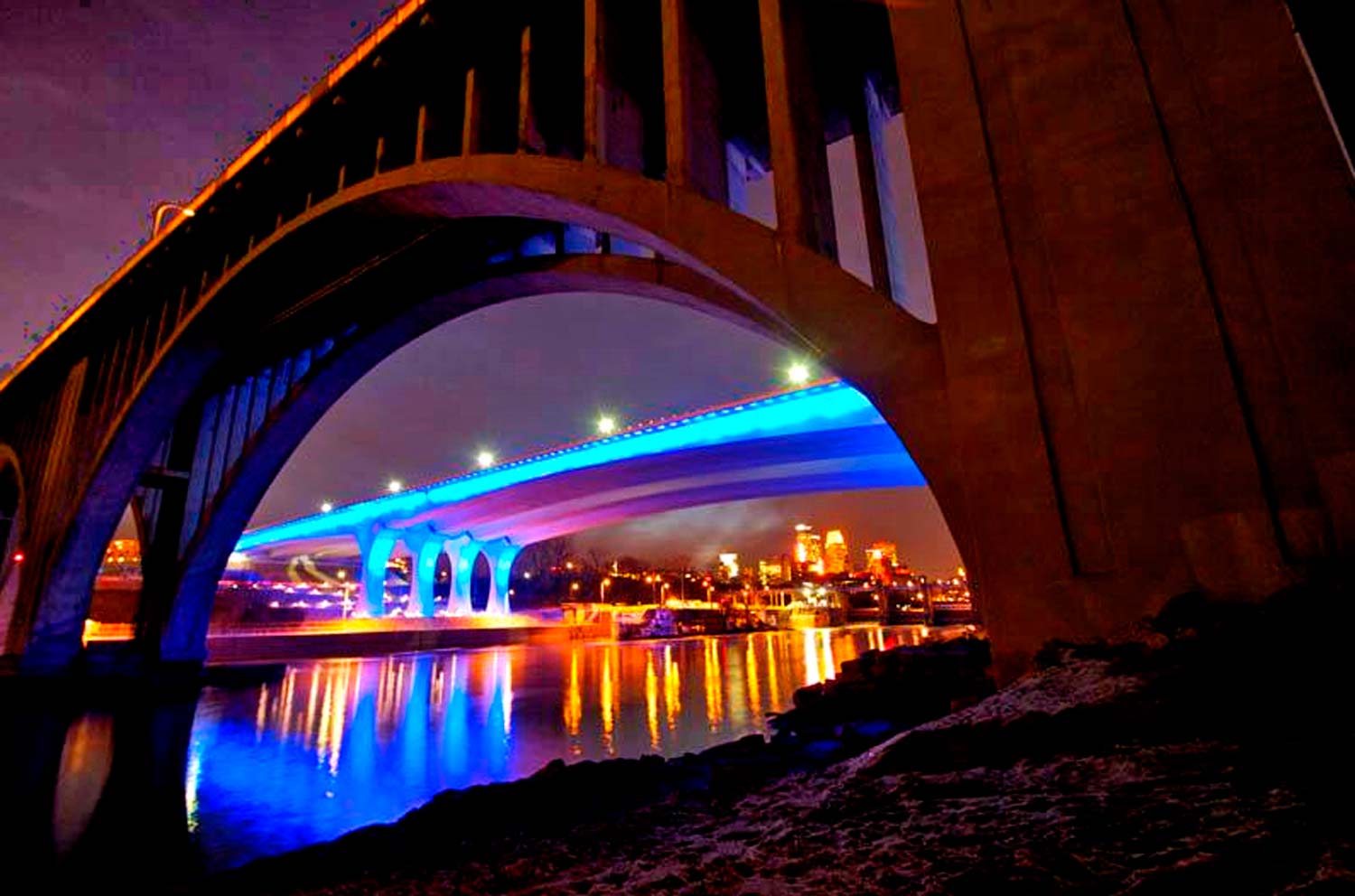
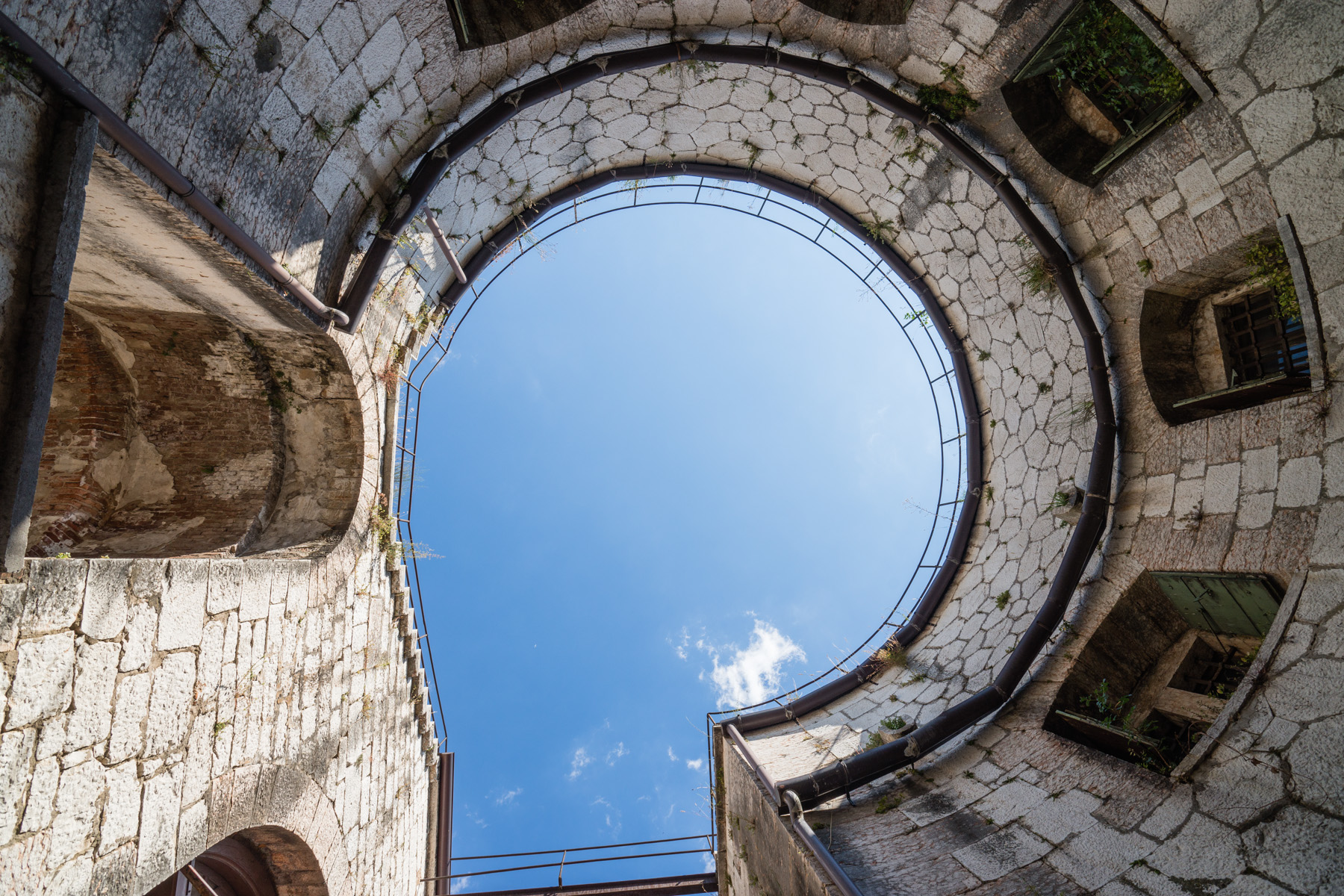
I want my students to realize that there’s two ways to look at everything. The left brain sees things as they are. A tree is just a tree, a bridge is just a bridge. In the above photo, the photographer’s left brain ( the analytical side) saw it as an opening to the sky in the middle of an old building in Europe. She was able to click off the left side and click on the right side of her brain…the creative side. Then, she was able to see her color and letter…a blue ‘P’.

Pretty impressive!!!

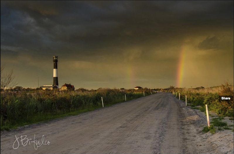
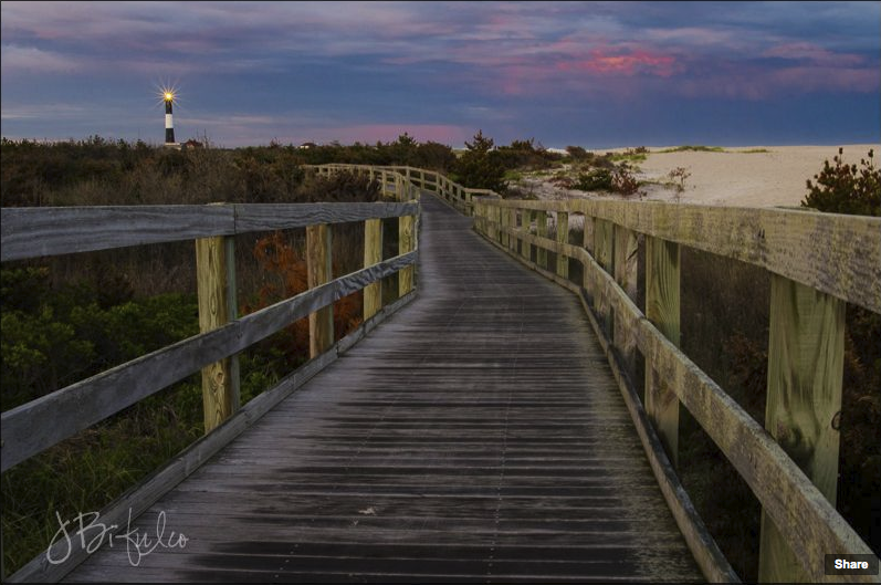
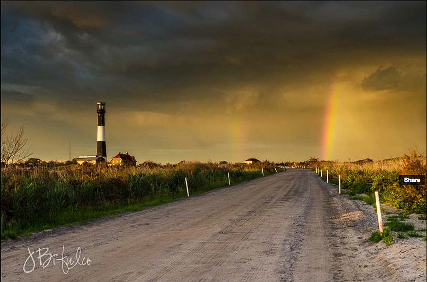
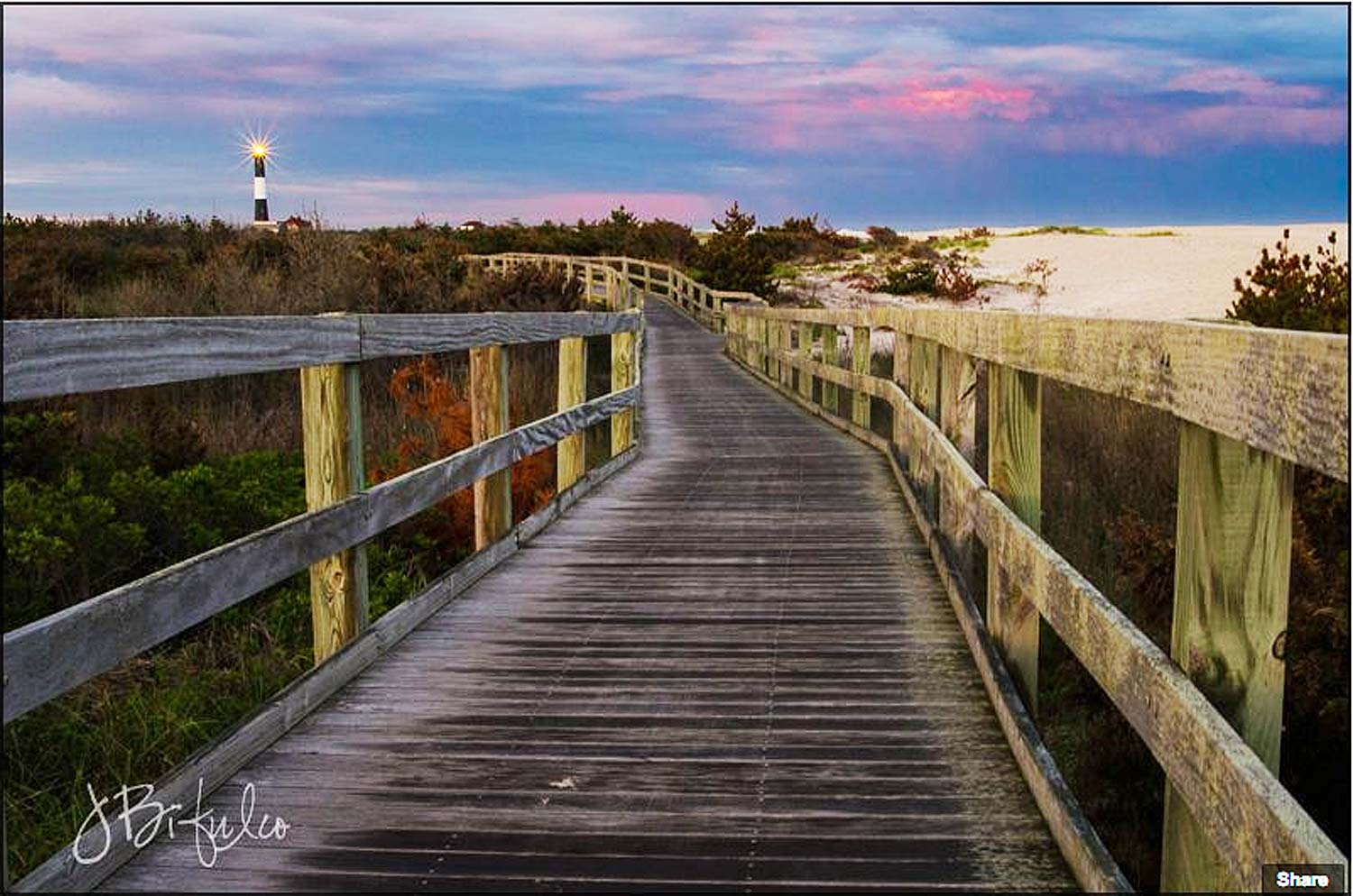
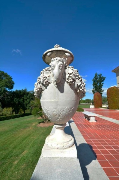
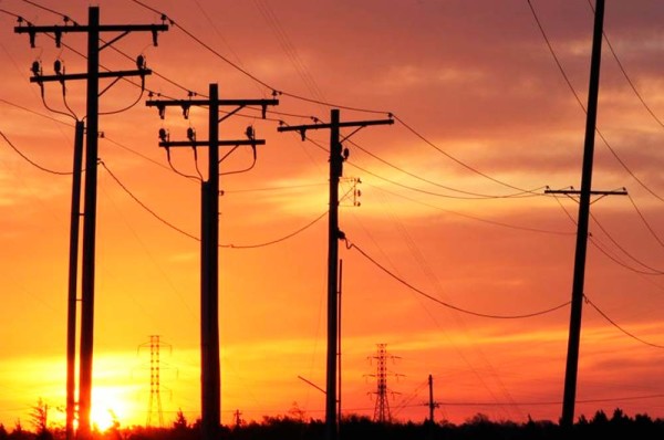
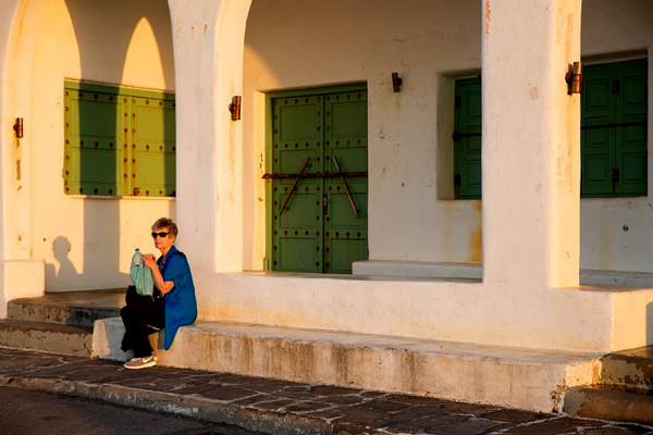
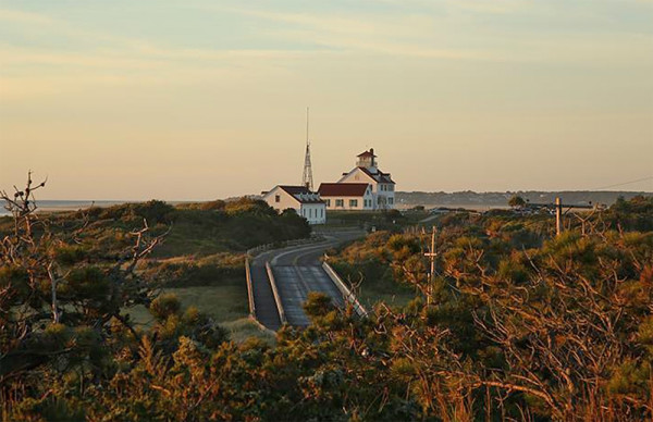
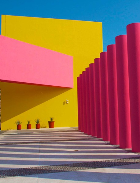
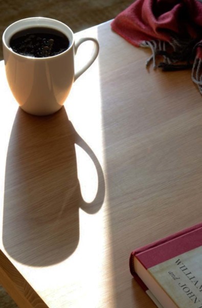
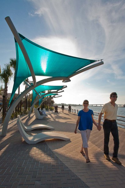
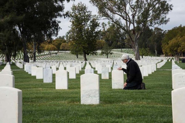
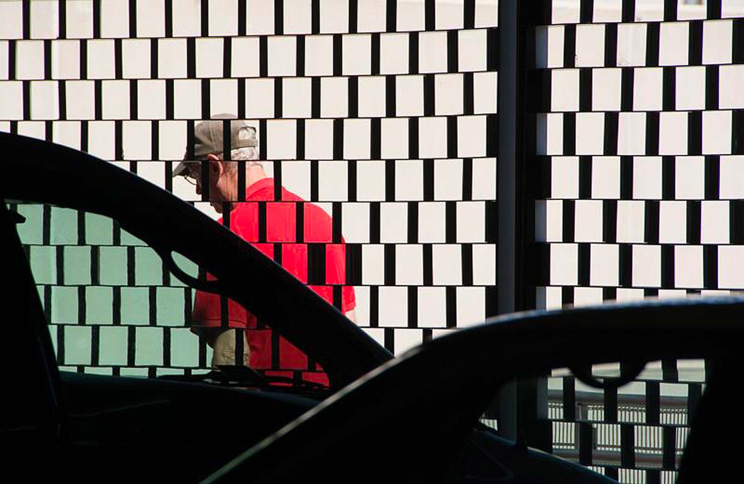
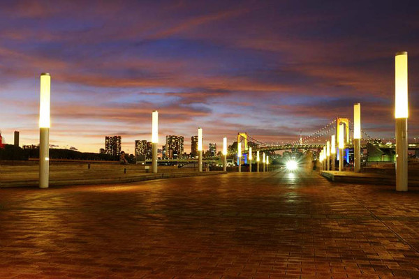
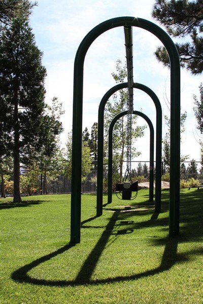
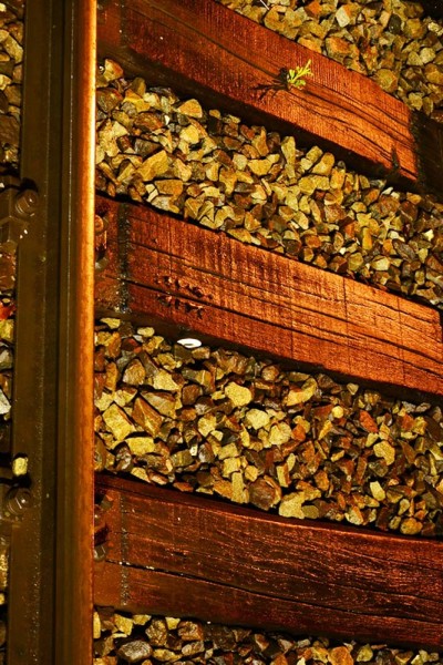
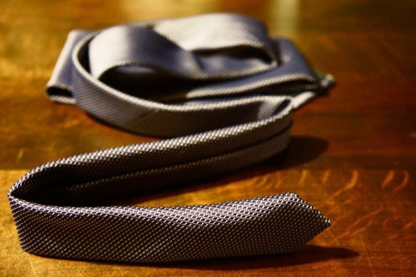
Here’s some of the ones that made it to my “Hall of Fame”.

Enjoy the show:

Visit my website at: www.joebaraban.com and follow me on Instagram: www.instagram.com/barabanjoe. Check out my workshop schedule at the top of this blog. Don’t forget to send me a photo and question to: AskJoeB@gmail.com for a video critique.

JoeB

Student work: What Do You Think?


Underexposed?
Underexposed?
Underexposed?
Underexposed?

Jean was one of my students that had taken my online class with the BPSOP before it shut own due to the passing of the founder Bryan Peterson.

She sent me this photo to talk about. As usual, i like to copy what every photographer had to say since so many have experienced the same situation or problem at one time or another. Here’s what Jean had to say:

Hi Joe!

I don’t think I will ever take a serious image again without hearing your words in my head about vanishing points, line, color, tension, etc.

I took a ride out to Robert Moses Park and Lighthouse in between rainstorms and had the good fortune to be there as a vivid rainbow appeared as the sun was beginning to set.  I am pretty happy with these two photos, but I really want to know what YOU think.

Thanks, Joe!”

Sincerely,

Jeanne

Hello Jeanne, ok, let’s talk about them:

First let’s talk about exposure and how important it is to bracket. In my “Stretching Your Frame of Mind” workshop I conduct around the planet, I’m always talking about how important it is to bracket, and bracket manually; in the camera…Why is it important when you can lighten or darken things later in front of a computer?

Because it will make you a more rounded and stronger photographer, not a better computer artist. By bracketing yourself, you’ll gain knowledge in shutter speed/aperture relationships and learn to see, sense, and feel the light around you…especially when it changes. One day you’ll be able to stand there and know by instinct what exposure is going to be the best, whether it be under or over exposing what the camera has told you what was the on reading. To me, being in control and doing things myself is a lot more gratifying than having some software do it for me.

I say all this because both of your photos are underexposed and to me hides how well done they are.

Take a look at them now:

Better exposure?
Better exposure?
Better to see the Vanishing Point?

The photo with the rainbow is one of those times that doesn’t come very often, so when it does, be ready to act fast. As Eddie Adams said, “When you get lucky, be ready”.

It’s a great photo, but to me there is too much road and not enough of that tension filled wonderful ominous sky. The road is just a road, with little redeeming qualities about it except of course the obvious one…it creates a Vanishing Point that leads the viewer to the point on the horizon and the remarkable payoff.

Having said that, you would still have the Vanishing Point if you raised your camera up to get more sky and less of the road.

In the second photo, you have also created a Vanishing Point that takes the viewer on a ride to the horizon and lighthouse. As you remember in my classes, the more ways we can lead the viewer around our frame the better. By doing this we make him an active participant and make him work a little…exactly what we want him to do.

You have also designed the composition as to include a couple more elements from your ‘Artist Palette’: The use of Negative space to define the railing and all the rectangular shapes created when the Negative Space defines the different parts.

Nice photos Jean and thanks for sharing them.

Visit my website at: www.JoeBaraban.com and follow me on Instagram: www.instagram.com/barabanjoe. Check out my workshop schedule at the top of this blog. Come shoot with me sometime

JoeB

Student Work: April PPSOP Class.

Peter shot this all in the camera on a rainy night.

I’m especially proud and impressed by the number of really good photos from this class. It was a great four weeks, and every day I saw in all my fellow photographer’s work how much their thought process, their approach to “making not taking pictures”, and how their eye was progressing.

Before Byron Peterson, the founder of the school…the BPSOP passed away this last year and still in my  “Stretching Your Frame of Mind” workshops I conduct around the planet, I taught and still teach people how to incorporate the Elements of Visual Design into their photography. I also show them how to use other important elements such as the silhouette and shadows as two examples. Each week I give out a lesson with two of the elements as their assignment, and I give out a video critique for each one photo submitted to me.

I call it my Artist Palette, and after the end of both my part I and part II, their Artist Palette is filled with: Line, Texture, Pattern, Form, Shape, Negative Space, Perspective, Visual Tension, the silhouette, and  your best friend the shadow.

When you look at the April slideshow, keep in mind that my class is not allowed to use any post processing during the four weeks, so what you see is straight out of the camera.

Impressed? I am!!!

Visit my website at: www.joebaraban.com, and follow me on Instagram: www.instagram.com/barabanjoe. Watch for my workshop schedule at the top of this blog. Come shoot with me. I

JoeB

AskJoeB: San Diego Amusement Park

A skilled student of mine sent me this photo to comment on. Here’s what he had to say:

“Hi Joe,

What do you think about this photo? I took it in San Diego at the amusement park in Mission BLVD.
It was my attempt to play a bit with movement and lights at twilight, and I’ve tried different exposures, in order to get the shutter speed that would have been creatively right for the effect I wanted to achieve.
Color communicating ideas

Ok, first of all, I love the colors. There’s a lot to be said for the study of color theory, and how the different colors have a psychological effect on the viewer.  For example, The blue background is calming, while orange is considered an attention grabber. yellow is cheerful, and red (the most powerful color of all) is stimulating, and at the same time is sexy, occasionally angry, and can sometimes imply risk-taking.

Sad to say, the founder of the school, Bryan Peterson passed away, and the school permanently closed. Before it closed,  I always said to my online class with the BPSOP, and in my “Stretching Your Frame of Mind” workshops I conduct around the planet, Color communicates ideas!!!

When you put these colors together in the form of lines (the most important of all the elements of visual design) and then make them move, the results can be memorable.

Ok, let’s talk about the idea itself:

One of my Personal Pearls of Wisdom is “In a perfect world, what if?” In other words, if you could go back and re-shoot this photo, what would you do different; providing you could do anything you wanted? What would any of you do different? Send me a mssage and tell me.

If I was to go back there with you, I would either create more of the buildings and lights, or lose them entirely. Right now they’re a touch distracting, mainly because the viewer might not draw a conclusion as to why they’re there and what he or she is looking at.. If you hadn’t said that you were at an amusement park, the ride in the foreground might not have been interpreted as part of the park. There’s lots of things I could conjure up that might create the same kind of effect.

If you were trying to say Amusement Park, then I might try to show more of the area.  More visual interest and Tension by incorporating more lights in the background. Remember that you won’t be around to explain your photo, unless you title it as a ride in an Amusement Park..not the best idea!!!  I might show a little more of the environment to make it what I call a “quick read”. If your intent was just to show the ride in motion, I might pull back to see more of it and perhaps one or two shutter speeds faster as well as different exposures. Maybe a little brighter sky.

Overall, I would say that it’s an interesting image to look at, and because of all the things going on, the viewer will stick around longer…exactly what we want!!!!

Thanks for sending it.

Visit my website at: www.joebaraban.com and follow me on Instagram: www.instagram.com/baraban/joe. Check out my workshop schedule at the top of this blog and come shoot color with me sometime.

JoeB

Student’s Work: Online Classes

Shot by Ana in her vineyard.

For years, actually sixteen, I taught online classes with the BPSOP. Several months ago, Bryan Peterson who founded the school passed away after a long illness and as a result, the school closed. I still conduct my “Stretching Your Frame of Mind” workshops around our planet, and for those interested, I also have a six month ‘mentoring’ program. If you want more details, contact me at: joe@joebaraban.com.

Coming from a background in art rather than photography, I studied the basic elements of visual design, and now I show my fellow photographers how to incorporate these same elements into their imagery: Line, Pattern, Texture, Shape, Form, Balance, as well as negative space, perspective, vanishing points, shadows, and silhouettes..to name a couple!

Each week of a four week class I gave a different lesson, and my students worked with these elements while composing their photos. After the four weeks, they had what I refer to as an Artist Palette, and these elements are on it.

In my Gestalt, students had to have taken my first two classes before signing up. In this class I showed my students how to manage what the viewer perceives and processes when looking at the visual information we lay out to him in the form of a photograph. We work on the six concepts: Figure-Ground, Similarity, Law of C0mmon Fate, Continuance, Closure, and Proximity.

In this slideshow are photos from all three classes, and I hope you are as impressed as I am as how their level of photography jumped up several levels from where they began.

Enjoy:


Visit my website at: www.joebaraban.com, and follow me on Instagram: www.instagram.com/barabanjoe. Check out my occasional workshop at the top of this blog. Come shoot with me sometime. They fill fairly quick, so if you see one posted and you’re interested, send me an email.

JoeB

Student Work: BPSOP/ Part II Class

Silhouette and light.
Light, Drama, and the Elements of Visual Design working here.

Before continuing with this post, I have two openings that just opened because of a family emergency for my January trip to Havana and Vinales, Cuba. Let me know if you or anyone you know is interested. Send me an email to: joe@joebaraban.com.

OK,until recently, I always like to show what my online classes with the BPSOP were doing in my part I and part II courses, as well as in my “Stretching Your Frame of Mind” workshops. Sadly, the founder, Bryan Peterson, passed away from cancer and the school shut down. I taught, and still teach, fellow photographers how to incorporate the elements of visual design and composition into their photography. Terms like: Negative space, Vanishing Point, Perspective, Tension, Line, Texture, Pattern, Shape, Form, and Color are all a part of their new ‘Artist Palette’. As a result, they walked away armed with the knowledge of what it took to create strong, well designed and memorable photos; and the ability to “make pictures”.

In my part II class, a continuation of what they learned in part I, we worked on the most important of all the elements of visual design, Line. We also worked on creating shadows, silhouettes, and the use of light to add drama and tension.

The following slideshow, as well as the photo featured at the top of this blog are examples of how they used not only what they remembered from part I, but what they walked away with at the end of the four week part II class as well.

Even though the school has permanently closed, I still conduct my six-month mentoring program. If you or anyone you know is interested in taking their level of photography “up a notch”, shoot me an email (after checking out my website) at: joe@joebaraban.com

Enjoy:

Visit my website at: www.joebaraban.com and follow me on Instagram: www.instagram.com/barabanjoe. Check out my workshop schedule at the top of this post. They fill fairly quick which is the reason they don’t stay up long. Come shoot with me sometime  and walk away with your own ‘Artist Palette’.

JoeB

Student’s Work: PSOP Gestalt Class

Figure-Ground, The Law of Common Fate, and Similarity.

Until the founder passed a way, Bryan Peterson, I taught three online classes with the best known online school out there, the BPSOP. I taught a Part I and part II class that’s all about using the elements of visual design to create stronger more memorable photos.

I recently finished my new inaugural class on how to incorporate the six principles of Gestalt (which deals in “Visual Perception”), into fellow photographer’s imagery. I also teach these same principles in my “Stretching Your Frame of Mind” workshop I conduct around the planet.

The six principles most commonly thought of are: Figure-Ground, Similarity, Closure, The Law of Common Fate, Continuance, and Proximity.  When used correctly, they are guaranteed to be effective in taking your photos up several levels.

These principles are not difficult to learn and use. Truth be told, many of you may have been using these principles but didn’t realize it. All you knew is that for some reason people really liked your pictures!!! Until approx. fifteen years ago, in a fifty-three year career in the advertising and corporate world of photography, I didn’t realize it myself and if I would have heard the word Gestalt, I probably would have thought someone had sneezed and looked around to say “God bless you”.

It was serendipity that I happened to be reading an article and realized that these six principles could be applied to Photography. Now it’s an important part of not only my thought process, but everyone that has taken any of my classes or workshops.

Here is a slideshow of just some of the images from my class. There were so many that it became difficult to narrow it down as much as I did. These represent all the different principles and I expect you’ll be as impressed as I was when I first saw them as submissions.

Btw, In my classes there was no Photoshop allowed and any cropping has to be done in the camera. All photos were created just as you see them without any additional help. It’s about becoming good photographers, not good computer artists.

Visit my website at: www.joebaraban.com and follow me on Instagram: www.instagram.com/barabanjoe. check out my workshop schedule at the top of this blog. Come shoot with me sometime. I don’t keep them up long because they fill rather fast with only ten photographers.

JoeB

Student work: Did I Achieve my Goal?

A past student of mine sent me this still life to ask me what I thought. As usual, I like to include the actual question from the photographer that sent it to me. I do this so others that may be thinking the same thing, or have has similar thoughts can read what was actually said.

“Hi Joe,
Here my thoughts were concerned primarily with accurate color, although I experimented with different focus options, sometimes focusing on the fruit and its surface dimpling, other times focusing on the rim of the metal bowl with softer fruit. I settled for color being the draw rather than “tack-sharp” on either the fruit or the bowl. Do you think I achieved my goal and is the shot pleasing?”

First let’s talk about your concern with “accurate color”. My first question would be why do you care about the color being accurate? What’s the ultimate use for this image? Who’s the target audience? Is it going into a reference book? I say this because I can only assume that just about everyone on this planet knows what color lemons and oranges are, and they probably wouldn’t care if the lemon wasn’t yellow enough; especially since the color can vary depending on when it was picked, when did it arrive in the grocery store, and how long it was there before you brought it home to photograph it. That’s not even going into the issue of all the different desktop and laptop monitors it’s going to appear on that are calibrated differently.

As for the bowl, if it’s not a standard bowl produced in mass, who’s going to know what color it actually is? Truth be told, I’m not sure anyone will care. What about all the different color profiles there are out there? That’s yet another issue. My point Stephen is that if it really doesn’t matter how accurate the color is. You’re sacrificing the most important part of this still life, namely the lighting.

For me, light is everything, and it certainly trumps whether the fruit is the right color. In my “Stretching Your Frame of Mind” workshops  I spend a lot of time talking about the light. In your still life, you have basically have two dimensions, height and width; you’ve taken out depth, and any chance to create a mood. Form is a basic element of visual design, and it refers to the three dimensional qualities of an object. In order to add the third dimension…depth, you need to side light your subject.

I have a whole lot of respect for studio shooters since I’ve taken my share of tabletop photos. Now I don’t know how long you spent on this photo, but to be completely honest, and I could be way off base here, I can’t imagine you spent a lot of time…compared to how long it takes to create an image that makes the viewer want to eat a piece of the fruit in the bowl. You could easily spend an entire day on one shot. Trust me, I have!!!!

Study the masters, from Renaissance painters to modern day studio photographers. Study the way they light their subjects. Vermeer is an excellent painter to study. F

Thanks for the submission, and good luck.

Visit my website at: www.joebaraban.com, and follow me on Instagram: www.instagram.com/baraban/joe. Check out my workshop schedule. Come shoot with me sometime.

Don’t forget to send me a photo and question to: joe@joebaraban.com, and I’ll write a critique for you.

JoeB

Student Work: February BPSOP Class

So many elements from the 'Artist Palette' in this photo.
So many elements from the ‘Artist Palette’ in this photo.

I love to showcase the photos from my online class with the BPSOP, and my “Stretching Your Frame of Mind” workshops I conduct around the world. Unfortunately, the founder, Bryan Peterson passed away from cancer so the school has closed. However, I will continue to showcase my classes over the years.

My online class was four weeks in length, and my workshops range from one week to twelve days. In both cases I show my fellow photographers how to incorporate the Elements of Visual Design into their imagery. Since my background is in Art rather than photography, I studied these elements for the majority of my academia, and afterwards I made them a part of my photographer career as a advertising and corporate photographer. To me I still considered myself an artist, I merely changed the medium from a paintbrush to a camera; everything still applies.

In each of these photos shown in this slideshow, the basic elements of both design and composition are present in some form or another: Negative Space, Texture, Pattern, Shape, Form, Line, Light and Color. You’ll also see a Vanishing Point, Silhouettes, and  Shadows which are also important in taking your imagery what I refer to as “up a notch”.

Enjoy the show:

Visit my website at: www:joebaraban.com, and follow me on Instagram: www.instagram.com/barabanjoe. check out my workshop schedule at the top of this blog.

If you’re interested, you an send me a photo for me to comment on. You can send them directly to joe@joebaraban.com.

JoeB

Croatia, Looking Over the Makarka Riviera.

I will often get questions with photos sent to me through my website or from past students. Jane sends me this photo and writes, “my name is Jane, I am an beginner with DSLR. I send you my favourite photo of my husband. I take it in Croatia over Makarka riviera. Is this exposure good? Is the feel from this photo “hey, i am a lonely cowboy”?

First of all I applaud her English, as I know how hard it is for people to express themselves in a language other than their own.

Ok Jane,  let’s talk about your photo:

As far as the exposure is concerned, be sure to read my post on the difference between Incident and Reflected light.  In your photograph, you can see that the foreground is overexposed while the beautiful water is  saturated and has lots of depth. If I had been standing there with you, I would have taken a reflected reading (with my hand held meter) of the water then the foreground and shown you how far apart they were in exposure. Since it would be difficult for you to get that meter, I suggest you set the meter in your camera to ‘spot’.

When you use the spot reading it reads a much smaller area so if you really want to learn about light, put your camera on manual. Next time you would take a reading of the foreground and then the water, and you would see the difference. That said, you set your camera on the highlights so they won’t be overexposed. At that point you can darken the water in post-processing because it will be lighter now. My philosophy is to never make your image look like you did something to it. So many photographers tend to over process their photos to the point where it looks like a cartoon. There was no way you could have had both the foreground and the water exposed the same, without the help of Photoshop.

Now, let’s talk about the feeling you were trying to express:

To me, it misses the mark. You’re reading this from a guy that lives in Texas and is surrounded by Cowboys!!! Unless Cowboy’s wear Tennis or Hiking/climbing shoes and matching shirts and shorts where you live, you would need to have him wearing Cowboy Boots and at least blue jeans. It also really doesn’t suggest loneliness, but rather someone that is resting for a moment.

In my “Stretching Your Frame of Mind” workshops I conduct, one of the many things we talk about is making sure your message is one that everyone will get right away. I also encourage people to research a subject before they shoot and to incorporate a little pre-production by locating the proper wardrobe that will fit their idea.

I realize that customs, ideas, are different in every country, but I also know that wherever you are in this world, a cowboy is always going to look the same. I recently taught a workshop in Singapore of all places, and every Friday evening in Chinatown about a hundred Singaporians gather to dance the Texas Two-Step and the Cotton-Eyed Joe, and they all are wearing the correct western wardrobe. It’s a sight to see!!!

One thing that the viewer might also question is why this man wouldn’t have been sitting there enjoying the view. I think I might have tried one like that as well as the photo you took.

Just food for digital thought.

By the way, what a fantastic view!!!

Thanks for sending it. I hope one day I’ll be standing there.

Visit my website at: www.joebaraban.com, and follow me on Instagram: www.instagram.com/barabanjoe. Be sure to check my workshop schedule at the top of this blog. They don’t stay up there for long since they fill right away. Come shoot with me sometime.

JoeB

Student’s Work: PPSOP’S September Class

So many elements from the "Artist Palette".
So many elements from the “Artist Palette”.

With great sadness, the creator of the BPSOP  has passes away after a long illness and the school has permanently closed.

I taught three classes: Part I, Part II, and the six principles of Gestalt.

Negative Space, Balance, Vanishing Points, Line, Shape, Texture, Pattern, and Form are all the elements, and by the end of both courses, they had become part of and placed on what I refered to both online and in my “Stretching Your Frame of Mind” workshops as the Artist Palette. I also show my fellow photographers how to “make pictures” instead of taking them, and by the end of my class, they are armed with the ability to “See past first impressions”. We work on “Mastering the Light” and how to use it effectively to create memorable images.

To be able to use the left side of their brain, the analytical side, and recognize a tree for what it is…a tree. Then, to be able to switch that part off and switch on the right side of their brain, the creative side, and see the parts that make up the tree. For example, the patterns of the bark, the texture, the Negative space that defines the leaves and branches, the knowledge that if they anchor that tree in the foreground, they can create Layers of Interest, thus providing depth to their composition. By placing that tree close to the edge of the frame, they will generate Visual Tension. By side lighting the bark on the tree, they can showcase the texture in bold-relief. Recognizing shapes, and using them to your advantage…etc., etc., etc.

Here are some of the finished results, shot by my students. They’re strong photos, sure to be remembered, that make the viewer an active participant (part of the Gestalt principles) which in turn will keep him around longer…isn’t that what we all want?

Enjoy the show:

After seeing my student’s work, if anyone is interested in finding out more about my six-month mentoring program you can contact me through my website.

Visit my website at: www.joeBaraban.com, and follow me on Instagram: www.instagram.com/barabanjoe. Check out my workshop schedule at the top of this blog. My first one this year is up and running. It’s my third “Springtime” workshop, and this coming May it will be in Paris, France. Come shoot with me and we’ll toast to our good health, over some great photography, with a glass of French Bordeaux.

JoeB

Ask JoeB: Chainlink Fence

Here’s a photo submitted by a photographer from Italy who would like a critique.

The first thing that strikes me is the light. As I say to all my students, LIGHT IS EVERYTHING!! In this photo, it adds drama and a feeling of mystery.

The black Negative Space defines the rusted metal, and in my classes I always talk about one of my “Personal Pearls of Wisdom”, which is “seeing past first impressions”. What that means is what besides rusted metal is it. They’re Lines!!! They’re Lines that lead the viewer in and out of the frame, and when you get the viewer to take an active role in your imagery, he;ll stick around longer.

Line is probably the most important of the Elements of Visual Design. In my  “Stretching Your Frame of Mind” workshops I conduct around the planet, we spend a great deal of time studying Line. Without Line, there wouldn’t be Patterns, Texture, a Vanishing Point and in fact, there wouldn’t be people or bridges or buildings, etc…why, because all things I mentioned have an outLINE!!! Lines can be implied.

Talking about Texture, this photo is also all about this common Element of visual design.

There are three basic types of Texture: Drama, Detail, and Information. This photo represents the Information type. Information Texture utilizes texture to communicate information about a photographic subject. In this photo the texture communicates information about the fence, and  enhances the impact of the photo; by showing the age of the fence.

I really like the window in the background, it breaks the rhythm of the pattern created by the fence (a very good thing). Framing it within the diamond shape of the fence adds Tension and it also adds a lot to the image giving the viewer something else to discover. The more things he’ll discover, the longer he’ll stick around.

I would have liked to see some more black Negative Space between the last links on the left and the edge of the frame. Giving the viewer some black Negative Space to rest his eyes before it leaves the frame would help.

Thanks for sharing it!!! This photo is all about “Stretching Your Frame of Mind”!!!!

Visit my website at:www.joebaraban.com and follow me on Instagram: www.instagram.com/barabanjoe. Check out my workshop schedule. Come shoot with me sometime and we’ll work on all the Elements!!!

BTW, I don’t leave the workshops on for very long because they fill so fast. Please be diligent and keep looking.

JoeB


BPSOP November Class

The 'Artist Palette' at work
The ‘Artist Palette’ at work

Besides my “Stretching Your Frame of Mind” workshop I conduct around the planet, I also teach a four week class with an online school called the BPSOP. Actually, I teach a part I and a part II class, the latter covering several areas I’m not able to cover in the first four week class.

In each of the four weeks I give a different lesson that covers the different elements of visual design and composition. These elements have been around since the Renaissance and are still considered classic ways to take your imagery what I often refer to as “Up a Notch”. At the end of the classes, fellow photographers walk away with I call the ‘Artist Palette’, and on this Palette are: Negative Space, Vanishing Point, Perspective, Tension, Pattern, Texture, Color, and Line. They also walk away with an understanding in how these elements work with Light, since we concentrate on it.

The above photo, taken in week three by one of my students, has several of the elements from his new ‘Artist Palette’. Can you see them?

When you look at the following slideshow from my part I class, you will see the ‘Artist Palette’ in action. As a result, these same photos, were taken from non professional fellow photographers whose only requirement for taking my class is a desire for improvement in the way they approach their photography, a good working knowledge of their camera and be able to shoot on the manual setting; passion also helps.

As you can see, these images are a definite cut above and in a lot of instances memorable. Btw, in my classes, my goal is to make you a better photographer not a better computer artist, so no post production of any kind or cropping is allowed so all the photos you see were taken “in the camera”.

🙂

Visit my website at: www.joebaraban.com and follow me on Instagram: www.instagram.com/barabanjoe. Be sure to check out my workshop schedule at the top of this blog. Come work on your ‘Artist Palette’ with me some time.

JoeB

Student Work: Your Thoughts

Too underexposed?
Too underexposed?

Daniel sent me this photo and asked me for “my thoughts and a critique”.

I usually get more of a description and a question associated with it, but since it’s a fairly straightforward image, I can still write a critique.

The first thing I want to discuss is one of the biggest areas of concern I have in my online class with the BPSOP, and in my “Stretching Your Frame of Mind” workshop I conduct around the planet, and that’s about exposure. For some unknown reason, my fellow photographers trusts what the camera tells them as far as what exposure to use. In my opinion, that’s one of the worst things you can do, and Daniel’s photo is a good example. It’s so underexposed, that I can’t figure out what the meter was telling him. I could be dead wrong, but if I had to guess, I would say that this was probably the only exposure taken of this composition. If you look at the top left side of the frame, the structure doesn’t really stand out against the sky until you almost get to the middle of the frame. Also, the color of the sky and horizon appear to be muddy and not a pure value of said colors.

I can’t tell you how many students of mine have no idea what shutter speeds and aperture settings are. They’ll go their entire life and never know because they let the camera do their work for them. I would not be shocked if I told one of them to put their camera on manual, and set the camera on 1/60 at F/8 and they just looked at me with question marks in their eyes…now that’s scary!!!

If you’re shooting for yourself, then it’s not going to be a problem since you were there and saw it the way it really was. If you’re shooting so other people can enjoy your work, then I suggest you learn what’s the right exposure to use for every photo you ever take. When I tell you that it will make you a stronger photographer, take it to the bank.

Better exposure?
Better exposure?

But I digress.

Ok, back to the photo. In my classes we spend a great deal of time working on balance and using negative space to define the positive space. In Daniel’s image if you look at the building on the left side of the structure, the negative space around it clearly defines it. If you look at the building just to the right of the same structure, a viewer won’t know where the left side ends and the object begins. It’s not a “quick read”. If you look way over to the right, the building is defined on both sides.

I like the strong diagonal line that almost cuts the frame in half. Line is the most important of all the Elements of Visual Design. Although there are many kinds of lines, the three basic ones are: Vertical, Horizontal, and Diagonal. Diagonal lines have more energy and visual tension that the other two. The reason is that it’s the anticipation of the diagonal lines falling forward that gives them the additional energy and tension.

I’m not sure what the red and white things at the bottom right corner are but I would have liked to see more of them; to add another layer of interest. The more the viewer discovers in our imagery, the longer he’ll stick around…and that’s exactly what we all want…that is if we’re shooting for other people.

Thanks for sending it to me.

Visit my website at: www.joebaraban.com, and follow me on Instagram: www.instagram.com/barabanjoe. Be sure to check out my workshop schedule at the top of this blog. Come shoot with me sometime.

JoeB