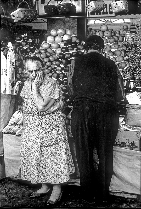
A Question About Color.

askjoebbonnieLamprey

Bonnie, an online student, sent me this photo with a question. As I always do, I put the message from the photographer so everyone can read it. This way, those that have similar issues or questions can benefit. Here’s what she said:

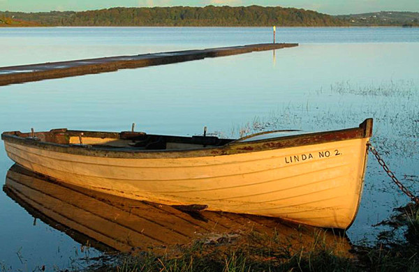
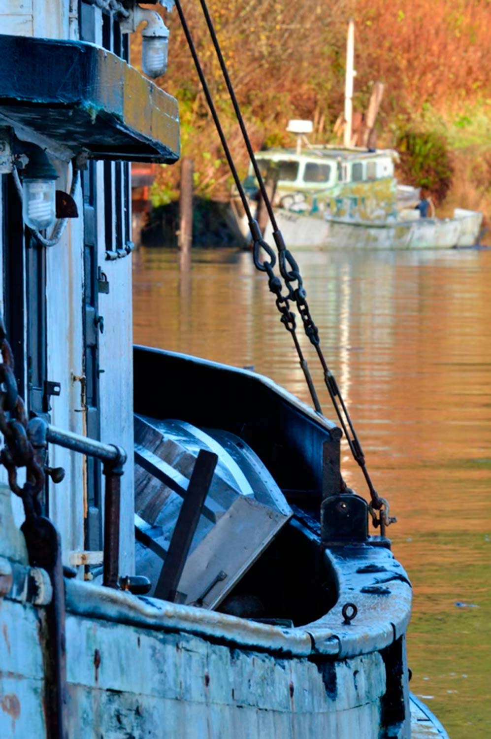
“Joe, my question on this photo is mainly about the color.  The boat in the foreground was in shade and the one in the background was in the sun.  I like the composition (mostly), but the differences in color (hue?) between the foreground and background is extreme.  I exposed for the boat in the background, so it would be seen.  Would you brighten up the boat in the foreground?  Would you have metered from a different spot?

I did do some post-processing – increased the contrast a bit and cropped off a bit on the right (there was too much space behind the background boat).  Also, the wire lines from the foreground boat cut across the front of the background boat – I’d like some space between the two.  I’ll go back to this spot again (undoubtedly a lot more times!), so I can keep my former mistakes in mind J .

Thanks!

Hi Bonnie,

Ok, first let’s address the question mark (?) you had next to the word “Hue”. The word Hue is basically the characteristics of a color. For example one might say,” Doctor, his face had a yellowish green hue (or color) to it”.

The photo of the boats is not just about color, its mostly about exposure. Let me explain:

This is really all about Dynamic Range. The light reflecting off the boat in the background was too far from the boat in the shade. I don’t know what you use to take readings, but I’m guessing you let your camera make the exposure recommendations, and like a good photographer you believe it. Depending on what you had your meter set on, it probably was picking up too much of the boat in shadow. For me, I never let the camera tell me what I should do, which is why I use a hand held Minolta One Degree Spot Meter. If I were to take a reflected reading of each boat separately, I would know that there’s way too much difference to get a proper exposure on each one. So, what to do?

I either change my composition so everything will read the same, or I stick with what I have. If I like what I have, I’m going after the boat in the sunlight, then underexpose it a stop. That’s where I want the colors to have depth and be saturated. What will happen is that the boat in the shade will be a lot darker, so you have to decide if that’s ok. Personally, I think it would still look good. In any event, you can always open the shadow in post.

Btw, If I had been standing next to you, I would have asked you why you didn’t want the boat in the background to be sharp?????? I think it would have looked soooooooo much better. Remember when you have that much distance between the foreground and background, you should always check your DOF to make sure you’re getting what you want.

One last note: If you ever want to become a really good photographer, I strongly suggest you do your cropping in the camera. If you use the computer to do your cropping, you’ll never know where the edges and corners of your frame are. Use the edges of your frame as a compositional tool.

Since I know you took my online class with the BPSOP, and as I tell the students in my “Stretching Your Frame of Mind” workshops, you probably forget to use your “Fifteen Point Protection Plan“. Otherwise you would have left some space between the cables on the boat in the foreground and the bow of the boat in the background; making it a “quicker read” and not so confusing.

Oh yes I forget to mention that I really like your composition!!!

Visit my website at: www.joebaraban.com and follow me on Instagram: www.instagram.com/barabanjoe. Be sure to check out my workshop schedule at the top of this Blog. Come shoot with me sometime.

JoeB

Student’s Work: BPSOP part I and II classes

Working on the silhouette.

I’ve been teaching an online class with the BPSOP for just about three years, and I’m always amazed and impressed with the level of work that’s generated over the course of the four weeks. I had started out with just one class, and like my “Stretching Your Frame of Mind” workshops I conduct around the planet, we work on incorporating the basic elements of visual design and composition to make  fellow photographer’s images stronger.

Several years ago I began teaching a part II class that extended these elements to include shadows, silhouettes, some interesting assignments, and some of the principles of Gestalt. When you put all these elements and concepts together the results are memorable photos that the viewer will mentally enjoy long after he’s stopped looking.

Here’s some examples of how these elements that they’ve  learn over the month made their photos look as good as I believe they do. These are amateur photographers with all different skill levels since everyone can benefit from my classes no matter where they are in the scheme of things…photographically that is!!!

The following slideshow is from both my Part I and Part II…enjoy and see if you can pick out the different elements and concepts.

Visit my website at: www.joebaraban.com and follow me on Instagram: www.instagram.com/barabanjoe. Check out my workshop schedule at the top of this blog. Come shoot the elements with me sometime.

JoeB

Student work: Does it Make A Statement?

One of my students sent me this photo and as always I like to copy exactly what each photographer had to say. I’ve found that there’s a lot of folks out there that have had similar experiences at one time or another.

Here’s what was said:

“I wanted to ask you if you thing that the attached picture makes a statement on its own, without any explanation required. It is called “Whatever the Dusk or the Dawn ” because I entered it in a Can Geo photo contest called “Whatever the Weather”.

I took it because I liked the colors and the multiple layers in the sky. I did not want to include the sun or other silhouettes in the frame, because I liked the simplicity of the colors alone.
I find that people don’t have the reaction I expected towards this photo. I believe that they take it as another pretty picture of a sunset that everybody can point and shoot.

This is one of those that does not scream the center of interest at you, but definitely has the visual interest through colors. When I look at it I see an abstract painting on canvas and all kind of other things, but as you say I am not there to tell my story.

Any critique will be appreciated.

Thank you very much.

I immediately wanted to send you a link to an article I read some time ago and have repeatedly show to my BPSOP and in my “Stretching Your Frame of Workshop” I conduct around the planet. It’s called “Giving meaning to photographs”. I think you’ll find it the answer to all your questions.

Remember that you’re not always going to be around to share your thought process or emotions at the time you created your image; it has to stand on its own merit. The feeling you had and the thoughts running through your mind were important to you. Unless the viewer was standing next to you, he can’t sense the same ethereal qualities just by looking at a pretty sky that he might have seen before.

So many times I’ve been driving down the road or walking on the beach and had the pleasure of witnessing a beautiful sunrise or sunset. The first thing I do is to look for anything else I can put in the photo to add what I refer to as a “layer of interest’. If I don’t see something I may shoot anyway just because I’m a photographer and like to take pictures of pretty things. There’s just as much chance as me not shooting it and just standing there smiling while I enjoy the forever fleeting moment.

Reason being that I’ve personally shot a million pretty skies and my files are crowded with them!

Here’s a post written my a very famous photographer who once said, “If you don’t have anything to say, your pictures aren’t going to say much. https://joebaraban.com/my-favorite-quotes-gordon-parks/

Having said all this, it is a pretty sky with great colors…but just another pretty sky.

I hope this has helped.

Visit my website at: www.joebaraban.com, and follow me on Instagram: www.instagram.com/barabanjoe. Check out my workshop schedule at the top of this blog. Come shoot with me.

JoeB

Student Work: Medusa Hair

Sue sent me this photo to talk about and as usual I like to copy exactly what fellow photographers had to say. It is often the case where others have experienced the same situation or might have a similar question about one of their photos. Here’s what sue had to say:

Medusa?

“Hi, I was thinking this has to be the best head of Medusa Hair in a long time. I wanted to get close and see what it would look like””.

Sue

Ok Sue, first of all I agree with you that it has been a long time since Medusa was around in Greek mythology.

Getting what I refer to as “up close and personal” was a good way to bring out the differences between the green and white “Lines”. I say lines because when you “see past your first impression”, that’s what they are.  In my online class with the BPSOP, and in my “Stretching Your Frame of Mind” workshops I conduct around the planet, I talk about Line. It’s the most important of all the elements of visual design, for without Line, none of the other elements would exist. As a matter of fact, nothing in this world would exist…you and I, planes, trains, automobiles, etc. all have an outLine.

Having said that, this is a study of green and white lines and so if I had been standing there I would have suggested to things to you: The first would have been to take out the dead (brown) blades of the green lines. They really aren’t adding anything and to me they take away from the pretty green ones.

So many of my students just don’t think about things like that. The main reason is because they’re out “taking pictures” instead of “making pictures”. It’s ok to change the way things look in your frame, if it will help it look better. Taking out the dead blades of the green grass is what I mean by “making pictures”.

The second thing I would have mentioned to you is that the bottom half of your photo looks more interesting than the top half. The top half is not as clean, graphic, and is somewhat distracting. Look at how simple the relationship between the white and green Lines and how much better the viewer’s eye can flow.

BTW, I would have suggested that you not show the area in the top right or left corners as they take away from the center of interest. Either “use it or lose it”. Next time, be sure to check the four corners to see things like that and be able to decide what to do in your next adjustments.

Thanks for the submission Sue and did you know that Medusa was beheaded? I’ll bet that left a mark!!!

Visit my website at: www.joebaraban.com and follow me on Instagram: www.instagram.com/barabanjoe. BE SURE TO CHECK OUT my NEW workshop schedule at the top of this blog. Come shoot with me sometime.

JoeB

Student work: What Do You Think?

What do you think?

Daniel sent this photo to me and asked what I thought about it.

Ok, first of all, let’s address the color to B/W conversion. B/W photography and I go back a very long way. In 1971, I  started my career shooting for UPI then AP, and virtually everything I shot was in B/W. I love the medium, and in the digital era I know when it’s a good fit and I can usually tell when the decision to convert a photo was done after the fact in front of a computer.

This may or not be the case in this example, but it sure feels like it was not thought of right before the shutter was clicked. I may be way off base here, but it just doesn’t feel like it should be a B/W photo. It doesn’t feel like that was the idea when the composition was formulating in Daniel’s mind…why do I say that?

Because of the location and the light. To me, B/W photography is all about subject matter. Daniel’s photo is closer to “street shooting” than any other genre. With the possible exception of landscapes B/W photography street photos should be made with a recipe in mind. When I think of B/W, I think of subject matter that has at least some of these ingredients: Tough, Tenacity, resolve, true-to-life ideas, gutsy, story telling, and above all, it has to have soul.

The direction of the light is coming from 9 O’clock and is side lighting the person. With this kind of light, I would have thought that it would have looked good in color, since side light is one of my favorite ways to like a subject, and we work on lighting in my classes.

Having said all this, to me a strong B/W photo is thought out in advance, with the clear intention of going out and shooting B/W for the sake and love of B/W. As I said, Daniel may well have shot this with the intention of it being a B/W image. It just doesn’t feel like it to me.

Ok, let’s talk about the photo itself. Let’s talk about how many of elements of visual design and composition are present in Daniel’s photo. In my online class with the BPSOP, and in my “Stretching Your Frame of Mind” workshop I conduct around the planet, I show fellow photographers how to incorporate the basic elements of visual design and composition into their photography. At the end of my class and workshop, my students walk away with what I call an Artist Palette. instead of pigment, this Palette now has: Line, Shape, Form, Negative Space, Vanishing Point, Perspective, Balance, Tension, Color, and Light.  

Daniel’s photo has a lot going for it!!! It has a strong directional Line that leads the viewer from the bottom left (the natural way we perceive) to an “implied” Vanishing Point through the person to the horizon. He has divided the un-inspiring sky into two Shapes which really helps the composition. Look at all the Negative Space that defines the Positive Space. What I’m talking about is the areas of sky that borders the lampposts. The area between the lamppost and the building on the left, the area (Negative Space) that defines the lamppost in the middle of the frame, and the area around the person that defines him, and the area on the far right that defines each lamppost.

One of the most important elements on the  is Visual Tension. There are several ways to achieve  this type of Tension, and one of the ways is to minimize the Negative Space that borders the Positive Space. If you notice the area between the person and the lampposts, this Negative Space has been minimized, which generates Tension. The Tension I’m talking about is not the Tension that comes from mental or emotional strain. It’s the Visual Tension that comes when forces (the Positive Space or in other words the person) act against one another. What that means is that the anticipation of the person and the lampposts touching one another.

I assure you that these shapes were no accident. Daniel saw these shapes and used them to his advantage. He used his “fifteen Point Protection Plan” he received while taking my online class to create this pleasing composition. So, why convert it to B/W?

I have no idea. I’m afraid you’ll just have to ask him!!!

Thanks for the submission Daniel.

Visit my website at: www.joebaraban.com and follow me on Instagram: www.instagram.com/barabanjoe. Watch for my new workshop schedule you’ll find at the top of the blog. Come shoot with me sometime.

JoeB

Student work: Street Market In London


As I normally do, I like to give the readers of my blog the actual request from the photographers. So many times what they are asking is the same kinds of questions a lot of you would be asking. Here’s what Joyce had to say:

“Hi Joe

I was reading your blog post so thought I’d send this photo I took today at a street market in the East End of London…at first I saw the street art on the wall but then from the corner of my eye I noticed the African guy in the corner so managed to quickly incorporate him into the scene before he walked across the street.
Are you doing any more photo trips this year?

Cheers,

Joyce”

To me, it was a great idea to incorporate the man into your photo. By doing so you’ve put an entirely different spin on it. Now, instead of the  being taken in the East End of London, it could have been shot somewhere in Africa. I’m not going for any kind of profiling here, but because of the image on the building, and the black man ” Up close and Personal”, it sends a message that can be construed as some kind of rally in one of the countries in Africa. The white guys in the background comes across as journalists; especially since you read everyday about all the problems so many countries are having now.

Here’s what I like about things being “Up Close And Personal”. By putting him in the foreground, you’ve created Perspective (depth). Now, you have what I call “Layers of Interest”.

If this is something you didn’t want to happen, then you have to step back and look at this photo before submitting it anywhere.

Ok, now let’s talk about “In a perfect world, what if”. This is a phrase I’m constantly talking to my online class with the BPSOP, and in my “Stretching Your Frame of Mind” workshops I conduct around the planet. When critiquing one of my students photos that was submitted for a particular assignment, I ask  them if they could go back and change or do anything they wanted, what would they do differently.

If I had been standing next to Joyce when she was shooting this photo, I would have had her tell the black man to glance directly into the lens…why you ask?

Line is the most important of all the elements of visual design found on the student’s ‘Artist Palette’ I give them at the beginning of the classes. Without Line, none of the other elements would exist. In fact, there wouldn’t be planes, trains, and automobiles. People wouldn’t even exist because we all have an outLINE. Now, a very powerful Line would be the implied Line between the black man’s eyes and the lens. There would be Visual Tension, and perhaps even a “shock value”, especially if he wasn’t smiling. It would also match the direction of the person’s image on the wall.

I would also have you turn him around and face out of the frame. This not only implies content outside the frame, but it also gives “visual direction” to the overall look. This falls into one of the six principles of Gestalt I often refer to with my students. Be sure to read the article I wrote for Adorama on these principles. and check out the one called The Law of common Fate.

The last thing I would have done is to move him so that the pole wasn’t growing out of his head. This is also one of the principles I talk about called Proximity.

Thanks for the submission Joyce.

Check out my website at: joebaraban.com and follow me on Instagram www.instagram.com/barabanjoe.  Be sure to watch for my upcoming 2024 workshop schedule. Come shoot with me sometime.

JoeB

AskJoeB: Too Personal?

Check out my new workshop on the six concepts in the Psychology of Gestalt: Gestalt Workshop link

Dan submitted this photo for me to comment on. Here’s what he had to say:

“Hi Joe,

 This is a photo of my wife and my 1 month old son. I wanted to show a mother’s love for her new born son. Please tell me what you think of it because for me it’s too personal, I think. I showed it to a friend photographer and he wasn’t that impressed. It wasn’t the reaction I expected.

For me, it looks perfect. All I modified in PS was a little white corner to the down left side, some cloning and healing on my wife’s face, and a curves layer to add a little contrast although it wasn’t absolutely necessary.

Please tell me how I can take photographs of my family in a more professional manner, without being so involved, if this is even possible. I was told that my portraits of my wife are too personal. How else could they be?
Thanks for your work, I am learning lots of interesting stuff.”

Dan,

I don’t feel that your photo is too personal even though it’s your own family. There’s nothing wrong in creating a feel of intimacy between a mother and her newborn baby. To me that’s the whole point in this approach.

The problem I have with this image is not necessarily the subject matter or the composition, although it looks too posed and you lost the feeling of spontaneity. It looks like she was holding the pose for you instead of you catching a moment in time. To me, that’s critical in getting your message across. It’s a fine line between looking like a real moment and being contrived/hookey. My main problem is the light and the environment around her. If you’re trying to get across a tender moment, the light needs to tender as well.

You need to remember that Light is everything!!! I constantly say this to my online students with the BPSOP, and in my “Stretching Your Frame of Mind” workshops. Your lighting is too harsh, too much contrast, and void of any direction and shadows that adds the third dimension, depth, to any Form (one of the elements of visual design). Right now, you have only two dimensions: height and width. I don’t mean to suggest that you always need the light to have a direction, because you don’t…just most of the time for me.

The background is somewhat distracting and appears as though you hung something behind her for an effect. The background is sooooo important and needs to be considered equally as much. The color just doesn’t do it for me. It’s a touch on the garish side.

One last thought Dan. I teach how to incorporate the elements of visual design to create stronger images. The most important of them all is Line. Without Line, nothing would exist since everything has an outLine. By having the mother looking into the camera creates an implied Line between the subject’s eyes and the camera, and it can be very powerful. I would definitely try one that way.

Take a look at a couple of my photos of a mother and baby:


Thanks for your submission!

Visit my website at: www.joebaraban.com, and follow me on Instagram: www.instagram.com/barabanjoe and. Check out my workshop at the top of this blog. Come shoot with me sometime.

JoeB


Student’s Work: Using silhouettes in our photography.

When given an empty room to shoot executives, I turn to silhouettes.

Check out my new workshop on the six concepts in the Psychology of Gestalt: Gestalt Workshop link

For me, shooting in ‘golden light’ is easy, but when I’m occasionally forced to shoot under conditions that I ordinarily would pass on, sleep through, or spend that time scouting, I look for SILHOUETTES!!!

In my part II online class I teach with the BPSOP, and in my “Stretching Your Frame of Mind” workshop I conduct around the planet, I’m always discussing ways to create mood or drama in photos under non-optimum lighting conditions such as harsh mid-day sun, an overcast sky, or even indoors. I tell them that if you put your subject against a bright background, and expose not for the subject, but for the brightest part of that background it can create abstractions in the form of silhouettes.

The best silhouettes are those that are simple and easily recognizable by the viewer. Remember that the abstractions, you’re creating from a three-dimensional reality are now being presented in a two-dimensional form. A form that is without depth, created only in width and height.

Midday light or overcast skies are not always the time to look for silhouettes. I’ll get to a sunrise location well in advance so I can look for silhouettes. I’ll also hang around after the sun goes down and look for interesting silhouettes at dusk.

After discussing complete silhouettes and showing examples,  which included talking about partial silhouettes where not all of the person or the environment is in silhouette. Dawn, a talented student of mine came back with these wonderful examples (shown below) of both partial and complete silhouettes. Not only are they strong images showing silhouettes, but more importantly, they show a photographer that knows how to “Stretch Her Frame of Mind”!

Visit my website at www.joebaraban.com, and follow me on Instagram.com/barabanjoe. Check out my workshops at the top of this post. Come shoot with me sometime.

JoeB

Student Work: Cherries In The Backyard

Check out my new workshop on the six concepts in the Psychology of Gestalt: Gestalt Workshop link

As  usual, I like to show the original note to me from a fellow photographer so everyone can read it and see what others are thinking. Perhaps some of you will identify with it.

One of my students in my online class with the BPSOP sent me this. I will will often do the same thing in my “Stretching Your Frame of Mind” workshops I teach all over the place.

 ” Joe, I was doing some macro work in the backyard.  Actually, I’m photographing for a macro contest and the rules are no flowers and no critters. So I thought the cherry tree would be cool. I was shooting the cherry tree and nothing was speaking to me. About an hour into it, the sun was getting lower and began to strike the tree at a nice angle so I got under and behind these cherries and the light was definitely speaking to me.

I brought the tree branch up from the left corner at a bit of an angle and the DOF seems about right in that just the cherries in focus. I wanted to limit any distractions around the red cherry. The top is too busy. If I were taller and branches weren’t hitting my head I may have been able to cut that business out. It is the light that really excited me. I remember your blog post about the angle of light being behind and at a 45 degree angle. As soon as I saw this I thought…that’s what Joe is talking about!  I had taken a few other photos a bit later but the light was just uninteresting. So here you go. Thanks. I look forward to what you have to say.”

Shelle

Shelle, the first thing I wanted to do was to turn it upside down. The reason for this is to show you that it’s not well balanced. When you’re looking at your photos right side up, you’re looking at them with the right side of your brain, the creative side. You see the cherries, the stem, the leaves, etc. When I turn it upside down, you’re now looking at your photo with the left side of your brain, the analytical side. Now, all you see are shapes, the negative space and the positive space. Now it becomes easier to see how well balanced your photo is. Does it look and feel balanced now? To me it looks heavy on the left side with very little on the right to help out.

The dark, out of focus branch on the left is taking away from the delicacy of the cherries. It ‘s also taking the viewer away from what he wants to look at. Be sure to check your DOF preview button, or just look at the back of your camera to make sure that what you put in the foreground is in the proper focus based on your complete composition; because that’s what the viewer will see first.I wrote a post entitled “The Whole Enchilada” where I talked about making sure everything is working, not just what you want as the center of interest. It’s the whole enchilada, it’s the foreground and background that’s as important as your subject.

Nice light, and you’re  right about it!!! It appears to be coming from about 3’oclock which would be sidelight. What I said was that I light everything from 9’oclock to 3’oclock, and 11’oclock to 2’oclock being my favorite way to light. Take a look at my post on the “Law of the Light“.

One last thought: To me this is a little overexposed. It’s missing the depth in the colors. I hope you’re bracketing!!!!

Thanks for the post. It gave me fond memories of my youth sitting/eating in the Cherry tree in our backyard. Macro work is not easy, especially when you’re not in a comfortable position. you might try a small step ladder next time.

Visit my website at: www.joebaraban.com and follow me on Instagram: www.instagram.com/barabanjoe. Check out my workshop schedule at the top of this blog.

JoeB

Student Work

Check out my new workshop on the six concepts in the Psychology of Gestalt: Gestalt Workshop link

One of my students submitted this photo after reading my post on “101 things to know about photography“. She’s referring to number 42 that says, “The Rule of Thirds is boring”. Since I meant every letter of every word, we’ll move on to her photo and question which is:

“Hey Joe, I’ve been working on using all the techniques I learned in your class.  I have a photo that I would love your input on.  I thought to submit it after reading your “101 Thing You Need to Know Post”, where you said that the “Rule of Thirds is Boring”.

I took the attached photo of my girls climbing on a fence in a neighborhood school yard.  I wanted to give equal attention to both of the girls split by the fence post.  I instinctively chose to put the girls and the fence in the middle of the frame but I’m questioning whether it works?  Perhaps it is not the positioning but the background activity that bothers me.  Do you have any suggestions for a different approach?

I did brighten it up a touch before I deciding to submit it.

Your instinct was right on in my opinion. I really like how you used the fence to divide the page right down the middle. It makes a statement to be sure, and it’s where I would have placed the fence and kids as well. It feels balanced and I also like how each girl is doing her own thing. I especially like it that you have just one of the kids looking in the camera with that great facial gesturing in the form of a big smile. They are the center of interest, so it’s feels right that they’re in the center of the composition.

As I told you in my online class with the BPSOP, and as I tell my students that take my “Stretching Your Frame of Mind” workshops I conduct around the planet, Line is the most important element of visual design (everything that exists has an outLine), and the implied line between the subject’s eyes and the lens can be very powerful…as it is in your photo.

It feels fresh and real. The viewer would never know if you had the girl look at you or she looked on her own. it’s your secret, and whether it was staged or not doesn’t matter; you were making pictures, not taking them!!! As you know from my class, there’s only one thing that can overcome an overcast, gray day and that’s Humor. It’s a funny photo while being one of those sweet moments in time.

In this photo, to make the Figure stand out from the Ground, I would have used a longer lens and knocked the background out of focus. Or shot with the lens you had on but shot it at it’s widest aperture. That would have put the focus where it needed to be…on the girls. Besides, no one but you knows that it’s a school yard since it’s not what I call a “quick read”.

Thanks for the submission, and I hope to shoot with you some day.

Visit my website at: www.joebaraban.com and follow me on Instagram www.instagram.com/barabanjoe. Check out my workshop schedule, and come shoot with me sometime.

JoeB

AskJoeB: Duct Tape and a can of WD-40

Couldn’t happen without a can of WD-40

Check out my new workshop on the six concepts in the Psychology of Gestalt: Gestalt Workshop link

FDTate, a past student of mine, recently sent me a question to comment on concerning one of the items to remember on my 101 things to know about photography”. Actually it was number 8 on the list: “Always have a roll of Duct Tape and a can of WD-40 with you.

His question was, “A great list, but I’m confused by #8.  I’ve never been on a shoot and thought, “Boy, this would have gone a whole lot smoother if I’d just brought along some duct tape and WD-40.”  Please explain.”

Before I explain why it’s important to carry Duct Tape and Wd-40, I’ll tell you what I tell my online students with the BPSOP, and in my “Stretching Your Frame of Mind” workshops that will simplify things. I tell them, “If it doesn’t move and should, use the WD-40. If it moves and shouldn’t, use the duct Tape!!!

In the top photo, we were in the Southwest part of the US shooting an annual report for a company that’s mostly in the agricultural business. I saw a large field with irrigation equipment and thought it would make for a great shot the next day at sunrise.

The two men seemingly in charge told me that they hadn’t used this equipment for a season, but it wouldn’t be a problem turning on the sprinkler jets so I could backlight them.

Taking their word for it, we showed up the next morning before sunrise and set up; I wanted to get the very first light. When they turned the main valve, nothing happened. Why was I not surprised to hear that the small valves on the jets were rusted and therefore no water.

I sent my assistant back to the car for my trusty can of WD-40. We sprayed all the nozzles and were able to slightly turn them so water would spray out.

And that’s why I always carry a can of WD-40 with me.

In the bottom photo, I was shooting a series of posters for Prince, a manufacturer of tennis equipment.

Remember that this was before the days when you could fix any problem later in post. We  had spread all the tennis balls all over the court and were ready to shoot when a Santa Anna wind came up and blew all the tennis balls off the court.

The wind was too strong to keep the balls in place, so what did I do? I had my crew, the model, and a few people that were standing around secure each one of the balls to the ground with Duct Tape. so, every ball you see has a piece of tape under it.

Couldn’t happen without a roll of Duct Tape.

A true story and the reason why you should have a roll of Duct Tape with you…because  you just never know!!!

Visit my website at: www.joebaraban.com, and follow me on Instagram: www.instagram.com/barabanjoe. Check out my workshop schedule at the top of this blog. Come shoot with me sometime. Don’t forget to bring some WD-40 and Duct Tape with you.

JoeB

A Student’s Question: Street Shooting

Check out my new workshop on the six concepts in the Psychology of Gestalt: Gestalt Workshop link

Charity sent me this photo to talk about. Here’s what she said:

“My question: How can I make this photo more gripping? This is a photo I want viewers to linger over – I want them to stop and think ‘Why has the girl with the phone stopped on this busy street? Why is the girl on the left annoyed? Why is the girl in the mid-ground with the badge on her hat so happy?’. No one I’ve showed my album to has lingered over this photo, only my landscapes seem to catch their attention.”

Charity,

First of all street shooting may seem easy to some, but in my opinion it’s not. I’ve certainly done my share over the years. If you want to experience real life street shooting imagine being chased down the street during the race riots while you were loading your Nikon F motor drive. That was my first opportunity to do some street shooting. That was around 1970 and I was shooting for United Press International. By the way, I was getting paid ten dollars a picture “if they transmit”. What that meant was that they had to like it for me to get paid.

Ok, let’s talk about your photo:

As I always tell my online students with the BPSOP, and the students that take my “Stretching Your Frame of Mind” workshops I conduct around the planet, you won’t always be around to explain your thought process to the viewer. It’s going to have to stand on its own and be what I refer to as a “Quick Read”.

In your photo, you may have felt the minimal vibrations given off by the people in the crowd, but the viewer won’t…why?

Our culture (the one currently subsiding in the US), has been bombarded with a lot of dumb reality shows and a whole lot of violence. We’re use to it, and to a lot of the population look forward to more and more and more. We get off to seeing people get angry on the TV. Angry or sick enough to kill a lot of people in just one hour. Actually, if you take away the commercials (which by the way are also getting violent) there’s a lot less than one hour.

So, you ask me how do you get people to “linger longer”? There will have to be a lot more going on in this photo than the subtleties you’re stating. The first thing you’ve said is, “Why has the girl with the phone stopped on a busy street?” The problem with this is that you’ve stopped all the action in your frame so it really doesn’t look like she has stopped. Btw, it looks like she’s blowing a bubble that just popped.

You asked, “why is the girl on the left annoyed?” Truth be told, she doesn’t look annoyed to me. If you want people to come off looking annoyed, then make sure the viewer can see that and not let it be something you think may be happening.

You asked, “Why is the girl in the mid-ground with the badge on her hat look so happy?” She’s sooooo out of focus, and surrounded by lots of other out of focused faces that I would be very surprised if the viewer would pick up on that.

   Here’s one of my photos I shot on Mardi Gras day in New Orleans. What feeling do you get when looking at it? Do I need to be with you to explain it?

Here’s what I strongly suggest you do: Study the great street photographers like Bruce Davidson for one, and of course the most famous of them all is Henri Cartier-Bresson. If street photography is a new passion for you, then studying the masters  should definitely be required reading.

Visit my website at: www.joebaraban.com, and follow me on Instagram: www.instagram.com/barabanjoe. Check out my workshop schedule at the top of this blog. Come shoot with me sometime.

JoeB

Student Work

Frank S. sent me this photo and said, ” Saw you were open to seeing  pics and thought I’d send you this one that just re-surfaced.”

In my online class with the BPSOP, and in my “Stretching Your Frame of Mind” workshops I conduct around the planet, I show people how to incorporate the Elements of Visual Design and Composition in to their imagery. Years and years (a million) ago, this man took my Maine Media Workshop, (which incidentally begins July 30th this year)  and along with his close friend, were way above the rest of the class in delivering quality images every day.3

Shooting with me didn’t give Frank his ‘eye’, he had it all along. All I did was to teach him how to use in in a different way. It seems to have stuck because his submission is a very nice portrait!!! Although I’m not a huge fan of combining B/W  (or sepia, I think!!!) and Color, this portrait is among one of the few that I really like.

It’s straightforward simple, but compelling at the same time. It hits you in the ‘eye’ like a big Pizza Pie…but with a thin soft crust!!!

For me, her eyes are the strongest part of this photo. As I teach/preach to my students, Line is probably the most important Element on their ‘Artist Palette’ ( a term I use in my workshops), because without Line, nothing else would exist. It takes lines to make patterns, Texture, Vanishing Points, etc., as well as planes, trains, and automobiles..why???? Because planes, trains, and automobiles all have outLINES.

The most important Line is the horizon line, which should always be straight. However, the implied line between the subject and the lens is  very powerful, and for that reason, if I’m not having them look out of the frame (see my post on the Leading in Rule), I usually have my subjects looking into the lens.

The exposure was very important here as far as getting the bright background, the skin-tones and her dress to have their own feel/look but to be combined together to make up the finished photo. It might look easy, but it’s not!!!

Thanks for the submission.

Visit my website at: www.joebaraban.com, and follow me on Instagram: www.instagram.com/barabanjoe check out my workshop schedule at the top of this Blog. Come shoot with me sometime.

JoeB


Student Work: Motion Freezing Picture

I recently had a fellow photographer submit this photo into my online class. I always like to include their question so those out there that share the same thoughts, or like to take similar photos can read what they had to say. Here’s what Jean had to say:

“Hello Joe,

I was in your class last month in your BPSOP and I read your blog coming from and I want to show you one of my ‘motion-freezing’ picture. I’d be glad to hear your critique.
Thanks a lot,

Jean”

First of all I want to comment on the fact that Jean was in my part I class that I teach with the BPSOP. What I teach there is the same material  covered in my “Stretching Your Frame of Mind” workshops I conduct around the planet. That said, I hope some of what I have to say has rubbed off on her. From the looks of this photo I must be a good teacher because it’s a very strong image; it’s filled with the elements of design and composition that I show people how to use in order to take their imagery what I refer to as “up a notch”.

Ok Jean, let’s talk about it.

It’s a really nice photo that takes the viewer on a ride through the frame via the bridge and the water. Visual direction is sooooo important when keeping the viewer an active participant. The more ways we can get the viewer to leave and enter our frame the more energy he or she will use…and that’s a good thing!!! It’s what I teach in my new Gestalt class.

As far as freezing the motion, I think you might really be meaning something else…why? Because you haven’t frozen the motion. By using a long exposure, you’ve made the water look almost placid, with no ripples that would catch the light accentuating them and say movement. If you had shot at a shorter exposure, it might have looked like you had frozen the water and their would have been a different kind of texture than the smooth type you created here. It’s something I would have tried both ways.

That’s not necessarily a bad thing, in fact it usually creates an almost ethereal feeling. However in this example, I think the reflections of the sky in the water being so smooth may not be a “quick read”. At the bottom of the small waterfall, it looks a little like a low covering fog bank. The part of the reflected water appears as it it’s disappearing under the fog. It appears as though the water is cascading over some kind of rock structure that’s rendering the reflections somewhat weird and perhaps a little hard to understand. That’s not a bad thing either!!! It’s also hard to tell where the water ends and the deck (I think) begins.

I think it’s still a beautiful photo, beautifully lit, perfectly exposed, and well composed. There’s lots of things for the viewer to discover and enjoy, and it’s one you should be proud of.

Btw, remember that showing a subject and its reflection is one of the ways to create Visual Tension, and that’s one of the reason your photo attracts the viewer in the way he perceives then processes the information.

Thanks for sharing it on my blog.

Visit my workshop at: www.joebaraban.com and follow me on Instagram: www.instagrm.com/barabanjoe. Also check out my workshop schedule at the top of this blog. Come shoot with me sometime.

JoeB