Student Work: Winter

Aaron from Georgia sent me this winter scene for a critique. Here’s what he had to say:

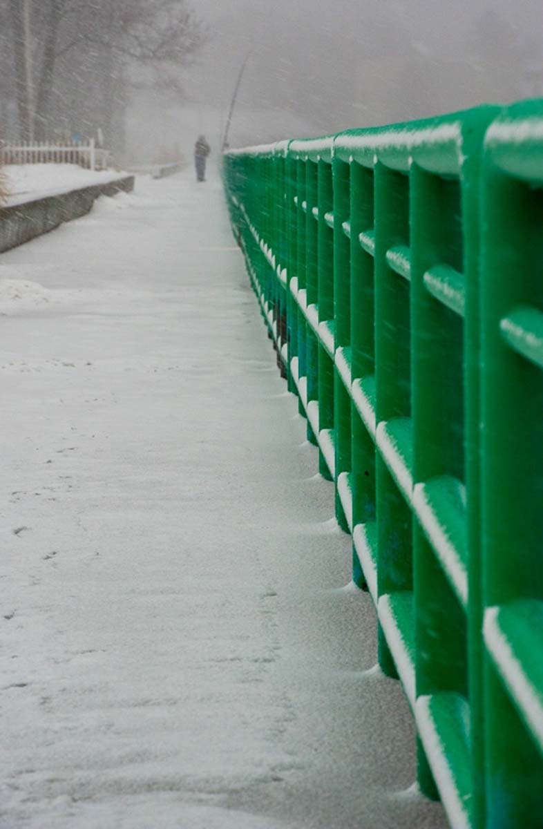
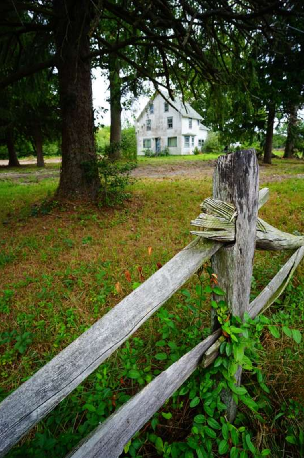
“Hi. I would like a critique on this image. This is one of the better images I have captured for a seasonal winter album. Like all the other pictures in this set, when I squeezed the shutter button, I was attempting to convey a sense of loneliness, cold and mystery. I took about 30 frames at this road near a farm in Eatonton, Ga. On each frame I was looking to use the road and fences as lines to pull a viewer’s eyes into the fog. (Each frame was a little different in composition.) I used a very selective depth of field, focusing on the first fence post on the bottom right of the frame. The image is photo shopped – In ACR, I adjusted exposure, increased the blacks, contrast and clarity. I also sharpened (what little depth of field there is) with ACR. In Photoshop I adjusted the levels.

So my question is: Does this photo convey the feelings of loneliness, cold and mystery well?”

Aaron, although it’s a very nice photo, I can only wonder what it looked like before all the post processing work??????? I also wonder what you would have done before the days of the digital era and specifically Photoshop????  It sort of reminds me of a conversation I had a while back with a student of mine in the class I teach with the BPSOP. She had a similar photo, not as far as a winter scene like yours, but a similar photo with quite a bit of post work. I told her that her photo reminded me of a woman I went out with once (and I do mean once).

Unfortunately, I found out the hard way that in order for her to look good, she would put on high heels (for additional height), a padded bra, fake eyelashes, colored contact lens,  and extensions for her dyed hair. It just struck me funny when you mentioned all the things you did to this photo to make it look good. I realize that this is the way it is now with the digital age and so many photographers that have only seen and composed through a digital camera, are thinking about Photoshop as a way of making their photo look better. I wonder what your photo looked like before you worked on it? I wonder if I could have taken this same photo and made it look good the way I would if I was still printing in my darkroom simply by burning and dodging, the right initial exposure,  and the right grade of paper?

Hummm, but I digress!!!

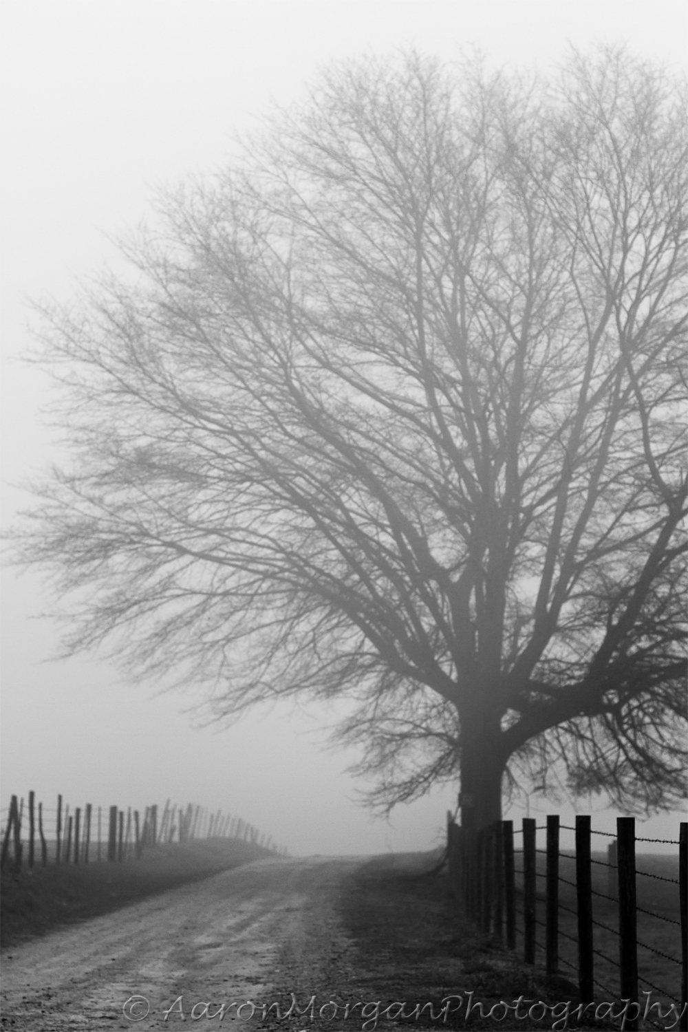
  Ok,  the first thing I wonder is what lens you used, and what aperture you had it set on. The reason I ask is because you said you used a shallow depth of field, but it seems as if all of this composition is in focus. If you had used a wide angle lens and you had it focused at infinity, then everything would have been sharp no matter what you had it set on. To me, it feels like the fog is making everything look soft.

As far as it looking cold, this kind of fog happens any time of the year just about anywhere in the country. I’ve taught a workshop where we had this exact light and fog most of the week. It was very sad since back then the name of my workshop was called “The Poetry of Light”. The class had a T-shirt made for me that said my class was now called “The Poetry of Fog. This was in August.

If you want to say cold, without being there to tell the viewer that it was indeed cold, you have to say it visually. You know it was cold because you were there, but will someone else that wasn’t there?

You do achieve a sense of Mystery and certainly Loneliness simply because of the fog, and the fact that you can’t see what’s over the hill. Loneliness also comes into play since there’s no one around.

The best part of this photo is the way you used Continuance (a concept of Gestalt) to lead the viewer down the road and fence line. You absolutely achieved that. The fence line is a very strong directional element that is very close to being a Vanishing Point which has created a sense of depth.

It’s a good photo Aaron, and thanks for submitting it to me.

Visit my website at: www.joebaraban.com, and follow me on Instagram: www.instagram.com/barabanjoe. Check out my workshop schedule, and come shoot with me sometime

JoeB

Student’s Work: Color Saved the Day.

In my online class with the BPSOP, and in my “Stretching Your Frame of Mind” Workshops, We spend a lot of time on color, since it’s one of the elements on my ‘Artist Palette’ and so important in taking our photography what I refer to as “Up a Notch”. Color is a stimulant for our eyes, and ties the elements of a photograph together. Color affects every moment of our lives, and has an enormous impact on our photography.

Coming from a background in color theory, painting and design, I have over the years trained my eye to look for color, and it often requires looking past your initial impression. Since my background is also in Journalism (as in a BA) I love to write and tell stories. Now, my medium is photography, so I use color as my way of communicating my ideas.

Nothing can help a photographer more than when he’s forced to shoot in bad light or just wants to venture out on a snowy day. Paul, a recent student with me at the PPSOP went out during our class with his ‘Artist Palette‘ (always in the back of his mind) and found this amazing location.  Since we had started working on Vanishing Points and Directional lines, and how they can add depth to our imagery, he had hit the photo jackpot!!!

 I can assure you that very few photographers would compose this photo so that the green railing would form a Vanishing Point and lead the viewer down the road to the man perfectly framed at the end. Also Paul,” seeing past first impressions“, knew that the green would have an enormous effect on his composition while communicating an idea. Moreover, on several occasions, I’ve had one of my students tell me that it was overcast and decided that there was nothing to shoot on such a gray day…and I love it when they do!! Every time they say that I just whip out this image that Paul shot and “let them eat crow”.

Paul has also done a great job in using one of the concepts in the theory of Gestalt I teach called Continuance.

I would have no problem telling people that I had shot this photograph…BRAVO!!!

Visit my website at: www.joebaraban.com and follow me on Instagram: www.instagram.com/barabanjoe. Check out my workshop schedule. Come shoot Vanishing Points with me sometime.

JoeB

AskJoeB: Sailing In Maine

Alan sent me the above photo and ask for my opinion. Here’s what he had to say:

“Hello Joe:

I was up in Acadia National Park a few years ago.  I love to sail  and we were out on this boat for a sunset cruise. I captured this image and thought it was interesting how the deck hand was focused on doing something as they sat on the rail.

I decided to turn it to Black and White as the color did not add to the image.  I like this image because it tells a story framed with the sails and showing the deckhand.
Then it looks like I got a “Sunstar”   We discussed these in the BPSOP composition class. Even though I like this image and I think it is good, I am sure that there is room for improvement.  What could I do to make this one better?

I look forward to your critique. ”

OK Alan, let’s take it one idea at a time:

With my online class with the BPSOP, and also with my “Stretching Your Frame of Mind” workshops I conduct around the planet, one of the things I tell my students is to make sure whatever message they want to get across is what I refer to as a “Quick read”. Since you won’t always be around to explain to the viewer what’s going on in your photo, it has to be able to stand on its own. What I mean is that you say it was interesting watching the deck hand. You would be hard pressed to find anyone that would know that it was a deck hand and not someone with you taking the cruise.

If you want to say deckhand, then say it visually. Have him doing something that only a deck hand would be doing.

First of all, we don’t perceive in a square, we perceive in a rectangle…a 3:2 aspect ratio. Your photo is way too claustrophobic for the environment that’s surrounding you…but that’s another story!!!Now let’s address the color vs Black and White issue:

Don’t get me wrong, I love B/W, and started my career shooting mostly B/W with the AP and UPI. There’s a time for B/W (unfortunately these days that means de-saturating the color), and there’s a time for color and watching the sunset on a sailboat cruising off the coast of Maine is, in my opinion, a time for color. You say that color didn’t add to this image so I would love to see the original color version because I’m from the great state of Missouri and our state motto is “The Show Me State”!!!

Sailing is just too romantic to view in B/W. Think of all the famous quotes about sailing, and the one that immediately comes to mind is: “Red sky by morning, sailor take warning. Red sky at night, sailor’s delight”. Can you imagine this quote as the title to your photo???????

Here’s a phrase I constantly hear now that I’m the age I am: “They retired and sailed off into the sunset”. When you retire, would you want to sail off into a B/W sunset?

Thanks for the submission Alan. I hope I was of help.

Visit my website at: www.joebaraban.com and follow me on Instagram: www.instagram.com/barabanjoe. Check out my workshop schedule at the top of this blog. Come shoot with me sometime.

JoeB

Student Work: Working With His ‘Artist Palette’

So many Elements from Elija’s ‘Artist Palette’

Elija is a photographer living in Croatia. He recently took my “Stretching Your Frame of Mind” class with the BPSOP and submitted this photo to show how he used several Elements of Visual Design and Composition that are on his new ‘Artist Palette’ to create this wonderful photograph. He composed this photo with these in mind: Line, Pattern, Texture, Negative Space, Perspective, Shape, Color, and Visual Tension.

The man was in the middle of the frame, and I made a suggestion to Elija to move him to the edge, and this is where the Visual Tension comes in. Now, I know that some of you were taught to always have your subject walking into the frame (The Leading in rule), but when you do that, the viewer will already know where he’s walking. I want the viewer to wonder where he’s walking to next by implying content outside the frame. By placing him close to the edge of the frame, and minimizing the Negative Space, it’s creates Tension.Not the garden variety that comes from emotional or mental strain, but visual Tension that occurs when forces act in opposition to one another; as in the person and the edge of the frame…BTW, that’s a stupid rule!!!

By the way, I wrote a post about the Leading in Rule, and why I thought it was a DUMB. Check it out!

After a four week course, Elija is able to see these elements before he composes his idea. With his imagination working in tandem with the Elements on his ‘Artist Palette‘, the results are what you’re looking at now. A very well done photograph, one that will surely be remembered.

Great shot!

Visit my website at: www.joebaraban.com and follow me on Instagram: www.instagram.com/barabanjoe. Check out my workshop schedule at the top of this blog. Come shoot with me sometime.

JoeB

My Student’s Work: Tension Equals Energy

In my online class with the BPSOP, and in my Workshops I teach around the globe, we work on the elements of visual design and how they can be incorporated into our imagery. These elements are found on my ‘Artist Palette’, and it’s what a lot of my workshop is all about.

One of the elements is called Tension. Tension is Energy, and it’s a very important tool in taking our photography what I call “Up a Notch”.

There are several ways to generate Tension in our photos, and one of them is “Framing within a frame”. The Energy is created when the viewer looks through the frame to see the subject. He will first see the frame, then he’ll move through it to see whatever it is for him to see. The time spent on doing this will take additional Energy, and TENSION=ENERGY.

Here’s an attempt by Laurette, on of my online students to create Tension. Not only is it a very good example of “Framing within a Frame”, but it’s also filled with other elements of design that can also be found on my ‘Artist Palette’:

Negative Space, Patterns, Texture, Line, Vanishing Point, Shape, and Perspective.

When you can put this many elements into a photograph, it stands a very good chance in being considered “Up a Notch”…even though it’s a square.

🙂

Nice job Laurette!!!

Visit my website at www.joebaraban.com, and follow me on Instagram www.instagram.com/barabanjoe. Look for coming workshops at the top of this blog. Come shoot with me sometime.

JoeB

My Student’s Work: Looking For Light In All The Right Places.

I found the light!

In my online class I teach with the BPSOP, and in my “Stretching Your Frame of Mind” workshops I conduct around the planet, I’m always telling my students that LIGHT IS EVERYTHING. I also tell them that when you find the light, you’ll find the shot.

As for the photograph above, I was walking the streets of Cairo doing what I’m always doing…looking for light, when I walked by this small shop where this man was selling very strong sweet tea. There, right in front of me, was the light. It was just a sliver of light that was  hitting the man and the small area around him. I immediately backed up to observe how a tiny bit of light could create such a strong image.

This is exactly what I was telling Eleanor, an online student of mine. The week assignment for the class was to go out and Find The Light. That’s exactly what she did, as you can see in these wonderful photographs.

Great job Eleanor!!

Take a look at my website at www.joebaraban.com and follow me on Instagram: www.instagram.com/barabanjoe. you’ll see a lot of what I think is the number one most important piece of advice I could ever give anyone. You find the light and you’ll find the shot! Come shoot with me sometime and we’ll look for it together.

JoeB

My Student’s Work: The Use of a Vanishing Point and Negative Space

06Two of several lessons I give, both in my online class with the BPSOP and my “Stretching Your Frame of Mind” workshop I conduct around the globe, deals with Vanishing Points and Negative Space. It’s about taking these elements of visual design  and using them to take you photography “up a notch”. The above photograph is one I show to my students as an example of both appearing in one shot.

These two elements are found on my ‘Artist Palette’ along with: Perspective, Tension, Light, Color, Texture, Pattern, Line, and Form.

Briefly, a Vanishing Point consists of parallel lines that begin somewhere behind the camera, and converge at a point on the horizon.

All photos are made up of Negative and Positive space, and in my class and workshop, we deal with that Negative Space that ‘defines’ the Positive Space and gives it substance.

Vanishing Point and Negative Space

Birka, one of my online students living in Moscow, Russia went out to “make a picture” with a Vanishing Point in it, and also use Negative Space to define the Positive Space. In the above photograph, she did just that. The white columns on the left form a Vanishing Point that leads the viewer to the two people walking in the middle of the frame. The Negative Space I’m referring to is that space that surrounds the two people, defining them. If it weren’t for that Negative Space between the people and the shadows on both sides of the columns. they wouldn’t be what I call a “quick read”; in other words, they wouldn’t look like two people walking.

This is how important Negative Space and a Vanishing Point are in taking our imagery “up a notch”.

Great shot and great job Birka!!!

JoeB

From a Student

So many Elements of visual design in this photo!!

Dawn, a photographer from the West coast, submitted this photo of three girls standing on what appears to be a bridge of some kind.

Ok Dawn, here’s my take on this photo:

You obviously know what you’re doing, you have a keen sense of design, and you have a very good knowledge of the Elements of Visual design…why, you ask?  Because there are several present in this photograph:

These Elements are what I teach online with the BPSOP, and also in my “Stretching Your Frame of Mind” workshops I conduct around the planet.

NEGATIVE SPACE: since everything that’s not positive space is negative space, the negative space I’m referring to is that space that Defines the positive space and gives it meaning. What that means is that the negative space in and around the three girls defines them. It’s that negative space that makes the three girls…three girls. Each one of their shapes is well defined by the use of the negative space, and it’s what I call a “Quick read”.

TENSION: by minimizing the negative space between the outside girls and the bridge, you’ve created Tension, as well as the stark contrast between the girls and the background. Framing the subject within a frame is another way to generate Tension.

VANISHING POINT: By having the parallel liners begin behind the camera and converge at an implied line on the horizon.

PATTERN: Both the floor and the sides of the bridge are Patterns.

TEXTURE: The Texture inside the Patterns.

LIGHT: I love the blown out light behind the girls!!! Also the band of light in front of them.

When you can combine this many Elements, you stand an excellent chance of your photo not only being “up a notch”, but one that will be remembered.

A very strong image Dawn, and I’ll certainly remember it. Thanks for sharing it.

Visit my website at:www.joebaraban.com and follow me on Instagram: www.instagram.com/barabanjoe. Check out my workshop schedule. Come shoot with me sometime and learn about the Elements of Visual Design.

JoeB

Student Work: Working on his Artist Palette

Negative Space, Perspective, Tension, Pattern, Shape, Light, Color, Line, and a Silhouette..

I teach people how to incorporate the Elements of Visual Design into their photography as a way to create stronger images; images that will be remembered. Isn’t that what all photographers want? For their photos to be liked enough to be committed to the viewer’s memory?

I know it’s what I’m after, but that’s just me!

In my online class I teach with the BPSOP, and the “Stretching Your Frame of Mind” workshop I conduct around the planet, I use what’s referred to as my Artist Palette, and I have my students fill it with not pigment, but all the important Elements of Visual Design: Negative Space, Vanishing Point, Tension, Perspective, Pattern, Texture, Shape, Form, Line, Color, and Light.

I also teach a part II class with the school, and the above mentioned elements are reviewed, but we also spend additional time on Light (the most important element there is), Shadows, and Silhouettes as well as Line  (the next most important element). For without Line, most if not all the other elements would not exist…nor would we!

Charlie, a student of mine from San Diego, recently completed my part II class and here’s two very strong photos that I especially thought used several elements from his new Artist Palette. In the first image his assignment was to photograph Line while keeping in mind the other elements on his new Artist Palette. A striking image that was all about what I call “Seeing Past First Impressions“, a term I often refer to in my workshops. Not only is their a great example of Line, but there are several other elements as well: Negative space, Color, Light, Shadows, and Patterns.

Can you see all of them?

In the second photo, Charlie was working on the different ways to light a subject as well as Tension. One of the ways to create Tension is by “Stopping an action and leaving it un-completed”. What’s also present is one of the basic concepts from the Theory of Gestalt I also teach which is Closure. Closure is all about “filling in the blanks”. Be sure to watch for my post on Closure later this month.

Really nice photos Charlie, photos that I remembered.

Visit my website at: www.joebaraban.com, and follow me on Instagram: www.Instagram.com/barabanjoe. Come shoot with me sometime!

JoeB

Student Work: Working On Her ‘Artist Palette’

In my online class with the BPSOP, and also with my “Stretching Your Frame of Mind” workshops I conduct around the planet, we work on the elements of visual design and composition, and how to use these elements to take our imagery what I call “Up a notch”. Instead of pigment placed on an artist palette, these elements replace the reds, and blues, and greens.

Joan, a student of mine had told me that she had been to this marina lots of times, but when she went back with her ‘Artist Palette’, she saw the marina like she never had before. Now with the help all the elements firmly on her palette, she was “making picture” instead of “taking pictures”.

In this one photo, there’s:

Tension (by framing within a frame), the use of Negative Space defining the Positive Space, Pattern, Leading or Directional Lines taking the viewer’s eyes to the boats, Perspective, by creating layers of interest, and Shape (those wonderful circles). Joan has given the viewer lots to discover, and the more he discovers, the longer he’ll stick around…just what we want!!!

Really nice photo Joan!!!

Visit my website at: www.joebaraban.com and ollow me on Instagram: www.instagram.com/barabanjoe and check out my 2023 workshop schedule at the top of this blog. Come shoot with me sometime and we’ll work on your ‘Artist Palette’.

JoeB


Student Work: Finding Their Letter and Color


Macadore was given the color red and the letter ‘H’

Henry David Thoreau once said, “The question is not what you look at, but what you see”. For me, as long as I’ve known this quote, and it’s been a while, I’ve always thought it to be a very astute observation as it relates to how we perceive photographically.

A couple of years ago, I was thinking about an assignment I had been giving to my online students with the BPSOP and in my “Stretching Your Frame of Mind” workshop I conduct around the planet. I was (and still do) assigning a letter and a color to each person and telling them to go out and find and photograph them….hopefully, but not necessarily, in the same photo. They needed to find their color and letter as they appear naturally in reality. In my explanation to whatever class I was in at the time (or in now), as to why I always give this assignment, Thoreau’s quote has always been in the back of my brain, and the point of the assignment was for my student’s to go out and focus their eyes and mind and begin to what I’ve always referred to as, “seeing past first impressions”. I realized that I was giving the same message as Thoreau, but just wording it differently.

It was an Epiphany!!! For one brief moment in time, I actually thought  Henry David Thoreau and I just might be on the same wavelength. Here was a man that not only came up with this quote sometime between 1817 and 1862 when he died, but the author of Civil Disobedience. He was just slightly ahead of his time!!!

I’m always impressed with some of the letters and colors my students find or come up with, so I wanted to share several with you from my  BPSOP’s classes. In each of these examples, both the letter and their color are in the same photo. It has proven to be a great exercise in taking my student’s photos “Up a Notch”. In the above photo, Macadore was also working on another of my assignments, the silhouette. I’m thinking she scored a “home run”…how about you?

Visit my website at www.joebaraban.com, and check out my workshop schedule at the top of this blog. Come shoot with me sometime.

JoeB

Student Work: Looking For His Color

Rob’s color blue!!!

In my online class with the BPSOP, We work on a number of assignments over the course of four weeks. In week three, after my students have had a chance to accumulate most of the elements of visual design and composition and begin incorporating them into their imagery we work on color and light.

I gave each participant a color for each of them to go out and find; making the color the subject. The reasoning behind this particular assignment is to get them to “see past first impressions”. I want them to begin “focusing their eye”, and start discovering things as a result.

Rob, one of my students in my January class was assigned the color blue. Since it was winter, he didn’t have much hope. This is what he said:

“I was assigned the color blue, and during a walk, I came across this house. I walked around until I found some trees to frame the doorway, and laid on the snow to get the stream. I then decided on a vertical shot with vertical trees for added tension and also to tightly crop the house. I spent a lot of time trying to get the white window completely visible, but it would not fit between the trees. If I moved closer it would have cut off the stream. I was definitely a bit bummed about that.”

What an incredible find and because of Rob’s perseverance, it paid off. He swears it was real, and I have no reason not to believe him!!!

Here’s what Rob was trying to do: He wanted to show all the window by providing some Negative Space (the lesson in week one is to use  Negative Space to define the Positive Space) between the right edge of the window and the left edge of the tree. He didn’t want to move closer because we had been discussing ways to lead the viewer around the frame and the concept of ‘continuance’ in the Psychology of Gestalt.

He wanted a vertical photo because I pointed out in an earlier discussion that Vertical formats have more energy than horizontal ones…why, you might ask?

In a vertical format, the viewer will start out as he usually does from the bottom to the top. It will take him longer to get to the top in a vertical and that time it takes created more energy. When you put vertical objects in a vertical format it increases the energy even more.


I reminded him to only shoot in a 3:2 aspect ratio for the class…which, as you can see, in this photo he didn’t!!!!!!!! The only reason why I’m showing it is because he was ‘thinking’.

Tension=Energy. I’m talking about visual Tension, not the Tension that comes from mental or emotional strain.

Visit my website at www.joebaraban.com and check out my workshop schedule at the top of this blog. Come shoot with me sometime.

JoeB

STUDENT WORK

Creating depth

I conduct my “Stretching Your Frame of Mind” workshops all over the planet. I also teach two online classes with the BPSOP, and it’s this school that I’m writing about today.

In my part I four week class, I show people how to incorporate the basic elements of Visual Design into their imagery. I call it my Artist Palette: Shape. Texture, Pattern, Form, Color, and the most important element…Line.

We also work on ways to generate Visual Tension, using negative space to define the positive space, and applying a Vanishing Point (linear perspective) as a way to show depth in a two-dimensional representation of a three-dimensional world; as in a photograph.

Since the camera has one eye (a lens) it can only see in two-dimensions, height and width; we have two eyes so we see in all three dimensions which include depth. Having my students anchor an object in the foreground using a wide-angle lens creates the illusion of depth.

That’s in my part I class.

When you sign up for my part II class, you have mastered (hopefully) these elements of design and composition and now we work on silhouettes, and your best friend…the shadow. We also spend a great deal of time on Line, and how to use it to move the viewer around the frame; which is a good way to keep the viewer an active participant when looking at our photos.

So now that I’ve given you a brief description of my two classes, I wanted to share with you some of the images that a few of my fellow photographers have taken in several of my past part II classes. I hope you will not only see what they have gotten out of both classes but be as impressed as I am with the level of work.

One last note, in my classes students can’t crop their photos and absolutely no post-processing. I want to see what they can do before clicking the shutter. So, what you see is what they got!!

Enjoy the show.

Visit my website at www.joebaraban.com, and check out my workshops at the top of this blog. Come shoot with me some time.

JoeB

Student Work: May BPSOP Class

Taken by Debby in my part I class.

For the past six years I’ve been teaching online classes with the BPSOP, while also teaching my “Stretching Your Frame of Mind ” workshops around the planet. In both of these, I like to share their work with the people that follow my blog. I would also like to thank everyone reading this for being loyal followers that as of now average 300-400 visits every week.

In my two four week classes, I teach photographers how to incorporate the elements of visual design and composition into their imagery: Line, Texture, Pattern, Shape, Form, Balance, Light, and Color are the basic elements. We also work on elements of composition such as: Negative Space, Vanishing Points, Creating Depth, Visual Tension, Silhouettes, and Shadows (your best friend).

After the end of the classes, photographers will walk away with a clear understanding of how their new Artist Palette will change the way they see things; to be remembered for as long as photography remains their passion and love.

I recently finished the part I and II May classes, and because of the great work that was done, I wanted to share their images with you. I hope, as I am, you’re as impressed with their work and can see how their Artist Palette played a big role in their ability to see things differently.

Enjoy!!!

Visit my website at: www.joebaraban.com, and check out my workshop schedule at the top of this blog. Come shoot with me sometime and get your own Artist Palette to start using.

If you send me a photo and question to AskJoeB@gmail.com, I’ll create a video critique for you.

JoeB