One of the basic elements of visual design is color, and spanning a fifty year career as an advertising, corporate, and editorial photographer I have put great emphasis on making it a big part of my photos. I have over the years trained my eye to look for color being that it’s a stimulant for our eyes and can often tie the elements of a photograph together.
Color affects every moment of our lives, and has an enormous impact on our photography. Knowing color is one of the first steps in taking consistently good photographs. Color can give you a sense of mood as well as a sense of place, and time. It can also be used to move the viewer’s eye around your composition.
I have often pointed out to my online students with the BPSOP and my fellow photographers that have taken one of my “Stretching Your Frame of Mind” workshops I conduct around our planet that different cultures and societies react to color in contrasting ways. For example in western societies black is the color of mourning but in Japan it’s a symbol of honor.
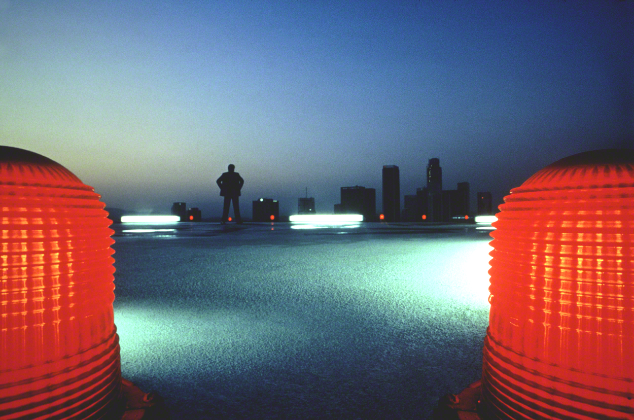
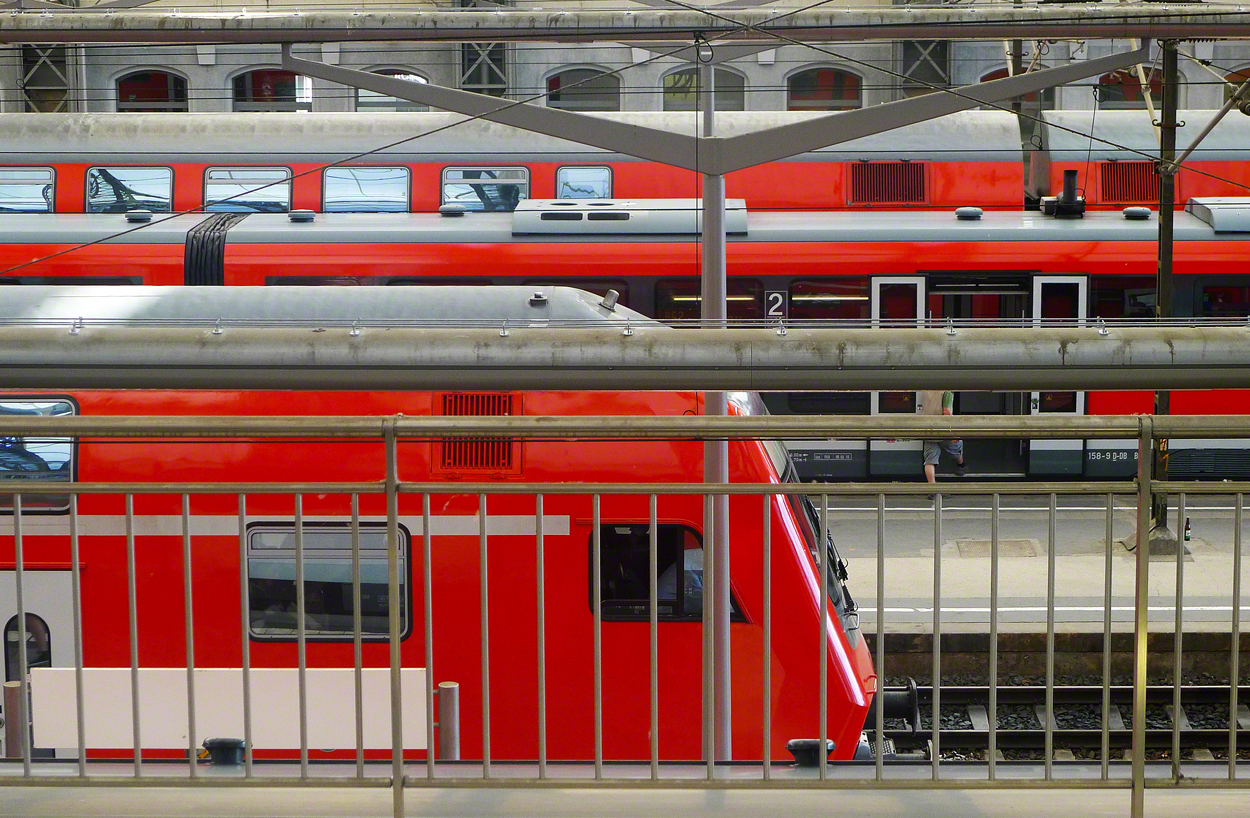
The color red (the longest wavelength) can be associated with danger, love, purity, good luck, and in parts of Africa it’s the color that represents mourning. Blue is intellectual and calming, but can also be cold, distant, and lack emotion.
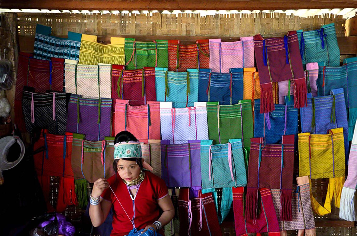
Yellow is generally positive, emotional and creative, green stands for balance and peace. Purple is majestic, orange is associated with warmth and passion, and gray is…well we all know what a gray sky means when we’re out chasing the light!!!
Although I think it’s important to know as much about the different colors as possible, it’s not always possible to consciously use these to your advantage while out and about taking photos; certainly something to recognize and act accordingly to improve visual interest.
Having said this, what you can control to some degree is the story-telling aspect of colors in general, and using it to communicate ideas and therefore keeping the viewer around longer by making him an active participant in your thought process…how you might ask?
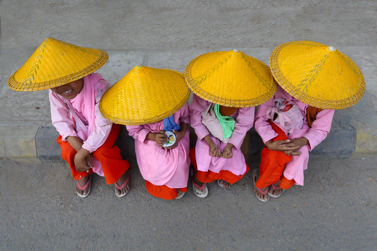
By controlling what the viewer perceives and then tries to process will do that for you. For example, showing a group of people all dressed the same will have the viewer asking himself what club, organization, team, etc., they represent; asking questions is a good thing and in your best interest. Remember that similar colors in inanimate objects will also provide much the same info for the viewer to assimilate.
So the next time your out shooting look for color that is communicating an idea to you because if it makes you ask a question, the viewer just might ask a similar one.
Visit my website at: www.joebaraban.com, and check out my 2018 workshop schedule at the top of this blog. Come shoot with me sometime. For those new to my blog I still have two openings for my Springtime in Berlin workshop; a beautiful and vibrant city.
In conjunction with The Santa Fe Workshops, October 2nd I’ll be leading a group in San Miguel de Allende. A beautiful oasis and artist colony, and the entire city is a UNESCO site.
Come join me for a week of fun and photography…what could be better?
JoeB