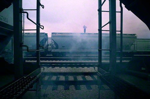
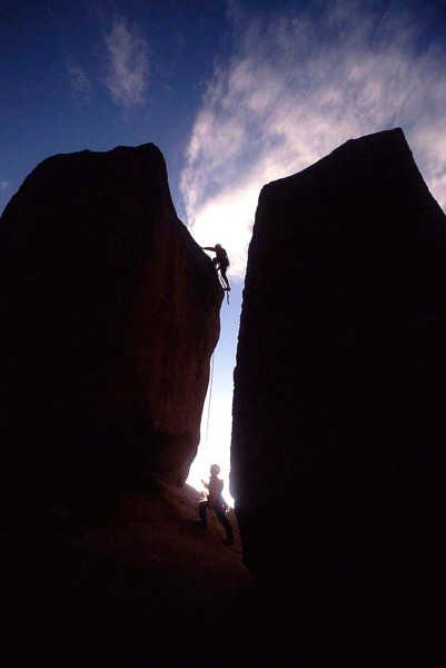
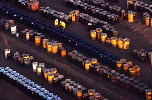
This is a continuation of a previous post when I talked about showing scale in a landscape photograph. Since I’m not a Purist when it comes to taking landscape photos, I like to give the viewer a sense of how vast an area is when I look through the viewfinder. For me, it puts things into perspective. It also gives the viewer a chance to discover new elements in my images. For example, a person or object somewhere in the frame that’s not immediately seen. Since I’m a follower of the psychology of Gestalt, I want the viewer to become an active participant in my thought process, and by having him discover new things when looking at my work, he’ll do just that.
There is another way that I like to show scale in my photos, and that is to show a person or object in relation to something much larger and man made. There’s a dichotomy created when I put a person in opposition to something that’s larger and/or more powerful. Animate verses inanimate. One of the ways to create Visual Tension is to have opposites sharing the same composition, thus competing with one another. The contrast creates energy, and the formula I’ve always given both in my online classes and in the “Stretching Your Frame of Mind” workshop I conduct around the planet is: Tension=Energy.
Besides the visual tension that’s created, the photo takes on an editorial feel by communicating some sort of story. Why is that person doing whatever it is that he’s doing. Why are they there? Where is he exactly, etc.
Here are a few examples of showing scale in a non-landscape environment.
Visit my website at: www.joebaraban.com, and follow me on Instagram: www.instagram.com/barabanjoe. Check out my workshop schedule at the top of this blog. Although I put them up, they fill rather quickly and then I take them down.Come shoot with me sometime.
JoeB


