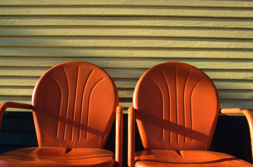
When I go out shooting I never look for a particular subject, for example: flowers, fences, boats, cars, buildings, planes, trains, rivers, oceans, etc. What I look for is color and light to be my subject. I’m usually looking for both to be co-subjects since it creates a strong, powerful relationship. A white picket fence is not just a picket fence, it’s a ‘white’ picket fence. The type of flower is unimportant; it’s the color that attracts me to it.
In my online classes with the BPSOP, and also my “Stretching Your Frame of Mind” workshops, I emphasize how color and light working in tandem creates those kinds of images that will stand the test of time.
Color is a stimulant for our eyes, and ties the elements of a photograph together. Color affects every moment of our lives, and has an enormous impact on our photography; knowing this, is one of the first steps in taking consistently good photographs.
I want to digress for a moment and put in a piece of information I read on the internet, if nothing else to show you how little value you should place when reading a considerable amount of photographic gibberish that’s out there..
This is what I read…” Colors that clash cause confusion to the eye and result in a poor image. Too many clashing colors create multiple focal points, causing the eye to dart around the image not sure what to look at first or what to focus on. Rather, choose one dominant color that becomes the focal point of the image and draws the eye of the viewer to it immediately. The greater the intensity of the color, the more it’s going to dominate so be careful that your subject in an image has the dominant color, otherwise a secondary subject could overshadow it because it has a dominating color”.
I couldn’t disagree more, and it leads me to the title of my post…I have created a link to the section on my brand new website to show you how color inspires me.
Since color is a basic element of visual design, it’s a very important ingredient in taking our imagery what I refer to as…”up a notch”. We should want to use color to it’s fullest dgree.
“I’m all about getting a viewer to feel some emotion when looking at my images. Except for the savvy photographer, most people aren’t really concerned how I compose a photo. Having said that, everyone responds when I’ve made them feel something; and nothing does it better than color.
So, my fellow photographer, the next time you go out shooting think of using color as your subject; using it to set a mood. If you really want your color to stand out think about the time of day you choose to shoot.
For example, photos taken in the early part of the day or in the late afternoon will have a warmer cast, which will make the scene seem inviting and cheerful.
Converesly, photos taken at mid-day will have a cooler cast and could render the different hues hot, contrasty and bold; not particularity relaxing…but definetely a look.
Visit my brand new website at: www.joebaraban.com, and check out my workshop schedule at the top of this blog. Come shoot with me sometime.
JoeB