Student Work: Has Doubts.

Does it work?
Does it work?
Ghita sent me this photo with doubts about whether I thought it was a good photo or not. As usual, i like to let my fellow photographers read what was sent to me. The reason being that we all at some point have doubt about our work, or have asked themselves similar questions. Here’s the question as it was sen to me:
“Hi Joe,
I’m a Danish hobbyist photographer following your blog. I send you a photo, I took a few evenings ago in my local area.

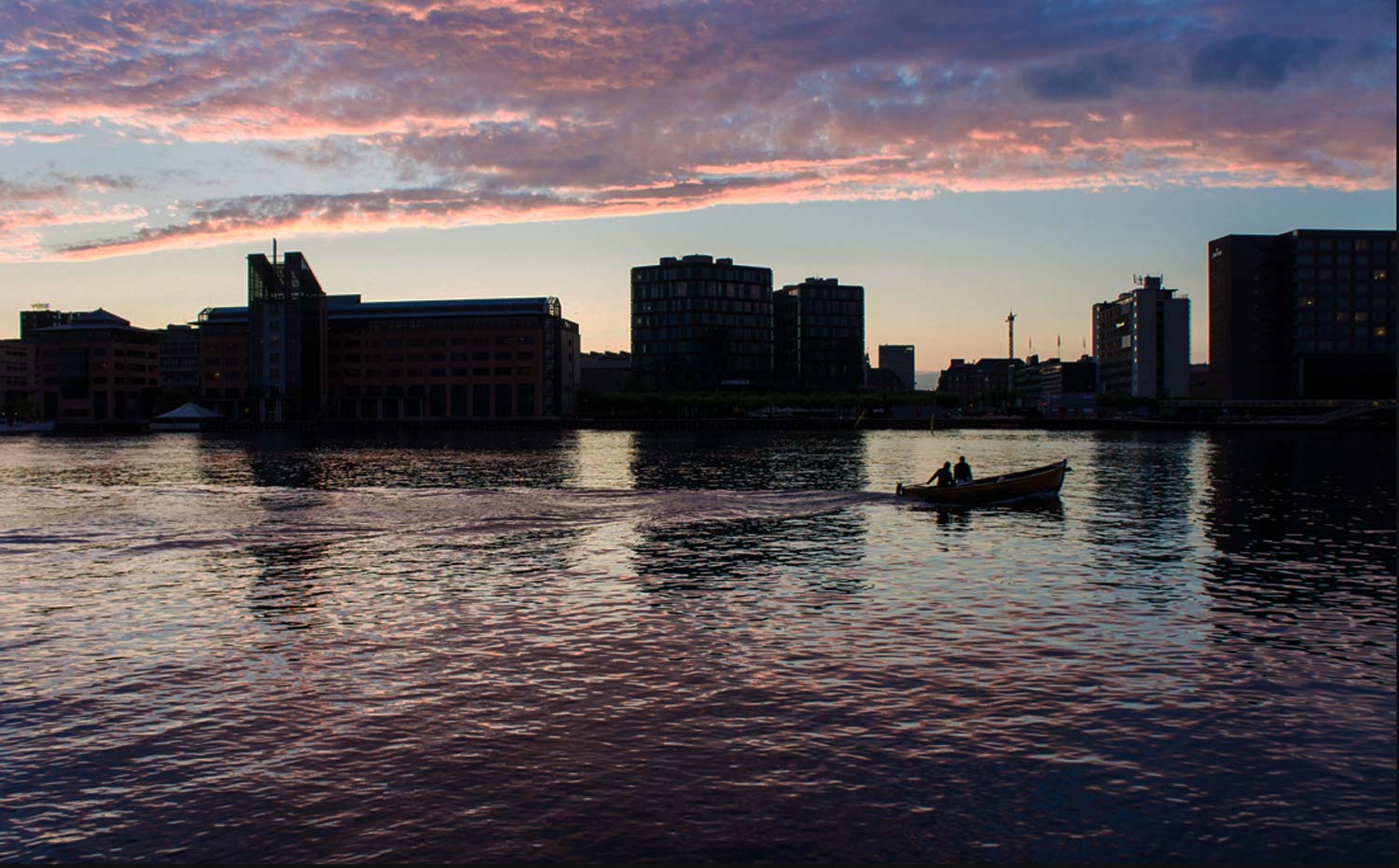
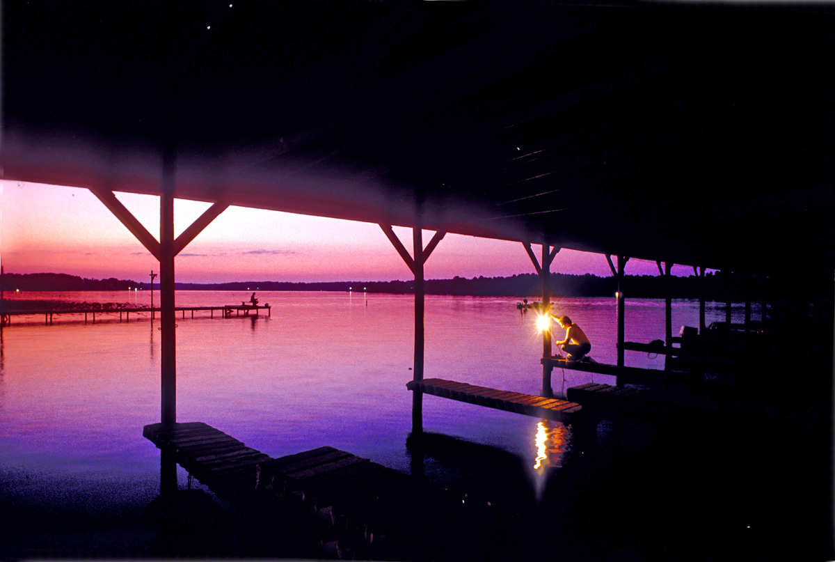
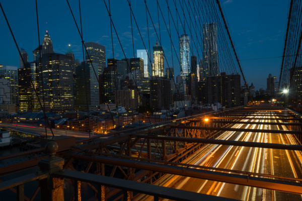
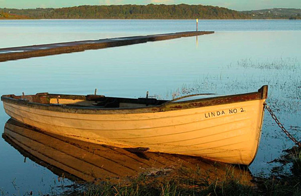
I’m quite happy about it, but nevertheless have some doubts about the light and the composition. It’s edited in Lightroom. I increased the clarity a bit and lightened the shadows. It now looks pretty much as I saw it.

But how does it work? Is it too dark? Is it too light? What about the balance between the amount of sky and water? And the composition? I had to be quick, because the boat went rather fast.

Kind Regards,

Ghita,

First of all, let’s talk about the overall composition. It’s a really nice, well balanced and the horizon line is straight (harder than you might think). I love the fact that you showed just the important part of the sky that has the color. You’ve created a really nice area of Negative Space between the bottom of the sky and the tops of the buildings. I always tell people to look at what’s the most important part of your image, the information above or below the horizon line. In this example, the information below is filled with texture, one of the basic principles of Visual Design so it will keep the viewer’s interest.

I talk about these elements both in my online class with the BPSOP, and also in my Stretching Your Frame of Mind workshops I conduct all around our perfectly round planet…Earth

So you said that you lightened the shadows, but not near enough to show any detail in the buildings. To show more detail would turn them a bad looking gray, so why not just leave them as silhouettes? They are almost at that point so they look good. All you need is the different shapes to show the different buildings, and the Negative Space and the contrast provides visual interest.

As far as the boat, you put it in just the right space, so great thinking. Eddy Adams once said, “When you get lucky be ready”. You were lucky and you were readt with a quick eye and responce.

Visit my website at: www.joebaraban.com and follow me on Instagram: www.instagram.com/barabanjoe. Watch for my Workshop schedule at the top of this blog. I don’t keep them up long because they fill very fast. Come shoot with me sometime.

JoeB

AskJoeB: Did It Do It…Create Tension?

Did it create Visual Tension?

A past online student with the BPSOP, sent me this photo to review. Like always I like to show the actual message, since so many of my fellow photographers have experienced similar situations and have had the same questions. Here’s what tom had to say:

“Hi Joe,

Took this shot of the Sydney Opera House almost an hour before sunrise – 120 seconds at f/13, 70mm on a full frame camera.
When I’m shooting, I’m always remembering the artist palette you taught me in the online BPSOP courses – or at least trying to. In this shot, I was thinking about tension, perspective, negative space, line, texture, and of course, light. The main focus was to create tension by putting the strong, smooth, and very simple diagonal of the bow of the cruise ship close to the complexity and texture of the Opera House, leaving enough negative space to define each clearly but not so much that they become separated.

Did it do it (create tension)?

Also, I’m not sure how quickly a viewer will be able to see that the strong white triangle is the front of a ship, there may not be enough there for them to fill in the rest in their mind (closure). But also not sure it makes much difference to the overall appeal of the shot whether that is a ship or a building or a UFO. Would appreciate your thoughts on that.
I did make a few lightroom adjustments. Brought the shadows up a bit and the highlights down, as the sails of the Opera House were a bit dark but the lights around it were a bit strong. Added contrast and decreased clarity. And increased both the saturation and the luminance of the blues, but left the other colours alone..

It’s a really nice photo,beautifully lit. So many areas to look at, and besides in my BPSOP class, I also talk a lot about ways to keep the viewer around longer in my “Stretching Your Frame of Mind” workshops I conduct around our planet. Having him discover new things when looking at your image, and moving him around the frame are two ways to keep him around.

Here’s my only problem: Since you were there standing in your three dimensional reality, you know that it’s a very large ship. However, you won’t be around to explain what this large object (that takes up just about fifty percent of your frame) is to the viewer. It will have to stand on its own and be a ‘quick read’. My question to you is…to you think that someone living in a place that is not bordered by water of any kind will know what it is?

As far as tension is concerned, yes it does generate tension. By minimizing the negative space between the ship and the Opera House, you create Tension. The use of light, and contrast also creates Tension.

Thanks for sharing this beautiful image with us, and I’m glad you’re thinking about my “did it do it” list for good composition we worked on in our online class.

FYI, a triangle has three sides, not four.

What do you think about it darker?

Visit my website at: www.joebaraban.com, and follow me on Instagram: www.instagram.com/barabanjoe. Check out my upcoming workshops at the top of this blog. Come shoot with me sometime.

JoeB

Springtime In Prague Workshop

Taking a lunch break and a glass of wine overlooking the Old Town Square.

It’s been a while since I conducted my workshop in Prague, and because of circumstances way beyond my control (that would be misplacing the flash drive with all the student’s work on it) I am now able to finally write this post. It seems that it was in the bottom of my bag…go figure!!!

My class and I spent a fantastic week shooting in Prague, and with a little help from the weather Gods, we had five perfect days of beautiful skies and wonderful sunsets. Like with my online class I teach with the BPSOP, my “Stretching Your Frame of Mind” workshop is centered around my Artist Palette. On this palette are the elements of visual design and composition, and I show fellow photographers how to apply them to their imagery. Negative Space, Balance, Vanishing Points, Perspective, Tension, Texture, Pattern, Form, Shape, Light, and Color.

When you can go to a location,  and are able to implement these elements into your thought process, you can pretty much count on walking away with a photo that you’ll not only be proud of, but you’re sure to impress most anyone, including fellow photographers. These elements have been around for a very long time, going back to the ‘Masters’ who also were using them in their paintings. After all, are we not painters who have chosen a different medium? Have we not exchanged a paintbrush for a camera?

The letter ‘Q’

I know I did, a very long time ago!!!

I took the above photo while scouting locations for the sunset shoot. There’s nothing quite taking a break for lunch and enjoying a glass of Sauvignon Blanc while overlooking the Old Town Square.

Take a look at these photos taken over a five day period by  nine serious amateurs photographers who were using their own Artist Palette. I think you’ll be as impressed as I was…and still am.

BTW, I gave each student a letter to find as one of their assignments, see if you can pick them out. I can tell you that my favorite was the letter ‘Q’ (very difficult to find in reality) I gave to Katka the woman that lives in Prague who did an incredible job producing this workshop for me.

Check out these remarkable images shot by amateur photographers that have implemented the elements that i teach in my classes.

Visit my website at: www.joebaraban.com and follow me on Instagram: www.instagram.com/barabanjoe. Stay tuned for my complete workshop scheduleCome shoot with me sometime.

JoeB

What Do you Think Of This Picture?

What do you see?

A student submitted this to me and wanted to know what I thought of it.

He said he liked this picture because the silhouettes are the subject and they pull the eye to them. He also likes the way his friends are looking at each other and that the beams and the trees create patterns around them.

When I first saw the photo and read his description my first thought was that he was being too esoteric. In other words that all may be well and good, but I’m thinking you had to be there to see what he saw in a three dimensional reality. Trying to portray this in a two-dimensional representation, as in a photograph, is not an easy task…for anyone, myself included.  I told him what I tell everyone in my online class with the BPSOP, and in my “Stretching Your Frame of Mind” workshops I conduct around the planet, that he won’t always be around to explain his thinking to the viewer. It has to be able to stand on its own. The exception being an abstract. What I’m talking about is  an idea that lives only in the photographer’s thought process and not made up of any concrete existence.

To me, the photo is closer to being in a three dimensional reality than an abstraction. Therefore, it needs to be what I call a “quick read”. The silhouettes have to stand out. There could also be a discussion about whether the silhouettes need to be easily recognized, or if they could be discovered as the viewer looks at this image. My thinking is why take that chance? Sure, it would be great if the viewer were to discover them after looking at this photo, but how long is the viewer going to give it before he just scratches his head and moves on.

Although I really like the colors as they are in harmony with one another, the fact is that the composition so busy that I get lost trying to figure out what’s going on here. His friends now that he mentions it could be looking at one another and the camera, but he had to tell me. because the body language has been overtaken by all the branches. There are so many lines going in and out of each silhouette that I can’t tell where their bodies and arms begin and where they end.

If it had been me with my friends, I might have easily become carried away with the fun I was having and forgotten to what I refer to as “stepping back and considering the scene, and its outcome”.

I almost thing it would look better without the three friends (and at least a stop brighter). This way it would just be a study of line, shape, texture, and color.

One of my Personal Pearls of Wisdom is “In a perfect world, what if”. What I mean is:  what if he could go back and could take this photo again and have anything at his disposal and be able to do anything he wanted…what would he do?

If it were me, I would go back with my camera  and put a 300mm 2.8 lens and of course a tripod. I would get back far enough to get close to this same composition and focus only on the silhouettes with my lens set on 2.8. That way, I would have the three silhouettes sharp and everything behind them completely out of focus. Then, they just might become the subject.

Thanks for your submission. It looked like you were having a lot of fun!!! I hope this helped.

Visit my website at: www.joebaraban.com and follow me on Instagram: www.instagram.com/barabanjoe. Check out my workshop schedule at the top of this page and come shoot with me sometime. FYI, the workshop descriptions at the top don’t stay up long because my workshops fill in just a few days.

JoeB

Student Work: Yosemite In The Fog

One of my students submitted this photo of Yosemite taken in the fog. His question was, “How I would compose this differently, and how would I deal with the exposure in the fog.”

Well,  the first thing I would do is to get the notion that the Rule of Thirds will take your imagery what I refer to as “Up a Notch” out of your mind!!! Check out my past post entitled “The Rule of Thirds is not for everyone“. The essence of that post is that if you want to be a good photographer then by all means follow that rule. However, if you want to be a great photographer forget about that rule.

In my forty-two year career as an Advertising, Corporate, and Editorial photographer, I can honestly say that I’ve never…not once…thought about that rule…why?

Because it’s very hard to generate Tension when you follow that rule. Be sure to look at my photo examples if you go back and read that post.

The most important elements in this photo are the clouds, the mountains, and of course the falls. That being said why show so much sky? In my opinion, you don’t need so much of it because it’s really not doing anything to take your photo “up a notch”. I would have cropped the photo (in the camera ) right above the mountain on the left. The reason is that by doing so, you would be creating Tension two ways: by minimizing the Negative Space between the tip of the mountain and the top edge of the frame, and by placing the mountain close to that edge of the frame.

Also, I would have placed the falls where it could create some Tension as well…anywhere but in the “Rule of Thirds”. I would place it where the viewer would discover it, not where it’s the first thing he sees.. In my classes, I talk a lot about the Psychology of Gestalt. In this theory, it’s important for the visual to become an active participant. One of the ways is to have him keep discovering new things in our photographs. The more he discovers the longer he’ll stick around…isn’t that what we want?????

I love the fog and the clouds. It’s a photo that you don’t see very often, and for that reason alone, it works for me!!!  As far as the exposure is concerned, do you ever bracket??? To me, this image is about a stop too dark. When I lightened it everything was brighter without losing the ethereal felling here.

In my online class I teach with the BPSOP, and my “Stretching Your Frame of Mind“workshops I conduct around the planet, we work on the elements of visual design and composition. Tension is a very important one. Use it to your advantage and let everyone else be predictable. Stretch your frame of Mind!!!

Thanks for sharing it with others.

Visit my website at: www.joebaraban.com and follow me on Instagram: www.instagram.com/barabanjoe. Check out my workshop schedule at the top of this blog. Come work on the elements with me sometime.

JoeB

Student Work: Camera Photo

A student sent me this photo and asked me, “If an unknown person was to see this photo for the first time, how will that person judge this photo?”

How would you judge this photo?

My question to you is on what level do you want it judged? Do you want it judged on what I refer to in an earlier post as “The Whole Enchilada“? In other words, do you want it judged as if it was a real photo? If this is what you want judged, then I’m not 100% sure it is. Of course, this is going to be predicated on the assumption that the viewer knows what he’s looking at. If he’s a competent photographer, he’ll know that it could be two photos put together. If he’s not, he might think that it’s a pretty cool photo. I think I might show it to non-photographers to judge this image…why you ask?????

Look at the image in the camera, then look at the environment the camera is taking a picture of. They don’t match!!! First of all, the way the camera is pointed down would distort the vertical lines of the train. I also don’t think you could capture the bottom and the top of the train at one time with this angle. This isn’t happening in the display. The light is different as well as the color, and if you look at the foreground in the camera’s display and the real environment, it’s also completely different.

Why is the train in the display in focus and not what the camera is seeing? If it was about to be taken, the display wouldn’t be in focus????? Hummmm!!!

Is that a reflection of a flash in the top right corner of the camera’s display????

In both my online class with the BPSOP, and my “Stretching Your Frame of Mind” workshop I conduct around the planet, I often use my “Pearl of Wisdom” …consider the scene and it’s outcome. In any event, right before you pull the trigger (that’s Texas talk) be sure that you’re message is getting across to the viewer. In the case, if you wanted the viewer to believe he was looking at a photo of a train at the back of your camera, make sure the two dimensional representation (the finished photo) of the three dimensional reality look the same.

Now, this is just my initial feelings. To be fair, I want to include a conversation I had with my web designer who thinks that this just might be a real photo and not a composite. He had some valid thoughts I sort of agreed with and we both did agree that it’s an interesting puzzle???

Visit my website at: www.joebaraban.com and follow me on Instagram: www.instagram.com/barabanjoe. Check out my workshop schedule at the top of this page. Come shoot with me sometime.

JoeB


Student Work: BPSOP Classes

Lots of elements from the 'Artist Palette' are in this image.
Lots of elements from the ‘Artist Palette’ are in this image.

In my online class with the BPSOP, and in my “Stretching Your Frame of mind” workshops I conduct around the planet, I teach my fellow photographers how to incorporate the Elements of Visual Design and composition into your photography. While Line, Texture, Pattern, Form, Shapes, Balance and Color are the basic elements, we also work on Negative Space, Vanishing Point, Perspective, Rhythm, and Visual Tension.  All of these are found on the ‘Artist Palette’ the students walk away with after the four week course.

I like to present my online classes work to show how their new ‘Artist Palette’ has taken their imagery to new heights…Up a notch” is what I always refer to it as. As you enjoy the slideshow, you’ll see all these elements in each of the photos and as you’re drawn to these images, you’ll begin to understand why they’re as strong as they are.

Enjoy the show:

Visit my website at: www.joebaraban.com, and follow me on Instagram: www.instagram.com/barabanjoe. Check out my workshop schedule at the top of this blog. Come shoot with me sometime.

JoeB

Student Work: Working From the Artist Palette

How many Elements from my Artist Palette do you see in my photograph?

For most of my forty plus career in Advertising and Corporate Photography,  I’ve been using what I call my Artist Palette. Now that I’m teaching online with the BPSOP, and conducting my “Stretching Your Frame of Mind” workshop around the planet, I’m passing the baton to all my students.

The full description of my Artist Palette  can be found in the workshop overview on my website, but basically the Artist Palette is filled with all the Elements of Visual Design and Composition. Terms like: Negative Space, Vanishing Point, Tension, Perspective, Pattern, Texture, Shape, Line, Form, Light, and Color are either used individually or together to make the viewer become an active participant in our imagery which in turn will take our photography what I refer to as “Up a Notch”.

In this wonderful photograph Liz, a BPSOP student of mine, has learned just how important her new Artist Palette can be. The balance between the Negative and Positive space, the use of Perspective to create Layers of Interest, Tension generated by framing within a frame, creating three important triangles (Shape), Line, Pattern, Texture, Light, and Color have all melded together into a memorable photograph. When you can use this many Elements of Visual Design in one photo, it’s going to be very hard to miss.

Great shot Liz!

Visit my website at: www.joebaraban, follow me on Instagram: www.instagram.com/barabanjoe. Check out my workshop schedule and come shoot with me and work with your new Artist Palette.

JoeB

Student Work: Vanishing Point and Leading Lines.

I like the use of a Vanishing Point in my photographs.

Knowing how to incorporate the elements of visual design into our imagery is probably the best way to take your photos “up a notch”. It’s what I’ve been doing for the past forty-two years, and have done very well by it.

Where I learned to use these elements was not studying photography, but the years in school surrounding myself with courses in painting, design,  composition, and drawing. When I crossed over to photography at the ripe old age of 21, I carried all my training into this new medium that I absolutely fell head over heels in love with, especially since it was the answer I had been looking for.

I thought why spend days, or a week, or even a month painting a picture when a photograph taken by my new camera provided me with instant gratification.  I still considered myself an artist, as I do now. I’ve just changed out my pencils and paintbrushes for a camera.

In my online class with the BPSOP, and with my “Stretching Your Frame of Mind” workshop I conduct around the planet, One of the elements my students use from their new Digital Artist Palette is called a Vanishing Point. Briefly stated,  a  Vanishing Point is the point where parallel lines viewed in perspective appear to converge at or near the horizon.

Leading lines are those Lines that lead the viewer around your composition, making him/her an active participant in your photography…a very good thing!!!

Here are two photos taken by students of mine that were able to create not only a Vanishing Point and Leading Lines, but several other elements from their new Digital Artist Palette as well.

Yvonne, a student of mine from Utah took this wonderful photograph that uses Leading Lines to take the viewer’s eyes down the wall to the payoff at the end…the Palm tree. The parallel lines are those lines that are at the top and bottom of the wall. They are very close to being a Vanishing Point, but the lines don’t begin behind the camera.

Karen, another student of mine that was part of my workshop at the Houston Center for Photography was with me at the Polo Grounds one sunrise when she saw this great example of a Vanishing Point and incorporated it into her final composition.

As usual, all my students learn exactly where the sun is going to rise and set any day of the year, so Karen knew a week before exactly where the light would fall when it would be there, and how long she had before the light was gone.


Really nice photographs!
Visit my website at www.joebaraban.com and follow me on Instagram: www.instagram.com/barabanjoe. Come shoot with me sometime. I’ll show you how to use both a Vanishing Point and Leading lines to take your imagery “Up a notch”.

JoeB

Student’s Work: New York Workshop/2016

"Taxi"!!!
“Taxi”!!!

I recently returned from yet another of my latest workshop in New York, and it will have to go down as one of the best group of people I’ve ever had…or close to it since so many had taken at least one if not ten  previous workshops with me. The level of work was amazing and I was was proud to be a part of it. Nor only am I proud to show you their week taken during the week, but I would think you will agree that it’s pretty impressive work.

We shot at several places you’ll recognize in the slideshow: The Seaport, Memorial Gardens, the Brooklyn Bridge, Chinatown, Washing Square Park, the Village, Central Park, Calatrava Path Station, and a private hard hat tour of the shuttered hospitals on Ellis Island…not counting just walking around the city finding photo ops wherever you looked.

As I said, most of the people had taken my “Stretching Your Frame of Mind” workshop, or had taken my online classes with the BPSOP…or both, and I would put their body of work against the majority of working professionals living through the US…and abroad.

Group photo taken after the hard hat tour on Ellis Island.

You’ll have to excuse me this time for the amount of photos I’ve selected, but it was very difficult and this is less than half of what I went through as to make it as short as possible. Just keep your finger clicking on the arrow and it will go by a lot quicker!!!!

🙂

I always try to select a photo to highlight and it was very difficult to do so. I finally settled on the one at the top that to me represents New York, albeit in a semi-strange (NY) way. It’s the one image you see happening more than any other when in the Big Apple.

Enjoy:

Visit my website at: www.joebaraban.com and follow me on Instagram: www.instagram.com/barabanjoe. Check out my workshop schedule at the top of this blog.

JoeB

AskJoeB: Red Tailed Hawk

Mary sent me this image with a question. I like to include what fellow photographers have to say so that others that might have a similar question or photo can benefit. Here’s what Mary had to say:

“Hi,

My name is Mary Robinson and I came across your site via Lightstalking.com. I have enjoyed reading your blog and am interested in having a photo critiqued. My question is, I have always been told and read numerous times that the most important thing would be to make sure in portraits that the eyes are in focus. In this particular image I have done that, but the beak itself is not, given the settings I was using and that my angle of view was slightly above the bird how would I have avoided getting parts of the bird out of focus while others are in focus and does it matter in this particular instance as the eyes are what drew me to take the shot in the first place?”

Mary,

I looked at you camera settings and it said you were using a 70-200 zoom, and you were just about all the way out at 190mm. It also says that you were at F/7.1 at 1/160th of a second.  This could be the problem.

I realize that the distance from the end of the beak to the eyes is not very far, but it might be too great a distance to get it all sharp at F/7.1 with a 200mm lens. At 200mm, the plane of focus is not very much, which is why it’s used to separate the Figure from the Ground. In my new class with the BPSOP, and in my “Stretching Your Frame of Mind” workshops we work on the six principles of Gestalt. One of them is called Figure-Ground”, and it deals with ways to separate the figure (the subject) from the ground (background). The best way is to use a long lens and shoot with a minimum aperture. This is sort of what’s happening with your photo of the hawk.

Here’s what I suggest: First of all I assume you were using a tripod, because if you were hand holding it you already started out with a sharpness problem. Ok, assuming you were on a tripod, I believe it would have taken more DOF to get him sharp from the beak to the eyes…if you were at 190mm.

It also appears that you were over to the right side of the beak, so the distance from the feathers and eye on the left was further away from the features and eye on the right on the right. That would have been enough to not get all of it sharp. Remember that you’re dealing with a long lens so you have to remember that it’s going to take more DOF to get everything you want in focus.

It’s also possible that 1/160th of a second was not fast enough to maintain sharpness. That’s not really all that fast when shooting wildlife.

I hope this helped.

Visit my website at: www.joeBaraban.com and follow me on Instagram: www.instagram.com/barabanjoe. Check out my workshop schedule at the top of this blog. Come shoot with me sometime.

JoeB

A Question About Color.

askjoebbonnieLamprey

Bonnie, an online student, sent me this photo with a question. As I always do, I put the message from the photographer so everyone can read it. This way, those that have similar issues or questions can benefit. Here’s what she said:

“Joe, my question on this photo is mainly about the color.  The boat in the foreground was in shade and the one in the background was in the sun.  I like the composition (mostly), but the differences in color (hue?) between the foreground and background is extreme.  I exposed for the boat in the background, so it would be seen.  Would you brighten up the boat in the foreground?  Would you have metered from a different spot?

I did do some post-processing – increased the contrast a bit and cropped off a bit on the right (there was too much space behind the background boat).  Also, the wire lines from the foreground boat cut across the front of the background boat – I’d like some space between the two.  I’ll go back to this spot again (undoubtedly a lot more times!), so I can keep my former mistakes in mind J .

Thanks!

Hi Bonnie,

Ok, first let’s address the question mark (?) you had next to the word “Hue”. The word Hue is basically the characteristics of a color. For example one might say,” Doctor, his face had a yellowish green hue (or color) to it”.

The photo of the boats is not just about color, its mostly about exposure. Let me explain:

This is really all about Dynamic Range. The light reflecting off the boat in the background was too far from the boat in the shade. I don’t know what you use to take readings, but I’m guessing you let your camera make the exposure recommendations, and like a good photographer you believe it. Depending on what you had your meter set on, it probably was picking up too much of the boat in shadow. For me, I never let the camera tell me what I should do, which is why I use a hand held Minolta One Degree Spot Meter. If I were to take a reflected reading of each boat separately, I would know that there’s way too much difference to get a proper exposure on each one. So, what to do?

I either change my composition so everything will read the same, or I stick with what I have. If I like what I have, I’m going after the boat in the sunlight, then underexpose it a stop. That’s where I want the colors to have depth and be saturated. What will happen is that the boat in the shade will be a lot darker, so you have to decide if that’s ok. Personally, I think it would still look good. In any event, you can always open the shadow in post.

Btw, If I had been standing next to you, I would have asked you why you didn’t want the boat in the background to be sharp?????? I think it would have looked soooooooo much better. Remember when you have that much distance between the foreground and background, you should always check your DOF to make sure you’re getting what you want.

One last note: If you ever want to become a really good photographer, I strongly suggest you do your cropping in the camera. If you use the computer to do your cropping, you’ll never know where the edges and corners of your frame are. Use the edges of your frame as a compositional tool.

Since I know you took my online class with the BPSOP, and as I tell the students in my “Stretching Your Frame of Mind” workshops, you probably forget to use your “Fifteen Point Protection Plan“. Otherwise you would have left some space between the cables on the boat in the foreground and the bow of the boat in the background; making it a “quicker read” and not so confusing.

Oh yes I forget to mention that I really like your composition!!!

Visit my website at: www.joebaraban.com and follow me on Instagram: www.instagram.com/barabanjoe. Be sure to check out my workshop schedule at the top of this Blog. Come shoot with me sometime.

JoeB

Student’s Work: BPSOP part I and II classes

Working on the silhouette.

I’ve been teaching an online class with the BPSOP for just about three years, and I’m always amazed and impressed with the level of work that’s generated over the course of the four weeks. I had started out with just one class, and like my “Stretching Your Frame of Mind” workshops I conduct around the planet, we work on incorporating the basic elements of visual design and composition to make  fellow photographer’s images stronger.

Several years ago I began teaching a part II class that extended these elements to include shadows, silhouettes, some interesting assignments, and some of the principles of Gestalt. When you put all these elements and concepts together the results are memorable photos that the viewer will mentally enjoy long after he’s stopped looking.

Here’s some examples of how these elements that they’ve  learn over the month made their photos look as good as I believe they do. These are amateur photographers with all different skill levels since everyone can benefit from my classes no matter where they are in the scheme of things…photographically that is!!!

The following slideshow is from both my Part I and Part II…enjoy and see if you can pick out the different elements and concepts.

Visit my website at: www.joebaraban.com and follow me on Instagram: www.instagram.com/barabanjoe. Check out my workshop schedule at the top of this blog. Come shoot the elements with me sometime.

JoeB

Student work: Does it Make A Statement?

One of my students sent me this photo and as always I like to copy exactly what each photographer had to say. I’ve found that there’s a lot of folks out there that have had similar experiences at one time or another.

Here’s what was said:

“I wanted to ask you if you thing that the attached picture makes a statement on its own, without any explanation required. It is called “Whatever the Dusk or the Dawn ” because I entered it in a Can Geo photo contest called “Whatever the Weather”.

I took it because I liked the colors and the multiple layers in the sky. I did not want to include the sun or other silhouettes in the frame, because I liked the simplicity of the colors alone.
I find that people don’t have the reaction I expected towards this photo. I believe that they take it as another pretty picture of a sunset that everybody can point and shoot.

This is one of those that does not scream the center of interest at you, but definitely has the visual interest through colors. When I look at it I see an abstract painting on canvas and all kind of other things, but as you say I am not there to tell my story.

Any critique will be appreciated.

Thank you very much.

I immediately wanted to send you a link to an article I read some time ago and have repeatedly show to my BPSOP and in my “Stretching Your Frame of Workshop” I conduct around the planet. It’s called “Giving meaning to photographs”. I think you’ll find it the answer to all your questions.

Remember that you’re not always going to be around to share your thought process or emotions at the time you created your image; it has to stand on its own merit. The feeling you had and the thoughts running through your mind were important to you. Unless the viewer was standing next to you, he can’t sense the same ethereal qualities just by looking at a pretty sky that he might have seen before.

So many times I’ve been driving down the road or walking on the beach and had the pleasure of witnessing a beautiful sunrise or sunset. The first thing I do is to look for anything else I can put in the photo to add what I refer to as a “layer of interest’. If I don’t see something I may shoot anyway just because I’m a photographer and like to take pictures of pretty things. There’s just as much chance as me not shooting it and just standing there smiling while I enjoy the forever fleeting moment.

Reason being that I’ve personally shot a million pretty skies and my files are crowded with them!

Here’s a post written my a very famous photographer who once said, “If you don’t have anything to say, your pictures aren’t going to say much. https://joebaraban.com/my-favorite-quotes-gordon-parks/

Having said all this, it is a pretty sky with great colors…but just another pretty sky.

I hope this has helped.

Visit my website at: www.joebaraban.com, and follow me on Instagram: www.instagram.com/barabanjoe. Check out my workshop schedule at the top of this blog. Come shoot with me.

JoeB