Did It Do It: Did It Have Balance Part II

In my first post on “did it have balance”, I talked about creating Balance in your photos.

Every shape, color value, line, areas of mass, (for example a building, tree, people, etc.), provides weight that when arranged correctly in your composition provides a way to pull the viewer throughout the frame, creating a feeling of balance. The balance occurs when the viewer’s ‘eye’ moves in a steady flow without one single area stopping it or bogging it down.

To keep your photo balanced, it’s important to counter-weight an element with another object with a similar mass. This can be done with different degrees of contrast, different colors, and different areas of light and shadows.

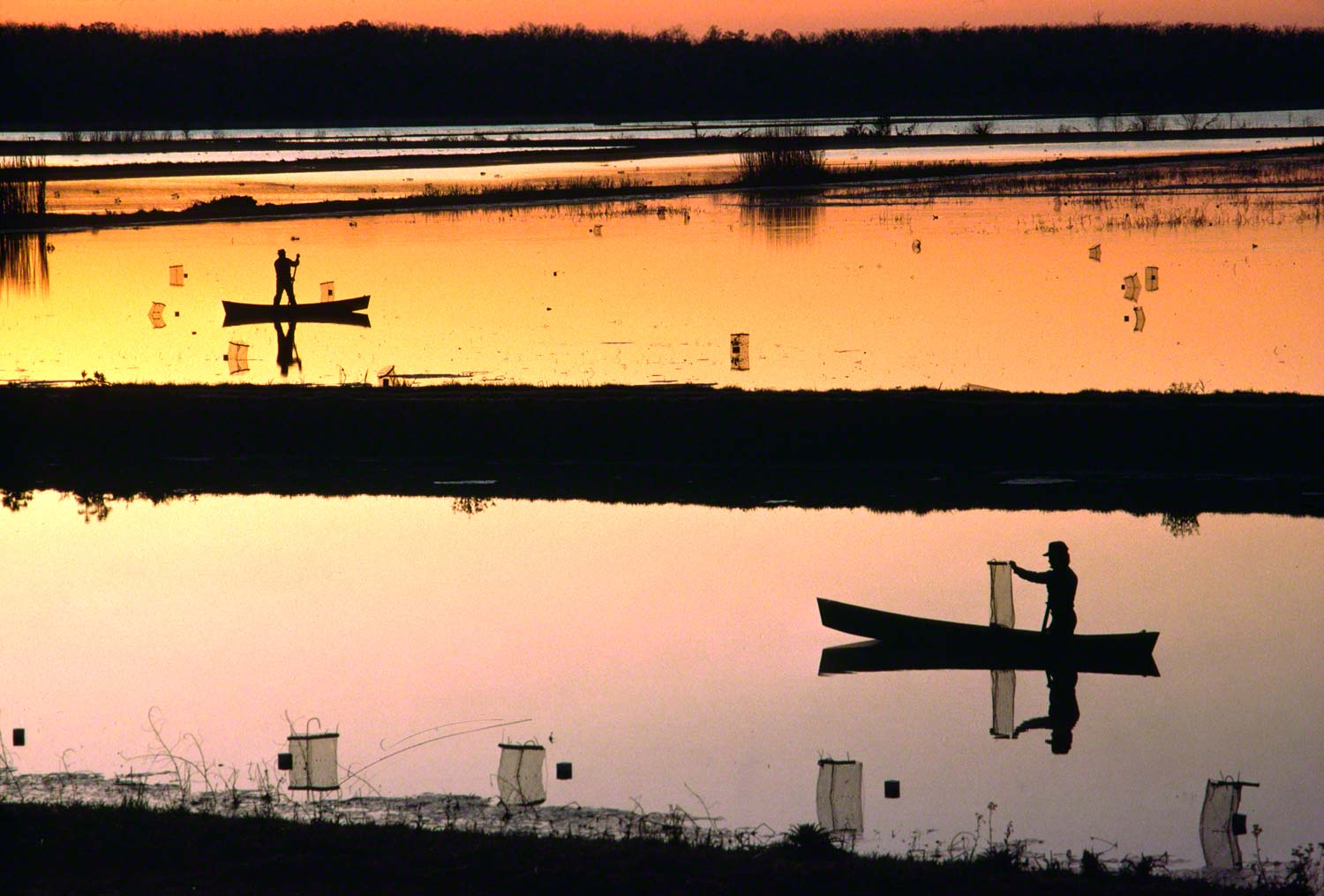
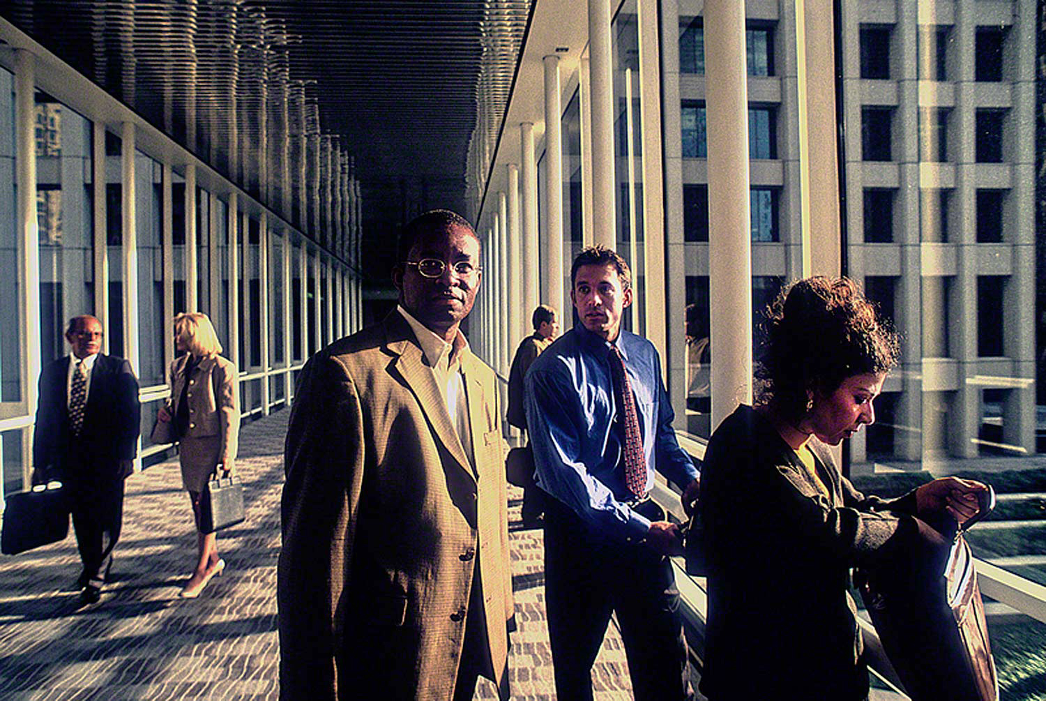
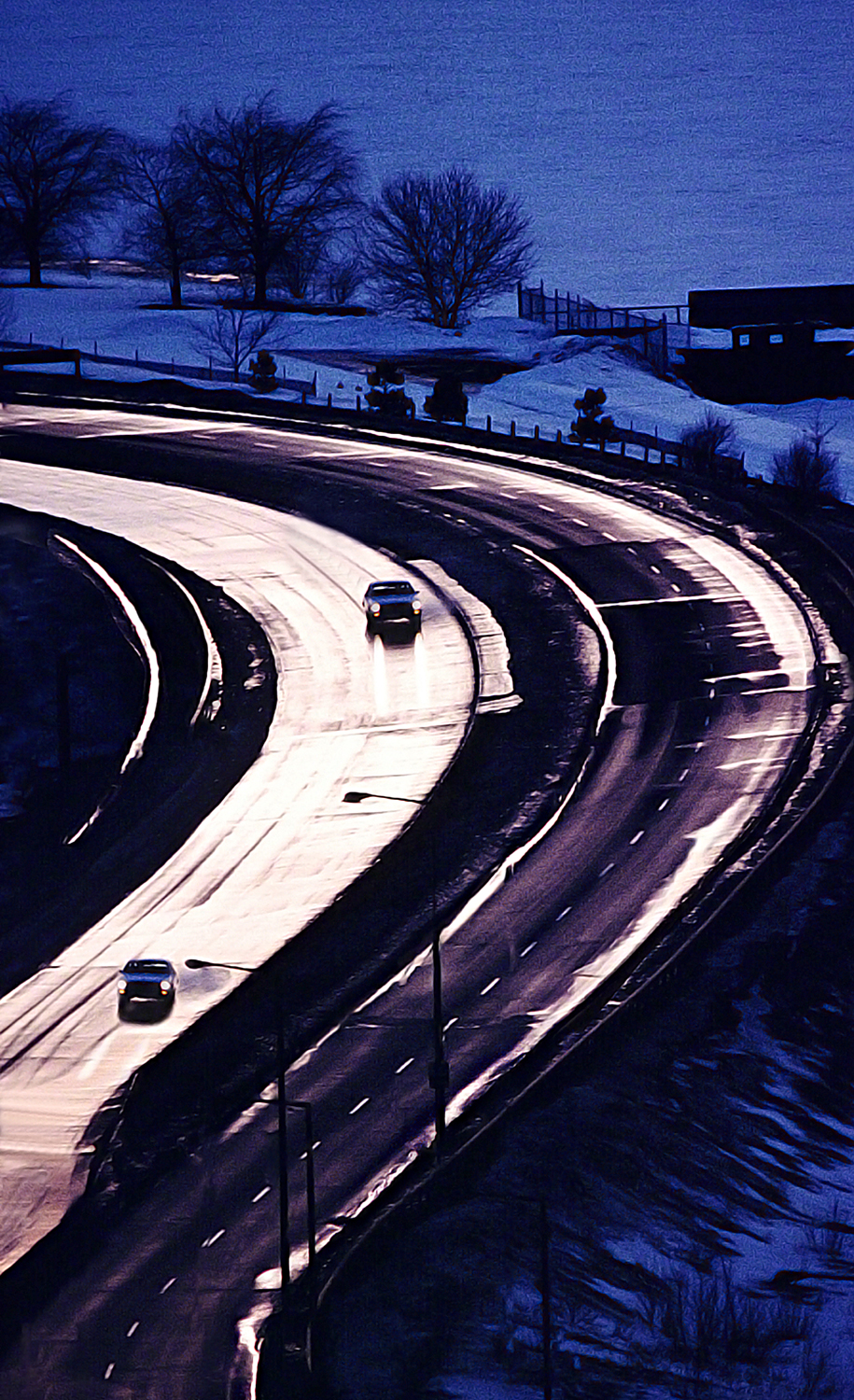
In my first post, I talked about creating Formal Balance in your imagery. In this post, I want to address the other kind of balance which is Informal Balance or Asymmetrical Balance as it also is referred to as.

Informal Balance, unlike Formal Balance, is more interesting to look at. Instead of mirrored subject matter on both sides of the vertical center,  the balance will still rely on an imaginary center point, but now the elements are different in size, shape, color, and mass. The balance comes from the placement of these elements in the frame in spite of their differences.

That being said, Informal Balance is more difficult to achieve than Formal Balance. Creating and assigning the relative values to completely unrelated objects can take practice. One way to test whether or not your photo has balanced is to turn your photo upside-down.

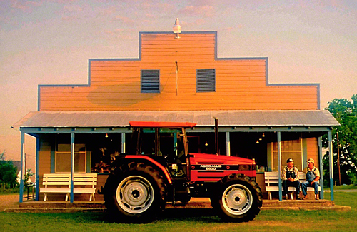
In the above photo, I’ve created an asymmetrical balance by capturing the scene from a different point of view. The angle I choose created the feeling of stability needed for the viewer to perceive a sense of balance. I’ve deliberately manipulated the subject in such a way as to balance the visual weight in both the classic car and the building.

Balance is an important part of my “Stretching Your Frame of Mind” workshops I conduct around the planet.

Visit my website at: www.joebaraban.com and follow me on Instagram: www.instagram.com/barabanbjoe. Check out my workshop schedule at the top of this blog. Come shoot with me sometime.

JoeB

Did It Do It: Did It Have Balance.

Formal balance

Since the early eighties I’ve been conducting my “Stretching Your Frame of Mind”, workshops showing photographers how to incorporate the elements of visual design into their thought process, I also give them what I call my “did it do it” list for good composition. It’s a list of twelve concepts that will help guide you though your thought process on your way to creating a well composed photo. I have written ten of them so far on my blog and you can find them by clicking on “Did it do it”.

This list is not meant to be rules, as most of you know by now that I don’t like rules. This list is merely a guide to help fellow photographers understand what goes into “making good photos”. I’ve been mentally referring to this list for most of my forty-six year career, and they have served me well.

The seventh one I’d like to share with you is called “did it have balance”. What do I mean by Balance? The balance between the Positive and Negative Space? Well yes, it’s one of my many crusades when working with students of photography, but it’s more than that.

Balance is about visual weight. A balanced photo is what we as photographers try to achieve because it makes for visually inviting images. A balanced photo gives the viewer a feeling of stability. We all are more comfortable when the environment around us is feels firm and steady. When I’m composing, I’m looking for harmony between the various shapes, colors, and most important, the areas of light and dark and shadows they might create. A sidebar here is when I tell my students to work on “mastering the light”, I also tell them to “master the shadows” as well, since shadows are our best friend.

In the psychology of Gestalt as it pertains to photography, the main goal is to take control of how the viewer perceives and processes information when looking at our photos. We want to make him an active participant and when we can do that, he’ll stick around looking longer. By using visual weight correctly, and distribute it evenly, we can pull the viewer’s eye around our composition which in turn makes him work harder…and that’s a good thing!!!

There are two types of balance, Formal and informal (asymmetrical) balance. In my first of two posts on this subject, I want to talk about Formal balance.

Formal balance is positioning your subject or subjects (either identical or similar) around a central point or an imaginary line drawn down the center of the frame, dividing in in half. Thus, both sides of the vertical middle are equal. Formal balance is much easier to create than informal balance.

In the photo above, I was specifically after Formal Balance. It was shot used in a brochure for a company in Louisiana that raises crayfish for mass consumption. The graphic designer wanted something that he could use for a wrap-a-round cover. In other words a similar subject on the front and back of the brochure.

Visit my new website at: www.joebaraban.com and follow me on Instagram: www.instagram.com/barabanjoe. Be sure to check out my workshop schedule at the top of this Blog. Come shoot with me sometime.

JoeB

Did It Do It: Did It Do What You Intended?

Did it do what I intended?

This is the seventh post in a series I call “did it do it”.

In my online class with the BPSOP, and in my “Stretching Your Frame of Mind” workshops I conduct, I talk about my “Did it do it” list for creating good photos with strong compositions. These aren’t rules (followers of my blog know that I don’t like rules), they’re merely guidelines to use when out shooting. If you can remember these guidelines, you have a very good chance in taking your photos what I refer to as “Up a Notch”.

I call this post “did it do what you intended”:

So many of my students will submit a photo and tell me what was in their mind the second before they clicked the shutter, but what they were thinking didn’t transfer to the final composition. The key to remember is that you won’t be around to explain what you were thinking, and what story if any you were trying to get across to the viewer. It has to be a quick read, and unless it’s an abstract intended for the viewer to interpret it the way he or she wants, it has to be able to stand on it’s own…without you there.

“Consider the scene and its outcome” has been a phrase I’ve been telling my students since the eighties when I first started teaching workshops. Make sure your photo passes the too esoteric muster. If you want to convey loneliness, keep what you put in your frame to a minimum…one person, one house, etc; not a crowd somewhere off in the background or an entire neighborhood. If you want to convey mystery and add drama, don’t shoot in the middle of the day. Shoot either early or late when the long shadows and contrast can help out. Above all, always make sure you consider “The Whole Enchilada“.

If you want to show how vast the area in your viewfinder is, or how large a building is, then put something in the frame that will show the scale. Something that the viewer will recognize and know its actual size.

In the above photo, the message Toyota, my client, wanted to get across in this full page ad was their ‘mentoring program’ where several well know athletes would go around to middle and high schools and talk about their occupations, and what it takes to achieve their goals.

Visit my brand new website at: www.joebaraban .com, and check out my 2019-2020 workshop schedule. Come shoot with me sometime.

JoeB

Did It Do It: Did It Tell The Story You Wanted?

 Did it do what I intended?
Did it do what I intended?

This is the tenth of twelve posts I’ve written on what I refer to as my “Did it do it” list for good composition and ultimately/hopefully/usually ends up as a good photo. I pass this out as soon as I can to my students so they can get a handle on it and start incorporating it into their thought process. I call this one “Did it tell the story you wanted”

If I took a census of all the frequently made mistakes that all my students have made over the years in both my online class I teach with the BPSOP, and in my “Stretching Your Frame of Mind” workshop I conduct around the planet, a few quickly come to mind.  One of them is when the student explains to me what they were trying to achieve in their photo that is clearly esoteric. Sometimes it’s so esoteric that only the student/photographer himself gets it.

Now that’s really esoteric!!!

Whatever message they’re trying to send out (in a photograph) has to be able to stand on it’s own. I explain to my student that he/she won’t always be around to describe their thinking and make that idea clear, so unless it’s an obvious abstraction of reality where it’s best if the student lets the viewer decide what they think it is, the photo should be a “quick read”.

If you intended for the man that’s standing on a rock overlooking the ocean to be in deep thought, make it so his body language conveys that thought. Where you place him in the composition is so important. Putting him in the bottom right corner says something entirely different than placing him in the middle of the frame. Put yourself in the viewer’s place and think whether you would get the message. Right before you click the shutter “consider the scene, and its eventual outcome”.

In my photo of the boy I shot it for Russel Athletics, the story I wanted to get across in one photograph was that if if you work hard enough, no matter where you come from, or where you live, you can make it in the big leagues.

Visit my website at: www.joebaraban.com, check out my 2020 workshop schedule and come shoot with me sometime.

JoeB

Did It do It: “Did it Convince the Viewer?”

Convincing?
Convincing?

This is the ninth post in the series of twelve I call “did it do it”, a guideline for good photographic composition. I call this one “did it convince the viewer”?

So many photographers don’t take the time to put their idea down in such a way as to convince the viewer that the photo was ready to be taken right before clicking the shutter. Did the photographer put forth enough effort and energy to deliver a solid message with the best possible visuals? Did it show the viewer that you knew what you were doing (even if you didn’t)? Did it show intent?

In this digital age, everyone’s in a hurry to get things done, even if it means sacrificing quality.  Get it done and move on seems to be the new Mantra, and there doesn’t seem to be any geographic boundaries that apply here.

In my online class I teach with the BPSOP, and in my “Stretching Your Frame of Mind” workshop I conduct around the planet, my goal is to instill in each of my students a sense of pride and accomplishment, and a finish photograph that has convinced the viewer that he or she cared about what they were doing. Creating an emotional appeal that will require a response from the viewer will convince him that his time won’t be wasted if he does. Will the viewer be convinced that the photo he’s looking at has enough informaion and therefore will believe it?

When  students of mine can include enough of these guidelines into their photos, they stand an excellent chance in taking their imagery what I refer to as “up a notch”.

In the above photo for a new high rise that was going up, The intent was to show prospective buyers that there was fine dining nearby.

FYI, the above photograph was shot entirely in the camera with absolutely no post processing involved in the final image. I just love creating photos in the camera!!!!

Visit my website at: www.joebaraban.com and check out my 2020 workshop schedule at the top of this blog. Come shoot with me sometime.

JoeB

Did It Do It: Did It Show Pre-Visualization

Pre-Visualization
Pre-Visualization

This is the eight post in my series I call “Did it do it”. These are meant solely as guidelines to help in our thought process when we’re composing the elements that will end in a competed photo. They’re not rules, as anyone that reads my blog can attest to the fact that I don’t care at all for rules. Having said this, I do think we should at least know all the rules the powers that be has bestowed on us before immediately forgetting about them  ASAP!!! I say this for those whose goals and expectations exceed the mediocrity running rampant through the ever changing world of digital photography. 🙂

I use these guidelines in my online class with the BPSOP, and in my “Stretching Your Frame of Mind” workshops I conduct around the planet. It’s an effective way to illustrate to my fellow photographers the difference between a photo that was taken and one that was made. I call this one “did it show pre-visualization”, and it seems to be one of the most important, if not the most important concept, of all twelve that I work on with my classes.

So many photographers bring the camera up to their eye and just start clicking away and when their finger gets tired, they move on. I wrote a post I called “I came, I shot, I left”, and it’s a perfect example of not Pre-Visualizing. As a result, the photos that make it past the mediocre level are few and far between. One thing I do want to make clear here is that I’m not including Street Photography where instinct is more important. However, anticipating the action before it happens is all about the ability to pre-visualize.

Here’s how I approach pre-visualization:

First of all, I’m always trying to scout a location ahead of time so that they’re no surprises when I get there. I take my Sunpath readings and my Morin 2000 hand bearing compass to figure out the light; as in where the sun is going to be. Since light is everything, I want to make sure the direction it’s coming from, where I have to stand, and how long I have to stand there. From there, I plan out my shots depending on where the light is going to be first, then where it will go, etc.

I think about what props I’ll need to bring back to tell whatever story I’m thinking up in my mind. My thought process is all about taking photos of what I’d like to see, not necessarily what I actually see. Most of the time I don’t see what I want, so I’m not going to waste any time waiting for it to happen.

When I’m not able to scout ahead of time or when I’m traveling, I still pre-visualize; just a lot faster. I still think before I shoot. I won’t just take a photo to be taking one, so that means that I’m still looking around at all the possibilities a location has to offer. I can see a photo in my mind before I bring the camera up to my eye, and will often move things around, add or take away objects that either fit or don’t fit, or ask people to be in my shot. Bottom line is that I’m an artist whose medium is a camera instead of a paintbrush…I paint pictures with my camera.

In the above photo, I was shooting a brochure for the leasing company; they wanted some random shots of people working in the building. As always, I want to have complete control, and I also know that the odds of seeing what I want to see or slim to none. So I asked the client to supply me with some internal company employees that I could work with.  I set up my camera and tripod and placed all the people where I wanted them, and I had all the people act out something they might have been doing if I wasn’t there, then I started shooting in a reportage style to stop people in their actions. I also included one of the six principles of Gestalt (I teach these principles in my new class at the PPSOP) named The Law of Common Fate by having the man in the middle looking towards me while the others are looking elsewhere.

Visit my new website at: www.joebaraban.com, and check out my 2019-2020 workshop schedule at the top of this blog. Come pre-visualize with me sometime.

JoeB

Did It Do It: Did It Have Visual Interest?

Did it have visual interest?

This is the sixth post in my series, “Did it do it“. I call this one, “Did it have visual interest”?

One of the ongoing issues I have with my online students with the BPSOP, and in my “Stretching Your Frame of Mind” workshops is that they won’t always be around to explain their thinking to the viewer. Their photo needs to be able to stand on its own and be what I refer to as a “quick read” and make a quick statement.. Unless it’s an abstract and you don’t want to put an idea into the viewer’s head so that any interpretation is left up to them, I suggest you have the viewer figuring out what you were trying to say. The best way to have him doing that is to create a photo that has visual interest…attention grabbing interest.

It’s soooo easy to get hung up in framing your subject, and people invariably forget about the reason they brought the viewfinder up to their eye in the first place. It’s important to stand back (not literally) and “consider the scene and it’s outcome”; be sure that your idea is not tooooooo esoteric. People like to look at pretty pictures as well as thought-provoking images. I know that the last thing I want is to have the viewer walk away from my photo scratching their head wondering what the point of the photo was…while yawning!!!

If it’s an editorial story you’re trying to get across it’s important that the message is clear, hopefully without any captions guiding the viewer’s way. If there are captions it would be nice if the printed word matched the visual. otherwise…there he goes wandering off again scratching hiss head!!!

One of the best ways to create Visual Interest is by using the elements of visual design and composition found on my Artist Palette: If the feeling you want to get across is loneliness, then place your subject small in a much larger environment. Create Visual Tension by placing your subject close to the edge of the frame. I’ve found that the bottom right corner will usually work. Remember that color also communicates ideas while providing visual interest. For example, a group of people wearing the same color will mean that they’re part of a group or organization, and the viewer will get it right away.

In the above photo, I was shooting a brochure for a new hospital in Houston, and they wanted to say that there are top professionals working on state of the art equipment aimed at finding the cause as to why you’re there in the first place. I wanted to tell the story as quick as I could, using contrast and light to create the Visual Tension, The attitude/Gesture/body language and the obvious quiet environment of the doctor’s office helps to qualify him as someone you could trust to make an accurate diagnosis.

To make the photo more visually interesting I also included Pattern (an element of visual design) to keep the viewer interested in looking around the frame. Shape is another element of visual design and the four basic shapes are: circles, squares, triangles, and rectangles. I’m always looking for those shapes and including them into my composition, as I’ve done here with all the circles.

Visit my brand new website at: www.joebaraban.com, and check out my 2019-20 workshop schedule at the top of this blog. Come shoot with me sometime.

JoeB

Did it do it: Did It Have Energy?

The use of light to create Visual Tension.

About seven years ago I wrote a series of posts around a phrase I talk about to both my online class with the BPSOP, and my “Stretching Yor Frame of Mind” workshops I conduct around the planet. I’m always handing out information on ways to take my students photos what I refer to as “Up a Notch”.

I’ve had some new interest lately so I thought I would bring back these posts to share once again over the next few weeks.

One of the first pieces of information I hand out is what I call my “Did It Do It” list for good composition. There are twelve of them I will to be discussing again with you. These aren’t rules that you have to live by, as you followers of my blog know I don’t like rules. It just good advise from someone that has been thinking about them for a very, very long time. I call this one “did it have energy”.

I’m not talking about the kind of energy a photographer needs to feed his passion, although that’s certainly a part of it. Passion is what drives us when things are difficult, it is by far the most efficient energy source that we have as humans.

I’m also not talking about the type of energy that’s usually associated with running or moving around quickly to get off a shot. I’m talking about the kind of energy that’s directly related to Visual Tension. Not the type of tension that comes from mental or emotional strain; I’m mean Visual Tension. This is a state in the viewer’s mind when forces act in opposition to one another.

Tension is what prompts the viewer’s brain to spend a little extra attention trying to understand an image. To do so, they should intuitively recognize that there’s more in the frame than what may be obvious at first glance and that there’s potential value in seeking a deeper meaning.

In my online class with the BPSOP, and in my “Stretching Your Frame of Mind” workshop I conduct around the planet, we work on creating energy in our imagery. In these classes my formula is E=T2. This means Energy equals Tension. The squared part is just for show because it looks good when it’s written!!!

🙂

To generate energy in your photos there needs to be some type of Visual Tension, and there are several ways to produce it. For example the use of light can create Tension. Contrast can also generate Tension. A gesture, body language, stopping an action and leaving it un-completed, showing a subject and it’s reflection, minimizing the negative space that borders the positive space as in your subject or center of interest. These plus more of which I’ll be dedicating several posts, since this is one of the most important ways to take your imagery what I always refer to as “up a notch”.

Visit my brand new website at: www.joebaraban.com, and check out my workshop schedule at the top of this blog. Come shoot with me sometime.

JoeB

Did It Do It: Did It Have A Center Of Interest?

Did it have a center of interest?

This is the sixth in my series I call “did it do it”. In each of my online classes I teach every month with the BPSOP, and also with my “Stretching Your Frame of Mind” workshop I conduct around the planet, I pass out this list of twelve suggestions to create stronger images and take your photos what I refer to as “up a notch”.

Since I’m not one for following rules, I submit these merely as guidelines. Guidelines that I’ve personally been following for most of my forty-six year career in Photography. The more of these guidelines you can include in your photos the better, as it’s worked for me so far. I call this one “did it have a center of interest”.

Since teaching my first workshop in 1984, I’ve looked at and critiqued hundreds of photographs, and a common thread that enviably runs through a vast majority is that they don’t have a center of interest.  Something that the viewer can clearly identify with and be able to recognize without aimlessness wondering around the frame looking for something to stop and enjoy; or wonder just what it was that you were shooting.

I can already hear what you’re thinking!!! What about a landscape or an abstract? First of all, a landscape does have a center of interest. It’s the location that’s the subject and what’s interesting. If there’s mountains, then they are the center of interest. If there’s a large body of water, then that’s what the viewer will latch onto. If there’s nothing but “sea, land and air”, then it the way they act and react to one another; the way the photographer arranges them in his composition.

If you’re talking about an abstract, then it’s conceptual and anything the viewer wants can be the center of interest.

For the most part, a photo needs a center of interest to create strength, convey a thought, communicate an idea,  make a statement, conjure up an emotion, or to be an anchor in the foreground to provide “layers of interest” and take the viewer to the horizon. It’s the glue that holds the entire composition together. Their can be more than one center of interest, as long as they say the same thing. This falls under one of the six principles of Gestalt I’ve written about for Adorama. This principle is called Similarity.

By the way, a center of interest does not have to be tangible. Intangible or an implied center of interest may come in the form of color, light, and contrast.

Some photographers tell you to “get to the point” by having your center of interest be seen right away. I agree, but with reservations. Sometimes I want the viewer to spend time looking at my photo, so I might pace it somewhere that will be discovered later rather than sooner.  This leads me to talk about another of the Principles of Gestalt…figure-Ground where sometimes the center of interest is up for grabs.

The important thing to remember is to make sure your idea is a “Quick read”, as in my tractor photo above.

Visit my new website at: www.joebaraban.com, and be sure to check out my workshop schedule at the top of this blog. Come shoot with me sometime.

JoeB

Did It Do It: Did It Make People Want To Give Your Photograph More Than A Cursory Look?

Moving the viewer around the frame

Well my fellow photographers, here is another in the series of my “did it do it” list for good composition. If you study all of them that wll be forthcoming, you’re imagery will most definitely go what I refer to as “up a notch”. As I’ve said all along, these are not rules since rules will hinder your creative thinking. They are guidelines to making strong photos; photos that will be remembered.

Will your composition make people want to give your photograph more than a cursory look? Well first things first. First let’s see what the dictionary says about the cursory:

cursory |ˈkərsərē|
adjective
hasty and therefore not thorough or detailed : a cursory glance at the figures.

In other words, will it make the viewer want to stick around and spend more time looking. In order for the viewer to be more thorough or detailed, you have to provide enough elements for him to be thorough with.

In my online classes with the BPSOP, and in my “Stretching Your Frame of Mind” workshops I conduct around the planet, I teach my fellow photographers how to use the elements of Visual Design and Composition to create strong photos. A lot of what I teach includes the power of Gestalt. The methods we use to gain attention to our photos will vary, but what’s important is how we manage what the viewer perceives and processes when he/she looks at the visual information we lay out to him in the form of a photograph.

Visual input is a part of our everyday life. As photographer’s it’s up to us to present this information in a way that will control what the viewer sees when looking at our imagery. The more ways we can get the viewer to move around our composition, while at the same time leaving and entering our frame, the longer they will stick around. The more things we can get the viewer to discover ( layers of interest) while moving him around will also keep him around longer. This is how the elements of Visual Design can play an important part in giving our images more than a cursory look.

Isn’t that just what we want?

🙂

Visit my new website at: www.joebaraban.com, and check out my 2019 workshop schedule.

JoeB

Did It Do It: Did It Show A New Way Of Looking At Ordinary Ideas?

A new way of seeing

This is another point on my did it do it list of twelve reasons why a photo works. Did it show a new way of looking at ordinary ideas? These are not rules, since I don’t like rules. Rules are a hindrance and can and will get in the way of those creative juices. They’re merely guidelines I’ve been using for a very long time; most of the fifty years I’ve been a photographer.

I feel strongly enough about the list that I show it to all my classes I teach online with the BPSOP, and I share them with my “Stretching Your Frame of Mind” workshops I conduct around the planet.

After a long career, I can tell you that there are few original ideas left, but that’s ok. The challenge comes with looking at a subject in a new light. It might be a different POV. For example, have you ever laid on your stomach to get a different perspective on something; getting dirt on your shirt? Have you ever adding some props to an existing location that’s been photographed a hundred times before you got there.

Maybe it’s the time of day since so many of my fellow photographers wait until after breakfast to go out shooting, or quit so they can have dinner…missing the great late evening sun. This alone would make a huge difference between your photos and everyone elses. Light can do wonders to ordinary ideas. I’ve often said that if you find the light you’ll find the shot.

It could be something as simple as using a lens you would never have thought of. Have you ever shot a portrait with a 200mm lens? How about a 17mm lens or a 100mm macro? No? Well you’re missing out on a great way to shoot people.  What about a landscape shot as a vertical? Trust me, it can work.

In the photo above, I found a new way of showing Venice, as well as ordinary umbrellas.

The key to all this is what the title to my classes and workshops is all about. You just gotta go out and stretch your frame of mind, or as my students refer to it as “SYFOM”.

Visit my new website at: www.joebaraban.com, and check out my 2019 workshop schedule at the top of this blog. I still have two spaces left for my workshop in New York, where we will be shooting in all five boroughs. Come shoot with me.

JoeB

Did It Do It: Did It Convey Your Idea or Thoughts?

Shot for the Shell Oil 18 Wheel Tractor Trailer Calendar. DID IT convey the month of July?
DID IT convey the month of July?

About seven years ago I wrote a series of posts around a phrase I talk about to both my online class with the BPSOP, and my “Stretching Yor Frame of Mind” workshops I conduct around the planet. I’m always handing out information on ways to take my students photos what I refer to as “Up a Notch”.

I’ve had some new interest lately so I thought I would bring back these posts to share once again over the next few weeks.

One of the first pieces of information I hand out is what I call my “Did It Do It” list for good composition. There are twelve of them I will to be discussing again with you, and the first one I want to talk about now is: “DID IT convey your idea or thoughts”.

One of the issues I’m always exploring with my students is whether or not their idea or train of thought is too esoteric for everyone to understand. This happens a lot because we tend to give way toooooooooooo credit to the viewer. One of the few perks in being my age (73) is knowing through experience NOT to give too much credit to anyone. This especially holds true for photography. Unless you’re representing your idea in an abstract form, be sure to always consider the scene, and it’s outcome. Make sure it says what you intended.

Remember that you won’t always be around to explain your thought. It needs to stand on its own without any help. One of my favorite photo quotes comes from an Anonymous writer who said, “I always thought good photos were like good jokes. If you have to explain it, it just isn’t that good”.

These are guidelines for good composition, not rules. A lot of my followers know that by now, I don’t like rules!!!!

In the above photo, I was shooting a calendar for Shell Oil and was given freedom to come up with an image for each month. They were to be portraits of the owners of these big rigs; this photo represented July.

Most of the time it’s important to convey your message so that it’s understood without any geographic boundaries. That said, there are times when it’s only important to a select group of people, and this photo was only suppose to reach out to people that were on Shell’s mailing list; they would understand my visual message.

Visit my website at: www.joebaraban.com, and check out my workshop schedule at the top of this blog. Come shoot with me sometime. I just announced my New York, New York Workshop beginning September 17th, 2019 and ending at noon on the 23rd. This will be my second workshop there and this time we’ll be shooting in all the five boroughs.

JoeB