AskJoeB: What’s My Take On These Tulips?

Elements at work here from his Artist Palette

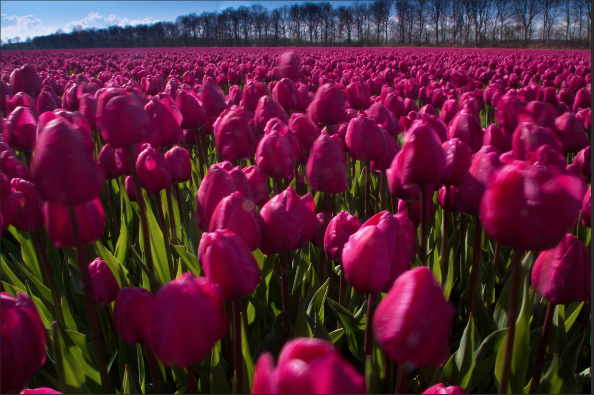
A fellow photographer and student sent this photo of a field of Tulips for discussion. Here’s what he had to say:

“Joe, here is a photo I’ve taken recently. My question to you is simple: How do you “read” it? (On purpose, I am not saying anything by words; I’d like to let the photo speak to you…)

Ok, let’s talk about your tulip photo. You asked how your picture of these tulips spoke to me, and how I read it.

First of all, it probably speaks to me differently than anyone else you might ask for the simple reason that I love tulips. I plant them every year, and when I buy cut flowers, which I usually do, I’ll buy tulips and when I can, I’ll buy French Tulips. So, you already have a score of ten. Now, lets see if you can keep it!!!

As you’ll notice, I lightened it a couple of stops so it’s a lot brighter, and now the color isn’t quite so heavy…which by the way is not the same as if it were over saturated. The main reason why the tulips appear dark and the sky looks ok, is that if you were to take a reflected reading just of the sky and then the tulips, you would find a big difference in the exposure. You wouldn’t be able to get both the flowers and the sky exposed properly without the help of post processing. It’s all about Dynamic Range, and if you click on this link, I can go into more detail.

Not that it’s a bad idea, but I like creating my pictures in the camera first without any help. I’ll resort to any post work when I absolutely have to. For me, I like creating my images before I click the shutter simply for the challenge…plus it has made me a better shooter in the process.

But I digress!

Ok, lets talk about how you used the elements of visual design you learned from taking my online classes and that you have on your Artist Palette.  These are shown in bold:

First of all, I like the contrast between the Texture of the trees in the background and the tulips. As you know, contrast is one of the ways to create visual tension. The tension that occurs when forces as in the trees and the tulips act in opposition to one another. Very different from the Tension that comes with emotional or mental strain.

I like the blue triangle you created in the top left corner. Since Shape is an element of visual design, I’m always looking to include one of the four basic shapes,  that being a square, circle, rectangle or a triangle.

As I’ve said a million times, Light is everything. Wherever I am , the first thing I do, before I raise the viewfinder to my eye is to determine the direction of the light. I’m always looking to back or sidelight anything that’s translucent,  like the stems and leaves in your photo. I love the way they glow!

I might have come around more to the right to get the tulips more backlit so they would glow as well. Right now, the shadows on the tulips take up most of the surface area…that’s not necessarily bad, as I like to side light as well.

The last thing I want to mention is to always be sure what’s going to be in focus, from the front to the back. In my opinion, the tulips in the foreground are large and out of focus which is somewhat distracting.

I’m going to assume that you were hand holding your camera so you might not have been able to stop all the way down without adjusting your ISO; in which case you weren’t in control…that’s why I use a tripod.

By the way, since Color is a great communicator of ideas, the field of red makes up a Pattern ( another element of visual design) that tells the viewer that the bulbs you buy here will all be the same color…red. Pattern is a good thing to include in our imagery, and breaking the rhythm of patterns is even better.

Overall, I would say that it’s a good shot, nicely composed and lit…but then I love tulips!!!

Thanks again for your submission.

Visit my website at: www.joebaraban.com, and follow me on Instagram: www.instagram.com/barabanjoe. Check out my workshop schedule at the top of this page. They don’t stay up very long. so you have to catch them at the right time. Come shoot with me sometime.

JoeB

Student Work: Question On The “Law Of The light”

In the “Law of the Light”?

I was going through some of my fellow photographer’s work, and inadvertently found this question.  In the past, when I got a question and photo, I liked to share what the photographer had to say. This way others that might feel the same way or have been in a similar situation can identify a lot easier. Here’s what he had to say:

“Hi Joe,

After reading your blog post about the “Law Of Light” (part one) I’ve started to pay attention in my photography for the “glow” effect you described. Of course I never shot photos with that physical law in mind, I only knew that the best light was with the low angle at sunrise/sunset and having my subject side lit would make it “pop” and it give it a more tri-dimensional effect by revealing it’s form.

Here’s a landscape shot I took in Sand Diego at Pacific Beach.  I only got the right creative exposure —shutter speed of about 2 seconds to get a calm ocean— later on this photographing session, when the sun was almost gone and the rocks were not glowing anymore.

Moreover the tight wasn’t my friend at that time —it was rising and it was the only time I could take this photo, meaning no other chances to plan another session with the light getting low.

I think of these shots as keepers but I’m not gonna use them in my portfolio. This is not only because I didn’t get the creative exposure I wanted, but also because I’m noticing a light flare on them. The flare is probably due to the camera position towards the sun and the use of an ND Grad filter to hold back the sky exposure.

What are your thoughts about it? How can we avoid light  flares when shooting with the “law of light” in mind? Is that possible to avoid light flares when we are obligated to use an ND grad filter, a polarizer or an ND filter for creative purpose (or a mix of this three depending on what we’d like to get)?

Is my approach to this matter right, or am I missing something here, Joe? Thanks for your suggestions and for the tricks you usually share with us non professional photographers.

PS I’ve also added the shot without any light glare but that I consider to be a shot for my portfolio. Thus you decide if is the case to show ’em both or not.”

If you read my post on the ‘Law of the Light“, you read that the sun should be in the ’10’ or ‘2’ position on the clock. In your photo the sun is closer to ’11’, making it almost backlit. In this case you won’t be able to get rid of any flare since the sun is  close to the middle of the frame. This not to say that if the sun were at ’10’ or ‘2’ you wouldn’t get some flare, because you would if the sun is too close to the edge of your frame. BTW, filters don’t have anything to do with flare from the sun.

We talk a lot about light  in my “Stretching Your Frame of Mind” workshops I conduct around the planet.

The solution is an easy one. Make sure you have a sun shade on your lens. If that doesn’t completely solve the problem, stick your hand out in front of you opened flat and place it between the sun and the lens. When the shadow from your hand covers the lens, the flare will go away. You can count on flare when you light from 9’oclock to noon to 3’oclock. I always watch for it.

Personally, I like the version on the left where the light and color is more dramatic. The glare in the water doesn’t detract from your photo. If anything, it adds Energy.

Thanks for the submission.

Visit my website at: www.joebaraban.com and follow me on Instagram: www.instagram.com/barabanjoe. Check out my workshop schedule at the top of this blog. Come shoot with me sometime.

JoeB

AskJoeB: How Do You See The Image?


Not too long ago I had one of my students submit to me something a little different than the usual photos I received to critique. It’s not something I will usually talk about since it’s not a pure photograph, but a montage. I found it quite interesting in the sense that being an art lover, I like looking at all kinds of different genre.

As usual, I like to show the actual question for those of you that have been in a similar situation, or have had similar questions. Here’s what Yvonne had to say:

“Dear Joe,

As a painter turned photographer, I finally needed some touch-of-the-hand.  I think of the montage part as drawing on top of a photographed image   But, an unexpected weakness appeared.  They look cheesy really easily.

Not all in the series are montages.  I like the mixture in a single series.  Many are diptychs.  Yes, I’m after an emotional tone in the straight photos and I expect to add little more in the montages than a figure and an ambiguous point of view.

Well, I bow to your critical comment.  This title: Your Voice is Mine, from the series Chokeberry Sugar.   My question: How do *you* see the image?  Thank you, Joe.  It would be important to me to hear what you think of it.

Very best, Yvonne

Yvonne,

As I said, this is not what I usually receive, and it’s not what I ever critique since I’m not a student of this particular genre. That being said, I can only comment on what I see and feel as someone that loves looking at art. However, I can comment on some of the areas that I use to teach in my online class with the BPSOP, and in my “Stretching Your Frame of Mind” workshops I conduct around the planet. Sadly, Bryan Peterson, the school’s founder passes away not too long ago.

The first thing I want to say is why so dark? I realize that you’re trying to seduce the viewer via mystery and drama, which is a very good thing. To me, it’s important for the viewer to be able to see it so he or she can realize any kind of emotion you are obviously trying to portray. If it were me, I would have more contrast between the sky and the trees; that would add more (visual) tension…as in some of the scenes in old Beula Lagosi as a vampire and Lon Chaney as a werewolf movies.

BTW, those movies scared the daylights out of me when I was a kid.

I would have moved the rabbit over to the right, so there was black negative space defining the top of his head instead of it running into the trees in the background. I would have also shown the rabbit’s front feet instead of cutting them off. Speaking of the area on the right, you could have eliminated a lot of it by making this montage more of a vertical. You could almost divide this in half and say the same thing.

Besides that, I don’t feel like it’s cheesy, and you’re right…it can very easily. That’s probably the main reason why I usually don’t like a montage. There’s a certain degree of taste that I like about it. I love the tack sharp texture on the rabbit. Texture is one of the basic elements of visual design, and used correctly can take our art what I refer to my students as “up a notch”.

Thanks for sharing it Yvonne.

Visit my website at: www.joebaraban.com and follow me on Instagram: www.instagram.com/barabanjoe. Be sure to check out my workshop schedule at the top of this blog.

JoeB

Student Work: Shooting At Lake Yamanaka In Japan

Working with his ‘Artist Palette’.

Lemena, an online student of mine with the BPSOP sent me this photo to take a look at. As usual, I like to include what people had to say as it often mirrors what others are thinking about when they’re shooting. There’s lots of photographers out there that experience the same thing. I know that the people that take my “Stretching Your Frame of mind” workshop class deals with a lot of the same issues, so let’s talk about them.

Dear Joe,

I just took your class at BPSOP a couple of weeks ago. Last week, I  came back from Japan and was at Lake Yamanaka, one of the Fuji’s 5 Lakes. I saw this scenery one early morning. There was a rope and some wet spots on the metal bridge. A little shadow as there was morning light, although at a distant, it was misty. I thought these fit the suggestions you made in the class when I took it.

I spot meter the reddish-brown metal bridge to choose my exposure. As a result, the sky on the right side of the picture is overblown. But inside the shade of the green duckling, you can see a small boat at a distant. I love the combination of these colors. I use active D-lighting in my camera. Standard setting. About 6:30 am local time. Did not manipulate the color in the White Balance as I usually do.
Hopefully, this picture can be improved with the help of  your critique.

Thanks so much.”

Regards,
Lemena

Lemena,

I remember your work well, as it was usually full of color and pretty light. As I always told you that using your ‘Artist Palette’ with all the elements of Visual Design on it will help take your imagery “up a notch” and make it memorable. Ok, lets talk:

The first thing to address is your choice of exposure. You remember me talking about the two different kinds of light, incident and reflected. Incident light being the kind of light that falls on an object and reflected light is the type that reflects off an object.  When you metered off the bridge there was more light being absorbed than reflected because the color was dark. The sky, being lighter, reflected more light than it absorbed. Therefore there was no way that you were going to get a proper exposure on the sky and the bridge at the same time.

Also, there’s the ‘Dynamic Range‘ factor, check it out! what you have in this image is a huge difference between the highlights , mid tones, and the shadows. It’s really important to always keep that in mind when exposing your photo.

So, what do you do? Being the type of photographer that wants to do as much in the camera as possible, I want to make sure that there’s some tone in the sky, unless I’m purposely trying to blow it out as in my photo of the small road.

Intentionally blowing out the sky to create energy.

I would take a reading somewhere close to the brightest area, of the sky where there’s a little blue. that’s what you set your camera on. With color you always want to expose for the brightest area and then open up the shadows…unless the Dynamic Range is too great. At that point you either show as little sky as possible or eliminate it all together.

That’s if you want to do as much “in the camera” as you can. If I were standing there taking the photo, part of my thought process would be in identifying the potential problem and telling myself that I could easily fix what I couldn’t fix “in the camera” in either Light Room or Photoshop.

BTW, I’m glad you didn’t mess with the color and make it unreal looking. To me, there’s nothing wrong with the color as I see it here. It looks natural compared with some of the photos I’ve seen out there that look like a cartoonist took the picture!!!

Now, let’s talk about the composition itself: Are you still using my “Fifteen Point Protection Plan”? You know the one that helps you leave out what should be left out and put in what should be in?  The reason I ask is the messy rope in the foreground that to me is a little distracting. I would have picked up on that and decided if it looked good the way it was or should I have wrapped it around itself making it look less messy. For me, KI have no problem making it look good. A camera on a tripod is just like a blank canvas on an easel. You’re an artist so paint, and if that means changing something then “Just Do It”!

Did you realize that you were not centered on the bridge?  Either move to one side to make the bridge more of a diagonal shape I(leading line), or move one step to the right so it would be symmetrical. I vote on it being symmetrical. It was just a slight adjustment.

As you know, I love reflections, and especially those created by water. Having said that, I would have tried one where I was “Up Close And Personal” to the wettest part half way down the bridge. Either that, or find a bucket or a hose and wet down the area right in front of where you would put your camera. Remember that reflections create Visual Tension”.

Also remember that you’re out there “making pictures”, not taking them.

I love the small boat in the distance. In the psychology of Gestalt as it applies to photography, it’s important to keep the viewer an active participant in perceiving and processing out photos. One of the ways is to keep him discovering new things as he looks at our pictures. He won’t see the small boat right away and that’s a very good thing!!!

Nice photo Lemera and nice light as well. As you know,LIGHT IS EVERYTHING!!!

Thanks for the submission.

Visit my website at: www.joebaraban.com and follow me on Instagram: www.instagram.com/barabanjoe. Check out my new workshop schedule at the top of this blog. Come shoot with me some time.

JoeB

Student work: Am I doing too much?

Did he do too much?
Did he do too much?

Tom submitted this photo with a question.  I always like to share what people say to me, in their own words. Since so many of my fellow photographers will occasionally find themselves in the same situation, it’s good to know that they’re not alone. Here’s what Tom had to say:

“Joe,

I took this at the Vivid Sydney festival.  This piano lit up in different colors when different keys were played.  Most of the people who played on it were seriously good, including this lady.  I wanted to capture her poise and confidence, the purples and blues she was producing with her music, and the vividly lit sails of the Opera House in the background.  Am I trying to do too much here?  What do you think?”

Tom,

Given the circumstances, I think you did as good a job as possible to get your message across to the viewer. That’s a tough situation to be in since you have virtually no control and have to “go with the flow”. I don’t think you did too much. It’s a pretty straight forward photo that shows the environment (as best as you could given the exposure parameters), and the energy created by the light and colors.

If I had been there with you, I would have suggested that you wait (with your finger close to the shutter release) for her to express herself with more body language; perhaps some kind of gesture. I want to hear the music through her body language and even facial expression. It seems like she’s stopped or waiting for something. Maybe she leaned and looked to her left. Something other than the appearance of her holding still.

In my online class with the BPSOP, and in my “Stretching Your Frame of Mind” workshops I conduct around the planet, I often refer to my expression “In a perfect world what if”?

What I mean is that if you could go back and do anything you wanted, what would you do? In this case, I’d like to be able to move around her. One shot I would definitely take is from the end of the piano looking straight at her. I would be using the top of the piano to frame her with color, and use the piano strings (wire) to lead the viewer to her face. What else would you like to do?

It’s a good photo Tom, and thanks for sharing it.

Visit my website at: www.joebaraban.com, and follow me on Instagram: www.instagram.com/barabanjoe. Be sure to check out my workshop schedule at the top of this blog. Come shoot with me sometime.

JoeB

Student Work: Has Doubts.

Does it work?
Does it work?
Ghita sent me this photo with doubts about whether I thought it was a good photo or not. As usual, i like to let my fellow photographers read what was sent to me. The reason being that we all at some point have doubt about our work, or have asked themselves similar questions. Here’s the question as it was sen to me:
“Hi Joe,
I’m a Danish hobbyist photographer following your blog. I send you a photo, I took a few evenings ago in my local area.

I’m quite happy about it, but nevertheless have some doubts about the light and the composition. It’s edited in Lightroom. I increased the clarity a bit and lightened the shadows. It now looks pretty much as I saw it.

But how does it work? Is it too dark? Is it too light? What about the balance between the amount of sky and water? And the composition? I had to be quick, because the boat went rather fast.

Kind Regards,

Ghita,

First of all, let’s talk about the overall composition. It’s a really nice, well balanced and the horizon line is straight (harder than you might think). I love the fact that you showed just the important part of the sky that has the color. You’ve created a really nice area of Negative Space between the bottom of the sky and the tops of the buildings. I always tell people to look at what’s the most important part of your image, the information above or below the horizon line. In this example, the information below is filled with texture, one of the basic principles of Visual Design so it will keep the viewer’s interest.

I talk about these elements both in my online class with the BPSOP, and also in my Stretching Your Frame of Mind workshops I conduct all around our perfectly round planet…Earth

So you said that you lightened the shadows, but not near enough to show any detail in the buildings. To show more detail would turn them a bad looking gray, so why not just leave them as silhouettes? They are almost at that point so they look good. All you need is the different shapes to show the different buildings, and the Negative Space and the contrast provides visual interest.

As far as the boat, you put it in just the right space, so great thinking. Eddy Adams once said, “When you get lucky be ready”. You were lucky and you were readt with a quick eye and responce.

Visit my website at: www.joebaraban.com and follow me on Instagram: www.instagram.com/barabanjoe. Watch for my Workshop schedule at the top of this blog. I don’t keep them up long because they fill very fast. Come shoot with me sometime.

JoeB

AskJoeB: Did It Do It…Create Tension?

Did it create Visual Tension?

A past online student with the BPSOP, sent me this photo to review. Like always I like to show the actual message, since so many of my fellow photographers have experienced similar situations and have had the same questions. Here’s what tom had to say:

“Hi Joe,

Took this shot of the Sydney Opera House almost an hour before sunrise – 120 seconds at f/13, 70mm on a full frame camera.
When I’m shooting, I’m always remembering the artist palette you taught me in the online BPSOP courses – or at least trying to. In this shot, I was thinking about tension, perspective, negative space, line, texture, and of course, light. The main focus was to create tension by putting the strong, smooth, and very simple diagonal of the bow of the cruise ship close to the complexity and texture of the Opera House, leaving enough negative space to define each clearly but not so much that they become separated.

Did it do it (create tension)?

Also, I’m not sure how quickly a viewer will be able to see that the strong white triangle is the front of a ship, there may not be enough there for them to fill in the rest in their mind (closure). But also not sure it makes much difference to the overall appeal of the shot whether that is a ship or a building or a UFO. Would appreciate your thoughts on that.
I did make a few lightroom adjustments. Brought the shadows up a bit and the highlights down, as the sails of the Opera House were a bit dark but the lights around it were a bit strong. Added contrast and decreased clarity. And increased both the saturation and the luminance of the blues, but left the other colours alone..

It’s a really nice photo,beautifully lit. So many areas to look at, and besides in my BPSOP class, I also talk a lot about ways to keep the viewer around longer in my “Stretching Your Frame of Mind” workshops I conduct around our planet. Having him discover new things when looking at your image, and moving him around the frame are two ways to keep him around.

Here’s my only problem: Since you were there standing in your three dimensional reality, you know that it’s a very large ship. However, you won’t be around to explain what this large object (that takes up just about fifty percent of your frame) is to the viewer. It will have to stand on its own and be a ‘quick read’. My question to you is…to you think that someone living in a place that is not bordered by water of any kind will know what it is?

As far as tension is concerned, yes it does generate tension. By minimizing the negative space between the ship and the Opera House, you create Tension. The use of light, and contrast also creates Tension.

Thanks for sharing this beautiful image with us, and I’m glad you’re thinking about my “did it do it” list for good composition we worked on in our online class.

FYI, a triangle has three sides, not four.

What do you think about it darker?

Visit my website at: www.joebaraban.com, and follow me on Instagram: www.instagram.com/barabanjoe. Check out my upcoming workshops at the top of this blog. Come shoot with me sometime.

JoeB

What Do you Think Of This Picture?

What do you see?

A student submitted this to me and wanted to know what I thought of it.

He said he liked this picture because the silhouettes are the subject and they pull the eye to them. He also likes the way his friends are looking at each other and that the beams and the trees create patterns around them.

When I first saw the photo and read his description my first thought was that he was being too esoteric. In other words that all may be well and good, but I’m thinking you had to be there to see what he saw in a three dimensional reality. Trying to portray this in a two-dimensional representation, as in a photograph, is not an easy task…for anyone, myself included.  I told him what I tell everyone in my online class with the BPSOP, and in my “Stretching Your Frame of Mind” workshops I conduct around the planet, that he won’t always be around to explain his thinking to the viewer. It has to be able to stand on its own. The exception being an abstract. What I’m talking about is  an idea that lives only in the photographer’s thought process and not made up of any concrete existence.

To me, the photo is closer to being in a three dimensional reality than an abstraction. Therefore, it needs to be what I call a “quick read”. The silhouettes have to stand out. There could also be a discussion about whether the silhouettes need to be easily recognized, or if they could be discovered as the viewer looks at this image. My thinking is why take that chance? Sure, it would be great if the viewer were to discover them after looking at this photo, but how long is the viewer going to give it before he just scratches his head and moves on.

Although I really like the colors as they are in harmony with one another, the fact is that the composition so busy that I get lost trying to figure out what’s going on here. His friends now that he mentions it could be looking at one another and the camera, but he had to tell me. because the body language has been overtaken by all the branches. There are so many lines going in and out of each silhouette that I can’t tell where their bodies and arms begin and where they end.

If it had been me with my friends, I might have easily become carried away with the fun I was having and forgotten to what I refer to as “stepping back and considering the scene, and its outcome”.

I almost thing it would look better without the three friends (and at least a stop brighter). This way it would just be a study of line, shape, texture, and color.

One of my Personal Pearls of Wisdom is “In a perfect world, what if”. What I mean is:  what if he could go back and could take this photo again and have anything at his disposal and be able to do anything he wanted…what would he do?

If it were me, I would go back with my camera  and put a 300mm 2.8 lens and of course a tripod. I would get back far enough to get close to this same composition and focus only on the silhouettes with my lens set on 2.8. That way, I would have the three silhouettes sharp and everything behind them completely out of focus. Then, they just might become the subject.

Thanks for your submission. It looked like you were having a lot of fun!!! I hope this helped.

Visit my website at: www.joebaraban.com and follow me on Instagram: www.instagram.com/barabanjoe. Check out my workshop schedule at the top of this page and come shoot with me sometime. FYI, the workshop descriptions at the top don’t stay up long because my workshops fill in just a few days.

JoeB

Student Work: Old Rusted Out Car

What’s the message here?

A student photographer of  mine from California submitted this photo for me to comment on. Since she didn’t have a specific question, but just to comment, I’ll just assume that her question was whether I thought this was a good photo or not.

Ok,Texture is one of the basic Elements of Visual Design, and when  Texture is lit in such a way the viewer will want to reach out and touch your photo…why, you ask?

Because since we were very little touch has been ingrained in our every day thought process. For example:

  • Don’t touch that it’s wet.
  • Don’t touch that it’s dirty.
  • Don’t touch that it’s sharp.
  • Don’t touch that you don’t know where its been.

This old rusted out car is mostly about one of the three varieties of Texture called ‘Information’  Texture.

For photos with information texture, it is crucial to identify precisely what information the texture is to communicate and compose the image in such a way that the texture brings out the proper message. In this image the texture alludes to the history that this car was a part of. The result is a much better image, but in this image what’s the message? Is it just the history of the old rusted out car, or is it the sign in the background? Or both?

DD, I’ve always been a firm believer that if you show a sign (especially one this big), make sure the viewer can read it. In this situation the sign is very close to being as important as the car. I love the graphics and the colors and it looks like its been there as long as the car has. I would love to be able to read what the sign says. Check out my earlier post I called “The Whole Enchilada”. In it I talk about the entire environment, not just the subject, which in this case I assume is the rusted out car.

By the way, DD told me that she was aware of the pole growing out of the top of the car, but couldn’t do anything about it at the time…That’s what the ‘Content Aware’ tool in CS5 is for!!!!

Stay tune for an upcoming post on Gestalt that talks about this issue. It’s called “Proximity”, and you’ll find it most interesting. In my online class with the BPSOP, and the “Stretching Your Frame of Mind”workshops I conduct around the planet, we work on all the concepts in the Psychology of Gestalt.

Visit my website at: www.joebaraban.com and follow me on Instagram: www.instagram.com/barabanjoe. Check out my workshop schedule at the top of this blog. Come shoot with me sometime.

JoeB

AskJoeB: So, what do you think?

So, what do you think?

I just love it when one of my fellow photographers submits an image for me to take a look at and critique. If I can help out by making suggestions that will ultimately have an impact on the way they approach their next photo, then so much the better.

As always, I like to let people read what the photographer had to say. The reason being that so many out there have had a similar experience or have had identical questions. Here’s what Greg had to say:

“Joe,

In your SYFOM II class we worked on silhouettes and you said one of your “favorite ways to show a silhouette is to combine it with an environment that isn’t a silhouette”. I didn’t quite understand this at the time but as our class was ending I was at a local park trying to get a photo of this covered bridge that wasn’t just another documentary photo, like the ones in the park brochure.

I framed the bridge with the trees in the foreground and then this girl walked by with her dogs, as she walked through the covered bridge, I realized she would be silhouetted in the opening on the far side and fired off several frames before she was gone. I chose this angle to show the inside and outside of the bridge and the diamond shapes at the top of the walls, I also like the light coming through the trees. There’s two dogs but only one is visible. I also had to straighten it a little. So, what do you think?”

Harry talks about one of the three classes I teach with the BPSOP. I also share a lot of the same information in my “Stretching Your frame of Mind” workshops I conduct around our planet. One of the lessons in my Part II class deals with the silhouette, and how to incorporate them into our imagery. The silhouette, among other elements on my Artist Palette, is a powerful tool in helping to take your photography what I call “up a notch”.

Here’s what I have to say:

Harry, you have done well ‘grasshopper’. It’s a wonderful photo that will definitely ‘stand the test of time‘.

The reason that the silhouette stands out from the environment around her is what’s called “Figure-Ground“, one of the six concepts that we work on in my third class on Gestalt. By having a dark object against a lighter background, it stands out in the composition. You also have created another concept in Gestalt, this one is called Continuance.By showing the road leading up to the bridge, you have made the viewer an active participant by moving him around your frame.

You have also framed her within a frame, one of the ways to generate Visual Tension that we also work on in my part II class.

You should pat yourself on the shoulder for creating a photograph that will indeed stand the test of time.

By the way Harry, I forgot to mention that I also love the little dab of light in the trees and on the structure, and actually wrote a post about it.

Well done!!!

Visit my website at: www.joebaraban.com, and follow me on Instagram: www.instagram.com/barabanjoe. Check out my workshop schedule at the top of this blog. Come shoot with me sometime.

JoeB

Student Work: Carousel On Lake Geneva.

Andrea, an online student of mine, asked me to talk a little about her photo of a carousel next to lake Geneva, Switzerland.

The first thing I can tell you is to bracket!!! This image is a little too underexposed. Since the sky is overcast and not especially pretty, why not have it lighter? By making it brighter, you lighten up everything else from the bright spot in the middle of the frame  on the horizon to the flowers, to the lights and horses on the carousel. To me, it’s a better trade than having the sky dark and foreboding.

Speaking of the small bright spot in the middle of the frame, If I had been standing there with you as I usually do in my workshops, I would have had you place the person on the bike about ten feet behind him…why? So that his silhouette would have ‘popped’ out more. By doing that, the viewer would have gone straight to it, even before enjoying the carousel.

I really like how you’ve created a path that goes around the carousel. It will lead the viewer right around the corner and as he takes his imaginary walk, he’ll wonder what’s around the bend. This is about the Psychology of Gestalt and when we can get the viewer to take an active role in out imagery, by giving him lots of ways to enter and leave the frame, and discovering new things as he does it (like the bicycle for example), the longer he’ll stick around…and isn’t that what we want him to do? In my online class with the BPSOP, and my “Stretching Your Frame of Mind” workshops I conduct around the planet, we spend time working with the different concepts in the Theory of Gestalt as it applies to photography.

I like the warmth of the carousel and the coldness of everything else, but one thing I would change is to take a step back so all of the horse’s head is in the photo. If you knew about my “Fifteen Point Protection Plan” and were using it, you would have seen that and decided if you would like the head where the viewer could see it.

Thanks for the submission. I hope this helps.

Visit my website at: www.joebaraban.com, and follow me on Instagram: www.instagram.com/barabanjoe. Check out my workshop schedule at the top of this blog. Come shoot with me sometime.

JoeB

Student Work: Medusa Hair

Sue sent me this photo to talk about and as usual I like to copy exactly what fellow photographers had to say. It is often the case where others have experienced the same situation or might have a similar question about one of their photos. Here’s what sue had to say:

Medusa?

“Hi, I was thinking this has to be the best head of Medusa Hair in a long time. I wanted to get close and see what it would look like””.

Sue

Ok Sue, first of all I agree with you that it has been a long time since Medusa was around in Greek mythology.

Getting what I refer to as “up close and personal” was a good way to bring out the differences between the green and white “Lines”. I say lines because when you “see past your first impression”, that’s what they are.  In my online class with the BPSOP, and in my “Stretching Your Frame of Mind” workshops I conduct around the planet, I talk about Line. It’s the most important of all the elements of visual design, for without Line, none of the other elements would exist. As a matter of fact, nothing in this world would exist…you and I, planes, trains, automobiles, etc. all have an outLine.

Having said that, this is a study of green and white lines and so if I had been standing there I would have suggested to things to you: The first would have been to take out the dead (brown) blades of the green lines. They really aren’t adding anything and to me they take away from the pretty green ones.

So many of my students just don’t think about things like that. The main reason is because they’re out “taking pictures” instead of “making pictures”. It’s ok to change the way things look in your frame, if it will help it look better. Taking out the dead blades of the green grass is what I mean by “making pictures”.

The second thing I would have mentioned to you is that the bottom half of your photo looks more interesting than the top half. The top half is not as clean, graphic, and is somewhat distracting. Look at how simple the relationship between the white and green Lines and how much better the viewer’s eye can flow.

BTW, I would have suggested that you not show the area in the top right or left corners as they take away from the center of interest. Either “use it or lose it”. Next time, be sure to check the four corners to see things like that and be able to decide what to do in your next adjustments.

Thanks for the submission Sue and did you know that Medusa was beheaded? I’ll bet that left a mark!!!

Visit my website at: www.joebaraban.com and follow me on Instagram: www.instagram.com/barabanjoe. BE SURE TO CHECK OUT my NEW workshop schedule at the top of this blog. Come shoot with me sometime.

JoeB

Student work: What Do You Think?

What do you think?

Daniel sent this photo to me and asked what I thought about it.

Ok, first of all, let’s address the color to B/W conversion. B/W photography and I go back a very long way. In 1971, I  started my career shooting for UPI then AP, and virtually everything I shot was in B/W. I love the medium, and in the digital era I know when it’s a good fit and I can usually tell when the decision to convert a photo was done after the fact in front of a computer.

This may or not be the case in this example, but it sure feels like it was not thought of right before the shutter was clicked. I may be way off base here, but it just doesn’t feel like it should be a B/W photo. It doesn’t feel like that was the idea when the composition was formulating in Daniel’s mind…why do I say that?

Because of the location and the light. To me, B/W photography is all about subject matter. Daniel’s photo is closer to “street shooting” than any other genre. With the possible exception of landscapes B/W photography street photos should be made with a recipe in mind. When I think of B/W, I think of subject matter that has at least some of these ingredients: Tough, Tenacity, resolve, true-to-life ideas, gutsy, story telling, and above all, it has to have soul.

The direction of the light is coming from 9 O’clock and is side lighting the person. With this kind of light, I would have thought that it would have looked good in color, since side light is one of my favorite ways to like a subject, and we work on lighting in my classes.

Having said all this, to me a strong B/W photo is thought out in advance, with the clear intention of going out and shooting B/W for the sake and love of B/W. As I said, Daniel may well have shot this with the intention of it being a B/W image. It just doesn’t feel like it to me.

Ok, let’s talk about the photo itself. Let’s talk about how many of elements of visual design and composition are present in Daniel’s photo. In my online class with the BPSOP, and in my “Stretching Your Frame of Mind” workshop I conduct around the planet, I show fellow photographers how to incorporate the basic elements of visual design and composition into their photography. At the end of my class and workshop, my students walk away with what I call an Artist Palette. instead of pigment, this Palette now has: Line, Shape, Form, Negative Space, Vanishing Point, Perspective, Balance, Tension, Color, and Light.  

Daniel’s photo has a lot going for it!!! It has a strong directional Line that leads the viewer from the bottom left (the natural way we perceive) to an “implied” Vanishing Point through the person to the horizon. He has divided the un-inspiring sky into two Shapes which really helps the composition. Look at all the Negative Space that defines the Positive Space. What I’m talking about is the areas of sky that borders the lampposts. The area between the lamppost and the building on the left, the area (Negative Space) that defines the lamppost in the middle of the frame, and the area around the person that defines him, and the area on the far right that defines each lamppost.

One of the most important elements on the  is Visual Tension. There are several ways to achieve  this type of Tension, and one of the ways is to minimize the Negative Space that borders the Positive Space. If you notice the area between the person and the lampposts, this Negative Space has been minimized, which generates Tension. The Tension I’m talking about is not the Tension that comes from mental or emotional strain. It’s the Visual Tension that comes when forces (the Positive Space or in other words the person) act against one another. What that means is that the anticipation of the person and the lampposts touching one another.

I assure you that these shapes were no accident. Daniel saw these shapes and used them to his advantage. He used his “fifteen Point Protection Plan” he received while taking my online class to create this pleasing composition. So, why convert it to B/W?

I have no idea. I’m afraid you’ll just have to ask him!!!

Thanks for the submission Daniel.

Visit my website at: www.joebaraban.com and follow me on Instagram: www.instagram.com/barabanjoe. Watch for my new workshop schedule you’ll find at the top of the blog. Come shoot with me sometime.

JoeB

AskJoeB: Confucius Says

Confucius says.

Check out my new workshop on the six concepts in the Psychology of Gestalt: Gestalt Workshop link

Here’s another photo that was submitted to me from a photographer that took my online class with the BPSOP. As is usually the case, I like to show everyone exactly what the sender had to say. I’ve found that by sharing it, a lot of people might identify with it or just want to know the background, if any. Here’s what Charlie had to say:

Hi Joe,

I recently participated in a calendar-shoot project where we were assigned a quote and tasked with taking/submitting a photo that we felt was representative. My quote was “It does not matter how slowly you go, as long as you do not stop” – Confucius

I was out-and-about with my camera, with “seeing beyond first impressions” foremost in my thoughts, and I came across this gentleman who struck me as someone who was keen on making time for going slowly, something I think we should never stop doing, which may or may not be a spin on where Confucius was coming from.

Anyway, I thought about several things we learned in your Stretching Your Frame of Mind classes:

  • creating illusion of depth using wide angle lens
  • anchoring subject in the foreground
  • creating layers of interest
  • maintaining sharpness from foreground through background

I saw this man flying his kite as an opportunity to apply these ideas. I asked his permission to photograph him, which he kindly provided, then I got down on my belly and crawled in close, my lens was inches from his shoulder. In retrospect, I think I could have made the image stronger if I had followed your rule “get in so close that it hurts, then get in closer”, in this case, I got in close enough to hurt from bouncing into the kite flyer’s personal space, I should have then gone in even closer.

This photo is pretty much straight from the camera, notice how I remembered to keep the horizon level 😉 , I did a little cosmetic cleanup with Photoshop to remove a palm tree whose top was just “touching” the heel of his tennis shoe, and to remove some extraneous kite “hardware” that was making contact with the left and right edges of the frame.

As always, thank you for your review/critique and for increasing my awareness and understanding of ways to stretch one’s frame of mind – something that has stuck with me and which I use every time I’m evaluating scenes for photo possibilities or looking through my viewfinder.

Charlie Jones

San Diego


Charlie,

It’s always good to hear from my students, and to see what they’re doing. I remember your images as I always remember the ones that were consistently “up a notch”!!!

Ok, the first thing I notice is that your photo is closer to being a square format than a 2X3 ration. If you remember me saying that we don’t perceive in a square, we perceive in a rectangle. It’s extremely difficult to create Visual Tension in a square. There’s only a few that can do it; Diane Arbus comes to mind.

If this has been cropped, then it’s not “straight out of the camera”. What do you have your aspect ratio set on? Is it set on 3:2 or maybe 4:3? In my opinion it should always be set on 2X3 since that’s how we perceive.

Your image feels closed in and almost claustrophobic. You have a location that needs to be seen. Flying a kite is generally done in a large area, but you’ve made it look just the opposite.

One last note on cropping: If you crop, you’ll never know where the edges and corners of your frame are. You’ll only know when you’re sitting in front of your computer, and by then it’s too late. If photographers want to be better shooters, then I suggest they use the edges of their frame as a compositional tool. If the composition wasn’t strong enough right before you clicked the shutter, then why click the shutter?

One last note…I once read that when you crop, it’s a sign of sloppy technique and a lack of discipline.  Food for thought.

Now that I got that out of the way, let’s talk about your photo:

I love your point of view! It’s what my online class and workshop is all about, and you were definitely “Stretching Your Frame of Mind” when you were composing. You were right in getting “up close and personal” as it not only creates Perspective (depth) by creating “layers of interest”, but it feels as though the viewer is also flying the kite. You also suggest a lazy blue day, a day when you have absolutely nothing better to do than “go fly a kite”.

Btw, as you probably remember, I virtually always shoot early and late and rarely shoot in the middle of the day, but this photo needs to say “a lazy blue day”.

A good interpretation of what Confucius had to say…nice job!!!

Thanks for the submission and I hope to hear from you again.

Visit my website at: www.joebaraban.com and follow me on Instagram: www.instagram.com/barabanjoe. Be sure to watch for my new workshop schedule. Come shoot with me sometime.

JoeB