Not long ago I conducting my “Stretching Your Frame of Mind” workshop with the Pacific Northwest School of Art on Whidbey Island, and a big part of my workshop deals with what I call Chasing the Light. As in all my workshops I encourage shooting in the Golden Hour. This refers to the time right after sunrise, and the time right before sunset. In the forty-two years of being an advertising and corporate photographer, I can safely say that 75% of every photograph (outdoors of course) I’ve taken during that span of time has been shot during these hours.
I tell my students that LIGHT IS EVERYTHING; you find the light and you’ll find the shot. When we’re out on location together, I help my students gain a better understanding and sensitivity to light as it affects all the elements on their Artist Palette…which I also give them during the workshop.
The light is just softer, warmer, and prettier. Notwithstanding the fact that the shadows become dominant and long, and as I always tell my students…”SHADOWS ARE OUR BEST FRIEND”. They should be embraced, not feared as some would have you believe. For one thing, Form, being a basic element of visual design, comes to us with only two dimensions: height and width. It’s the shadows that add Depth, the third dimension.
After scouting Deception Pass with my Sunpath readings and my Morin 2000 hand bearing compass before the workshop started, I knew where there would be a glow in the water as a result of being backlit I took the class there to shoot, but before we went we gathered a couple of props to be used after the sun had set over the water, hiding all the beautiful scenery one will find there.
The photograph above is one that was taken by an online student. He and his girlfriend came over from his home in the Netherlands to take my workshop.
A really nice photograph, and an even better model. That would be me!!!
Visit my website at: www.joebaraban.com, and follow me on Instagram: www.instagram.com/barabanjoe. Check out the workshop schedules I put at the top of this blog. They fill fairly quick then I take the description down. Come shoot with me sometime.
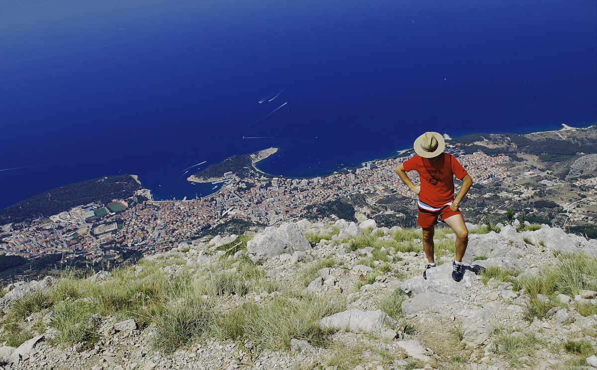
I will often get questions with photos sent to me through my website or from past students. Jane sends me this photo and writes, “my name is Jane, I am an beginner with DSLR. I send you my favourite photo of my husband. I take it in Croatia over Makarka riviera. Is this exposure good? Is the feel from this photo “hey, i am a lonely cowboy”?
First of all I applaud her English, as I know how hard it is for people to express themselves in a language other than their own.
Ok Jane, let’s talk about your photo:
As far as the exposure is concerned, be sure to read my post on the difference between Incident and Reflected light. In your photograph, you can see that the foreground is overexposed while the beautiful water is saturated and has lots of depth. If I had been standing there with you, I would have taken a reflected reading (with my hand held meter) of the water then the foreground and shown you how far apart they were in exposure. Since it would be difficult for you to get that meter, I suggest you set the meter in your camera to ‘spot’.
When you use the spot reading it reads a much smaller area so if you really want to learn about light, put your camera on manual. Next time you would take a reading of the foreground and then the water, and you would see the difference. That said, you set your camera on the highlights so they won’t be overexposed. At that point you can darken the water in post-processing because it will be lighter now. My philosophy is to never make your image look like you did something to it. So many photographers tend to over process their photos to the point where it looks like a cartoon. There was no way you could have had both the foreground and the water exposed the same, without the help of Photoshop.
Now, let’s talk about the feeling you were trying to express:
To me, it misses the mark. You’re reading this from a guy that lives in Texas and is surrounded by Cowboys!!! Unless Cowboy’s wear Tennis or Hiking/climbing shoes and matching shirts and shorts where you live, you would need to have him wearing Cowboy Boots and at least blue jeans. It also really doesn’t suggest loneliness, but rather someone that is resting for a moment.
In my “Stretching Your Frame of Mind” workshops I conduct, one of the many things we talk about is making sure your message is one that everyone will get right away. I also encourage people to research a subject before they shoot and to incorporate a little pre-production by locating the proper wardrobe that will fit their idea.
I realize that customs, ideas, are different in every country, but I also know that wherever you are in this world, a cowboy is always going to look the same. I recently taught a workshop in Singapore of all places, and every Friday evening in Chinatown about a hundred Singaporians gather to dance the Texas Two-Step and the Cotton-Eyed Joe, and they all are wearing the correct western wardrobe. It’s a sight to see!!!
One thing that the viewer might also question is why this man wouldn’t have been sitting there enjoying the view. I think I might have tried one like that as well as the photo you took.
Just food for digital thought.
By the way, what a fantastic view!!!
Thanks for sending it. I hope one day I’ll be standing there.
Visit my website at: www.joebaraban.com, and follow me on Instagram: www.instagram.com/barabanjoe. Be sure to check my workshop schedule at the top of this blog. They don’t stay up there for long since they fill right away. Come shoot with me sometime.
In my first post on “did it have balance”, I talked about creating Balance in your photos.
Every shape, color value, line, areas of mass, (for example a building, tree, people, etc.), provides weight that when arranged correctly in your composition provides a way to pull the viewer throughout the frame, creating a feeling of balance. The balance occurs when the viewer’s ‘eye’ moves in a steady flow without one single area stopping it or bogging it down.
To keep your photo balanced, it’s important to counter-weight an element with another object with a similar mass. This can be done with different degrees of contrast, different colors, and different areas of light and shadows.
In my first post, I talked about creating Formal Balance in your imagery. In this post, I want to address the other kind of balance which is Informal Balance or Asymmetrical Balance as it also is referred to as.
Informal Balance, unlike Formal Balance, is more interesting to look at. Instead of mirrored subject matter on both sides of the vertical center, the balance will still rely on an imaginary center point, but now the elements are different in size, shape, color, and mass. The balance comes from the placement of these elements in the frame in spite of their differences.
That being said, Informal Balance is more difficult to achieve than Formal Balance. Creating and assigning the relative values to completely unrelated objects can take practice. One way to test whether or not your photo has balanced is to turn your photo upside-down.
In the above photo, I’ve created an asymmetrical balance by capturing the scene from a different point of view. The angle I choose created the feeling of stability needed for the viewer to perceive a sense of balance. I’ve deliberately manipulated the subject in such a way as to balance the visual weight in both the classic car and the building.
Visit my website at: www.joebaraban.com and follow me on Instagram: www.instagram.com/barabanbjoe. Check out my workshop schedule at the top of this blog. Come shoot with me sometime.
Since the early eighties I’ve been conducting my “Stretching Your Frame of Mind”, workshops showing photographers how to incorporate the elements of visual design into their thought process, I also give them what I call my “did it do it” list for good composition. It’s a list of twelve concepts that will help guide you though your thought process on your way to creating a well composed photo. I have written ten of them so far on my blog and you can find them by clicking on “Did it do it”.
This list is not meant to be rules, as most of you know by now that I don’t like rules. This list is merely a guide to help fellow photographers understand what goes into “making good photos”. I’ve been mentally referring to this list for most of my forty-six year career, and they have served me well.
The seventh one I’d like to share with you is called “did it have balance”. What do I mean by Balance? The balance between the Positive and Negative Space? Well yes, it’s one of my many crusades when working with students of photography, but it’s more than that.
Balance is about visual weight. A balanced photo is what we as photographers try to achieve because it makes for visually inviting images. A balanced photo gives the viewer a feeling of stability. We all are more comfortable when the environment around us is feels firm and steady. When I’m composing, I’m looking for harmony between the various shapes, colors, and most important, the areas of light and dark and shadows they might create. A sidebar here is when I tell my students to work on “mastering the light”, I also tell them to “master the shadows” as well, since shadows are our best friend.
In the psychology of Gestalt as it pertains to photography, the main goal is to take control of how the viewer perceives and processes information when looking at our photos. We want to make him an active participant and when we can do that, he’ll stick around looking longer. By using visual weight correctly, and distribute it evenly, we can pull the viewer’s eye around our composition which in turn makes him work harder…and that’s a good thing!!!
There are two types of balance, Formal and informal (asymmetrical) balance. In my first of two posts on this subject, I want to talk about Formal balance.
Formal balance is positioning your subject or subjects (either identical or similar) around a central point or an imaginary line drawn down the center of the frame, dividing in in half. Thus, both sides of the vertical middle are equal. Formal balance is much easier to create than informal balance.
In the photo above, I was specifically after Formal Balance. It was shot used in a brochure for a company in Louisiana that raises crayfish for mass consumption. The graphic designer wanted something that he could use for a wrap-a-round cover. In other words a similar subject on the front and back of the brochure.
Visit my new website at: www.joebaraban.com and follow me on Instagram: www.instagram.com/barabanjoe. Be sure to check out my workshop schedule at the top of this Blog. Come shoot with me sometime.
With great sadness, the creator of the BPSOP has passes away after a long illness and the school has permanently closed.
I taught three classes: Part I, Part II, and the six principles of Gestalt.
Negative Space,Balance, Vanishing Points, Line, Shape, Texture, Pattern, and Form are all the elements, and by the end of both courses, they had become part of and placed on what I refered to both online and in my “Stretching Your Frame of Mind” workshops as the Artist Palette. I also show my fellow photographers how to “make pictures” instead of taking them, and by the end of my class, they are armed with the ability to “See past first impressions”. We work on “Mastering the Light” and how to use it effectively to create memorable images.
To be able to use the left side of their brain, the analytical side, and recognize a tree for what it is…a tree. Then, to be able to switch that part off and switch on the right side of their brain, the creative side, and see the parts that make up the tree. For example, the patterns of the bark, the texture, the Negative space that defines the leaves and branches, the knowledge that if they anchor that tree in the foreground, they can create Layers of Interest, thus providing depth to their composition. By placing that tree close to the edge of the frame, they will generate Visual Tension. By side lighting the bark on the tree, they can showcase the texture in bold-relief. Recognizing shapes, and using them to your advantage…etc., etc., etc.
Here are some of the finished results, shot by my students. They’re strong photos, sure to be remembered, that make the viewer an active participant (part of the Gestalt principles) which in turn will keep him around longer…isn’t that what we all want?
After seeing my student’s work, if anyone is interested in finding out more about my six-month mentoring program you can contact me through my website.
Visit my website at: www.joeBaraban.com, and follow me on Instagram: www.instagram.com/barabanjoe. Check out my workshop schedule at the top of this blog. My first one this year is up and running. It’s my third “Springtime” workshop, and this coming May it will be in Paris, France. Come shoot with me and we’ll toast to our good health, over some great photography, with a glass of French Bordeaux.
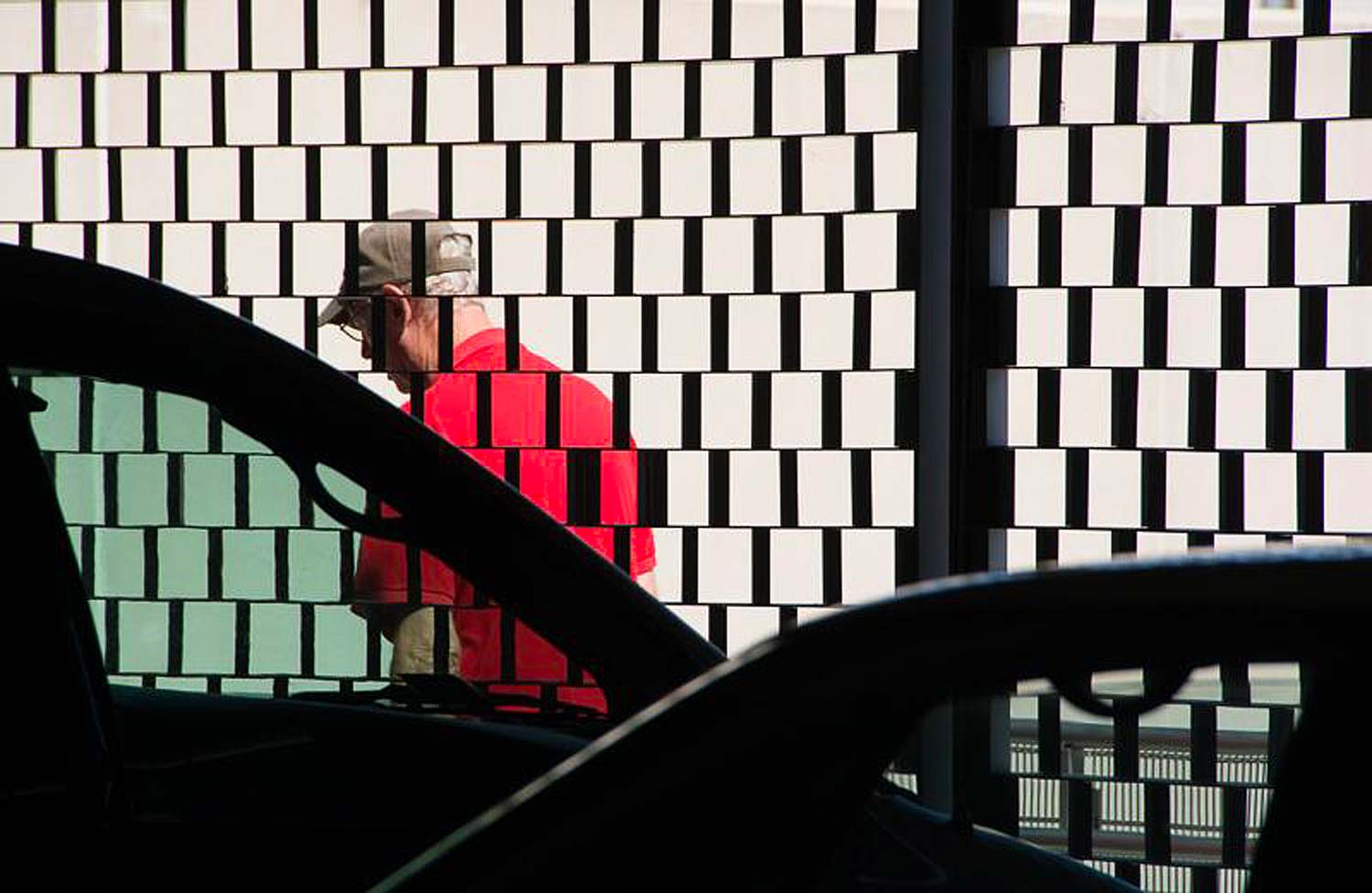
Here’s a photo submitted by a photographer from Italy who would like a critique.
The first thing that strikes me is the light. As I say to all my students, LIGHT IS EVERYTHING!! In this photo, it adds drama and a feeling of mystery.
The black Negative Space defines the rusted metal, and in my classes I always talk about one of my “Personal Pearls of Wisdom”, which is “seeing past first impressions”. What that means is what besides rusted metal is it. They’re Lines!!! They’re Lines that lead the viewer in and out of the frame, and when you get the viewer to take an active role in your imagery, he;ll stick around longer.
Line is probably the most important of the Elements of Visual Design. In my “Stretching Your Frame of Mind” workshops I conduct around the planet, we spend a great deal of time studying Line. Without Line, there wouldn’t be Patterns, Texture, a Vanishing Point and in fact, there wouldn’t be people or bridges or buildings, etc…why, because all things I mentioned have an outLINE!!! Lines can be implied.
Talking about Texture, this photo is also all about this common Element of visual design.
There are three basic types of Texture: Drama, Detail, and Information. This photo represents the Information type. Information Texture utilizes texture to communicate information about a photographic subject. In this photo the texture communicates information about the fence, and enhances the impact of the photo; by showing the age of the fence.
I really like the window in the background, it breaks the rhythm of the pattern created by the fence (a very good thing). Framing it within the diamond shape of the fence adds Tension and it also adds a lot to the image giving the viewer something else to discover. The more things he’ll discover, the longer he’ll stick around.
I would have liked to see some more black Negative Space between the last links on the left and the edge of the frame. Giving the viewer some black Negative Space to rest his eyes before it leaves the frame would help.
Thanks for sharing it!!! This photo is all about “Stretching Your Frame of Mind”!!!!
Visit my website at:www.joebaraban.com and follow me on Instagram: www.instagram.com/barabanjoe. Check out my workshop schedule. Come shoot with me sometime and we’ll work on all the Elements!!!
BTW, I don’t leave the workshops on for very long because they fill so fast. Please be diligent and keep looking.
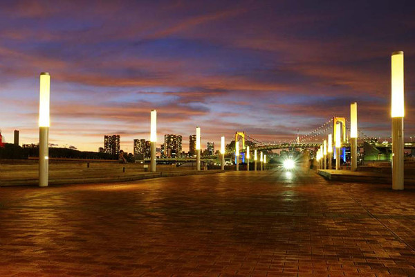
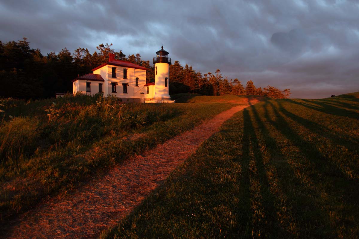
As I write this, today marks the anniversary of my workshop on Whidbey Island. The unique locations for photographers to photograph, and the quality of the light. Both of these came to bear when I took my “Stretching Your Frame of Mind” workshop there for a week. As I always say both in my workshops and my online class with the BPSOP, LIGHT IS EVERYTHING!!! You find the light and you’ll find the shot. In this case finding the light at a wonderful location is just about as good as it gets.
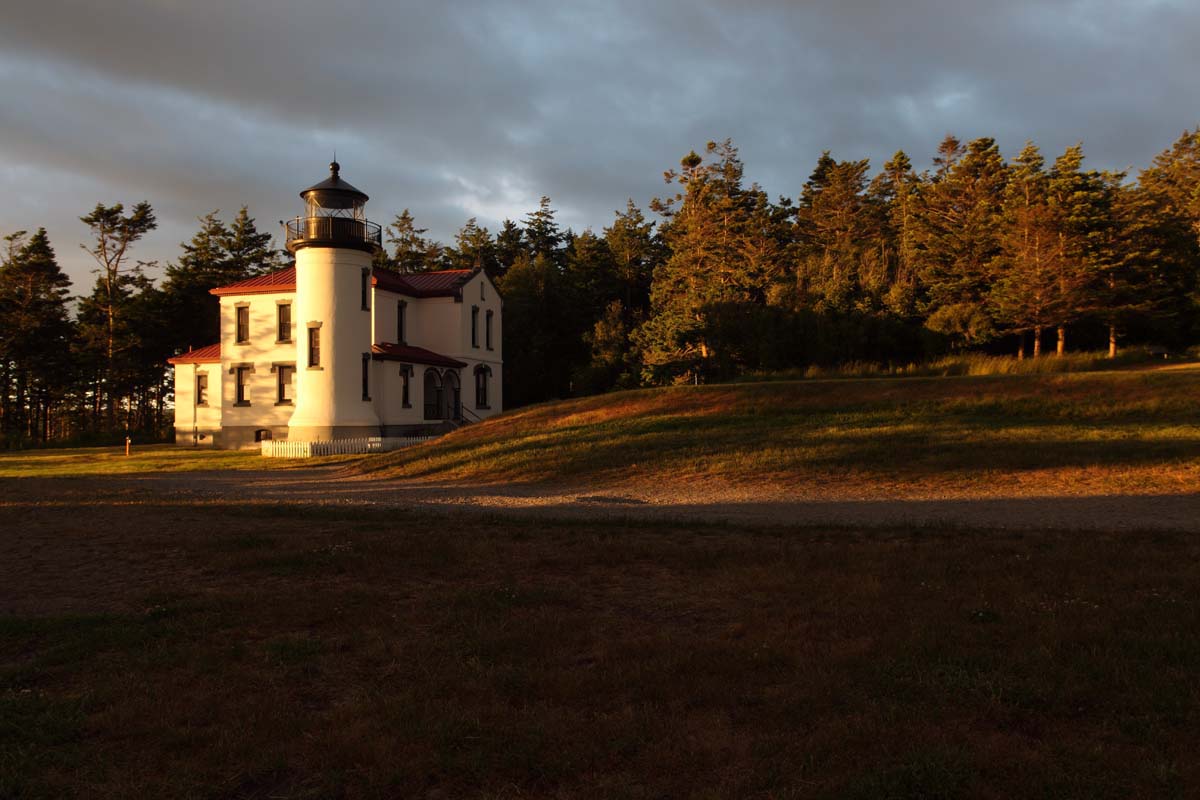
We were shooting at one location late one afternoon in June when the sun disappeared behind a large bank of dark clouds, and it looked like we were done for the day. We were heading back to the offices and classroom when I looked over and saw that there was a small hole between the horizon and the dark clouds. One of my students that was familiar with the area told me about Admiralty Head lighthouse, and that it was high enough in elevation to catch the sun break through the clouds before it set.
I immediately thought to myself about Eddie Adams, a famous Pulitzer Prize winning photographer. He once said, “When you get lucky, be ready”. This has been my mantra for the last fifty-three years, and it has helped me take some incredible photos; so off we went chasing the light, my favorite pastime!!!
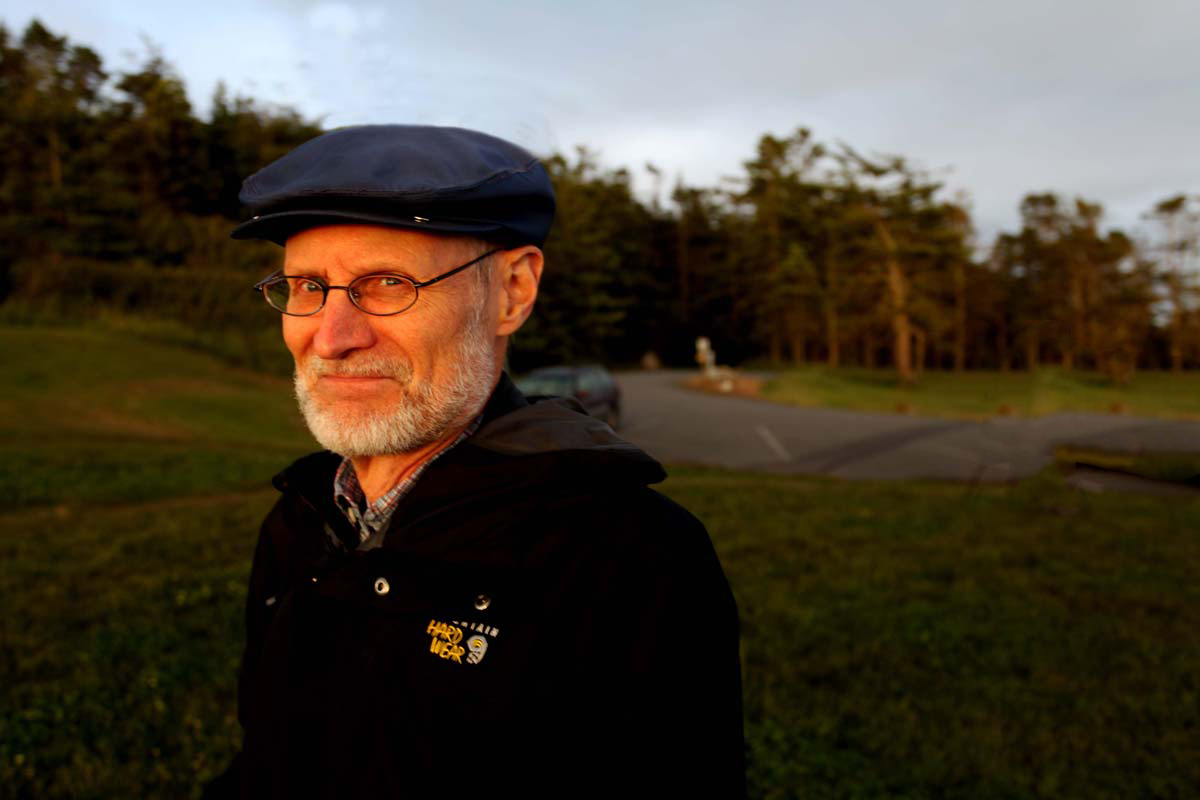
When we arrived, the temperature had dropped significantly, and the wind was howling at us. It was mighty ‘freaking’ cold up there that night and I have to take my hat off to the students that went with me. As they say in Texas, “Sometimes you just gotta cowboy up”.
Larry could “cowboy up”!!!
Second version a few seconds later.
While working with another one of my students I said that Light is so fleeting that it will change in just seconds. I took this shot and had her run with me around to the other side to show that the time it took for us to get there the light and color had changed dramatically.
As I always say, “Never stop shooting until you can’t see anything, because as long as you can see it, you can photograph it!!!
Visit my website at: www.joebaraban.com, and follow me on Instagram: www.instagram.com/barabanjoe. Check out my workshop schedule at the top of this page and come shoot with me some time.
Here’s something to think about next time when you pick up a camera and go out shooting. Is your approach to taking pictures more of a objective nature or are you more subjective in the way you see things?
Let me explain by giving you an example: If you’re out shooting and you see two dressed up women standing side by side, and all of a sudden one of them picks her nose, do you take the shot?
If the answer is yes, then you’re being objective…why? Because you’re not being influenced by any personal feelings; you’re merely representing the facts.
You also probably have an ulterior motive, that being you caught someone in an act and you’re after some recognition for being ‘quick on your feet’; and the forthcoming laughter from the viewer(s).
Conversely, if you’re somewhere and you see two women all dressed up standing side by side, and all of a sudden one picks her nose…but it’s your favorite aunt, do you take the shot?
If the answer is no, then you’re being subjective…why? Because you’re being influenced by personal feelings; you don’t want to represent the fact that your aunt picks her nose.
I will often get images from people that take my online class with the BPSOP, and my “StretchingYour Frame of Mind” workshops I conduct around the planet, that may or may not show something like that happening.
During the critique they will tell me that they have other variations where the subject isn’t doing something embarrassing. The problem is that they’re not as interesting.
Part of my answer is in the form of ways to create Visual Tension. Visual Tension gives your photograph strength and intensity. Tension equals energy, and it’s a psychological force to be reckoned with and used correctly can take your photography what I refer to as “up a notch”.
When you hear the word tension you more than likely associate it with mental or emotional stress since that’s the most popular definition. After all, how many commercials have you seen or heard where they talk about “the tension headache”, and that their pill works better than all the rest to get rid of it?
I’m talking about the kind of Visual Tension that’s comes as a result of forces acting against one another; which creates energy and visual interest.
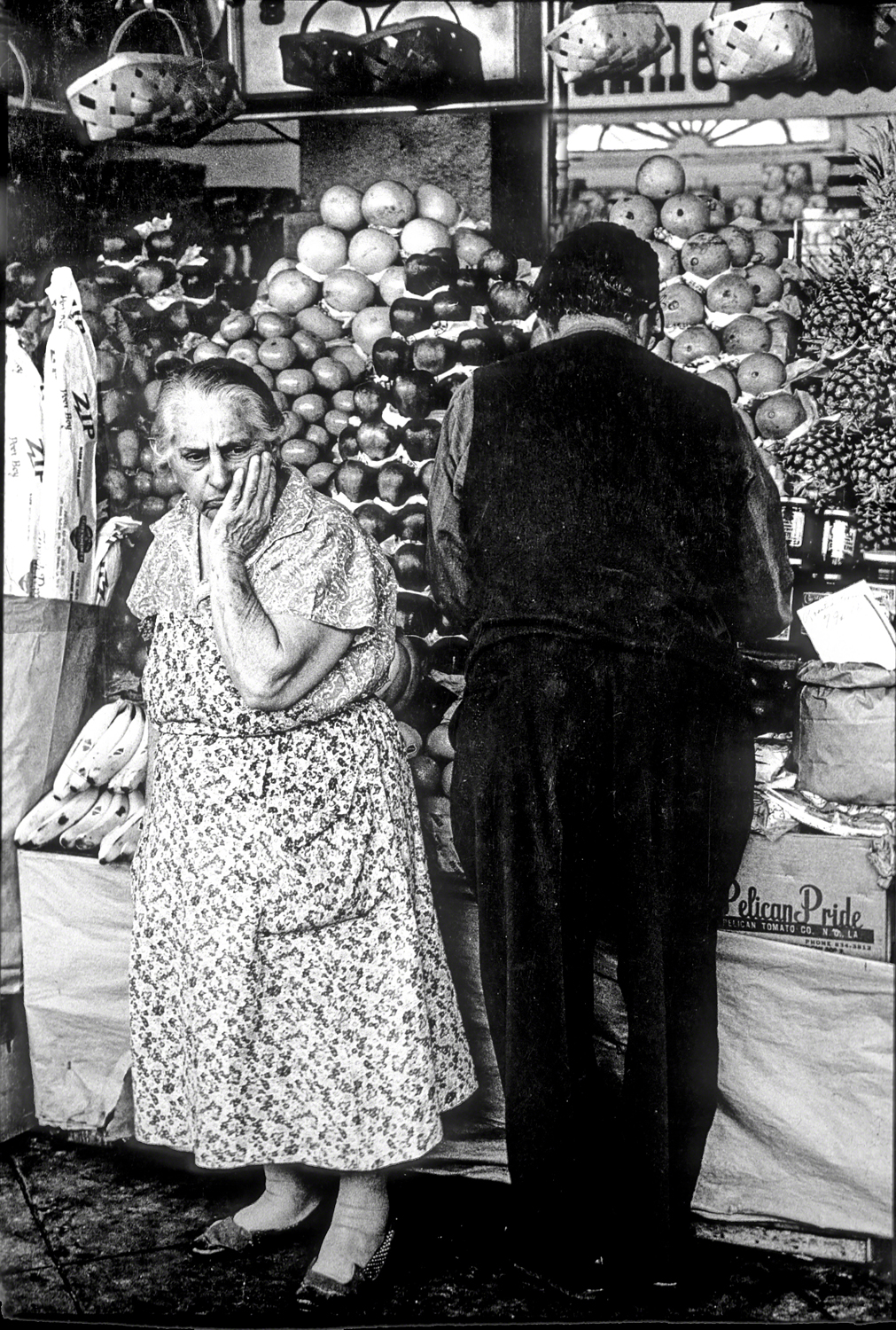
When Visual Tension is present, it’s the feeling that something is going to (or has occured) occur that will change the dynamics of the message we’re trying to get across to the viewer. There are several ways to do this and two of them fits this post: body language and gesture.
In the above photo, I was walking around New Orleans during Mardi Gras, and stopped to take a picture of this couple. At that moment the man turned around but the woman, through her body language, told me that she was very old and very tired from being on her feet all day for countless years.
Do I become subjective and not take the shot, or do I transcend any personal empathy and take the shot; I took the shot and now it’s in the permanent photography collection at the Museum of Fine Art in Houston.
So my fellow photographers, it will be a tough choice…do you go for the gold and become objective? Do you sell your aunt down the proverbial river, or do you protect her by waiting until she’s through picking?
For me, it all depends on whether I’m in her will.
Visit my website at: www.joebaraban.com, and check out my workshop schedule at the top of this blog. Come shoot with me sometime.
Every once in a while, I come across a quote that hits me right smack dab in the kisser. Loving Robert Franks images, I wanted to share one of his quotes with you and explain how it relates to my way of thinking. He once said, “When people look at my pictures I want them to feel the way they do when they want to read a line of a poem twice”.
So, how does that relate to photography? There are several ways that I can come up with that immediately resonated with me:
Imagine you’re at an opening at a photo gallery walking around all dressed up in artful clothing and drinking cheap Chardonnay or Merlot out of the wrong kind of a plastic cup. You’re walking around looking at all the images while talking to you friend about what restaurant you’re going to afterwards.
While you’re talking and walking slow, you are giving each photo a casual glance, but you stop abruptly in front of one of the prints and look at it for more than just a few seconds.
You stop because there’s something there, something that moves you, the way the image treats you with an intrinsic value and brings you into the very essence of what the photographer was trying to communicate.
Another way to keep the viewer around is to be sure to “Make not Take” pictures. When you’re at some location , don’t just walk up to your subject bring the camera up to your eye and take a photo. Think about what you’re doing if you want your photos to stand the test of time.
Take some time to walk around your subject, what is the center of interest? Take a look around the entire location you are about to shoot in. Shoot from different POV, look to see where the Sun or the source of the light is coming from. If you try to sidelight your subject you will be creating depth. Form is one of the basic Elements of Visual Design, and it refers to the three dimensional qualities of an object: height, width, and depth. In order to create the third dimension Depth, you need to sidelight the object, a.k.a., your subject.
I teach these things in my online classes with the BPSOP and also in my workshops. To master just these two ideas will bring the level of you photography what I refer to as “up a notch:”, and will undoubtedly have the viewer giving your images a second look.
Visit my website at: www.joebaraban.com, and follow me on Instagram: www.instagram.com/barabanjoe. Always give my workshop schedule a second look as they occasionally come up. Come shoot with me sometime.
Lemena, an online student of mine with the BPSOP sent me this photo to take a look at. As usual, I like to include what people had to say as it often mirrors what others are thinking about when they’re shooting. There’s lots of photographers out there that experience the same thing. I know that the people that take my “Stretching Your Frame of mind” workshop class deals with a lot of the same issues, so let’s talk about them.
Dear Joe,
I just took your class at BPSOP a couple of weeks ago. Last week, I came back from Japan and was at Lake Yamanaka, one of the Fuji’s 5 Lakes. I saw this scenery one early morning. There was a rope and some wet spots on the metal bridge. A little shadow as there was morning light, although at a distant, it was misty. I thought these fit the suggestions you made in the class when I took it.
I spot meter the reddish-brown metal bridge to choose my exposure. As a result, the sky on the right side of the picture is overblown. But inside the shade of the green duckling, you can see a small boat at a distant. I love the combination of these colors. I use active D-lighting in my camera. Standard setting. About 6:30 am local time. Did not manipulate the color in the White Balance as I usually do.
Hopefully, this picture can be improved with the help of your critique.
Thanks so much.”
Regards,
Lemena
Lemena,
I remember your work well, as it was usually full of color and pretty light. As I always told you that using your ‘Artist Palette’ with all the elements of Visual Design on it will help take your imagery “up a notch” and make it memorable. Ok, lets talk:
The first thing to address is your choice of exposure. You remember me talking about the two different kinds of light, incident and reflected. Incident light being the kind of light that falls on an object and reflected light is the type that reflects off an object. When you metered off the bridge there was more light being absorbed than reflected because the color was dark. The sky, being lighter, reflected more light than it absorbed. Therefore there was no way that you were going to get a proper exposure on the sky and the bridge at the same time.
Also, there’s the ‘Dynamic Range‘ factor, check it out! what you have in this image is a huge difference between the highlights , mid tones, and the shadows. It’s really important to always keep that in mind when exposing your photo.
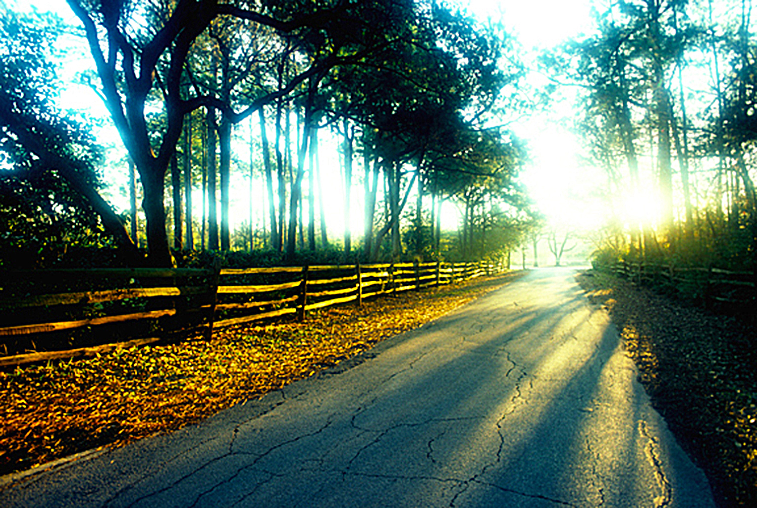
So, what do you do? Being the type of photographer that wants to do as much in the camera as possible, I want to make sure that there’s some tone in the sky, unless I’m purposely trying to blow it out as in my photo of the small road.
Intentionally blowing out the sky to create energy.
I would take a reading somewhere close to the brightest area, of the sky where there’s a little blue. that’s what you set your camera on. With color you always want to expose for the brightest area and then open up the shadows…unless the Dynamic Range is too great. At that point you either show as little sky as possible or eliminate it all together.
That’s if you want to do as much “in the camera” as you can. If I were standing there taking the photo, part of my thought process would be in identifying the potential problem and telling myself that I could easily fix what I couldn’t fix “in the camera” in either Light Room or Photoshop.
BTW, I’m glad you didn’t mess with the color and make it unreal looking. To me, there’s nothing wrong with the color as I see it here. It looks natural compared with some of the photos I’ve seen out there that look like a cartoonist took the picture!!!
Now, let’s talk about the composition itself: Are you still using my “Fifteen Point Protection Plan”? You know the one that helps you leave out what should be left out and put in what should be in? The reason I ask is the messy rope in the foreground that to me is a little distracting. I would have picked up on that and decided if it looked good the way it was or should I have wrapped it around itself making it look less messy. For me, KI have no problem making it look good. A camera on a tripod is just like a blank canvas on an easel. You’re an artist so paint, and if that means changing something then “Just Do It”!
Did you realize that you were not centered on the bridge? Either move to one side to make the bridge more of a diagonal shape I(leading line), or move one step to the right so it would be symmetrical. I vote on it being symmetrical. It was just a slight adjustment.
As you know, I love reflections, and especially those created by water. Having said that, I would have tried one where I was “Up Close And Personal” to the wettest part half way down the bridge. Either that, or find a bucket or a hose and wet down the area right in front of where you would put your camera. Remember that reflections create Visual Tension”.
Also remember that you’re out there “making pictures”, not taking them.
I love the small boat in the distance. In the psychology of Gestalt as it applies to photography, it’s important to keep the viewer an active participant in perceiving and processing out photos. One of the ways is to keep him discovering new things as he looks at our pictures. He won’t see the small boat right away and that’s a very good thing!!!
Nice photo Lemera and nice light as well. As you know,LIGHT IS EVERYTHING!!!
Thanks for the submission.
Visit my website at: www.joebaraban.com and follow me on Instagram: www.instagram.com/barabanjoe. Check out my new workshop schedule at the top of this blog. Come shoot with me some time.
When I taught online with the BPSOP, and now when I also conduct my “Stretching Your Frame of Mind” workshops around the planet. I teach my fellow photographers how to incorporate the elements of visual design into their photography. I also show them how to use their eye, and to see past first impressions. to not look at things but to see them.
There is a skill in photography called ‘seeing’, a few have it naturally, most people don’t, but can be shown the way.
The first step is the ability to frame just the part of the scene in front of you that makes a good, interesting photograph; this will take time to develop.
The second step is to fill the frame with your subject and to photograph ‘bits of things; pieces of the puzzle. Instead of the building just the window, instead of the window, the texture of the faded, peeling paint.
When out on the street and you look at the scene in front of you there are probably 30 or 40 good images you could take. Seeing is the ability to pick them out one at a time. Each potentially being the individual pieces that makes up the finished puzzle.
After a while you’ll realize that you have been walking around blind. It’s an epiphany, a sudden exciting realization that brings you into your own personal reality…perhaps for the first time.
The third step is ‘seeing’ the lighting and only taking images when the lighting is good, this takes a lot longer; a lot more discipline.
The fourth step is deciding on the best composition for your images, keeping in mind that balance is a basic element of visual design. Cropping only in the camera, and using the edges of your frame as a compositional tool.
The fifth step to consider is applying color contrasts, keeping in mind those colors that are in harmony, and juxtaposition of the light to your images; one of the best ways to generate Visual Tension.
The sixth step is simplifying the images, paring down the subject to its bare essentials. Remembering that it’s not what you put into a picture that counts, it’s what you don’t put in that matters.
The seventh and last step is grabbing the ‘moment’. The moment it all comes together, recording it to secure it’s place in our history…by clicking the shutter.
It’s a long, long learning curve.
I didn’t mention the word camera because it’s the least important part of the whole process. Clicking the shutter is the easiest part of photography.
I like to have complete control over all aspects of my final composition/photo. That means being in control of the final exposure as well. Letting the meter in your camera decide your exposure takes you out of the control you need to create strong images with lots of Visual Tension/Energy, and interest. I can tell you that the meter in your camera, no matter the brand, is not giving you the right information.
One of the many areas I cover both in my online classes with the BPSOP, and in my “Stretching Your Frame of Mind” workshops I conduct around the planet is how to take meter readings that will provide you with this tension, interest, and energy.
Most of my fellow photographers have the meter in their camera set on Matrix. The problem with that is the meter doesn’t know exactly what you want. It will read a large area of reflected light, and that’s not the best way to have control of the final photograph.
For me, I want more control than that. I want to know what every area of my composition reads so I can compare one part of the frame to the other. I want to know what it’s going to look like before I look at it on the back of my camera, and certainly before I sit down in front of a computer. By that time I had lost control and now I’m left to devices, computer software, and programs to help out.
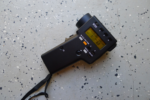
The next time you go out, try setting your meter on ‘spot’ so it will read a smaller portion of your composition. Read the highlights and then the shadows and see what you get. If you really want to master the light, get a handheld meter like the one I’ve used for the past forty-four years. I use a meter that’s not made anymore but you can find them in mint condition on e-Bay.
I use a one degree spot meter that was made by Minolta, and in it’s day, it was the state of the art. I can read just one degree of light at a time and can compare readings from the highlights to the shadows…and everything in between.
Minolta One-Degree Spot Meter
In the past couple of years, this meter has become very popular again. I guess there’s more people out there that want the challenge of being a good photographer and not a good computer artist.
Of course these days you don’t need that, but to me it’s fun and challenging to get exactly what I want in a photo…before I click the shutter.
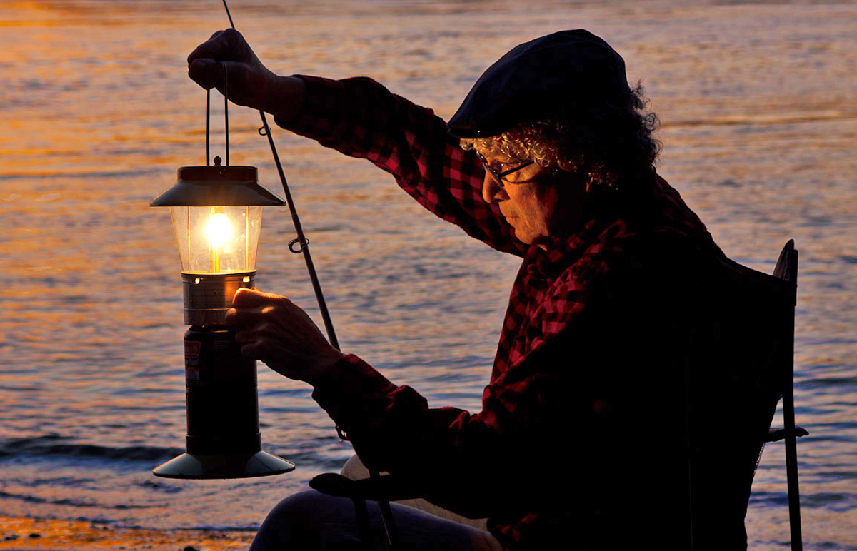
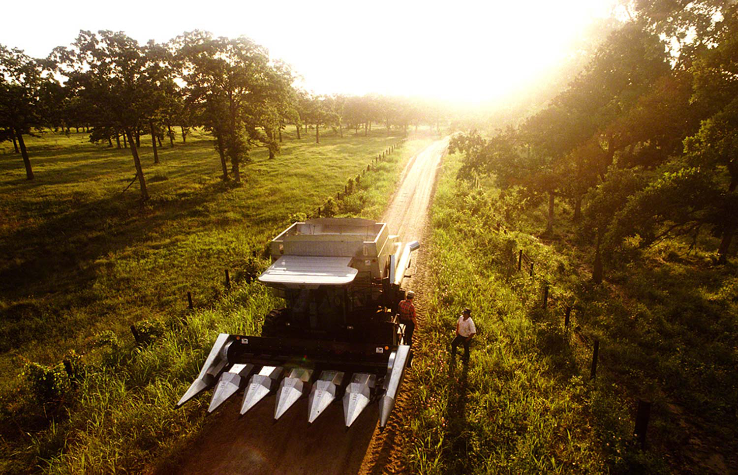
In the photo above, I wanted that sunrise energy so I read the reflected light on the two men. Once I set my camera to expose for them, the early morning sky behind blew out creating the Visual Tension, interest, and energy.
I’m sure some of you out there are horrified because I clipped the highlights. All I can say is…get over it. Stop being predictable and following rules written by people a long time ago that never colored outside the lines.
Visit my website at: www.joebaraban.com, and follow me on Instagram. Check out my workshop schedule at the top of this blog.
Besides my “Stretching Your Frame of Mind” workshop I conduct around the planet, I also teach a four week class with an online school called the BPSOP. Actually, I teach a part I and a part II class, the latter covering several areas I’m not able to cover in the first four week class.
In each of the four weeks I give a different lesson that covers the different elements of visual design and composition. These elements have been around since the Renaissance and are still considered classic ways to take your imagery what I often refer to as “Up a Notch”. At the end of the classes, fellow photographers walk away with I call the ‘Artist Palette’, and on this Palette are: Negative Space, Vanishing Point, Perspective, Tension, Pattern, Texture, Color, and Line. They also walk away with an understanding in how these elements work with Light, since we concentrate on it.
The above photo, taken in week three by one of my students, has several of the elements from his new ‘Artist Palette’. Can you see them?
When you look at the following slideshow from my part I class, you will see the ‘Artist Palette’ in action. As a result, these same photos, were taken from non professional fellow photographers whose only requirement for taking my class is a desire for improvement in the way they approach their photography, a good working knowledge of their camera and be able to shoot on the manual setting; passion also helps.
As you can see, these images are a definite cut above and in a lot of instances memorable. Btw, in my classes, my goal is to make you a better photographer not a better computer artist, so no post production of any kind or cropping is allowed so all the photos you see were taken “in the camera”.
🙂
Visit my website at: www.joebaraban.com and follow me on Instagram: www.instagram.com/barabanjoe. Be sure to check out my workshop schedule at the top of this blog. Come work on your ‘Artist Palette’ with me some time.
Daniel sent me this photo and asked me for “my thoughts and a critique”.
I usually get more of a description and a question associated with it, but since it’s a fairly straightforward image, I can still write a critique.
The first thing I want to discuss is one of the biggest areas of concern I have in my online class with the BPSOP, and in my “Stretching Your Frame of Mind” workshop I conduct around the planet, and that’s about exposure. For some unknown reason, my fellow photographers trusts what the camera tells them as far as what exposure to use. In my opinion, that’s one of the worst things you can do, and Daniel’s photo is a good example. It’s so underexposed, that I can’t figure out what the meter was telling him. I could be dead wrong, but if I had to guess, I would say that this was probably the only exposure taken of this composition. If you look at the top left side of the frame, the structure doesn’t really stand out against the sky until you almost get to the middle of the frame. Also, the color of the sky and horizon appear to be muddy and not a pure value of said colors.
I can’t tell you how many students of mine have no idea what shutter speeds and aperture settings are. They’ll go their entire life and never know because they let the camera do their work for them. I would not be shocked if I told one of them to put their camera on manual, and set the camera on 1/60 at F/8 and they just looked at me with question marks in their eyes…now that’s scary!!!
If you’re shooting for yourself, then it’s not going to be a problem since you were there and saw it the way it really was. If you’re shooting so other people can enjoy your work, then I suggest you learn what’s the right exposure to use for every photo you ever take. When I tell you that it will make you a stronger photographer, take it to the bank.
Better exposure?
But I digress.
Ok, back to the photo. In my classes we spend a great deal of time working on balance and using negative space to define the positive space. In Daniel’s image if you look at the building on the left side of the structure, the negative space around it clearly defines it. If you look at the building just to the right of the same structure, a viewer won’t know where the left side ends and the object begins. It’s not a “quick read”. If you look way over to the right, the building is defined on both sides.
I like the strong diagonal line that almost cuts the frame in half. Line is the most important of all the Elements of Visual Design. Although there are many kinds of lines, the three basic ones are: Vertical, Horizontal, and Diagonal. Diagonal lines have more energy and visual tension that the other two. The reason is that it’s the anticipation of the diagonal lines falling forward that gives them the additional energy and tension.
I’m not sure what the red and white things at the bottom right corner are but I would have liked to see more of them; to add another layer of interest. The more the viewer discovers in our imagery, the longer he’ll stick around…and that’s exactly what we all want…that is if we’re shooting for other people.
Thanks for sending it to me.
Visit my website at: www.joebaraban.com, and follow me on Instagram: www.instagram.com/barabanjoe. Be sure to check out my workshop schedule at the top of this blog. Come shoot with me sometime.