For years, actually sixteen, I taught online classes with the BPSOP. Several months ago, Bryan Peterson who founded the school passed away after a long illness and as a result, the school closed. I still conduct my “Stretching Your Frame of Mind” workshops around our planet, and for those interested, I also have a six month ‘mentoring’ program. If you want more details, contact me at: joe@joebaraban.com.
Coming from a background in art rather than photography, I studied the basic elements of visual design, and now I show my fellow photographers how to incorporate these same elements into their imagery: Line, Pattern, Texture, Shape, Form, Balance, as well as negative space, perspective, vanishing points, shadows, and silhouettes..to name a couple!
Each week of a four week class I gave a different lesson, and my students worked with these elements while composing their photos. After the four weeks, they had what I refer to as an Artist Palette, and these elements are on it.
In my Gestalt, students had to have taken my first two classes before signing up. In this class I showed my students how to manage what the viewer perceives and processes when looking at the visual information we lay out to him in the form of a photograph. We work on the six concepts: Figure-Ground, Similarity, Law of C0mmon Fate, Continuance, Closure, and Proximity.
In this slideshow are photos from all three classes, and I hope you are as impressed as I am as how their level of photography jumped up several levels from where they began.
Visit my website at: www.joebaraban.com, and follow me on Instagram: www.instagram.com/barabanjoe. Check out my occasional workshop at the top of this blog. Come shoot with me sometime. They fill fairly quick, so if you see one posted and you’re interested, send me an email.
I had led a group of my fellow photographers to Provence for one of my yearly workshops. We met in Arles and for three days photographed many of the areas where Vincent Van Gogh roamed the streets and countryside looking for subject matter including: Arles, Avignon, Saint Remy de Provence, Les Baux, and Chateauneuf de Pape.
From there we traveled by van to Nice and for the next three days photographed this beautiful city by the sea, a sunrise in the magical village of Eze, then a train one afternoon to Monte Carlo.
Many of the photographers had taken my online classes with the BPSOP, and studied the elements of visual design with me. There were so many that had been on prior workshops, and some as many as three, four and five before coming again with me to Provence. It ‘s always like a family reunion with several people returning to shoot with me again, and this time it was to celebrate my 70th birthday…which we did!!!
Christine taking a picture of Mikki taking a picture of the class at the top of Eze
All I can say is that there were so many great images that it was difficult to get it down to the number I finally wound up with. I realize that it’s a lot of photos to look at, but it was the best I could do to reduce the size to what I consider a good representation of the area, the light, and the people.
How many times in your life have you heard this old adage? For me, I’m putting it at a million to be one the low side. I’ve also said it to my online class with the BPSOP and my “Stretching Your Frame of Mind” workshops as many times. One picture is worth a thousand words can fit all types of applications, for all types of people.
The quote has been attributed to several sources throughout the years from a Chinese proverb to Arthur Brisbane, a newspaper editor who said it in 1911. In any event the meaning has really come to light in the digital era as truth in our new transparent culture. It’s now talked about ad nauseam in social media, but the simple fact is that it’s all about being able to (very quickly) convey so much meaning with so little or no explanation at all in one photograph.
For my fellow photographers it especially has meaning since we talk about it in my online class with the BPSOP, and in my “stretching your frame of mind” workshops I conduct around our planet. Just let your image do the talking for you since you’re not going to be around to share your thought process with the viewer. Unless you’re going for an abstract in which case you’re leaving it up to others to see what they want to see, then it needs to be what I refer to as a “quick read”.
If you’re trying to tell a story, then get to it because it’s not easy to hold the viewer’s attention for very long. Imagine that you’re a cinematographer shooting a scene at twenty-four frames a second. Stop the projector and take one frame out and show it to the viewer. That’s what you’re up against when you’re shooting stills and have to portray whatever it is you’re trying to portray in one image…not like motion where you have some time to get the message across. Btw, did you know that one page in a screenplay is equal to one minute on the screen?
The methods we use to gain attention to our photography varies, but what’s important is how we manage what the viewer perceives and processes when looking at the visual information we lay out to him in the form of a photograph. Visual input is a part of our everyday life, and when you’re trying to gain attention, by telling a story, we want to take immediate control of what the viewer sees when contemplating the message we’re putting out.
In other words as the Notre Dame football teams were know for…”rock em sock em” when it comes to telling it in one photo.
I was going through some of my fellow photographer’s work, and inadvertently found this question. In the past, when I got a question and photo, I liked to share what the photographer had to say. This way others that might feel the same way or have been in a similar situation can identify a lot easier. Here’s what he had to say:
“Hi Joe,
After reading your blog post about the “Law Of Light” (part one) I’ve started to pay attention in my photography for the “glow” effect you described. Of course I never shot photos with that physical law in mind, I only knew that the best light was with the low angle at sunrise/sunset and having my subject side lit would make it “pop” and it give it a more tri-dimensional effect by revealing it’s form.
Here’s a landscape shot I took in Sand Diego at Pacific Beach. I only got the right creative exposure —shutter speed of about 2 seconds to get a calm ocean— later on this photographing session, when the sun was almost gone and the rocks were not glowing anymore.
Moreover the tight wasn’t my friend at that time —it was rising and it was the only time I could take this photo, meaning no other chances to plan another session with the light getting low.
I think of these shots as keepers but I’m not gonna use them in my portfolio. This is not only because I didn’t get the creative exposure I wanted, but also because I’m noticing a light flare on them. The flare is probably due to the camera position towards the sun and the use of an ND Grad filter to hold back the sky exposure.
What are your thoughts about it? How can we avoid light flares when shooting with the “law of light” in mind? Is that possible to avoid light flares when we are obligated to use an ND grad filter, a polarizer or an ND filter for creative purpose (or a mix of this three depending on what we’d like to get)?
Is my approach to this matter right, or am I missing something here, Joe? Thanks for your suggestions and for the tricks you usually share with us non professional photographers.
PS I’ve also added the shot without any light glare but that I consider to be a shot for my portfolio. Thus you decide if is the case to show ’em both or not.”
If you read my post on the ‘Law of the Light“, you read that the sun should be in the ’10’ or ‘2’ position on the clock. In your photo the sun is closer to ’11’, making it almost backlit. In this case you won’t be able to get rid of any flare since the sun is close to the middle of the frame. This not to say that if the sun were at ’10’ or ‘2’ you wouldn’t get some flare, because you would if the sun is too close to the edge of your frame. BTW, filters don’t have anything to do with flare from the sun.
The solution is an easy one. Make sure you have a sun shade on your lens. If that doesn’t completely solve the problem, stick your hand out in front of you opened flat and place it between the sun and the lens. When the shadow from your hand covers the lens, the flare will go away. You can count on flare when you light from 9’oclock to noon to 3’oclock. I always watch for it.
Personally, I like the version on the left where the light and color is more dramatic. The glare in the water doesn’t detract from your photo. If anything, it adds Energy.
Thanks for the submission.
Visit my website at: www.joebaraban.com and follow me on Instagram: www.instagram.com/barabanjoe. Check out my workshop schedule at the top of this blog. Come shoot with me sometime.
For me, the easiest way to walk away with the best shot possible is to make a series of adjustments as I’m shooting. Photography is all about making adjustments from your first frame to your final composition.
As I’m shooting, I look all around the frame. I’m doing my Fifteen Point Protection Plan, my Border Patrol, and the Four Corner Checkoff. Each time the shutter opens and closes I’m making adjustments, some minor and some major…a new final composition, and I take several “final compositions” before I’m through….shoot adjust, shoot adjust, shoot adjust, etc., etc., etc.
The reason? To achieve what I want in the camera, and not have to rely on a computer to fix the problems I could/should have done prior to clicking the shutter.
I rarely use the first image I take unless I’m street shooting and I have one shot at it. It’s always the second, third, fourth, etc., before I’m satisfied.
I’ve discovered after thirty plus years of teaching that my fellow photographers will generally bring the camera up to their eye and aim, shoot, then move on to the next shot. Doing that really lowers the odds of that one photo being the one that can stand the test of time. The proverbial ‘OMG’ shot, a ‘keeper’, one that makes it to the ‘wow’ category of picture making.
In my online class with the BPSOP I use to critique so many images that could have been so much stronger had they made just a few adjustments. I say that in the past tense since Bryan Peterson, the founder recently passed away and the school closed. In my personal “Stretching Your Frame of Mind” workshops, I’ll observe a photographer shoot an images and immediately walk away. Slow down and smell the flowers I’ll say to them; don’t be in such a hurry.
Maybe the horizon line is off, perhaps it’s something growing out of someone’s head. It could be something coming into the corner or edge of the frame (those dead branches for one example) that you really don’t want to be there…I call those UFO’s, which would not be considered something that was hidden in Area 51. These may be nothing but minor nuisances, but they could also be something that even a computer can’t fix and therefore winds up on the cutting room floor…as in painfully deleted.
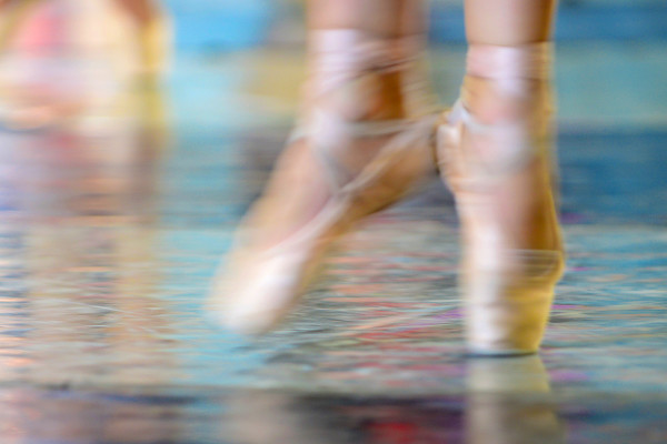
In the above photo of a dance instructor in Cuba, there were several adjustments before I was satisfied: I had her standing with no chairs, sitting with no chairs against the wall, then I added a chair, then I added another chair, then I had her looking out the window, then straight at me, then at me through the mirror…shoot adjust, shoot adjust, shoot adjust, etc., etc., etc.
If you consider yourself a painter as I do, then a good analogy would be to not think about your camera being on a tripod, think about it being a blank canvas on an easel. A finished painting is achieved by adding and subtracting pigment. Mixing colors to get just the right shade of blue, adding white or black to change the value of an area. Switching from one size brush to another is akin to changing lens. Then there’s always the option of using a palette knife of various shapes.
If you’re into getting the right light, then you’re shooting from different points of view and thinking about my clock. Shoot then adjust by moving around to see how your subject looks lit from the side perhaps to bring out the texture, then make another adjustment by placing the sun behind your subject to backlight it.
The digital age has had a profound effect on photography. some good and so many not so good. One good thing that has come about is the ability to shoot a photo and immediately look at the back of your camera to check it out. It’s so easy now to make those adjustments that will undoubtedly take your photography to where you’ve never gone before; and what I refer to as ‘up a notch”.
Visit my website at: www.joebaraban.com, and follow me on Instagram: www.barabanjoe.com Check out my workshop schedule at the top of this blog. I’ll be conducting a workshop every so often, so be sure to check them out at the top of this post.They fill rather quickly.
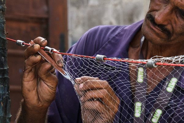
Light, Drama, and the Elements of Visual Design working here.
Before continuing with this post, I have two openings that just opened because of a family emergency for my January trip to Havana and Vinales, Cuba. Let me know if you or anyone you know is interested. Send me an email to: joe@joebaraban.com.
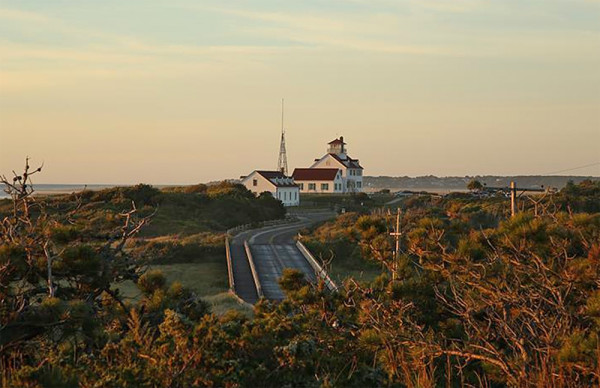
OK,until recently, I always like to show what my online classes with the BPSOP were doing in my part I and part II courses, as well as in my “Stretching Your Frame of Mind” workshops. Sadly, the founder, Bryan Peterson, passed away from cancer and the school shut down. I taught, and still teach, fellow photographers how to incorporate the elements of visual design and composition into their photography. Terms like: Negative space, Vanishing Point, Perspective, Tension, Line, Texture, Pattern, Shape, Form, and Color are all a part of their new ‘Artist Palette’. As a result, they walked away armed with the knowledge of what it took to create strong, well designed and memorable photos; and the ability to “make pictures”.
In my part II class, a continuation of what they learned in part I, we worked on the most important of all the elements of visual design, Line. We also worked on creating shadows, silhouettes, and the use of light to add drama and tension.
The following slideshow, as well as the photo featured at the top of this blog are examples of how they used not only what they remembered from part I, but what they walked away with at the end of the four week part II class as well.
Even though the school has permanently closed, I still conduct my six-month mentoring program. If you or anyone you know is interested in taking their level of photography “up a notch”, shoot me an email (after checking out my website) at: joe@joebaraban.com
Visit my website at: www.joebaraban.com and follow me on Instagram: www.instagram.com/barabanjoe. Check out my workshop schedule at the top of this post. They fill fairly quick which is the reason they don’t stay up long. Come shoot with me sometime and walk away with your own ‘Artist Palette’.
Not too long ago I had one of my students submit to me something a little different than the usual photos I received to critique. It’s not something I will usually talk about since it’s not a pure photograph, but a montage. I found it quite interesting in the sense that being an art lover, I like looking at all kinds of different genre.
As usual, I like to show the actual question for those of you that have been in a similar situation, or have had similar questions. Here’s what Yvonne had to say:
“Dear Joe,
As a painter turned photographer, I finally needed some touch-of-the-hand. I think of the montage part as drawing on top of a photographed image But, an unexpected weakness appeared. They look cheesy really easily.
Not all in the series are montages. I like the mixture in a single series. Many are diptychs. Yes, I’m after an emotional tone in the straight photos and I expect to add little more in the montages than a figure and an ambiguous point of view.
Well, I bow to your critical comment. This title: Your Voice is Mine, from the series Chokeberry Sugar. My question: How do *you* see the image? Thank you, Joe. It would be important to me to hear what you think of it.
Very best, Yvonne
Yvonne,
As I said, this is not what I usually receive, and it’s not what I ever critique since I’m not a student of this particular genre. That being said, I can only comment on what I see and feel as someone that loves looking at art. However, I can comment on some of the areas that I use to teach in my online class with the BPSOP, and in my “Stretching Your Frame of Mind” workshops I conduct around the planet. Sadly, Bryan Peterson, the school’s founder passes away not too long ago.
The first thing I want to say is why so dark? I realize that you’re trying to seduce the viewer via mystery and drama, which is a very good thing. To me, it’s important for the viewer to be able to see it so he or she can realize any kind of emotion you are obviously trying to portray. If it were me, I would have more contrast between the sky and the trees; that would add more (visual) tension…as in some of the scenes in old Beula Lagosi as a vampire and Lon Chaney as a werewolf movies.
BTW, those movies scared the daylights out of me when I was a kid.
I would have moved the rabbit over to the right, so there was black negative space defining the top of his head instead of it running into the trees in the background. I would have also shown the rabbit’s front feet instead of cutting them off. Speaking of the area on the right, you could have eliminated a lot of it by making this montage more of a vertical. You could almost divide this in half and say the same thing.
Besides that, I don’t feel like it’s cheesy, and you’re right…it can very easily. That’s probably the main reason why I usually don’t like a montage. There’s a certain degree of taste that I like about it. I love the tack sharp texture on the rabbit. Texture is one of the basic elements of visual design, and used correctly can take our art what I refer to my students as “up a notch”.
When I first starting my career, right at the beginning of recorded history, I knew nothing about color photography. I had studied painting and design my entire life and almost always worked in color.
However, at the time when I was shooting with my first real camera, a Pentax Spotmatic with a 50mm lens, I was shooting in B/W. The reason being that I was also learning all about photography and how to process my film to eventually make my own prints. Color wasn’t an option even if I did know or think about it…which I didn’t.
In 1971, when I started shooting for UPI, AP, and was a Black Star photographer we shot primarily in B/W, so that’s the way I saw things. Besides at that time I was looking for the moment, that moment that assured me that my photo would be bought ( for ten dollars apiece) and transmitted. Color never entered my mind.
To me, that was the best way to shoot B/W…with B/W film. Now, As I tell people in my online classes with the BPSOP, and in my “Stretching Your Frame of Mind” workshops I conduct around the planet, if you’re going out with the intention of shooting B/W, then either look for the action and capturing it or look for the ten different tones that’s between white and black.
As I’ve told my fellow photographers, my background is in painting, drawing, and design. One of the exercises I remember is completing the grayscale with white and black tempera paint. I had to start out with a block of white and by adding a little black at a time get to black in ten steps. We referred it to: 10% of black, 20%, 30%, 40%, 50%, etc. until we got to 100%…pure black right out of the bottle. You might try it sometime. It will help you better understand how we perceive our environment around us without any color.
Contrast will be so important when composing, and you’ll want to have areas of pure white and areas of pure black..as well as the complete tonal range. It takes some getting use to if you’ve never thought that way, but in the long run, I think your images will turn out much stronger than just sit in front of the computer and deciding to convert a color image.
My B/W image is from those early days when I only thought in B/W. Unfortunately it’s a digital files so it’s lost a lot of the real beauty it had when it was a print.
Btw, Ted Grant, a Canadian photojournalist once said, “When you’re thinking and shooting in color you’re photographing their clothing, and when you’re shooting in B/W, you’re taking pictures of their soul”.
Visit my website at: www.joebaraban.com, and follow me on Instagram: www.joebarabam.com/barabanjoe. Check out my upcoming workshop description at the top of this blog. Come shoot with me sometime.
Taken at one of the cultural events the group goes to.
Last January, I lead a photographic cultural tour to Cuba. It was a great experience not only for the group that was full, but for yours truly as well. BTW, it was my eight time!
It’s a fantastic country, with wonderful, friendly, and engaging people. The photo opportunities range from the cultural events we go to as part of the tour, as well as the “dawn patrols” and afternoon to late evening shoots we all go out shooting on our own.
I’m going again next January 3rd, and you might think that after being there eight times I would have seen and photographed enough to fill a long slideshow to the family. But as I often quote a 19th century French novelist named Marcel Proust to my online class with the BPSOP, and in my own “Stretching Your Frame of mind” workshops I conduct around our planet, “The only real voyage of discovery is not in seeking new landscapes, but in having new eyes”.
One could keep going back to Cuba and find new photo opportunities each and every time, and I’m looking forward to doing just that. Here’s a slideshow of photos not that I took, but those from my group. As you can see, they’re truly indicative of the kinds of subject matter you see when you’re there with me. I would put a lot of these images up against the majority of self-professed professional photographers that are out there right now.
I hope these images reach down into the soul of every photographer out there looking for places to see and photograph while inspiring you to join me. If Cuba has always been on your bucket list, I strongly suggest you see it before it changes forever as our government’s relationships with theirs becomes more and more open.
I can guarantee you as I did with all the photographers work you’ve seen in both these posts, an experience you’ll be talking about for years to come. Come join me next January 3rd. as I see things again with new eyes. For those that are interested, I can tell you that my group fills fairly quick. If you’re interested, you can send me a n email to joe@joebaraban.com.
Figure-Ground, The Law of Common Fate, and Similarity.
Until the founder passed a way, Bryan Peterson, I taught three online classes with the best known online school out there, the BPSOP. I taught a Part I and part II class that’s all about using the elements of visual design to create stronger more memorable photos.
I recently finished my new inaugural class on how to incorporate the six principles of Gestalt (which deals in “Visual Perception”), into fellow photographer’s imagery. I also teach these same principles in my “Stretching Your Frame of Mind” workshop I conduct around the planet.
The six principles most commonly thought of are: Figure-Ground, Similarity, Closure, The Law of Common Fate, Continuance, and Proximity. When used correctly, they are guaranteed to be effective in taking your photos up several levels.
These principles are not difficult to learn and use. Truth be told, many of you may have been using these principles but didn’t realize it. All you knew is that for some reason people really liked your pictures!!! Until approx. fifteen years ago, in a fifty-three year career in the advertising and corporate world of photography, I didn’t realize it myself and if I would have heard the word Gestalt, I probably would have thought someone had sneezed and looked around to say “God bless you”.
It was serendipity that I happened to be reading an article and realized that these six principles could be applied to Photography. Now it’s an important part of not only my thought process, but everyone that has taken any of my classes or workshops.
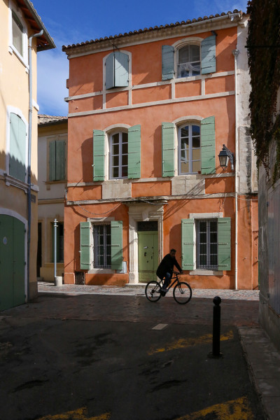
Here is a slideshow of just some of the images from my class. There were so many that it became difficult to narrow it down as much as I did. These represent all the different principles and I expect you’ll be as impressed as I was when I first saw them as submissions.
Btw, In my classes there was no Photoshop allowed and any cropping has to be done in the camera. All photos were created just as you see them without any additional help. It’s about becoming good photographers, not good computer artists.
Visit my website at: www.joebaraban.comand follow me on Instagram: www.instagram.com/barabanjoe. check out my workshop schedule at the top of this blog. Come shoot with me sometime. I don’t keep them up long because they fill rather fast with only ten photographers.
A past student of mine sent me this still life to ask me what I thought. As usual, I like to include the actual question from the photographer that sent it to me. I do this so others that may be thinking the same thing, or have has similar thoughts can read what was actually said.
“Hi Joe,
Here my thoughts were concerned primarily with accurate color, although I experimented with different focus options, sometimes focusing on the fruit and its surface dimpling, other times focusing on the rim of the metal bowl with softer fruit. I settled for color being the draw rather than “tack-sharp” on either the fruit or the bowl. Do you think I achieved my goal and is the shot pleasing?”
First let’s talk about your concern with “accurate color”. My first question would be why do you care about the color being accurate? What’s the ultimate use for this image? Who’s the target audience? Is it going into a reference book? I say this because I can only assume that just about everyone on this planet knows what color lemons and oranges are, and they probably wouldn’t care if the lemon wasn’t yellow enough; especially since the color can vary depending on when it was picked, when did it arrive in the grocery store, and how long it was there before you brought it home to photograph it. That’s not even going into the issue of all the different desktop and laptop monitors it’s going to appear on that are calibrated differently.
As for the bowl, if it’s not a standard bowl produced in mass, who’s going to know what color it actually is? Truth be told, I’m not sure anyone will care. What about all the different color profiles there are out there? That’s yet another issue. My point Stephen is that if it really doesn’t matter how accurate the color is. You’re sacrificing the most important part of this still life, namely the lighting.
For me, light is everything, and it certainly trumps whether the fruit is the right color. In my “Stretching Your Frame of Mind” workshops I spend a lot of time talking about the light. In your still life, you have basically have two dimensions, height and width; you’ve taken out depth, and any chance to create a mood. Form is a basic element of visual design, and it refers to the three dimensional qualities of an object. In order to add the third dimension…depth, you need to side light your subject.
I have a whole lot of respect for studio shooters since I’ve taken my share of tabletop photos. Now I don’t know how long you spent on this photo, but to be completely honest, and I could be way off base here, I can’t imagine you spent a lot of time…compared to how long it takes to create an image that makes the viewer want to eat a piece of the fruit in the bowl. You could easily spend an entire day on one shot. Trust me, I have!!!!
Study the masters, from Renaissance painters to modern day studio photographers. Study the way they light their subjects. Vermeer is an excellent painter to study. F
Circles, squares, rectangles and triangles are the basic shapes, and Shape is one of the elements of Visual Design. When you create photos using these shapes, they will definitely take your pictures what I refer to as “up a notch”. In my “Stretching Your Frame of Mind” workshops around our planet. One of the areas I also cover is on the Psychology of Gestalt, and one of them is called Closure, and it’s about letting the viewer fill in the missing pieces you’ve laid out in the form of a puzzle.
Where am I going with this? Think about combining what’s learned in my workshops far as the triangle is concerned with what you learn in my Gestalt class as far as Closure is concerned and you have the gist of what goes through my thought process when I’m making my pictures.
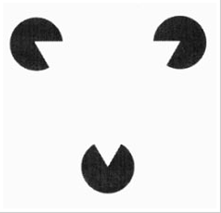
What I mean is this: I show my fellow photographers a series of diagrams I’ve collected over the past thirty years, that I’m always thinking about when I’m out shooting. One of them I call my PacMan diagram, and it’s to show how we can fill in the missing pieces whether it be in a diagram or a photograph.
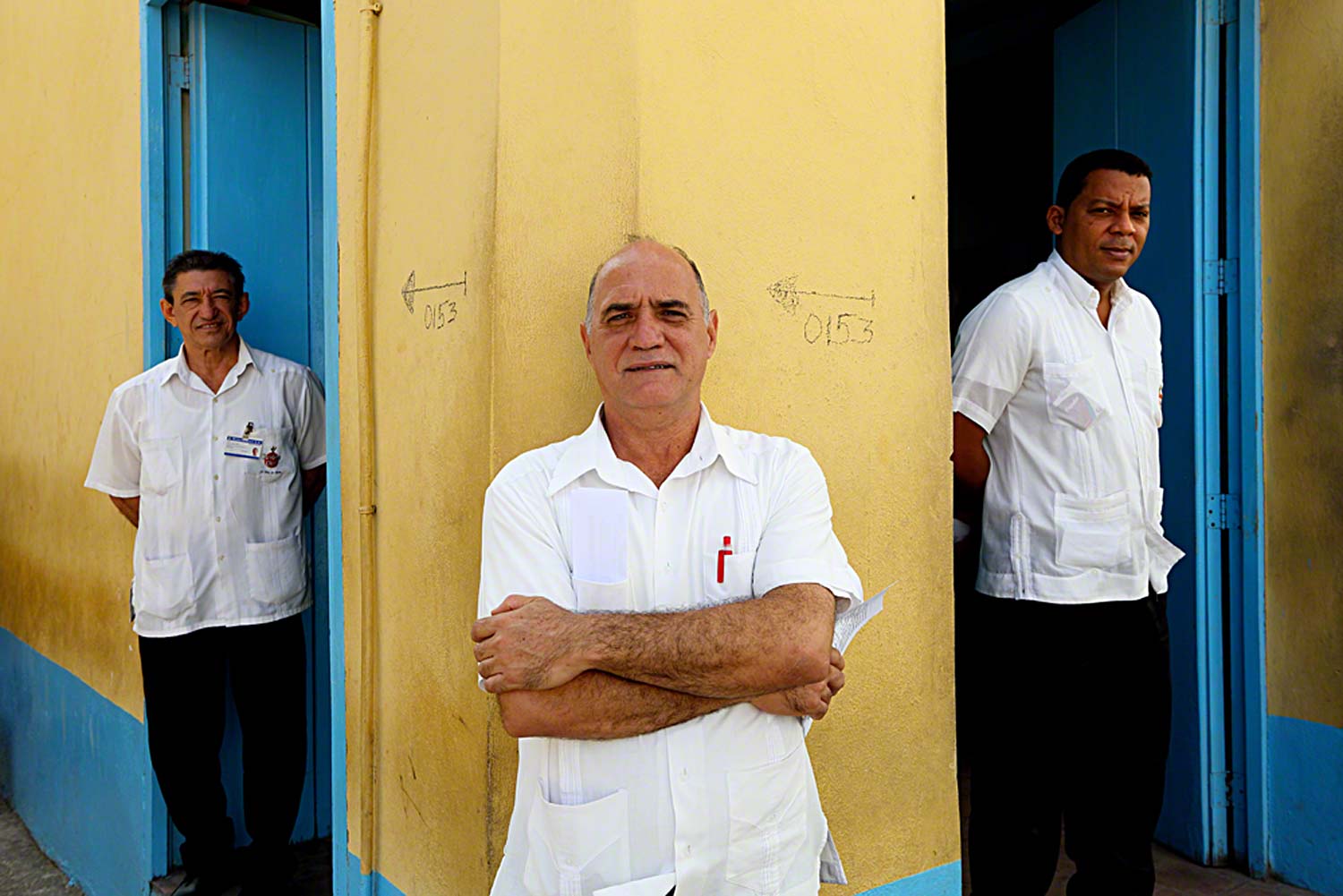
Do you see a triangle?
After looking at the PacMan diagram and the above photo, you can start to see how I use certain methods to keep the viewer as active participant when he looks at my photos. In the photo of the three men taken in Cuba, the initial processing of the pieces (of the final puzzle) will be of three waiters. From that he’ll fill in the missing and implied lines that connects the three men and will perceive a triangle…creating a sense of unity and will be viewed as one.
For most of my career as an advertising and corporate photographer, Adobe had not been born. The name was synonymous with a type of house predominately in the southwest part of the US. Everything that you could think up in your imagination had to be translated to one piece of 35mm film. Everything you wanted to say, and the final exposure was in the camera before you clicked the shutter; you even did the focusing yourself.
Now, in the digital age that’s no longer necessary, and to many no longer important. Time marches on, but it’s a pity because it has taken away the chance for new photographers as well as those that have been shooting for years to simply be a good photographer, and not a better computer artist.
In my “Stretching Your Frame of Mind” workshops I conduct around our planet, I encourage my fellow photographers to spend more time getting it right in the camera. Stop relying on a computer to either fix their mistakes or to do what they didn’t feel like doing when working on the final composition. BTW, this also goes for cropping their photos which in my personal opinion shows a tinge of sloppiness in the approach of a photographer’s technique; certainly a lack of discipline in his or her area of expertise. But that’s another story.
Having said that, I’m no purist when it comes to making my photos look as good as they can. I use Photoshop to some degree on every photo…why not? It’s no different as when I use to spend hours in the darkroom tweaking one of my images. However, I want to capture as much as possible before I click the shutter. For me, it’s a good feeling knowing that I can take a good picture…all by myself.
BTW, in my forty-eight years shooting professionally, I’ve never cropped on of my photos.
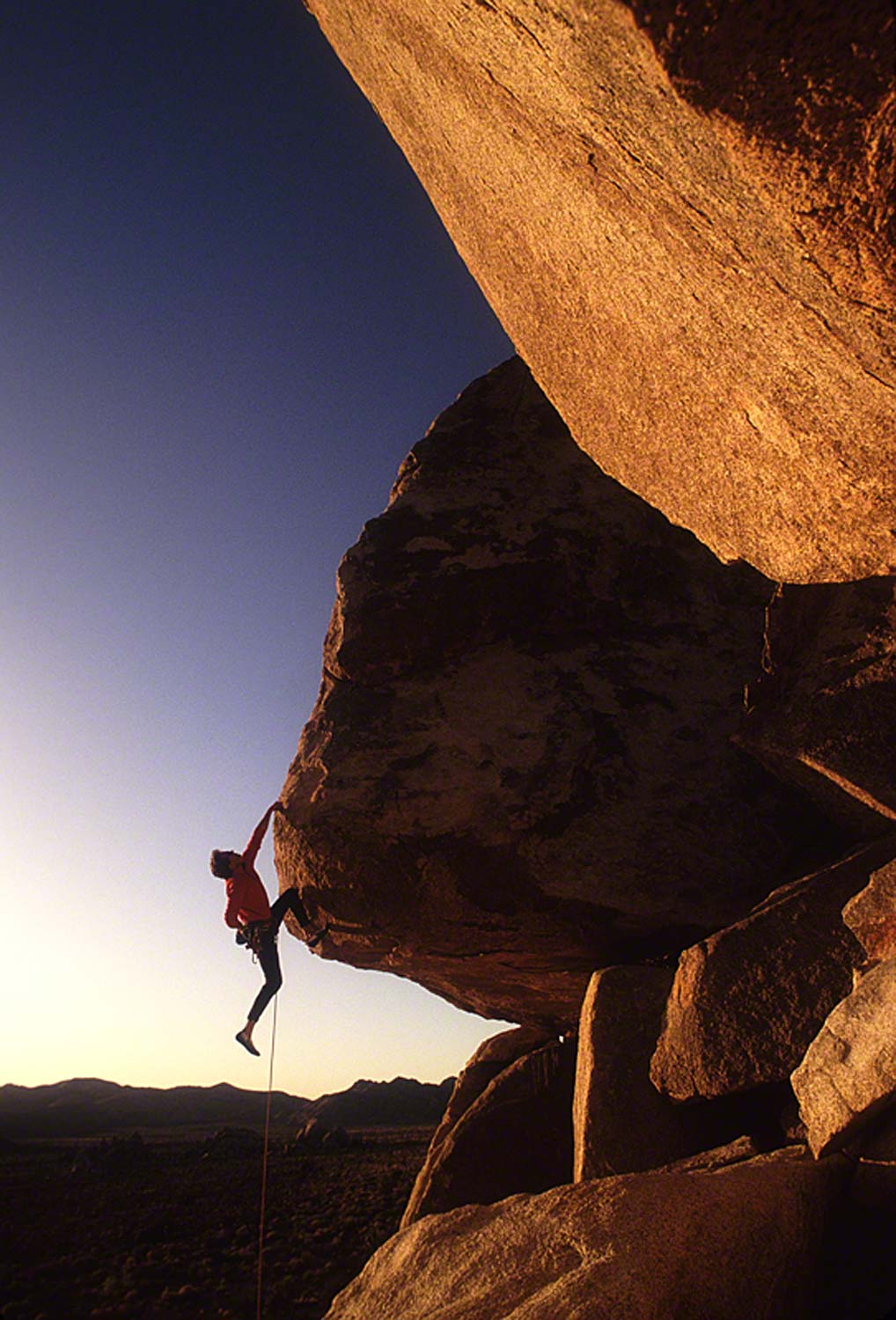
Now days the photo shown above taken for REI could have easily been created in the studio and using a computer; that’s no fun!!!
And that’s the way it was.
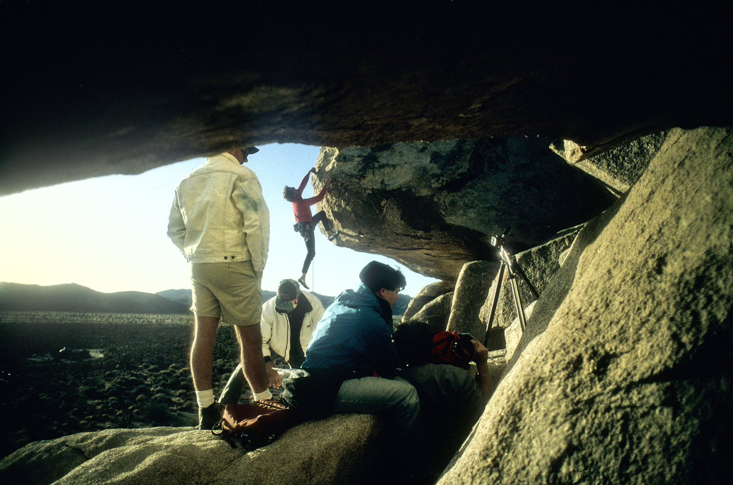
The process started from scouting the best location using my Sunpath readings in conjunction with my Morin 2000 Hand Bearing Compass. Then after determining where to set up shop we climbed up the side of the mountain with all the gear and the team to help get me there. The final part was getting the climber in the right position ready to go at exactly the right time of day; not only cool, but just way tooooooo much fun…and needless to say challenging.
FYI, watching this guy free climb was frightening, but memorizing at the same time. And as this category is called, there was no Photoshop done to this image. What you see is exactly what I saw…no tricks, no mirrors, no nothing!!!
I will admit that it did cross my mind the potential Pulitzer Prize for spot news I might have received capturing the fall from the moment he lost contact with the mountain to the time he and the earth became one.
So many elements from the ‘Artist Palette’ in this photo.
I love to showcase the photos from my online class with the BPSOP, and my “Stretching Your Frame of Mind” workshops I conduct around the world. Unfortunately, the founder, Bryan Peterson passed away from cancer so the school has closed. However, I will continue to showcase my classes over the years.
My online class was four weeks in length, and my workshops range from one week to twelve days. In both cases I show my fellow photographers how to incorporate the Elements of Visual Design into their imagery. Since my background is in Art rather than photography, I studied these elements for the majority of my academia, and afterwards I made them a part of my photographer career as a advertising and corporate photographer. To me I still considered myself an artist, I merely changed the medium from a paintbrush to a camera; everything still applies.
In each of these photos shown in this slideshow, the basic elements of both design and composition are present in some form or another: Negative Space, Texture, Pattern, Shape, Form, Line, Light and Color. You’ll also see a Vanishing Point, Silhouettes, and Shadows which are also important in taking your imagery what I refer to as “up a notch”.