Check out my new workshop on the six concepts in the Psychology of Gestalt: Gestalt Workshop link
Dan submitted this photo for me to comment on. Here’s what he had to say:
“Hi Joe,
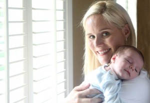
 This is a photo of my wife and my 1 month old son. I wanted to show a mother’s love for her new born son. Please tell me what you think of it because for me it’s too personal, I think. I showed it to a friend photographer and he wasn’t that impressed. It wasn’t the reaction I expected.
For me, it looks perfect. All I modified in PS was a little white corner to the down left side, some cloning and healing on my wife’s face, and a curves layer to add a little contrast although it wasn’t absolutely necessary.
Please tell me how I can take photographs of my family in a more professional manner, without being so involved, if this is even possible. I was told that my portraits of my wife are too personal. How else could they be?
Thanks for your work, I am learning lots of interesting stuff.”
Dan,
I don’t feel that your photo is too personal even though it’s your own family. There’s nothing wrong in creating a feel of intimacy between a mother and her newborn baby. To me that’s the whole point in this approach.
The problem I have with this image is not necessarily the subject matter or the composition, although it looks too posed and you lost the feeling of spontaneity. It looks like she was holding the pose for you instead of you catching a moment in time. To me, that’s critical in getting your message across. It’s a fine line between looking like a real moment and being contrived/hookey. My main problem is the light and the environment around her. If you’re trying to get across a tender moment, the light needs to tender as well.
You need to remember that Light is everything!!! I constantly say this to my online students with the BPSOP, and in my “Stretching Your Frame of Mind” workshops. Your lighting is too harsh, too much contrast, and void of any direction and shadows that adds the third dimension, depth, to any Form (one of the elements of visual design). Right now, you have only two dimensions: height and width. I don’t mean to suggest that you always need the light to have a direction, because you don’t…just most of the time for me.
The background is somewhat distracting and appears as though you hung something behind her for an effect. The background is sooooo important and needs to be considered equally as much. The color just doesn’t do it for me. It’s a touch on the garish side.
One last thought Dan. I teach how to incorporate the elements of visual design to create stronger images. The most important of them all is Line. Without Line, nothing would exist since everything has an outLine. By having the mother looking into the camera creates an implied Line between the subject’s eyes and the camera, and it can be very powerful. I would definitely try one that way.
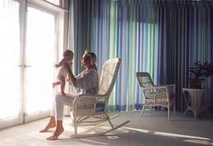
Take a look at a couple of my photos of a mother and baby:
Thanks for your submission!
Visit my website at: www.joebaraban.com, and follow me on Instagram: www.instagram.com/barabanjoe and. Check out my workshop at the top of this blog. Come shoot with me sometime.
JoeB


