Since I think that a lot of you out there share similar feelings, levels of expertise and situations as the photographers that write into me think it’s important to share the comments i receive with all of you. Here’s one from Mark, a recent student of mine in my online class with the PPSOP. Here’s what he had to say:
“Hi Joe,
Having recently traveled for business, I was anxious to Stretch My Frame of Mind when time permitted. With my newly expanded Artist Palette ready to be deployed, Las Vegas was surely a land of opportunity!
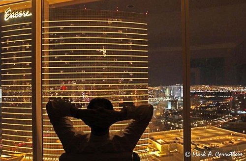
After taking your class, I must admit, the world looks a lot different these days. Shapes, texture, patterns & colors seem to be everywhere. For example, the silhouette image was taken at 1:00AM after returning from a banquet. Entering my room with the lights off was a gift. Everything about the view was screaming, “take my picture” (lines, reflections, framing, etc). Adding myself in the image seemed to add perspective and negative space.
Here are 3 of my favorite images from the trip. Feel free to re-post, comment or delete if you don’t like them! 🙂
Cheers,
Mark Carruthers”
Hi Mark, good to hear from you again. I always like to stay in contact with former students. Since I like your submissions, I won’t delete them. :-)))))
I can tell by looking at these images that you are using my “Artist Palette” I not only teach with the PPSOP, but also with my “Stretching Your Frame of Mind” workshops I conduct around the planet. I like the Vegas photo (#1) for a couple of reasons: One is the silhouette you included. You do remember the week we spent on the silhouette in my Part II class. It adds not only a “layer of interest” creating Perspective, but it now has a level of Visual Tension crated by the contrast between the dark silhouette and the bright lights outside. I also see that you intentionally created some Negative Space inside his arms…clearly defining them. Nice job!!!

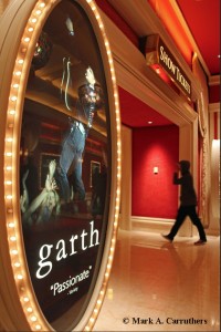
In the photo of the sign (#2), You’ve done well grasshopper!! By getting “up close and personal” with the sign, you’ve also created a “layer of interest” which creates Perspective. You’ve taken control of what the viewer will perceive and process by leading him around your frame. By adding the silhouette, you’ve not only generated Visual Tension, but you’ve given the viewer lots of things to discover in your photo…just what we want him to do because the more elements he’ll discover, the longer he’ll stick around looking…a very good thing!!!

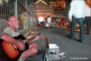
What I like about the man playing the guitar (#3) is that you’ve placed the man “up close and personal” while creating a Vanishing Point (the fence) that will lead the viewer the walkway. This also represents one of the six principles of Gestalt I write about and teach in my classes. This one is called Continuance. If you want to read more about them you can read my recent article with Adorama. You can find it here at:
http://www.adorama.com/alc/0013706/article/6-Principles-of-Gestalt-Psychology-That-Can-Improve-Your-Photography
Thanks for the submissions. The next step is to come shoot with me sometime!!!
JoeB
Visit my website at: www.joeBaraban.com, and check out my 2012 workshop schedule at the top of this blog. come shoot with me sometime.
Don’t forget to send me a question and photo to: AskjoeB@gmail.com
Mark Carruthers
13 Aug 2012Hi Joe… Thank you for the kind words. Both Stretching Your Frame of Mind 1 & 2 were very enjoyable. Learned a ton! Hope to shoot with you in person one day!!
Cheers,
Mark
Joe
13 Aug 2012Hopefully next year!!!
JoeB
Pingback: More Photography Links That Are Made of Win
Pingback: - Gregory Allen Deese
Joe
20 Aug 2012Thanks for the comment.
JoeB
Mark Carruthers
22 Aug 2012Hi Joe…
Nice article in Adorama! Well written with plenty of content and examples.
Mark
Joe
22 Aug 2012Thanks Mark.
JoeB