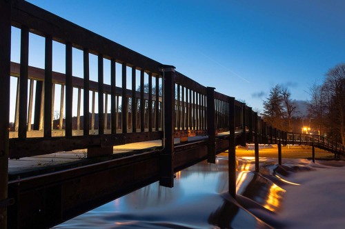
I recently had a fellow photographer submit this photo into my online class. I always like to include their question so those out there that share the same thoughts, or like to take similar photos can read what they had to say. Here’s what Jean had to say:
“Hello Joe,
I was in your class last month in your BPSOP and I read your blog coming from and I want to show you one of my ‘motion-freezing’ picture. I’d be glad to hear your critique.
Thanks a lot,
Jean”
First of all I want to comment on the fact that Jean was in my part I class that I teach with the BPSOP. What I teach there is the same material covered in my “Stretching Your Frame of Mind” workshops I conduct around the planet. That said, I hope some of what I have to say has rubbed off on her. From the looks of this photo I must be a good teacher because it’s a very strong image; it’s filled with the elements of design and composition that I show people how to use in order to take their imagery what I refer to as “up a notch”.
Ok Jean, let’s talk about it.
It’s a really nice photo that takes the viewer on a ride through the frame via the bridge and the water. Visual direction is sooooo important when keeping the viewer an active participant. The more ways we can get the viewer to leave and enter our frame the more energy he or she will use…and that’s a good thing!!! It’s what I teach in my new Gestalt class.
As far as freezing the motion, I think you might really be meaning something else…why? Because you haven’t frozen the motion. By using a long exposure, you’ve made the water look almost placid, with no ripples that would catch the light accentuating them and say movement. If you had shot at a shorter exposure, it might have looked like you had frozen the water and their would have been a different kind of texture than the smooth type you created here. It’s something I would have tried both ways.
That’s not necessarily a bad thing, in fact it usually creates an almost ethereal feeling. However in this example, I think the reflections of the sky in the water being so smooth may not be a “quick read”. At the bottom of the small waterfall, it looks a little like a low covering fog bank. The part of the reflected water appears as it it’s disappearing under the fog. It appears as though the water is cascading over some kind of rock structure that’s rendering the reflections somewhat weird and perhaps a little hard to understand. That’s not a bad thing either!!! It’s also hard to tell where the water ends and the deck (I think) begins.
I think it’s still a beautiful photo, beautifully lit, perfectly exposed, and well composed. There’s lots of things for the viewer to discover and enjoy, and it’s one you should be proud of.
Btw, remember that showing a subject and its reflection is one of the ways to create Visual Tension, and that’s one of the reason your photo attracts the viewer in the way he perceives then processes the information.
Thanks for sharing it on my blog.
Visit my workshop at: www.joebaraban.com and follow me on Instagram: www.instagrm.com/barabanjoe. Also check out my workshop schedule at the top of this blog. Come shoot with me sometime.
JoeB
