≡ Menu

AskJoeB: Croatia, Looking Over the Makarka Riviera.

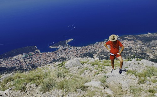
Jane sends me this photo and writes, “my name is Jane, i am an beginner with DSLR. I send you my favourite photo of my husband. I take it in Croatia over Makarka riviera. Is this exposure good? Is the feel from this photo “hey, i am a lonely cowboy”?

First of all I applaud her English, as I know how hard it is for people to express themselves in a language other than their own.

Ok Jane,  let’s talk about your photo:

As far as the exposure is concerned, be sure to read my latest post on the difference between Incident and Reflected light that just came out.  In your photograph, you can see that the foreground is overexposed while the beautiful water is  saturated and has lots of depth. If I had been standing there with you, I would have taken a reflected reading (with my hand held meter) of the water then the foreground and shown you how far apart they were in exposure.

There was no way you could have had both the foreground and the water exposed the same, without the help of Photoshop. If you had the foreground darker, then you would have lost the blue. The meters in digital cameras are not accurate and have no idea what you’re looking for. Depending on what you have the meter set on, it will give you different readings.

Now, let’s talk about the feeling you were trying to express:

To me, it misses the mark. You’re reading this from a guy that lives in Texas and is surrounded by Cowboys’!!! Unless Cowboys wear Tennis or Hiking/climbing shoes and matching shirts and shorts where you live, you would need to have him wearing Cowboy Boots and at least blue jeans. It also really doesn’t suggest loneliness, but rather someone that is resting for a moment.

In my online class I teach with the PPSOP, and the “Stretching Your Frame of Mind” workshops I conduct, one of the many things we talk about is making sure your message is one that everyone will get right away. I also encourage people to research a subject before they shoot and to incorporate a little pre-production by locating the proper wardrobe that will fit their idea.

I realize that customs, ideas, are different in every country, but I also know that wherever you are in this world, a cowboy is always going to look the same. I recently taught a workshop in Singapore of all places, and every Friday evening in Chinatown about a hundred Singaporians gather to dance the Texas Two-Step and the Cotton-Eyed Joe, and they all are wearing the correct western wardrobe. It’s a sight to see!!!

One thing that the viewer might also question is why this man wouldn’t have been sitting there enjoying the view. I think I might have tried one like that as well as the photo you took.

Just food for digital thought.

By the way, what a fantastic view!!!

Thanks for sending it. I hope one day I’ll be standing there.

Visit my website at: www.joebaraban.com, and be sure to check my 2012 workshop schedule at the top of this blog. Come shoot with me sometime.

JoeB


{ 10 comments… add one }
  • Thilo March 11, 2012, 5:33 am

    A great view, indeed! He will certainly not pass through as a cowboy, but his red outfit nicely complements the blue of the sea!
     
    I think I would have let him sit down on the little rock on which he is currently standing, looking over the sea. Maybe have him look to the left such that you get his profile and make him recognizable.
     
    About the difference in exposure between land and sea: I would try putting an ND grad filter along the coast line, for bringing down the foreground…

    • Joe March 11, 2012, 1:21 pm

      Thilo,

      I also like the red, blue and green colors together. As you know, the primary colors (pigment) are red, blue, and yellow. However, the primary lights are red, blue, and green and when you put them together they form white light. Check out this link: http://www.forhair.com/Articles/Primary_and_Secondary_Colors_of_Light.htm

      I agree about having him possibly look to his left (camera right). Not only would you see a little of his profile, but by having him looking out of the frame, you would create ‘visual tension’ by having the viewer wonder where he’s looking and at the same time you would be implying content outside of the frame.

      A ND filter would bring down the foreground, but here’s the problem with that: Since the dividing line between the foreground and background is not straight, and the man is partially in both, the filter wouldn’t darken everything equally. The bottom part of the man would be dark and the top half would be light. Same with the foreground and background. I’m afraid it would look too ‘funky’!!!

      I wonder if they make those filters so that the dividing line can be manipulated somehow for these kinds of situations? What a great idea!!! Although that’s why there’s Photoshop CS5.

      Thanks for the input.

      JoeB

  • Jane March 12, 2012, 3:23 am

    Dear Joe,

    thank you for your appraisal of my photo. So view is fantastic :), but my cowboy is not perfect :). Next time i will make it better. So ND filter cannot be helpful? I used Polarize filter. With ND+ polarize will be that picture better, or not? So in PS CS5 i would make the foreground better, right?

    Thilo, thank you for your comment :). I am plaesure.

    ps. i try learn english every day, and i try explayn my ideas 🙂

    Have a nice day

    Jane

  • Owais Ashraf Photography March 12, 2012, 7:43 am

    hello sir, hope u doin good.i just found out your website and it just made my day. I loved your phtography. I too am a passionate photographer and have this small photo-blog of mine @ http://letters365.blogspot.com/I would love u to make a visit.don’t look to miy giving u this link as an advertisement thing, its just a passionate photographer trying to make friends with a highly skilled one…!!

    • Joe March 12, 2012, 9:08 am

      You’re very welcome.

      The easiest thing for you to do would be to darken the foreground while adding a little contrast and saturation. You really don’t need a filter for this one.

      JoeB

      • Joe March 12, 2012, 9:20 am

        I went to your site and found some very nice work!!!!!

        JoeB

  • dawn March 12, 2012, 6:07 pm

    Jane

    Thank you for sharing this beautiful view and photo with us.  I agree that this looks like someone resting after a long hike up the hill.  I especially like the bright red and bright blue.  You might want to try to use the “burn” brush in photoshop to get the foreground a little more saturated.  It is a lovely photo and I can see why it would be a favorite photo of your husband.  I hope you submit more work to Joe.  If you can, consider joining his class you will learn a lot.  It’s likely that you won’t be the only one in class for whom English is not their primary language.  Everyone in class is very supportive of each other.   

    Dawn
     

    • Jane March 17, 2012, 10:12 am

      Thank you Dawn 🙂
       
      i am happy, that you like my photo. i will try use “burn” in PS. i do not write it right, but i will study and get ready in pposp for czech and slovak :). there will be people from my coutry and “brothers” from czech republic. we have similar language so it will be easily for me. But i follow Joes work and Bryan Petersons too.
       
      Have a nice day
      Jane

  • Valeriano March 13, 2012, 4:14 am

    Hey Joe,
    about the exposure and how to correct it in camera, what about using an nd grad in this circumstances?

    Probably  2 stops but used upside down to hold back the rocks exposure.

    Your thoughts?


    • Joe March 13, 2012, 8:48 am

      Valeriano,

      The problem is that you will still have to go back in with Photoshop because the line of demarcation (separating the foreground from the background) is not level/straight and the line running through the filter of the ND is. It’s going to look weird if the area right above that line is also dark.

      Joe

Leave a Comment