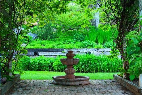
Linda sent me her photo to talk about. here’s what she had to say, as I like to share each photographer’s feelings and situation. I’ve found that many of you out there are in similar situations:
Hi,
I am retired now and am an amateur photographer, always appreciative of positive criticism. I have a Canon Rebel xs and usually use Zoom browser for any post production, I do not have photoshop/lightroom.
I was out with the local photo club, Kamloops, BC, Canada at the universities horticultural area and came across this beautiful setting, my first thought was the array of vibrant greens with the water fountain in front and wanted to create a window looking into this scene. Although pleased with the colors, I still see blur……even with a tripod.
Linda, first let’s address the issue you have with “blur”. What you have here isn’t an issue with blur, it’s an issue with your aperture settings. If you look at the area that’s in the foreground from the fountain to the camera, it’s all in focus. From the fountain to the implied horizon it’s not as sharp…not blurry, but just not in focus which is a big difference. Your aperture was not closed down enough to get everything in focus. Being on a tripod won’t matter if you don’t have enough depth of field.
If you want everything to be sharp from the foreground to the background, you have to make sure your aperture is stopped down to it’s smallest setting on your lens. If you’re shooting with a wide angle lens, you don’t have to stop down as much as you would with a longer lens. For example, with a lens that has a focal length of 28mm down to let’s say 16mm, F/5.6 will
The next time you’re in a situation like this and you’re on a tripod (which you should be to have complete control), shoot the same picture but with different aperture settings and compare them to each other. You’ll be able to see the difference and make future decisions based on you’re findings.
I would highly recommend setting your focus to manual and then focus about a third of the way in at F/22. That way you have control instead of your camera’s auto-focus function that would focus on the fountain.
Ok, let’s talk about the photo itself:
The first thing I want you to notice is that I straightened your horizon. The strong line above the fountain was going downhill. Line is probably the most important element of visual design, and it’s part of what I teach in my online class with the BPSOP, and in my “Stretching Your Frame of Mind” workshops I conduct around the planet. Without Line, none of the other elements would exist as they all require Lines. You and I wouldn’t exist as we both have an implied outLINE.
Having said that, the most important Line is the horizon line and when I see a photo that has a horizon line that’s not straight, it’s a sign that a novice took it. I can tell by your photo that you haven’t been a novice for a long time…why do I say this? Because you instinctively framed the background with the two posts with the plants growing on them. In my classes we talk a lot about the ways to create Visual Tension, and one of the ways is to frame a subject within a frame. Combining opposites also creates Visual Tension. The hardness of the concrete and the softness of the green area are the contrasting elements.
Color is another element of visual design, and you’ve used color here to communicate an idea….namely the plant life found in this botanical garden. Texture is yet another element found on my “Artist Palette”, and you have lots of it working for you here.
Linda, it’s a much stronger image than you probably thought!!! Thanks for sharing it.
Visit my website at: www.joebaraban and follow me on Instagram: www.instagram.com/barabanjoe. Be sure to check out my workshop schedule at the top of this blog. I still have a spot ope on my next trip to Cuba, see above.
Come shoot with me sometime.
JoeB
