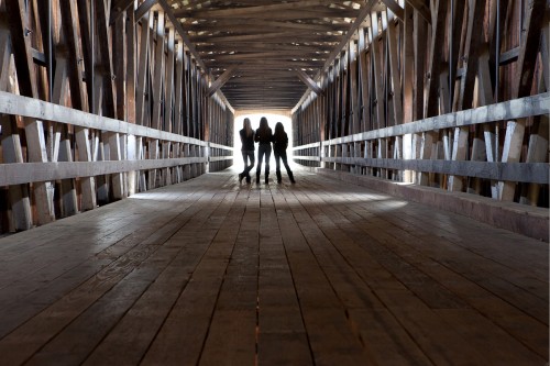
Dawn, a photographer from the West coast, submitted this photo of three girls standing on what appears to be a bridge of some kind.
Ok Dawn, here’s my take on this photo:
You obviously know what you’re doing, you have a keen sense of design, and you have a very good knowledge of the Elements of Visual design…why, you ask? Because there are several present in this photograph:
These Elements are what I teach online with the BPSOP, and also in my “Stretching Your Frame of Mind” workshops I conduct around the planet.
NEGATIVE SPACE: since everything that’s not positive space is negative space, the negative space I’m referring to is that space that Defines the positive space and gives it meaning. What that means is that the negative space in and around the three girls defines them. It’s that negative space that makes the three girls…three girls. Each one of their shapes is well defined by the use of the negative space, and it’s what I call a “Quick read”.
TENSION: by minimizing the negative space between the outside girls and the bridge, you’ve created Tension, as well as the stark contrast between the girls and the background. Framing the subject within a frame is another way to generate Tension.
VANISHING POINT: By having the parallel liners begin behind the camera and converge at an implied line on the horizon.
PATTERN: Both the floor and the sides of the bridge are Patterns.
TEXTURE: The Texture inside the Patterns.
LIGHT: I love the blown out light behind the girls!!! Also the band of light in front of them.
When you can combine this many Elements, you stand an excellent chance of your photo not only being “up a notch”, but one that will be remembered.
A very strong image Dawn, and I’ll certainly remember it. Thanks for sharing it.
Visit my website at:www.joebaraban.com and follow me on Instagram: www.instagram.com/barabanjoe. Check out my workshop schedule. Come shoot with me sometime and learn about the Elements of Visual Design.
JoeB