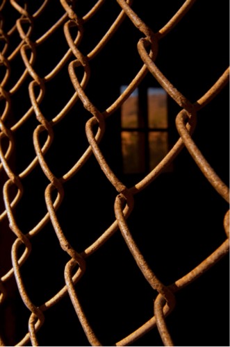
Here’s a photo submitted by a photographer from Italy who would like a critique.
The first thing that strikes me is the light. As I say to all my students, LIGHT IS EVERYTHING!! In this photo, it adds drama and a feeling of mystery.
The black Negative Space defines the rusted metal, and in my classes I always talk about one of my “Personal Pearls of Wisdom”, which is “seeing past first impressions”. What that means is what besides rusted metal is it. They’re Lines!!! They’re Lines that lead the viewer in and out of the frame, and when you get the viewer to take an active role in your imagery, he;ll stick around longer.
Line is probably the most important of the Elements of Visual Design. In my “Stretching Your Frame of Mind” workshops I conduct around the planet, we spend a great deal of time studying Line. Without Line, there wouldn’t be Patterns, Texture, a Vanishing Point and in fact, there wouldn’t be people or bridges or buildings, etc…why, because all things I mentioned have an outLINE!!! Lines can be implied.
Talking about Texture, this photo is also all about this common Element of visual design.
There are three basic types of Texture: Drama, Detail, and Information. This photo represents the Information type. Information Texture utilizes texture to communicate information about a photographic subject. In this photo the texture communicates information about the fence, and enhances the impact of the photo; by showing the age of the fence.
I really like the window in the background, it breaks the rhythm of the pattern created by the fence (a very good thing). Framing it within the diamond shape of the fence adds Tension and it also adds a lot to the image giving the viewer something else to discover. The more things he’ll discover, the longer he’ll stick around.
I would have liked to see some more black Negative Space between the last links on the left and the edge of the frame. Giving the viewer some black Negative Space to rest his eyes before it leaves the frame would help.
Thanks for sharing it!!! This photo is all about “Stretching Your Frame of Mind”!!!!
Visit my website at:www.joebaraban.com and follow me on Instagram: www.instagram.com/barabanjoe. Check out my workshop schedule. Come shoot with me sometime and we’ll work on all the Elements!!!
BTW, I don’t leave the workshops on for very long because they fill so fast. Please be diligent and keep looking.
JoeB
Toad Hollow Photography
31 Jan 2012You produce one of my favorite blogs, Joe, I always learn SO much from your posts. Thanks once again for sharing with the community at large, I can honestly say I’ve come away with a deeper understanding of composition. Great post, my friend!
Joe
31 Jan 2012Thank you, thank you very much!!!
Pingback: 73 Links and Photos That Will Make Your Photography Better « Oxford School of Photography