In my online class with the BPSOP, We work on a number of assignments over the course of four weeks. In week three, after my students have had a chance to accumulate most of the elements of visual design and composition and begin incorporating them into their imagery we work on color and light.
I gave each participant a color for each of them to go out and find; making the color the subject. The reasoning behind this particular assignment is to get them to “see past first impressions”. I want them to begin “focusing their eye”, and start discovering things as a result.
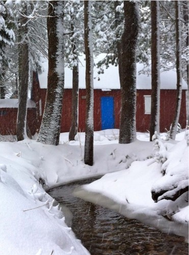
Rob, one of my students in my January class was assigned the color blue. Since it was winter, he didn’t have much hope. This is what he said:
“I was assigned the color blue, and during a walk, I came across this house. I walked around until I found some trees to frame the doorway, and laid on the snow to get the stream. I then decided on a vertical shot with vertical trees for added tension and also to tightly crop the house. I spent a lot of time trying to get the white window completely visible, but it would not fit between the trees. If I moved closer it would have cut off the stream. I was definitely a bit bummed about that.”
What an incredible find and because of Rob’s perseverance, it paid off. He swears it was real, and I have no reason not to believe him!!!
Here’s what Rob was trying to do: He wanted to show all the window by providing some Negative Space (the lesson in week one is to use Negative Space to define the Positive Space) between the right edge of the window and the left edge of the tree. He didn’t want to move closer because we had been discussing ways to lead the viewer around the frame and the concept of ‘continuance’ in the Psychology of Gestalt.
He wanted a vertical photo because I pointed out in an earlier discussion that Vertical formats have more energy than horizontal ones…why, you might ask?
In a vertical format, the viewer will start out as he usually does from the bottom to the top. It will take him longer to get to the top in a vertical and that time it takes created more energy. When you put vertical objects in a vertical format it increases the energy even more.
I reminded him to only shoot in a 3:2 aspect ratio for the class…which, as you can see, in this photo he didn’t!!!!!!!! The only reason why I’m showing it is because he was ‘thinking’.
Tension=Energy. I’m talking about visual Tension, not the Tension that comes from mental or emotional strain.
Visit my website at www.joebaraban.com and check out my workshop schedule at the top of this blog. Come shoot with me sometime.
JoeB