Food For Digital Thought: Are You a Photo Sinner or Saint?
To all my brothers and sisters,
Do you raise the camera up to your eye and start shooting without first thinking it out? Do you take one shot then move on leaving a lot still on the table? Do you follow advice from all your self taught fellow photographers, even though it will lead you down the iniquitous path to mediocrity? Photographic purgatory for life everlasting!!!!
Moreover, do you buy expensive cameras in the name of artistry hoping for that creative vision, inspiration, and imagination that will evade you in perpituity? Do you really think a fast 50mm prime lens will make you a better photographer, so it’s the only lens you use? Do you crop your photos into squares, long rectangles, and enhancement bubbles or circles as they’re commonly called? Do you triple mount with colorful mats those camera club entries and give them weird esoteric titles? Do you let your camera do all your thinking for you? Do you aimlessly walk the hallowed aisles of the B&H photo store looking for expensive unnecessary crap you really don’t need? Do you let those naysayers convince you that HDR is the only way to achieve proper exposures? Do you fix it later in Photoshop?
If you answer yes to any of these, then I beseech you my fellow photographers in the name of all that’s sacred, mend your ways or become photo sinners for all eternity!!!
REPENT!! How do you ask? How do you find salvation? How do you keep the devil, also referred to as Lucifer, The Prince of Darkness, Beelzbub, Satan, the Antichrist, or the funny looking guy with horns, a weird tail, and carries a trident wherever he goes, off your left shoulder who is just itching to force you into acts of bad behavior? How do you change your ways and go from being a photo sinner to saint?
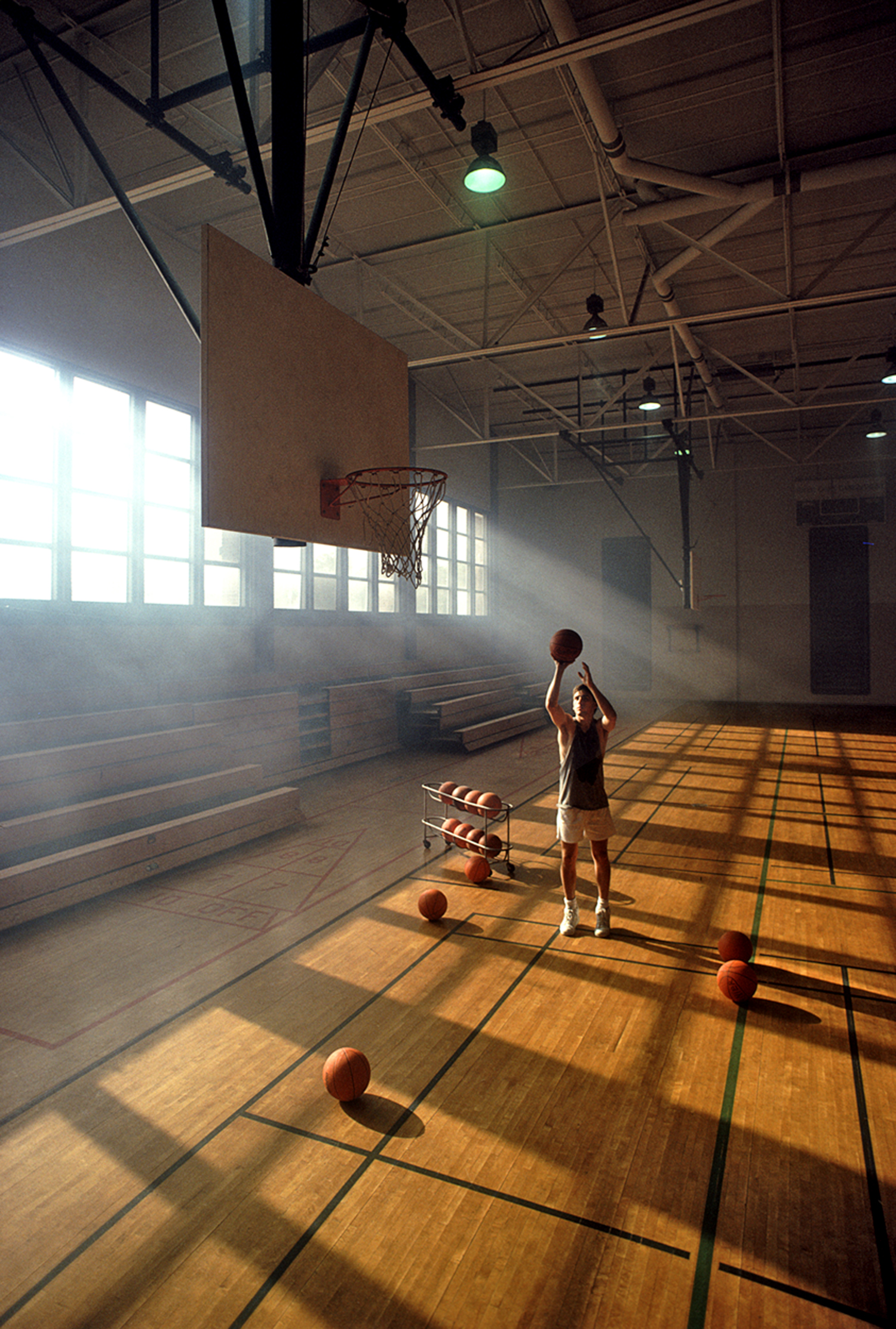
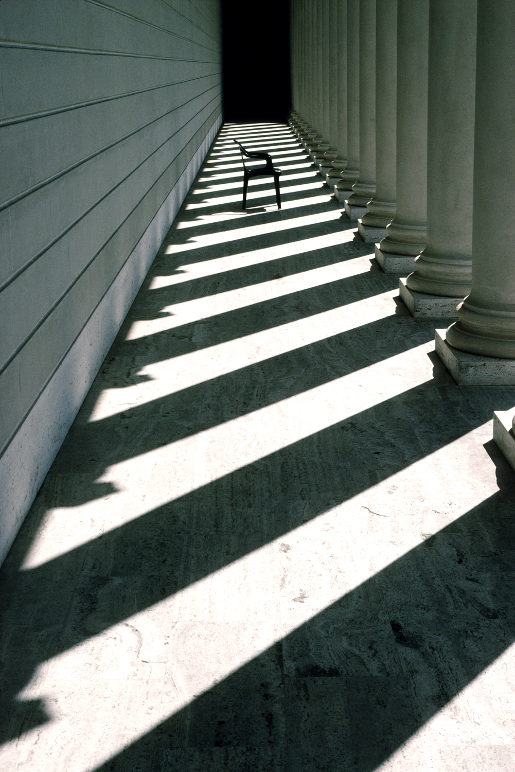
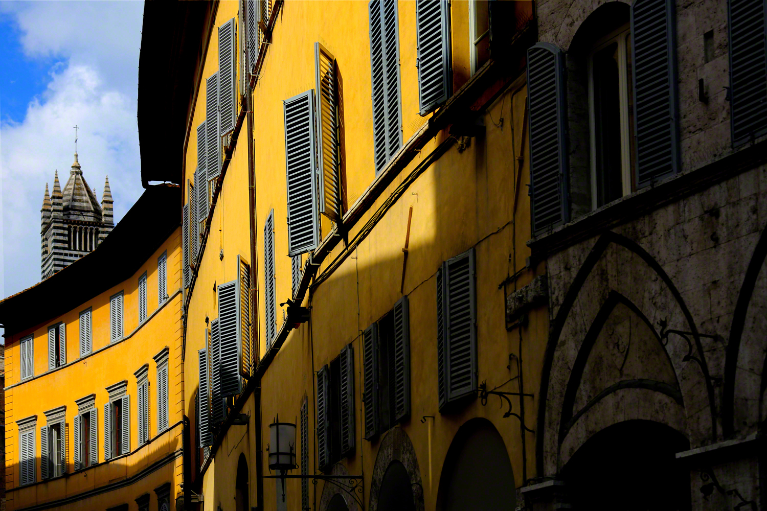
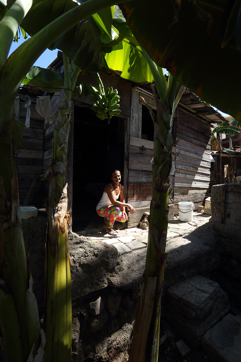
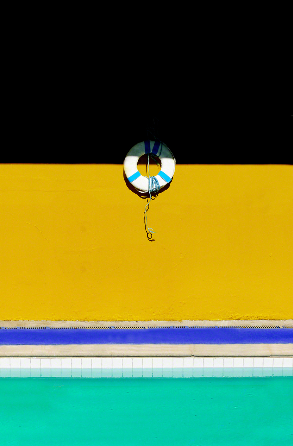
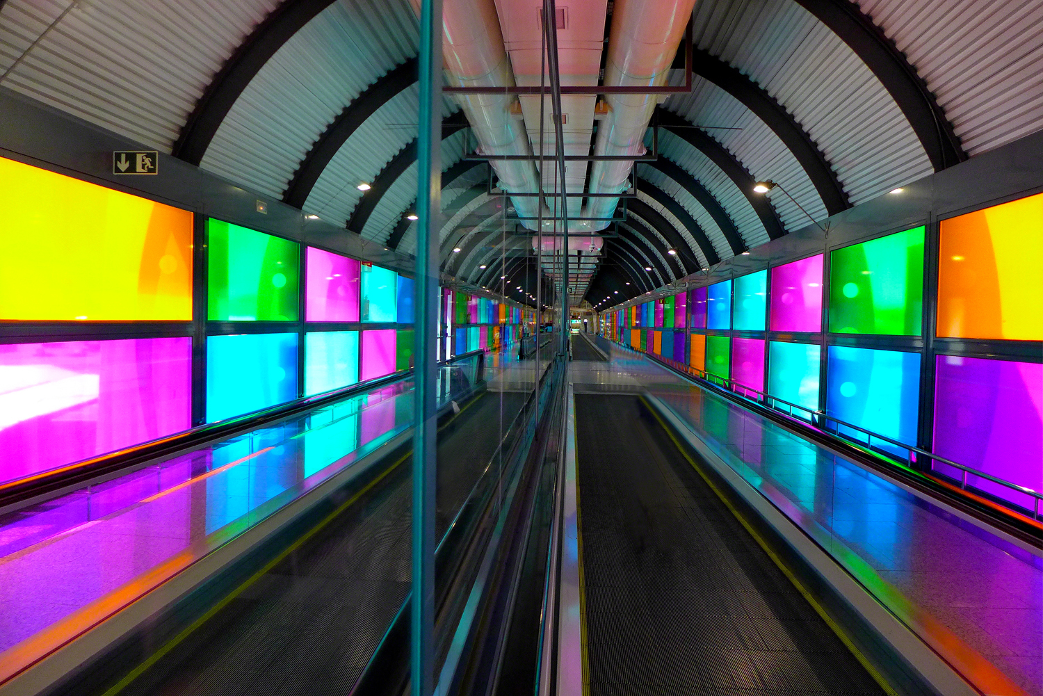
By following the righteous trail less traveled…by not taking advice from people you might know more than…by using the elements of design and composition in your imagery…by making sure you convey your thoughts to the viewer….by doing what you intended…by having a center of interest…by including visual tension and interest in your photos…by pre-visualizing…by slowing down and smelling the roses…by coloring outside the lines, and most importantly…by breaking all the rules!!!
Of course, you could always take my online classes with the BPSOP, and/or take one of my “Stretching Your Frame of Mind” workshops I conduct around our (round) planet.
🙂
Visit my new website at: www.joebaraban.com, and check out my workshop schedule at the top of this blog. Come shoot with me some time and find sanctuary.
JoeB