Dawn sent me another photo to comment on. As usual, I like to include the actual question since so many out there may have experienced a similar situation or have thought about similar question. Here’s what Dawn had to say:
“Hi Joe,
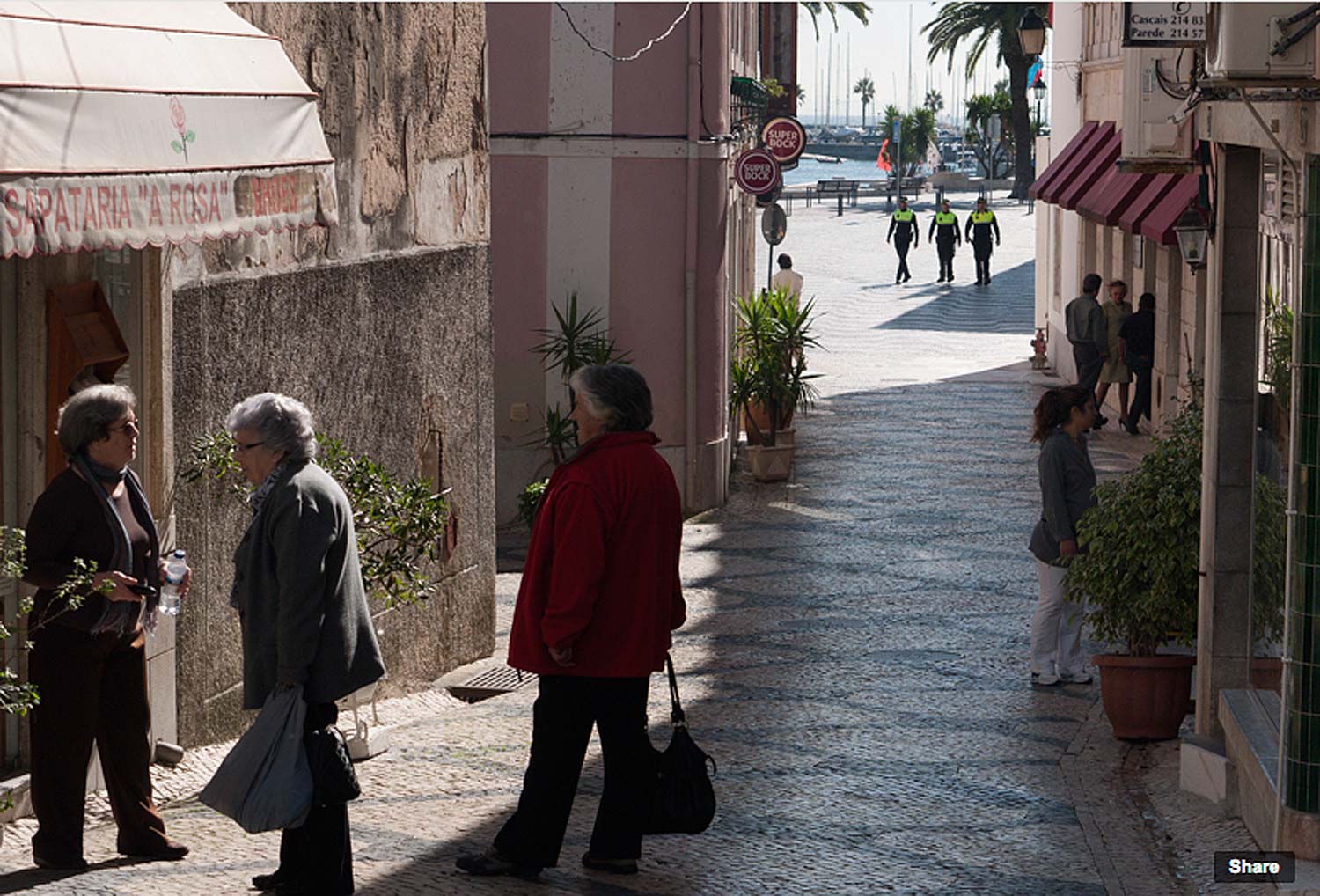
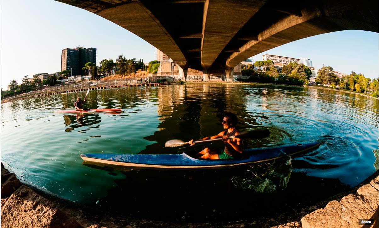
This question has to do with composition. I took the attached pic on a visit to Cascais, Portugal 2 weeks ago. It wasn’t a photo workshop or tour but I wanted pics to show what Cascais was like, and the people. In this shot, I wanted to maintain the negative space between the two groups of people, the ladies and the 3 policemen in the background. I included the policemen in the shot for depth and to draw the viewer into the photo. Overall, I thought it captures the sunny relaxed feel of the town. Thank you for your comments, if you have time to make some.
Regards,
Dawn”
Dawn, I’ve begun to answer questions and talk about photos with a video critique. It’s the way I teach in my online class with the PPSOP and also in the occasional question I’m asked from recent photographers that have taken my “Stretching Your Frame of mind” workshop somewhere around the planet.
I hope I’ve been able to help. Feel free to send me photos anytime.
Visit my website at: www.joebaraban.com and check out my first workshop in 2014. It’s my third “springtime” workshop, and this year it’s in Paris. Come shoot with me and we’ll toast to our health with a glass of French Bordeaux.
Don’t forget to send me a photo and question to: JoeB@gmail.com.
Daniel sent me three photos to look at with the intent of choosing the strongest image. As always, I like my fellow photographers to read what was written to me since so many people share the same questions or experiences. Here’s what Daniel had to say:
“Hey Joe,
Once again, just looking for a good critique. this pictures were taken at the rooftop of the hotel I work for. Lately I’ve been trying to make photographs that tell a little more than “uh, look at that”.
I’m not quite sure if this pictures tell much, I’m sure I would have to explain what the objects on the left are, and why the person is tied up, if the viewer is even able to tell. I guess my main concern is whether this pictures have any visual tension. i tried to create a bit of a pull by having his body kind of go with the buildings from big to small. Same thing with the objects on the left. Out of these three which one would you say works best?
Thanks for time,
Daniel”
Daniel, I’ve started created video critiques the same way I do in my online class with the PPSOP, so I’ve positioned all three of your photos side by side so a more comprehensive comparison can be made. Creating Visual Tension is an important part of my “Stretching Your Frame of Mind” class and workshop, and is an important element that’s found on my Artist Palette.
Thanks for the submission, and BTW, I like where you placed the man. The negative space that surrounds him clearly defines him and by minimizing that negative space between him and the buildings also generates Visual Tension.
Visit my website at: www.joebaraban.com and check out my new 2014 workshop schedule at the top of this blog. My first one so far is my “Springtime in Paris” workshop in May. Come shoot with me sometime.
Don’t forget to send me a photo and question to: AskJoeB@gmail.com.
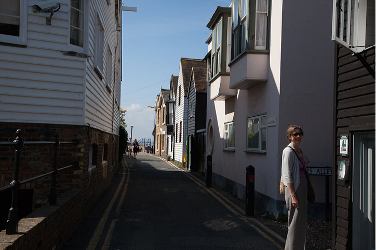
Dawn sent me this photo with a question. As is my customary way to answer all my fellow photographers, I like to include the actual question so that others that have had similar questions can read it as I first did. Here’s what Dawn had to say:
“Hi Joe,
I’m taking up your offer to send you a photograph for some comments/advice. in my last post on the Q&A forum for your SYFOM 2 class I asked you some questions about exposure. You will find attached a picture I took a few days ago at a fishing village on the coast of Kent. My friend Mary and I were walking to the seafront along this narrow road with houses characteristic of the village. I like the way the light catches her but I’m not sure I can replicate this – a bit of luck here – and it’s a lighting effect I rather like. What do you think of the light background?
Dawn, Let me answer you in a video that I know use for all my AskJoeB questions and photos. It’s how I work with my students in all three of my classes I teach with the PPSOP. I’ve found it to be incredibly helpful and the best way to answer all your questions, while pointing out other areas I think you should see as well.
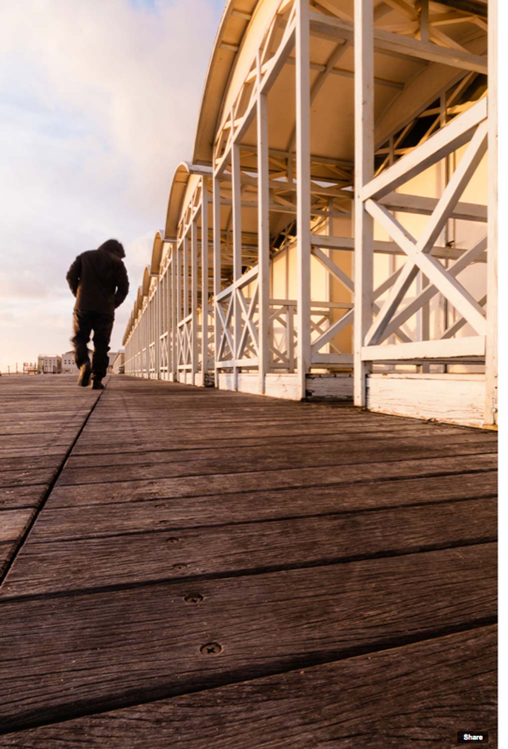
Valeriano submitted this photo to me and as usual, I like to share the photographer’s words with everyone. I find that there’s a lot of people out there that have either experienced a similar situation or have thought similar ideas. Here’s what he had to say:
“Hi Joe,
I’d like to submit a photo to your blog’s section “Ask Joe”.
I was working this subject (cabin’s at the beach), and after finding a nice composition I decided to add a person to the picture to give it a sense of scale. Not having anybody else than myself to model, I decided to self model.
After I’ve found and set the right exposure, I set my camera with a timed shutter release, and I start to walk into the frame.
Out of the several attempt, this one I think is the picture that I’d like the most.
What do you think about it?
PS I haven’t shot this horizontal, indeed I’m having a problem when trying to compose this kind pictures horizontally: distortion I cannot get rid of n camera. The vertical lines on the edge of the frame are always leaning and trying to correct them in camera seems always quite impossible (I’ll always end up with a composition I don’t like). Do you have any trick or suggestion for this issue?
Thanks,
Valeriano.”
Valeiano,
First of all, as I tell my online class with the PPSOP, and my “Stretching Your Frame of Mind workshops” I conduct around the planet, the key to taking your imagery what I refer to as “up a notch” is to “make pictures” not just take pictures. What you have done by putting yourself in this composition is “making pictures”. So many of my fellow photographers are content in taking pictures of what they see, instead of taking pictures of what they could see if they just stretched their frame of mind.
Ok, having said that, let’s talk about “Showing Scale to Your Photos”. In a nutshell, here’s the important part of that post: “The best way to show the scale within my composition is by including something whose size is already known. That being a person, ship, auto, etc. Without something in your photo, the viewer won’t have any reference as to just how big an area he’s looking at.”
In your photo, there’s really not that much difference in size between everything in your composition, namely the person and the building, I’m not sure scale is what you were thinking.
Moving on, there’s a lot for the viewer to look at, and the more we give him the more he’ll stick around: There’s a Vanishing Point, Patterns, Texture, Visual Tension, Shape, and light. These are the things found on my ‘Artist Palette’ and have taken this photo “up a notch”.
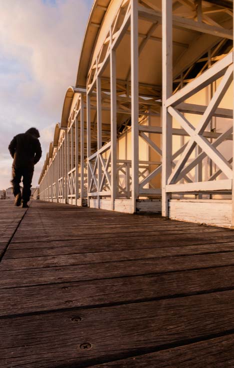
Take a look at this crop. I’ve made the Negative Space that surrounds the man walking equal on both sides and now feels more balanced. I’ve also darkened it and now there’s more depth in the colors and a greater degree of contrast between the light and dark areas that border each other.
Tightened up a little.
One last note, the vertical lines should be as easy to straighten in a vertical as well as in a horizontal format, so I’m not sure why it is you have trouble. It’s a matter of tilting your camera down to straighten lines that bend in, and tilting your camera up to straighten lines that appear to bend out.
Whenever I’m composing, the first two things I do is to make sure the horizon line is straight, then I tilt the camera up and down and watch the vertical lines close to the edge of the frame until they’re parallel to it.
It’s a nice photo, so thanks for sharing it.
Visit my website at: www.joebaraban.com and check out my 2013 workshop schedule at the top of this blog. Come shoot with me sometime.
Don’t forget to send me a photo and question to AskjoeB@gmail.com.
Valeriano, a past student of mine sent me this photo to talk about. For a better understanding of where the photographer is coming from, and what his or her thought process was at the time, I like to copy exactly what they say when submitting. Another reason is that often is the case that others are thinking the same thing or have experienced similar situations.
Here’s what Valeriano had to say:
“Hi Joe,
I’ve recently broken your class rule for the fish-eye lens when composing this subject. Since also at dawn the monument wasn’t lit, the sky was dull gray and hazy with no clue of getting a single ray of dun at sunrise. I’ve also decided to break another of your class rules about white balance and set mine on Tungsten knowing I would get a bluish color cast on what wasn’t lit by artificial lights. Not having any one to model for me, I had to rely on pedestrians climbing the stairs in order to give a sense of scale by having a human figure in the composition.
Please let me know your thoughts, and-as-usual-thank you a lot for your invaluable critique and advice.
Cheers,
Valeriano”
Ok Valeriano, let me first offer up a quote that was said by a very famous photographer named Ansel Adams. He said, “There are no rules for good pictures, there’s just good pictures”. In my online class with the PPSOP, and in my “Stretching Your Frame of Mind” workshops I conduct around the planet, I do have rules. These rules are only intended for my classes, not necessarily rules you have to live by. I have these rules because I’m a firm believer in teaching fellow photographers how to become stronger at their craft; by using their imagination not gimmicks.
To me, a good photographer doesn’t need to resort to specialty/trick lens or to wash everything in a specific color. A good photographer will rely on his wit, his ability to create good photos in the camera, and a knowledge of the elements of visual design and composition that he’ll get in my class. This has been my thinking for the past forty-six years and I’ve managed to take pretty good pictures without resorting to tricks or manipulation. I guess it’s all about being comfortable in my own skin. When I go out to shoot, I’m confident I’ll come back with something that will be timeless, memorable, and classic…but that’s just me.
In your photo, I hope that the people that view it loves blue, because it’s blue from corner to corner and edge to edge. Even the people you added for scale are blue!!! I’d be interested in seeing how it would look all yellow, or green, or even red? What I’d really like to have seen is this photo looking real. The reason is that you had all the elements to have created an interesting well composed photo that included several of the elements from my ‘Artist Palette’.
For example: Shape (the triangle at the top left), Pattern (the steps), Line (the lines you have that lead the viewer in and out of your frame), Tension (placing the people close to the edge of your frame), and Scale. In my opinion it would have been enough to carry it without turning everything blue.
As far as the Fisheye lens goes, there are definitely times when it’s used, for example in aerials or to solve industry related problems, but for me those times do not include the concept of “creativity”. In my opinion, the distortion is distracting, and there’s just not a place for it in the day to day world of picture taking.
Here is another photo Valeriano shot with a Fisheye and submitted to me. For me, I think it’s an interesting picture that’s obviously well balanced and composed, and I’m sure that there will be people that will “ooh and aah” and there will even be people (usually friends or family) that will say…”Cool man”! If those are the people you’re trying to impress, then I say go for it and don’t take that lens off.
Again, that’s just one opinion, and now I want to leave you with this last thought, “If you have a hammer in your hand and everything looks like a nail, then you have a problem”.
As usual, thanks for sharing your photo and thoughts.
Visit my website at: www.joebaraban.com and check out my 2013 workshop schedule at the top of this blog. Come shoot with me sometime, but please…leave the Fisheye at home.
Don’t forget to send me a photo and question to: AskJoeB@gmail.com
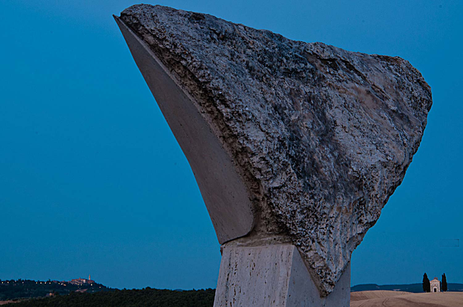
Valeriano sent me this photo to talk about. As usual I like to have people read what was said to me when the image was submitted. I find that a lot of photographers share the same problems, or the same stories, or the same ideas so it’s nice to know that you’re not alone. Here’s what he had to say:
“Hi Joe,
I’d really like your critique about this photograph and mainly about my composition.
The little white chapel (with the cypress trees “guarding” it) is an iconic landmark in this Tuscan area named Val d’Orcia (a UNESCO world heritage site). I’ve shot it in many different ways and in many light situations and seasonal situations, as well as with different weather conditions.
Thus this time I went there again, I really wanted to find a different point of view for this subject. The sculpture in the immediate foreground is something that I thought could work to define a frame within a frame composition. I’ve got the idea cause I was together with another photographer at the place I usually go, and he “hates” these sculptures that the landlord allowed to be put on its property by an artist. I always wondered if there was some interesting way to shot ’em, I probably have found one.
Unfortunately this idea came up to me at very last moment I was in my stay at this place. Moreover I was in a very bad creative vision moment for my photography, which, as usual, will start to improve as I’m at the end of a time slice exclusively dedicated to photography.
I didn’t shot it with the right light conditions I would had rather have: at sunset with a nice side light which would had let the texture of the sculpture pop up. Therefore I shot it at twilight.On the left side, in the background, there is also the profile of the little town Pienza, another well known place of this area.
Please let me know your thoughts about it and if there is anything I can improve with this composition.
Thanks a lot,
Valeriano.
Valeriano,
The first thing I felt I needed to do was to turn your photo upside down. For those of you out there that don’t know why I do this, it’s to show how well a composition is balanced. I’m talking about the balance between the Negative Space and the Positive space. In Valeriano’s photo, the Positive Space is the sculpture in the foreground, the small chapel, and the land mass and town in the left background. The Negative Space is the blue sky.
When you look at this photo right side up, the way you meant it to be, you’re looking at it with the right side of your brain; the creative side. You see a sculpture, a chapel, and a small town, and blue sky. When you look at this photo upside down, you’re looking at it with the left side of your brain; the analytical side. The sculpture, the chapel, the town, and the sky don’t exist anymore. Now, all you see are shapes and how they relate to one another. Now it’s easy to see how well the balance between the Negative and Positive Space actually is.
Is this photo balanced? To me, it’s very heavy on the right side of an imaginary line drawn down the middle. Don’t get me wrong, I’m the first one that would disrupt the way a viewer perceives then processes one of my photos, but when you have an object this large anchored in the foreground, it’s too much.
Since Valeriano wanted to show both the chapel and the town, I would have moved a few steps to the right so as to balance the sky on both sides of the sculpture.
Ok, Valeriano mentioned “framing within a frame”. Since he took my online class with the PPSOP, he learned several ways to create Visual Tension. I also teach this in my “Stretching Your Frame of Mind” workshops I conduct around the planet. One of the ways is to frame a subject, or an object or a scene within a frame. By cleverly using the sculpture and the right edge to frame the chapel, he succeeded. I also show my students how to use perspective to create the feeling of depth. By ‘anchoring’ the sculpture in the foreground he created “layers of interest” which in turn created the feeling of not only depth, but distance and scale as well.
The last thing I want to mention is that people that follow my blog and my work know that I’m very big on light, since light is everything!!! However, in this photo I like the absence of directional light here. There’s something magical about this photo and waiting for the twilight color to take effect. The psychological effect color has on our psyche can’t be dismissed as it has been proven to have certain powers.
A very cool photo!!!!! You were definitely “Stretching your Frame of mind”.
By the way, did you know that there was a time when the color blue was believed to soothe illness and treat pain; ancient cultures practiced Chromotherapy or the use of color to heal.
Thanks for the submission.
Visit my website at: www.joebaraban.com and watch for my 2013 workshop schedule. Come shoot with me sometime.
Keep those questions and photos coming in at: AskJoeB@gmail.com
Since I think that a lot of you out there share similar feelings, levels of expertise and situations as the photographers that write into me think it’s important to share the comments i receive with all of you. Here’s one from Mark, a recent student of mine in my online class with the PPSOP. Here’s what he had to say:
“Hi Joe,
Having recently traveled for business, I was anxious to Stretch My Frame of Mind when time permitted. With my newly expanded Artist Palette ready to be deployed, Las Vegas was surely a land of opportunity!
After taking your class, I must admit, the world looks a lot different these days. Shapes, texture, patterns & colors seem to be everywhere. For example, the silhouette image was taken at 1:00AM after returning from a banquet. Entering my room with the lights off was a gift. Everything about the view was screaming, “take my picture” (lines, reflections, framing, etc). Adding myself in the image seemed to add perspective and negative space.
Here are 3 of my favorite images from the trip. Feel free to re-post, comment or delete if you don’t like them! 🙂
Cheers,
Mark Carruthers”
Hi Mark, good to hear from you again. I always like to stay in contact with former students. Since I like your submissions, I won’t delete them. :-)))))
I can tell by looking at these images that you are using my “Artist Palette” I not only teach with the PPSOP, but also with my “Stretching Your Frame of Mind” workshops I conduct around the planet. I like the Vegas photo (#1) for a couple of reasons: One is the silhouette you included. You do remember the week we spent on the silhouette in my Part II class. It adds not only a “layer of interest” creating Perspective, but it now has a level of Visual Tension crated by the contrast between the dark silhouette and the bright lights outside. I also see that you intentionally created some Negative Space inside his arms…clearly defining them. Nice job!!!
#2
In the photo of the sign (#2), You’ve done well grasshopper!! By getting “up close and personal” with the sign, you’ve also created a “layer of interest” which creates Perspective. You’ve taken control of what the viewer will perceive and process by leading him around your frame. By adding the silhouette, you’ve not only generated Visual Tension, but you’ve given the viewer lots of things to discover in your photo…just what we want him to do because the more elements he’ll discover, the longer he’ll stick around looking…a very good thing!!!
#3
What I like about the man playing the guitar (#3) is that you’ve placed the man “up close and personal” while creating a Vanishing Point (the fence) that will lead the viewer the walkway. This also represents one of the six principles of Gestalt I write about and teach in my classes. This one is called Continuance. If you want to read more about them you can read my recent article with Adorama. You can find it here at: http://www.adorama.com/alc/0013706/article/6-Principles-of-Gestalt-Psychology-That-Can-Improve-Your-Photography
Thanks for the submissions. The next step is to come shoot with me sometime!!!
JoeB
Visit my website at: www.joeBaraban.com, and check out my 2012 workshop schedule at the top of this blog. come shoot with me sometime.
Don’t forget to send me a question and photo to: AskjoeB@gmail.com
Valeriano sent this image to me with this explanation:
“This shot was taken by me in 2007 for a PPSOP class about “Learning to see creatively”, and the assignment was about pattern.
I’d chosen to compose this image with the cup in that position to imply the letter “Q” by its shape. The “Q” letter should also stand for the concept “Quality”.
As you may know for Italians like me, a good coffee it’s something very important we cannot ever give up. ;)”.
Ok, the photo: If you hadn’t mentioned what you were trying to achieve with the letter ‘Q’, I don’t think the viewer would pick up on it…as I didn’t. I like to think of myself as a fairly intuitive/creative thinker, but I didn’t get the letter ‘Q’ or the word Quality. If you look at how the capital ‘Q’ is made, you’ll see that it’s different enough from your cup to make the difference between getting/seeing it or not. I think I might have taken a close look on how the capital letter ‘Q’ is made.
The important thing to always remember is that you won’t be around to explain your thought process. Your photo will need to stand on its own. It needs to be what I refer to as a “quick read”, unless you’re asking the viewer to comment on an abstract representation of some reality your portraying in your photo. Now, as I continue to look at your image, seeing the letter becomes easier. However, you can’t expect the viewer to look at your photographs that long. If they don’t get it right away, and there’s not a lot of other elements for them to discover in your photos, they’ll move on.
In my online class with the PPSOP, and in my “Stretching Your Frame of Mind” workshops, I tell my students to Consider the scene and its outcome. Make sure what you’re trying to get across is not toooooooo ‘esoteric’.
As far as the photo itself goes, I think it’s a really good shot that accomplished the assignment in a creative way. I think I might also have tried one where their was actual brewed coffee in the cup, and still had the patterns of the beans on the bottom..with some Cognac in it”!!!
🙂
Thanks for the submission Valeriano, and feel free to send me images any time.
Visit my website at: www.joebaraban.com, and check out my 2012 workshop schedule at the top of this blog. Come shoot with me sometime.