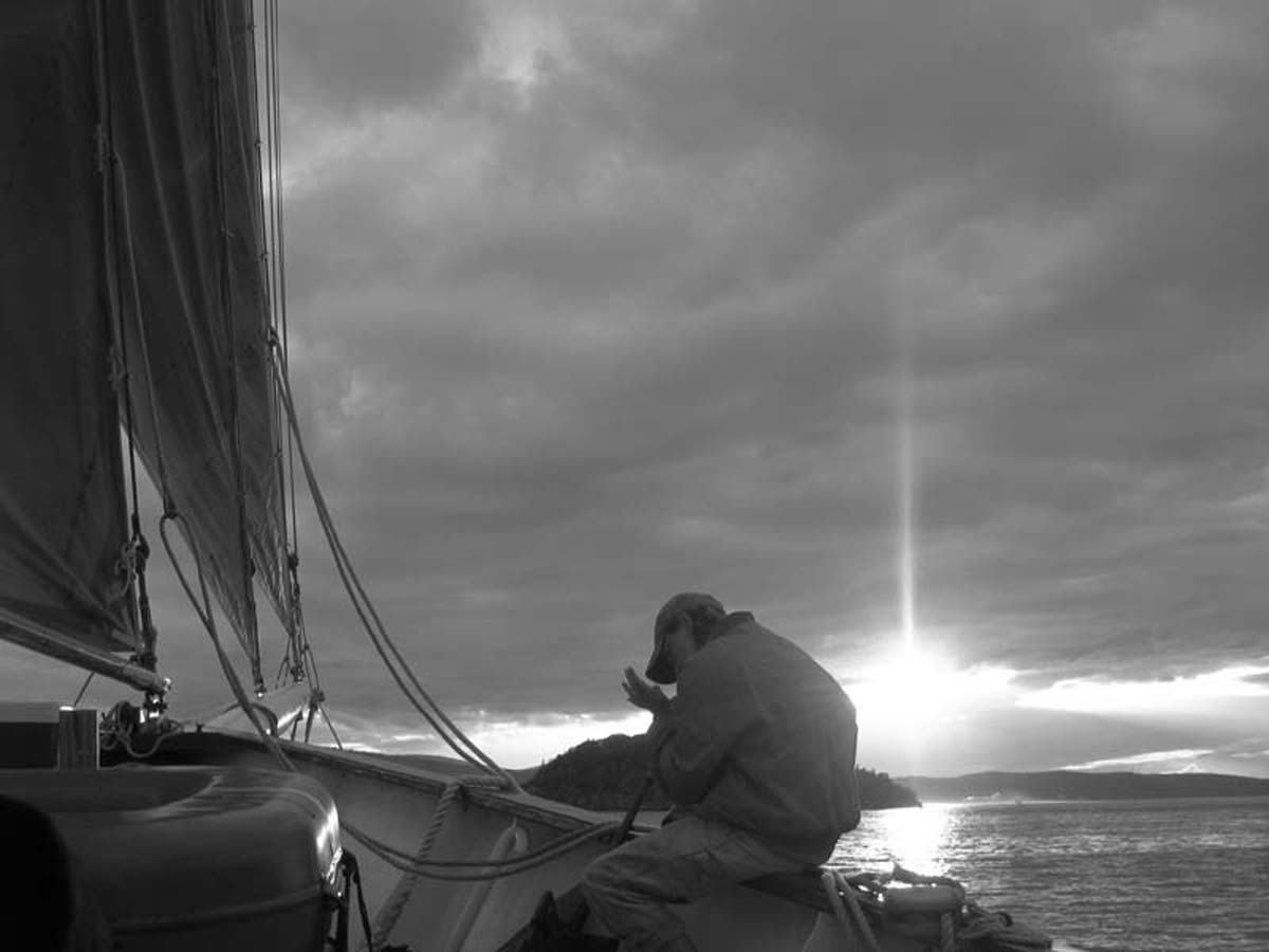
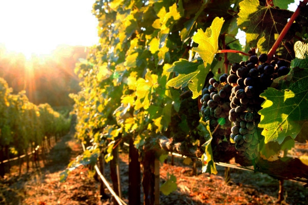
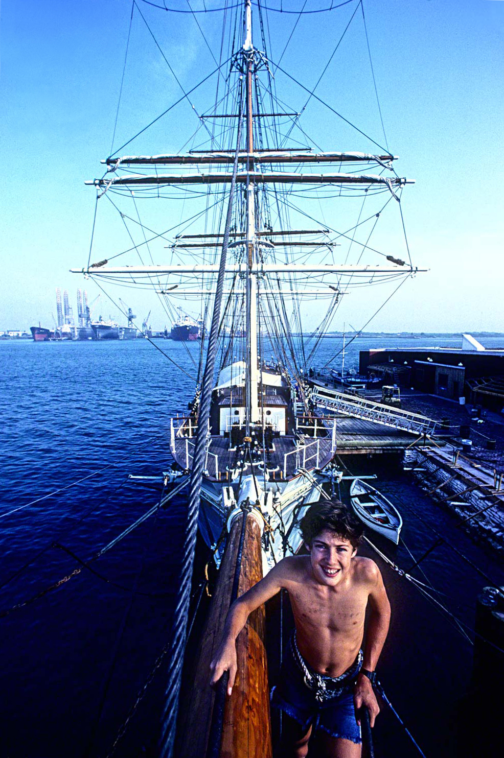
Anecdotes: Apache Oil and Gas Annual Report.
I just love thinking back over my forty-three year career to all the funny things that happened during some of my shoots, and I gotta tell you that there were so many that are repeatable and some not so much!!!
If you’ve taken my online class with the BPSOP, or my “Stretching Your Frame of Mind” workshops I conduct around the planet, you’ve probably hard some of the ones I wouldn’t repeat to just anyone.
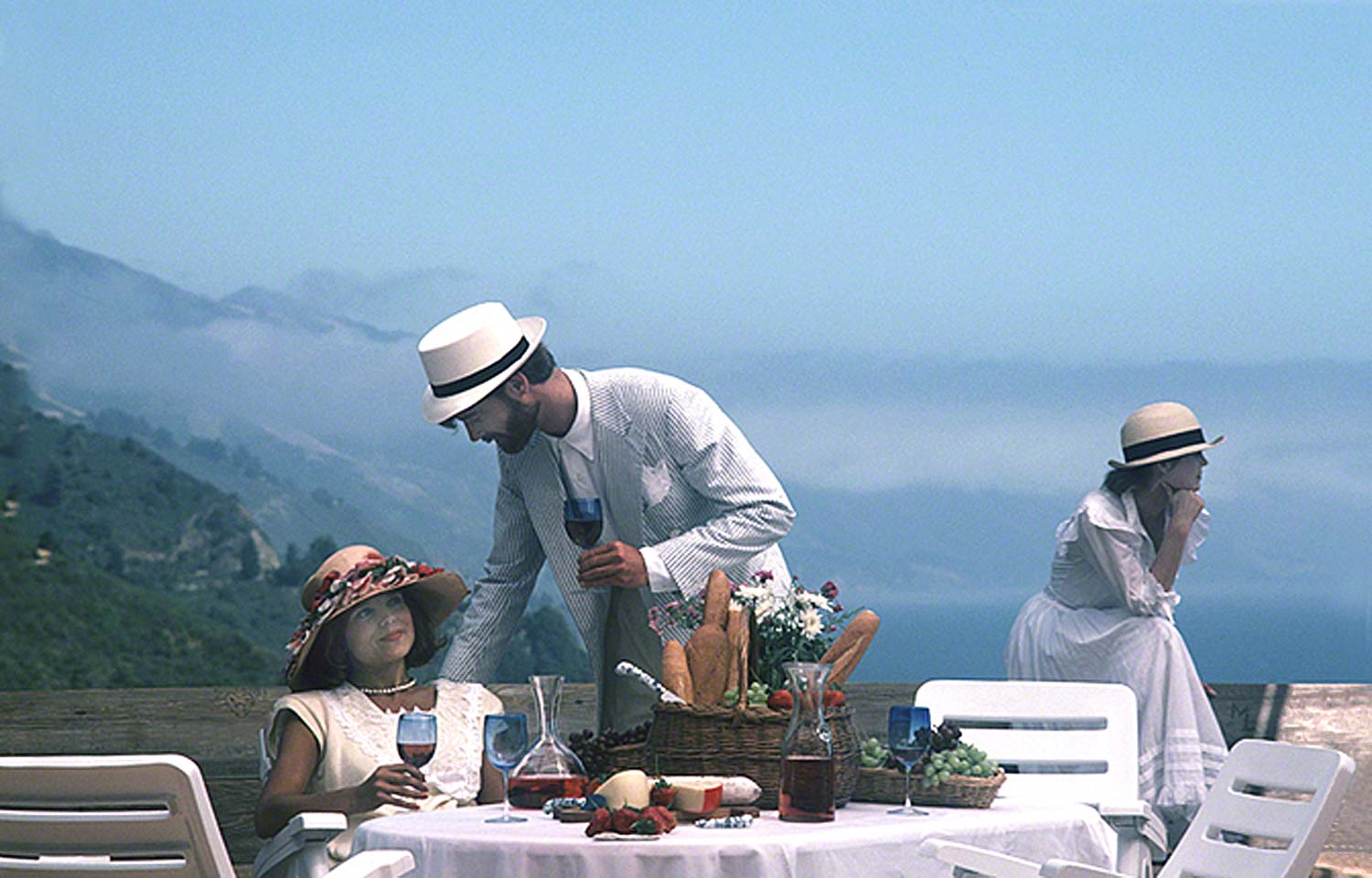
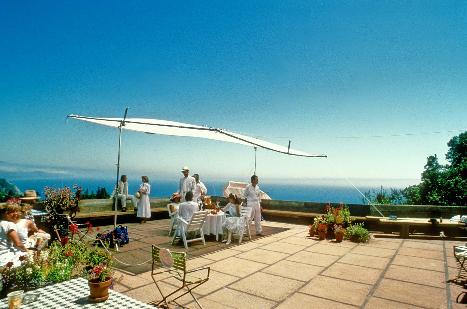
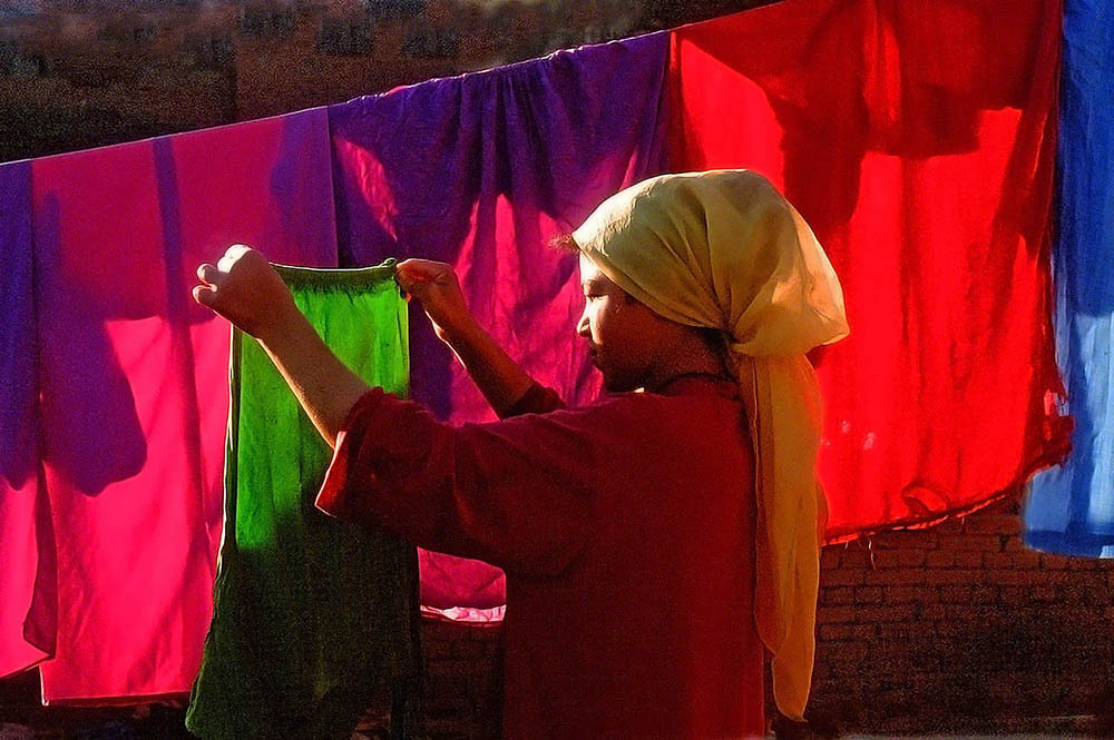
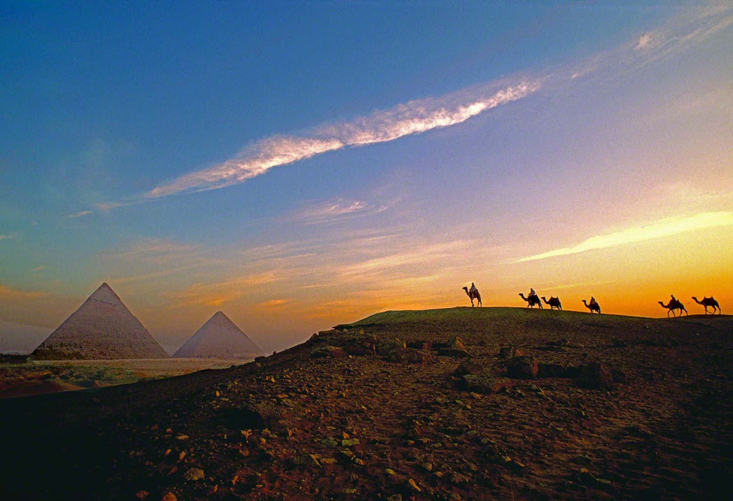
Years ago, one of the craziest projects I worked on was for Apache Oil and Gas Annual Report. They were in the process of partnering up with the Egyptian government to start drilling there, so they sent me over to photograph whatever I wanted provided it said something about the country and it’s history. What a great assignment. For a week, I basically had Carte blanche, backed by whatever expenses I saw fit to use in order to get the shot I wanted. As the above photo will show, Egypt is dripping with history.
The day before the above shoot, we were scouting locations to find a sunrise location where I could position the camel caravan I had just hired. We were scouting on camels, so when we found the right spot and returned to the stables I made a point in saying that it was going to be the very last time I would ever get on a smelly, dirty, obstinate, and very uncomfortable camel.
Before sunrise of the morning of the shoot, we headed out but this time the designer, my assistant and I were on Arabian Stallions instead of camels. Wow, what a difference!!! After a great morning shoot, we headed back racing down the huge sands dunes with the Pyramids of Giza looking right at us. It was a Cecil B. DeMille moment and one I’ll always remember.
Ok, now for the funny part: For those of you out there that have never seen the pyramids, let me tell you that they’re not out in the desert; quite the contrary. Much to my surprise they’re just on the edge of Cairo, with a resort hotel and casino across the street ((actually where we stayed), a shopping center on one side where you could buy pyramid thermometers, and a golf course on the other.
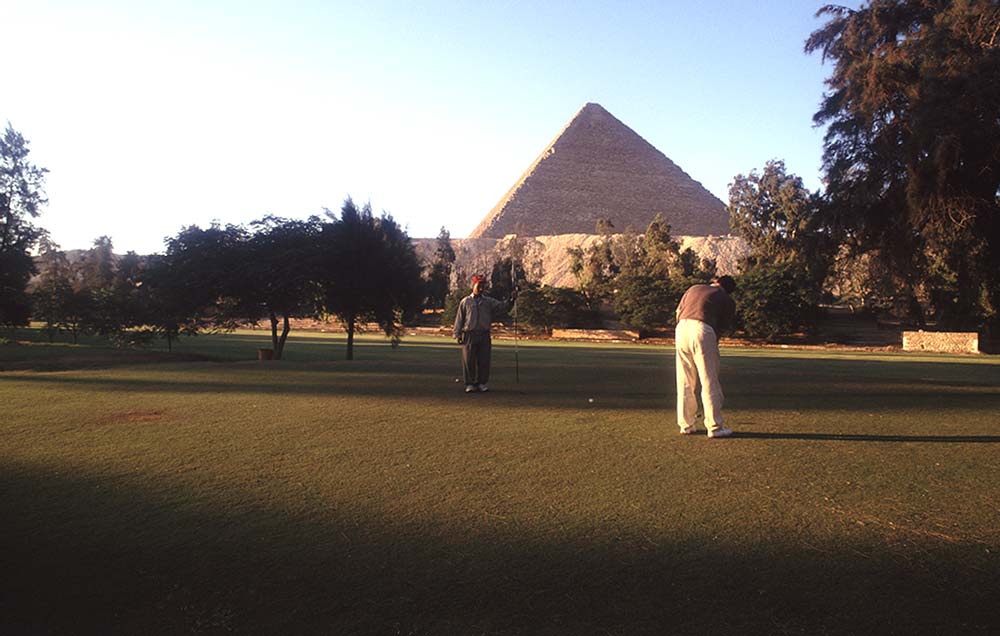 Hard to believe? Well two photos are worth two thousand words. Here’s one with the client putting on a green ( with a caddy possibly a descendant from Pharaoh himself ) and the other is yours truly hitting out of the largest sand trap in the world!!!
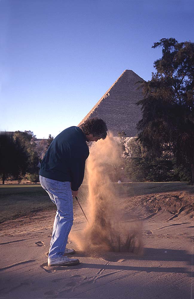
Visit my website at: www.joebaraban.com, and follow me on Instagram: www.instagram.com/barabanjoe. Check out my workshop schedule at the top of this blog. Come shoot with me sometime.
JoeB