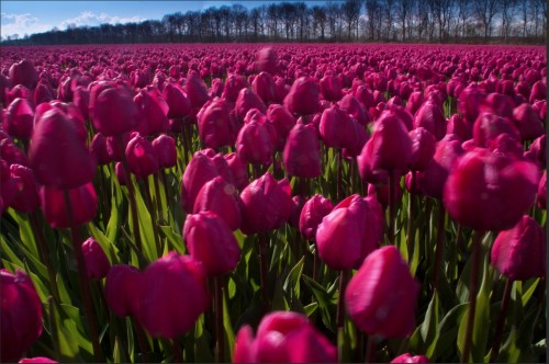
A fellow photographer and student sent this photo of a field of Tulips for discussion. Here’s what he had to say:
“Joe, here is a photo I’ve taken recently. My question to you is simple: How do you “read” it? (On purpose, I am not saying anything by words; I’d like to let the photo speak to you…)
Ok, let’s talk about your tulip photo. You asked how your picture of these tulips spoke to me, and how I read it.
First of all, it probably speaks to me differently than anyone else you might ask for the simple reason that I love tulips. I plant them every year, and when I buy cut flowers, which I usually do, I’ll buy tulips and when I can, I’ll buy French Tulips. So, you already have a score of ten. Now, lets see if you can keep it!!!
As you’ll notice, I lightened it a couple of stops so it’s a lot brighter, and now the color isn’t quite so heavy…which by the way is not the same as if it were over saturated. The main reason why the tulips appear dark and the sky looks ok, is that if you were to take a reflected reading just of the sky and then the tulips, you would find a big difference in the exposure. You wouldn’t be able to get both the flowers and the sky exposed properly without the help of post processing. It’s all about Dynamic Range, and if you click on this link, I can go into more detail.
Not that it’s a bad idea, but I like creating my pictures in the camera first without any help. I’ll resort to any post work when I absolutely have to. For me, I like creating my images before I click the shutter simply for the challenge…plus it has made me a better shooter in the process.
But I digress!
Ok, lets talk about how you used the elements of visual design you learned from taking my online classes and that you have on your Artist Palette. These are shown in bold:
First of all, I like the contrast between the Texture of the trees in the background and the tulips. As you know, contrast is one of the ways to create visual tension. The tension that occurs when forces as in the trees and the tulips act in opposition to one another. Very different from the Tension that comes with emotional or mental strain.
I like the blue triangle you created in the top left corner. Since Shape is an element of visual design, I’m always looking to include one of the four basic shapes, that being a square, circle, rectangle or a triangle.
As I’ve said a million times, Light is everything. Wherever I am , the first thing I do, before I raise the viewfinder to my eye is to determine the direction of the light. I’m always looking to back or sidelight anything that’s translucent, like the stems and leaves in your photo. I love the way they glow!
I might have come around more to the right to get the tulips more backlit so they would glow as well. Right now, the shadows on the tulips take up most of the surface area…that’s not necessarily bad, as I like to side light as well.
The last thing I want to mention is to always be sure what’s going to be in focus, from the front to the back. In my opinion, the tulips in the foreground are large and out of focus which is somewhat distracting.
I’m going to assume that you were hand holding your camera so you might not have been able to stop all the way down without adjusting your ISO; in which case you weren’t in control…that’s why I use a tripod.
By the way, since Color is a great communicator of ideas, the field of red makes up a Pattern ( another element of visual design) that tells the viewer that the bulbs you buy here will all be the same color…red. Pattern is a good thing to include in our imagery, and breaking the rhythm of patterns is even better.
Overall, I would say that it’s a good shot, nicely composed and lit…but then I love tulips!!!
Thanks again for your submission.
Visit my website at: www.joebaraban.com, and follow me on Instagram: www.instagram.com/barabanjoe. Check out my workshop schedule at the top of this page. They don’t stay up very long. so you have to catch them at the right time. Come shoot with me sometime.
JoeB
Joe
15 Jun 2012Thilo, it all makes sense, since I wasn’t there. Also, I know you’re on a tripod, but since you live in this area and see this all the time, I figured you were driving, had an idea and jumped out and shot it without a tripod.
I’ll do that and when I get situated on my knees sometimes I’m just tooooooooo lazy to get up go back to the car and get my tripod…the photo usually suffers when ever I do that!!!
Send me another!!!
JoeB