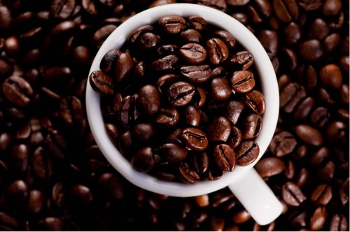
Valeriano sent this image to me with this explanation:
Ok, the photo: If you hadn’t mentioned what you were trying to achieve with the letter ‘Q’, I don’t think the viewer would pick up on it…as I didn’t. I like to think of myself as a fairly intuitive/creative thinker, but I didn’t get the letter ‘Q’ or the word Quality. If you look at how the capital ‘Q’ is made, you’ll see that it’s different enough from your cup to make the difference between getting/seeing it or not. I think I might have taken a close look on how the capital letter ‘Q’ is made.
The important thing to always remember is that you won’t be around to explain your thought process. Your photo will need to stand on its own. It needs to be what I refer to as a “quick read”, unless you’re asking the viewer to comment on an abstract representation of some reality your portraying in your photo. Now, as I continue to look at your image, seeing the letter becomes easier. However, you can’t expect the viewer to look at your photographs that long. If they don’t get it right away, and there’s not a lot of other elements for them to discover in your photos, they’ll move on.
In my online class with the PPSOP, and in my “Stretching Your Frame of Mind” workshops, I tell my students to Consider the scene and its outcome. Make sure what you’re trying to get across is not toooooooo ‘esoteric’.
As far as the photo itself goes, I think it’s a really good shot that accomplished the assignment in a creative way. I think I might also have tried one where their was actual brewed coffee in the cup, and still had the patterns of the beans on the bottom..with some Cognac in it”!!!
🙂
Thanks for the submission Valeriano, and feel free to send me images any time.
Visit my website at: www.joebaraban.com, and check out my 2012 workshop schedule at the top of this blog. Come shoot with me sometime.
JoeB
Valeriano
12 Apr 2012Thanks for your critique Joe!
Very helpful! I’ve realized that you’re completely right about the quick read of the Q letter shape. I ought re-shot this using a different cup.
Joe
12 Apr 2012Let’s see what you come up with.
JoeB