
Triadic Harmony
Although it would be nice if everyone lived in harmony with one another, that concept will most probably have to wait. Until then I would like to talk about something that can happen right now, and that would be to seek out and use colors that are in harmony with one another in your photos.
Since my background is not in Photography but in painting and design, I’ve learned through my studies which color is in harmony with another. I taken that knowledge and have applied it to my love of photography. By the way, I still consider myself an artist, I’ve just switched the medium from a paintbrush to a camera.
I tell my students that take my online classes with the BPSOP, and those that have taken my “Stretching Your Frame of Mind” workshops I conduct all around the planet that a camera on a tripod is just like a blank canvas on an easel. I talk a lot about color since it’s a basic element of visual design, and should be thought of as a very important tool in creating those works of art…the same ones you find on a canvas.
The methods we use to gain attention to our photography will vary, but what’s important is how we manage what the viewer perceives and processes when looking at the visual information we lay out to him in the form of a photograph. Humans rely on perception of the environment that surrounds them. Visual input is a part of our everyday life. Color, and understanding how the viewer perceives color, is what we as photographers have as a tool to present this information in a way that creates a sense of harmony.
 In my opinion we spend far too much time dwelling on so called ‘Rules’ in Photography: The Rule of Thirds (the silliest of them all), The Leading in Rule, Never Clip the Highlights, are three that come to mind and I’ve written posts about them going back six years.
We also think about shutter speeds, DOF, cropping (please don’t do that!), White Balance, etc., etc., ad nauseam. I can tell you that color should be considered right alongside every other facet when composing your photo.
Color is a great resource when trying to get across an emotion, drawing the viewer into our photos, making the subject stand out against the environment he or it is in, creating visual tension, visual interest, balance, and a sense of order in our present day chaotic world.
Ok, let’s first talk about ways to achieve harmony through the color wheel, which as a trivia question for you to someday know, it was invented by Sir Issac Newton….yes it’s the same guy, the one who discovered gravity.
There are four main ways to create harmony using color: Using Monochromatic, Analogous, Complementary, and Triad colors.
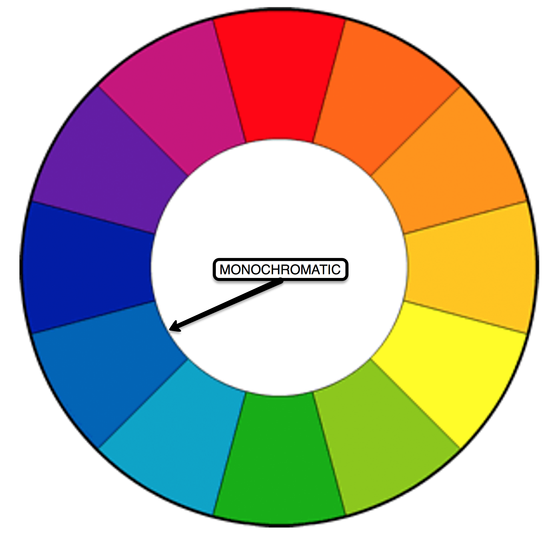
The word monochromatic would usually conjure up the old black and white days, but it can also apply to color. In this application it’s made up of just one color, and different shades of it. This will create a visually balanced and appealing photo, albeit one that’s low in contrast; good to use when you don’t want a particular object stand out from the rest of the environment.
 Analogous colors are those that are next to one another on the color wheel. They live in harmony because of the similar hues. They’re pleasing to the eye and appear more often in nature than monochromatic and complementary colors do. That said, if you’re looking for contrast these colors wouldn’t be my first choice…complementary colors would.
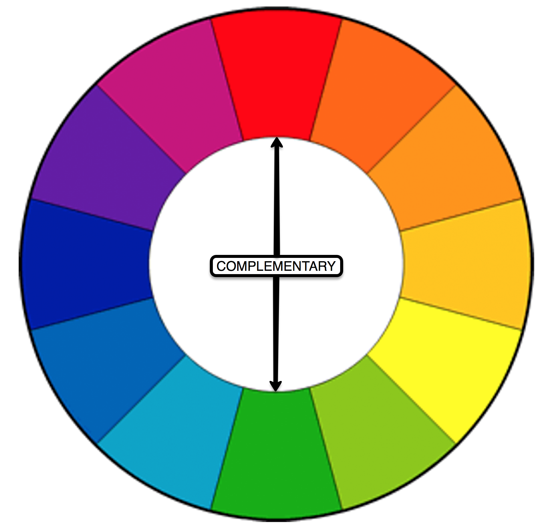
Complementary colors are those that are opposite one another on the color wheel. They generate visual tension because of the contrast of one to another.
Triadic colors on the color wheel are those that are evenly spaced on the color wheel, and will form a triangle. When using this form it’s important to achieve balance between the three colors. 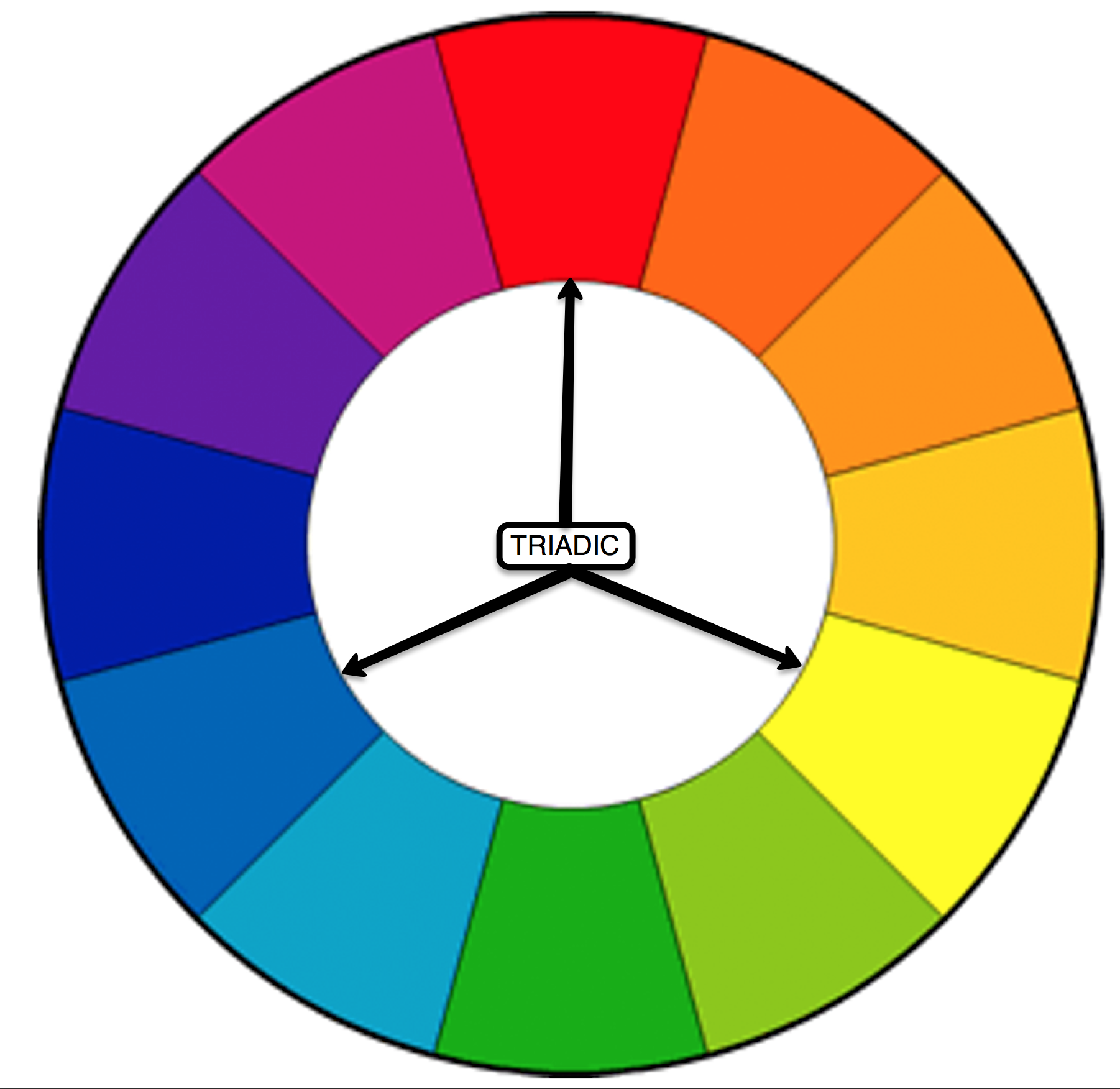
Pre-visualization” is one of the guidelines in my “did it do it” list for good composition I pass out to my students. Being aware of colors that are in harmony and the effects it will have on the viewer will help you do just that…pre-visualize.
So my fellow photographers, the next time you go out think about all the tools you have on hand and make sure color and the harmony are included. Observe the effects colors have upon each another, study the color wheel and become a student of their visual relationships.
Visit my website at: www.joebaraban.com, and check out my workshop schedule at the top of this blog. Come shoot with me some time. This coming January Along with William Yu, I’ll be taking a group to China to photograph the flooded rice terraces and also the tribal villages. Next February in conjunction with the Santa Fe Workshops, I’ll be returning to Cuba for the fourth time. My next springtime workshop will Berlin next May; an incredibly beautiful city.
If you send me a photo and question to AskJoeB@gmail.com, I’ll create a video critique for you.
JoeB