Did it have visual interest?
This is the sixth post in my series, “Did it do it“. I call this one, “Did it have visual interest”?
One of the ongoing issues I have with my online students with the BPSOP, and in my “Stretching Your Frame of Mind” workshops is that they won’t always be around to explain their thinking to the viewer. Their photo needs to be able to stand on its own and be what I refer to as a “quick read” and make a quick statement.. Unless it’s an abstract and you don’t want to put an idea into the viewer’s head so that any interpretation is left up to them, I suggest you have the viewer figuring out what you were trying to say. The best way to have him doing that is to create a photo that has visual interest…attention grabbing interest.
It’s soooo easy to get hung up in framing your subject, and people invariably forget about the reason they brought the viewfinder up to their eye in the first place. It’s important to stand back (not literally) and “consider the scene and it’s outcome”; be sure that your idea is not tooooooo esoteric. People like to look at pretty pictures as well as thought-provoking images. I know that the last thing I want is to have the viewer walk away from my photo scratching their head wondering what the point of the photo was…while yawning!!!
If it’s an editorial story you’re trying to get across it’s important that the message is clear, hopefully without any captions guiding the viewer’s way. If there are captions it would be nice if the printed word matched the visual. otherwise…there he goes wandering off again scratching hiss head!!!
One of the best ways to create Visual Interest is by using the elements of visual design and composition found on my Artist Palette: If the feeling you want to get across is loneliness, then place your subject small in a much larger environment. Create Visual Tension by placing your subject close to the edge of the frame. I’ve found that the bottom right corner will usually work. Remember that color also communicates ideas while providing visual interest. For example, a group of people wearing the same color will mean that they’re part of a group or organization, and the viewer will get it right away.
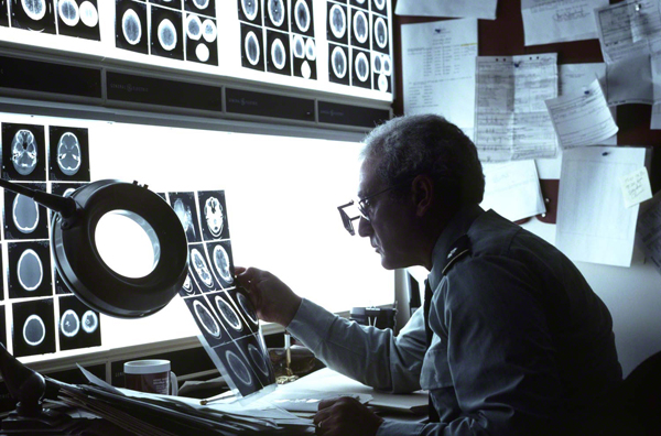
In the above photo, I was shooting a brochure for a new hospital in Houston, and they wanted to say that there are top professionals working on state of the art equipment aimed at finding the cause as to why you’re there in the first place. I wanted to tell the story as quick as I could, using contrast and light to create the Visual Tension, The attitude/Gesture/body language and the obvious quiet environment of the doctor’s office helps to qualify him as someone you could trust to make an accurate diagnosis.
To make the photo more visually interesting I also included Pattern (an element of visual design) to keep the viewer interested in looking around the frame. Shape is another element of visual design and the four basic shapes are: circles, squares, triangles, and rectangles. I’m always looking for those shapes and including them into my composition, as I’ve done here with all the circles.
Visit my brand new website at: www.joebaraban.com, and check out my 2019-20 workshop schedule at the top of this blog. Come shoot with me sometime.
JoeB


Great post & commentary!!!
Hope you’re having a great summer!
Mark
Thanks mark. I hope all is well with you and all yours.
JoeB